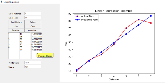
This article is about using Linear Regression. My aim is to demonstrate the concept of Linear Regression using a GUI interface. Since Tkinter is fairly well-known to Python programmers and easy to use, I have chosen it as the GUI toolkit.

Introduction
This article is about prediction using Linear Regression Analysis. The advantage of using it in a GUI environment is that it can be made interactive and the effect of changing the independent variable on the dependent variable can be seen in real time.
Background
Linear Regression is an analysis method that estimates the coefficients of the linear equation having one or more independent variables that best predict the value of the dependent variable. Linear Regression fits a straight line that minimizes the discrepancies between the actual and predicted values of the dependent variable. Linear Regression is best suited for and widely used by businesses to evaluate trends and make estimates or forecasts. The example I have used for demonstration is based on predicting the fare to be paid based on the distance travelled. Since the interface is graphical, it is easy to input the distance and get the predicted fare as result.
The equation of linear regression can be expressed as Y = a + bX, where X is the independent variable and Y is the dependent variable. The term b in the equation represents the slope of the line and a represents the intercept, which is the value of Y when X is zero.
Using the Code
The following imports are required by the program:
from tkinter import *
from tkinter import messagebox
from tkinter.tix import *
import pandas as pd
from sklearn.linear_model import LinearRegression
import matplotlib.pyplot as plt
from matplotlib.backends.backend_tkagg import FigureCanvasTkAgg
import os
The main program chiefly consists of designing the user-interface of the application using Tkinter and declaring the required variables. Following is the Python code for the same:
distances = []
fares = []
data = {}

window = Tk()
window.title("Linear Regression")
window.geometry("800x500")

tip = Balloon(window)

lbldistance = Label(window,text="Enter Distance: ",anchor="w")
lbldistance.place(x=50,y=50,width=100)

txtdistance = Entry(window)
txtdistance.place(x=150,y=50,width=100)

lblfare = Label(window,text="Enter Fare: ",anchor="w")
lblfare.place(x=50,y=75,width=100)

txtfare = Entry(window)
txtfare.place(x=150,y=75,width=100)

btnadd = Button(window,text="Add/Update",command=add)
btnadd.place(x=50,y=100,width=100)

btndelete = Button(window,text="Delete",command=delete)
btndelete.place(x=150,y=100,width=100)

btnplot = Button(window,text="Plot",command=plot)
btnplot.place(x=50,y=125,width=100)

btnclear = Button(window,text="Clear",command=clearplot)
btnclear.place(x=150,y=125,width=100)

btnsave = Button(window,text="Save Data",command=savedata)
btnsave.place(x=50,y=150,width=100)

btnopen = Button(window,text="Open Data",command=opendata)
btnopen.place(x=150,y=150,width=100)

lstdistance = Listbox(window)
lstdistance.place(x=50,y=175,width=67)

lstfare = Listbox(window)
lstfare.place(x=120,y=175,width=67)

lstpredfare = Listbox(window)
lstpredfare.place(x=190,y=175,width=67)

lblintercept = Label(window,text="Y-Intercept: ",anchor="w")
lblintercept.place(x=50,y=350,width=100)

txtintercept = Entry(window)
txtintercept.place(x=150,y=350,width=100)

lblslope = Label(window,text="Slope: ",anchor="w")
lblslope.place(x=50,y=375,width=100)

txtslope = Entry(window)
txtslope.place(x=150,y=375,width=100)

lstdistance.bind("<<ListboxSelect>>",listselected)

tip.bind_widget(lstdistance,balloonmsg="Distances")
tip.bind_widget(lstfare,balloonmsg="Actual Fares")
tip.bind_widget(lstpredfare,balloonmsg="Predicted Fares")

window.mainloop()
The following add() user defined function is used to add or update the distance and fare stored as lists. It adds new distance and fare if the distance is not already in the list and updates the fare if the distance is already added. It then uses the updatelists() user defined function to update the data in the front-end GUI and then finally calls the plot() user defined function to plot the data.
def add():
      if txtdistance.get() in distances:
         i = distances.index(txtdistance.get())
         distances[i] = txtdistance.get()
         fares[i] = txtfare.get()
      else:
         distances.append(txtdistance.get())
         fares.append(txtfare.get())
      updatelists()
      plot()
Following is the code of the updatelists() function.
def updatelists():
      lstdistance.delete(0,END)
      lstfare.delete(0,END)
      for distance in distances:
           lstdistance.insert(END,distance)
      for fare in fares:
           lstfare.insert(END,fare)
The following user defined plot() function is used to plot the chart. The data is stored as a dictionary of distance and fare lists. The model is an instance of the LinearRegression class from the sklearn.linear_model package. The fit() function is used to train the model and the predict() function is used to generate the predicted fares. The actual and predicted fares are then plotted against the distance using the matplotlib library.
The intercept_ property is used to display the Y-intercept and the coef_ property is used to display the slope of the linear regression line.
The FigureCanvasTkAgg class is used to embed the plot in Tk. The clearplot() user defined function is used to clear the old plot before drawing a new plot to prevent multiple plots from being embedded.
def plot():
      distances = list(lstdistance.get(0,lstdistance.size()-1))
      if len(distances) == 0:
         return
      fares = list(lstfare.get(0,lstfare.size()-1))
      distances = [int(n) for n in distances]
      fares = [int(n) for n in fares]

      data["distances"] = distances
      data["fares"] = fares

      df = pd.DataFrame(data)
      X = df[["distances"]]
      y = df["fares"]

      model = LinearRegression()
      model.fit(X,y)

      y_pred = model.predict(X)

      lstpredfare.delete(0,END)
      for n in y_pred:
           lstpredfare.insert(END,n)

      txtintercept.delete(0,END)
      txtintercept.insert(0,str(round(model.intercept_,2)))

      txtslope.delete(0,END)
      txtslope.insert(0,str(round(model.coef_[0],2)))

      clearplot()

      fig = plt.figure()

      ax = fig.add_subplot(111)
      ax.plot(X,y,color="red",marker="o",markerfacecolor="blue",label="Actual Fare")
      ax.plot(X,y_pred,color="blue",marker="o",markerfacecolor="blue",label="Predicted Fare")
      ax.set_title("Linear Regression Example")
      ax.set_xlabel("Distance")
      ax.set_ylabel("Fare")
      ax.legend()

      canvas = FigureCanvasTkAgg(fig,master=window)
      canvas.draw()
      canvas.get_tk_widget().pack()
Following is the code of the clearplot() function:
def clearplot():
  for widget in window.winfo_children():
       if "Canvas" in str(type(widget)):
          widget.destroy()
The following delete() function is used to delete any distance and fare from the lists and update the plot.
def delete():
  try:
     d = lstdistance.get(lstdistance.curselection())
     if d in distances:
        i = distances.index(d)
        del distances[i]
        del fares[i]
        lstdistance.delete(i)
        lstfare.delete(i)
        lstpredfare.delete(i)
        plot()
  except:
        pass
The following listselected() function is used to display the distance and fare selected from the List on the screen.
def listselected(event):
  if len(lstdistance.curselection()) == 0:
     return
  i = lstdistance.curselection()[0]
  txtdistance.delete(0,END)
  txtdistance.insert(END,distances[i])
  txtfare.delete(0,END)
  txtfare.insert(END,fares[i])
The current list of distances and fares can be saved to a CSV file using the savedata() function as follows:
def savedata():
  pd.DataFrame(data).to_csv("data.csv",index=False)
The saved distances and fares can be loaded from the saved CSV file using the opendata() function as follows:
def opendata():
      if os.path.exists("data.csv"):
          data = pd.read_csv("data.csv")
          values = data.values
          lstdistance.delete(0,END)
          lstfare.delete(0,END)
          distances.clear()
          fares.clear()
          for row in values:
               lstdistance.insert(END,row[0])
               distances.append(str(row[0]))
               lstfare.insert(END,row[1])
               fares.append(str(row[1]))
      else:
          messagebox.showerror("Error","No data found to load")
Note: The plot button must be clicked after opening the existing saved data to update the plot.
Points of Interest
I was looking for some way of plotting data of machine learning algorithms interactively and it struck me that Tkinter would be the best option for it. I wish readers of this article find it as interesting as I found writing it.
History
- 2nd September, 2021: Initial version
