In this article, we will learn how to quickly build a map with useful overlay data. We’ll use the Wijmo React libraries in our tutorial. After setting up a starter React app, we will create a Wijmo map using static GeoJSON from an API. Finally, we'll look at how to add tooltips using data from a live API.
Humans have overlaid information on maps for centuries, from the best army battalion positions to the best pubs in the city. Nowadays, those maps are usually digital and web-based, displaying everything from weather information to virus hotspots to, well, the city's best pubs. Today, we'll explore how you can quickly build a map with useful overlay data using Wijmo, GrapeCity’s dynamic set of 100+ JavaScript UI components, and its bubble map feature.
We’ll use the Wijmo React libraries in our tutorial, but Vue, Angular, and plain JavaScript (JS) libraries are also available. First, we’ll set up a starter React app, then create a Wijmo map using static GeoJSON from an API.
Finally, we'll look at how to add tooltips using data from a live API. Our app will map the fixed location of grain elevators across Canada, then it will map live COVID-19 information, but it's essential to realize that the possibilities are endless.
This tutorial uses Wijmo’s 30-day free trial version. To use these libraries in production, you’ll need to buy a Wijmo license key and supply it to your installation. To follow this tutorial, you should be familiar with npm and React, although we’ll show all the steps to build our simple app.
Setting Up the React Page
We’ll start by using Create React App to set up a skeleton React app:
npx create-react-app wijmo-geomaps
Next, we’ll change to the directory Create React App setup:
cd wijmo-geomaps
From here, we install Wijmo and the serve package that acts as our development server.
npm install @grapecity/wijmo.react.all # Installs all wijmo packages

npm install serve # Simple dev server

npm install bootstrap react-bootstrap # Bootstrap
Although this is how you would install Wijmo from npm, we downloaded the Wijmo developer pack and used npm ln to link the download folder to our node_modules folder. We can then import files from there.
Now we build our skeleton app:
npm run build
Finally, we can look at our starter React app in a browser:
serve -s build
The above command serves the application on a free port on your local machine. Look at http://localhost:5000 in your browser to see the app’s React logo:
Now that we’ve created our starter app and installed Wijmo, we can build a map using Wijmo Bubble Maps.
Creating a Wijmo Map Using Static GeoJSON
Let’s start adding content to our app. First, change directories to your React app’s source directory:
cd src
Now, open the file App.js in your favorite text editor. Remove all lines except the final one:
export default App;
We’ll rewrite the App class to use Wijmo Bubble Maps, so set up your App.js file as follows:
import 'bootstrap/dist/css/bootstrap.min.css';

import * as React from ‘react’;

class App extends React.Component
     {
         constructor(props)
         {
             super(props);
         }

         render()
         {
             return(
                 <div>Hello, world!</div>
             );
         }
}

export default App;
You should see the text "Hello, World" when you reload your page.
Let’s now start working on a basic, static map. Add the following JS and CSS imports so you can use Wijmo’s libraries:
import { FlexMap, GeoMapLayer, ScatterMapLayer } from '@grapecity/wijmo.react.chart.map';
import { Rect } from "@grapecity/wijmo";
import '@grapecity/wijmo.styles/wijmo.css';
Now we replace our placeholder with a container to hold our Wijmo map. We use React Bootstrap’s container-fluid class to ensure the map looks good. Return the following JavaScript XML (JSX):
<div className="container-fluid">
</div>
We can now add Wijmo map components. Wijmo maps use a series of layers, and you can add as many layers as you want, with layers declared later in JSX overlaying previous layers.
Let’s declare the map inside the we just created:
<FlexMap>
</FlexMap>
You can add many attributes to a FlexMap, including header, to set the map title, and tooltipContent, which can pass a function that returns a string to display in a tooltip at a map point. We’ll use the header attribute for now and set the tooltipContent attribute later.
Our map’s title refers to the grain elevator data source we’ll add later.
<FlexMap header="Grain Elevators in Canada">
</FlexMap>
This dataset is available via a public REST API that returns GeoJSON, the format Wijmo maps use.
Now, let’s add a map of Canada to our app. We can add this outline as a GeoMapLayer inside our FlexMap.
<FlexMap header="Grain Elevators in Canada">

    <GeoMapLayer
url="[https://raw.githubusercontent.com/johan/world.geo.json/master/countries/CAN.geo.json]
     (https://raw.githubusercontent.com/johan/world.geo.json/master/countries/CAN.geo.json)"
style={{ fill: "transparent", stroke: "black" }}
/>
</FlexMap>
We supply the GeoJSON data to our GeoMapLayer as a URI and add some minimal CSS styling. You should see an outline of Canada on your map when you rebuild your app and reload.
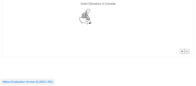
The outline’s there, but it looks small because the map isn’t zoomed in enough. We’ll fix this with a callback. Wijmo Bubble Maps support an itemsSourceChanged event that triggers whenever the map’s GeoJSON source changes. In our case, this only happens once when the map loads, so we’ll zoom in while handling the event. To do this, add the following line in your constructor:
this.canadaBB = new Rect(-80, 30, 80, 80);
This uses the Rect class we imported earlier to define a bounding rectangle focusing on Canada's outline. The rectangle's upper-left corner will be at (-80, 30), and we set both sides to a length of 80 units.
Next, we add a handler method for the itemsSourceChanged event:
itemsSourceChanged(layer)
{
    layer.map.zoomTo(this.canadaBB);
}
This handler is passed in the layer with our listener and called when the GeoJSON data loads. It uses the layer to fetch the map then zooms in on Canada’s outline using the bounding box we defined earlier. Don’t forget to bind this handler in your constructor so it’ll work properly when passed to the GeoMapLayer:
this.itemsSourceChanged = this.itemsSourceChanged.bind(this);
Lastly, we add an attribute to our GeoMapLayer to set our layer’s handler:
itemsSourceChanged={this.itemsSourceChanged}
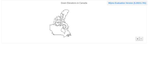
Build your app and reload. Canada should now look bigger because the handler zoomed in when the GeoJSON data loaded.
Now that we have an outline of Canada, we can add the Government of Canada’s GeoJSON data set as a second GeoMapLayer to display grain elevator locations in Canada. Go to the Government of Canada website, click the "GeoJSON" button, and copy that page’s URL. We need to pass that URL to our GeoMapLayer.
We’ll also style the locations in orange to make them stand out. Put together, our full Flexmap looks as follows:
   <FlexMap header="Grain Elevators in Canada">
            <GeoMapLayer
url="[https://raw.githubusercontent.com/johan/world.geo.json/master/countries/CAN.geo.json]
     (https://raw.githubusercontent.com/johan/world.geo.json/master/countries/CAN.geo.json)"
style={{ fill: "transparent", stroke: "black" }}
/>
<GeoMapLayer
url="[https://www.agr.gc.ca/atlas/data_donnees/agr/cgcElevators/geoJSON/cgcElevators2018.geojson]
     (https://www.agr.gc.ca/atlas/data_donnees/agr/cgcElevators/geoJSON/cgcElevators2018.geojson)"
style={{ fill: "transparent", stroke: "orange" }}
/>
      </FlexMap>
Rebuild and reload. You should now see orange outlines around the locations of Canadian grain elevators in 2018.
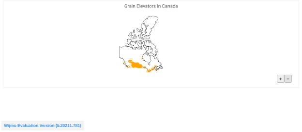
Just like that, we've created a map that displays a recognizable background and data from an API. Zooming in, you can also see that most of Canada's grain elevators are located in the prairie provinces if you zoom in.

Of course, you can easily make the design more complex by adding more layers and additional data. You need only provide a URL that points to a GeoJSON resource, such as a local file or an API, and that information displays on your map.
Adding Live Data
We can easily include data from a live API by adding some more components and a few methods. We use an API that provides data about the COVID-19 situation in Canada.
We’ll transform this live data into a heatmap visualization showing the number of reported cases in each province the previous day. We fetch data from the following URI: https://api.opencovid.ca/timeseries?stat=cases&loc=prov&after={prev-DD-MM-YYYY}&before={cur-DD-MM-YYYY}
We chose to fetch the total number of cases per province. The placeholders indicate that we fetch data for the previous day by passing the previous day’s date for the parameter after and the current day’s date for the parameter before.
Let’s start by adding a date formatter object in our constructor:
this.dtFormatter = new Intl.DateTimeFormat("en-CA",
    {
        year: "numeric",
        month: "2-digit",
        day: "2-digit"
    }
);
This creates an object to get parts of a date. The parameters ensure we’ll get four-digit year and two-digit month and day values, which we need to create the dates we’ll pass into the API. Let’s add a method to our class that converts yesterday’s and today’s dates to strings in the correct format:
getDates()
{
    return {
        "today": this.dtFormatter.formatToParts(new Date()).reverse().map
                 (part => part.value).join(""),
        "yesterday": this.dtFormatter.formatToParts((new Date()).setDate
         ((new Date()).getDate() - 1)).reverse().map(part => part.value).join("")
    };
}
This method returns an object containing two keys, one for today and one for yesterday. The code does the following: get either yesterday’s or today’s date, pass that to the formatter to return the year, month, and day as integers, reverse the list to the order DD-MM-YYYY, extract the number from each date-time object in the list, and join them together.
Luckily, the date formatter inserts dashes for us, which is what the OpenCOVID API expects. You should see strings such as the following if you log the output of getDates to the console:

Now that we have our dates, we can add another method that sends a request to the OpenCOVID API and parses the response into data our map can use:
async getData(dates)
{
     const url = "https://api.opencovid.ca/timeseries?stat=cases&loc=prov&after=" +
                  dates.yesterday + "&before=" + dates.today;
     const resp = await fetch(url);

     if (!resp.ok)
     {
         throw new Error(resp.statusText);
     }

     const json = await resp.json();

     return json;

}
getData takes the date object that getDates returned and uses it to construct the URL. We then wait for the response from the server, convert that response to JSON upon receiving it, and return the converted response. We also throw an error if the response is invalid.
The last step in fetching the data is to call getData in the lifecycle method componentDidMount:
async componentDidMount()
{
    const dates = this.getDates();

    try
    {
        let apiDat = await this.getData(dates);
        this.setState({
            covidData:apiDat
        });
    }
    catch (e)
    {
        console.log("componentDidMount: error occurred\nError: %o", e);
    }
}
Our app calls this method only when our component first loads since we’re fetching the previous day’s COVID data. If you log the data, you’ll see it has the following structure:
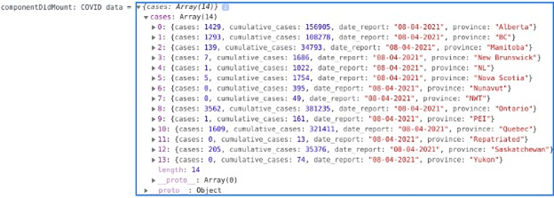
To make it simple, we’ll display only the cumulative case count.
To display the data, first create an invisible "data map" in the constructor that maps the case counts to provinces:
this.state = {
    dataMap: new Map(),
    loadedData: false
};
We add a Boolean variable to ensure our heatmap only renders after the data loads.
Next, let’s go back to componentDidMount and add some code to associate each province’s cumulative case count with that province:
apiDat.cases.forEach(report => {
    this.dataMap.set(report.province, report.cumulative_cases);
});
this.setState({
    covidData: apiDat,
    loadedData: true
});
Once we map the data to provinces, we tell React to re-render our page with the new COVID data and a Boolean allowing our heatmap layer to display. Next, we add a method that fetches data from our hidden map when our heatmap layer requests it.
Where necessary, this method also converts province names from the longer names used in the hidden data map to the abbreviations used in the COVID-19 dataset. We also add a method that inverts a percentage of cases, so provinces with higher case counts are colored darker:
binding(o)
{
let nameConv = {
name : COVID data name
"Newfoundland and Labrador": "NL",
"British Columbia": "BC",
"Northwest Territories": "NWT",
"Prince Edward Island": "PEI",
"Yukon Territory": "Yukon"
};
var dataMapName = o.properties.name;
if (o.properties.name in nameConv)
{
dataMapName = nameConv[o.properties.name];
}
return this.state.dataMap.get(dataMapName);
}
scale(v)
{
return 1 - v;
}
Let’s also bind these new methods in our constructor to ensure they’ll function properly as callbacks:
this.binding = this.binding.bind(this);
this.scale = this.scale.bind(this);
Now we add a ColorScale element using our binding method. Let’s first import it along with the other Wijmo React chart elements. We’ll also import some color palettes to show our heatmap, and a color scale to inform the user of what each color represents.
import { FlexMap, GeoMapLayer, <u>ColorScale</u> } from '@grapecity/wijmo.react.chart.map';
import { Palettes } from "@grapecity/wijmo.chart";
import { FlexChartLegend } from "@grapecity/wijmo.react.chart";
We also change GeoMapLayer from a single element to an element with an opening and closing tag to contain the ColorScale, and we’ll add a FlexChartLegend after the layer to display a scale to the left of our map:
<GeoMapLayer
url="https://raw.githubusercontent.com/codeforamerica/click_that_hood/
     master/public/data/canada.geojson"
    style={{ fill: "transparent", stroke: "black" }}
    itemsSourceChanged={this.itemsSourceChanged}
    >

    {this.state.loadedData &&
        <ColorScale
            colors={Palettes.Diverging.RdYlBu}
            binding={this.binding}
            scale={this.scale}
        />
}
</GeoMapLayer>
<FlexChartLegend position="left"></FlexChartLegend>
We use the Boolean to ensure the color scale only displays after we load the COVID data. The map will show redder colors in more heavily affected areas.
Now you have a map displaying live data from an API.

Next Steps
Creating maps is a breeze with Wijmo Bubble Maps and the standard GeoJSON format. You can quickly include your static JSON files or point the map to a URL.
When your static base map is ready, Wijmo’s components and JavaScript hooks make it a cinch to display data in a custom format or display live data. They work with React, Vue, Angular, or plain JavaScript, and you can install packages from npm or download the full developer package, source TypeScript, play with samples, and more.
Now that you know how easy it is to layer Wijmo Bubble Maps with publicly available data, you can add helpful maps to your app or website: monarch butterfly habitat improvements, wireless download speeds in Vermont, community pools in Virginia, school district incomes, water levels, or, yes, city pubs.
To get started on your next map creation, or add one of a hundred other user interface components to your app, explore Wijmo.
History
- 17th September, 2021: Initial version
