This is Part 3 of a 3-part series that shows how to create an end-to-end streaming solution starting by streaming data into Azure Event Hubs, processing it with Streaming Analytics, and saving the results to a Cosmos DB database. This article demonstrates how to transform the data to produce statistics and visualize the data using Power BI.
The previous articles on streaming data to Azure using Event Hub and Stream Analytics set up a simple Python application to send weather data to Azure using Event Hub. They then connected the Event Hub as input to a Stream Analytics job and outputted the data to an Azure SQL database.
This article will demonstrate transforming the data to produce statistics and visualize the data using Power BI.
Grouping Streaming Data
Getting some statistics from the Stream Analytics job first requires grouping the data. The Event Hub potentially keeps streaming data without stopping, but analytics needs a specific set for minimum and maximum values, counts, sums, and averages.
Azure Stream Analytics has some specific windowing functions for this. A windowing function enables group-based operations on data within a particular time range.
Exploring Windowing Functions
The easiest of the windowing functions is the tumbling window. That window groups the data every x unit of time — for example, every five seconds, every three minutes, or every 24 hours. This article uses the tumbling window.
The hopping window does almost the same, except windows can overlap. For example, it can aggregate every ten seconds while overlapping five seconds with the previous window.
The sliding window is less straightforward. It triggers when data becomes available, goes back over the specified period, and aggregates all data from that time. This window can overlap with previous data.
Unlike the other windows, the session window does not have a fixed length. Its function groups all data that arrives after a specific duration of the previous window. For example, it can group all data streamed within ten seconds after the previous group. So, this windowing function groups data for ten seconds until there is no data.
The last is the snapshot window, which simply groups all data that has the same timestamp.
Grouping in Stream Analytics
A demonstration will help to clarify this windowing action. This example counts when a specific weather event occurs in a ten-second period (remember, the Python application sends a couple of messages every three seconds). Typically, these values would be more meaningful, retrieving all data for a day, a week, etc. However, ten seconds is sufficient for this example. This duration should provide about three hours of data.
First, create a new output for the job. This tutorial requires a new SQL table to receive the result.
CREATE TABLE [dbo].[WeatherCount](
   [id] [int] IDENTITY(1,1) NOT NULL,
   [min_date] datetime2 NULL,
   [max_date] datetime2 NULL,
   [description] nvarchar(256) NULL,
   [count] int NULL
) ON [PRIMARY]
Create the new output in the same Stream Analytics job from the previous article. The job must stop to change it. Name the new output something like sql-weather-count-output.
The existence of this output enables changing the query. The query can contain more than one SELECT statement. So, simply add the new query to the Azure menu's query option to group the description and count the occurrences every ten seconds:
SELECT MIN(CAST([date] AS DATETIME)) AS min_date
   ,MAX(CAST([date] AS DATETIME)) AS max_date
   ,[description]
   ,COUNT(*) AS count
INTO [sql-weather-count-output]
FROM [evhub-weather-input]
GROUP BY [description], TUMBLINGWINDOW(SECOND, 10)
The tumbling window is in the group by clause. This code now also casts the date, but MIN and MAX won’t work on varchars. When all is correct, start the analytics job and run the Python application, then both SQL tables should be receiving data.
Adding Data to Power BI
Next, add this data to Power BI. Get an account and the Power BI Desktop app to get started with Power BI.
After opening the Power BI Desktop application, start by selecting or adding a data source. Under data sources, find the Azure SQL database. Filtering Azure-specific data sources should place it at the top.
Enter the existing server’s name for the server option, such as example-weather-server.database.windows.net.
Then, select Import or DirectQuery as the data connectivity mode. The import option imports the selected table(s) and data, so the user must refresh the report to see data changes. DirectQuery connects directly to the data source, so select that one to immediately see imported data.
After selecting the data source, pick tables to use in the report. Select the WeatherCount table and click Load. After that, an empty page appears where the user can add various types of visuals, including bar, line, and pie charts. Select the pie chart to display on the canvas.
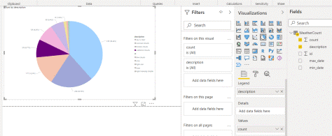
Next, click the description and count fields from the WeatherCount table. The report should now look something like this screenshot:

Now, go to File and Publish to export this basic report to Power BI. Publish it to My workspace and find it at app.powerbi.com.
Unfortunately, Power BI notifies that the data source is missing credentials and cannot be accessed. Fix this issue by going to Datasets in the menu on the left and selecting the data source. Power BI asks for credentials, then stores them.
After that, pro account users can share the report with people in their organization.
Adding a Filter
Some Power BI users may wonder why they are aggregating data in Stream Analytics when Power BI can aggregate and filter data. First, aggregating a large amount of data on the fly may be expensive and time-consuming. Second, there may be more than one consumer for this data. Aggregating every time can be tiresome and error-prone.
To add a filter to the data, open the report in the desktop app. Find Filters, which should be between the pie chart and the data source.
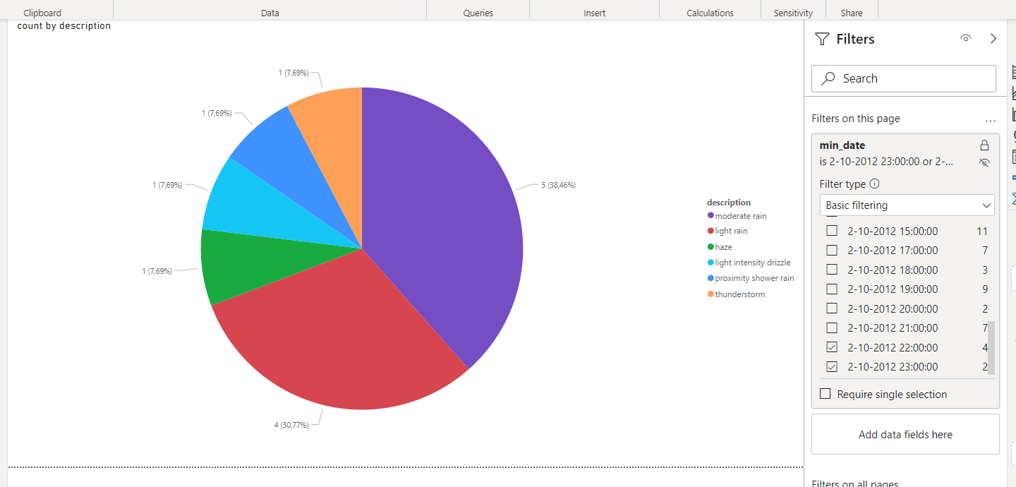
Now, drag the min_date field to Filters on this page. Then, select Basic filtering, Advanced filtering, Relative date, and Relative time. In a real-world scenario, the user may select something like “Relative date” and “[is in the last] [1] [days]” to always have the previous day’s weather report. Then, they would lock the filter from changes by other users. They could name the report something like Yesterday's weather data.
Unfortunately, that filter won’t show us anything, as we’ve only read the data for a couple of hours. Instead, select Basic filtering and pick the last few values to filter.

The screenshot above shows the view after filtering. It displays information for only the last two hours. There’s less data and fewer weather types than before because the weather stations did not measure all weather types during those hours.
Wrapping Up
This three-part article series has demonstrated streaming data to Azure using Event Hub. Then, it processed that data using Azure Stream Analytics and stored the data in an Azure SQL database. Finally, it visualized the data using Power BI.
These examples only scratch the surface of what’s possible using Azure Stream Analytics. For example, we can stream data directly to Power BI to create real-time Power BI dashboards (with some limitations). Other outputs include Cosmos DB, Azure Data Lake, Azure Blob Storage, and Azure Functions. As it happens, most of these can be Power BI data sources, which can produce helpful business insights.
This article should help the reader start streaming IoT, connected vehicle, and other connected device data using Azure’s services, and then process that data to produce helpful analytics at scale.
To learn more about how to connect to your data sources, visualize and discover what's important, and share that with your team, check out our Reactor YouTube Introduction into Data Analysis using Power BI.
