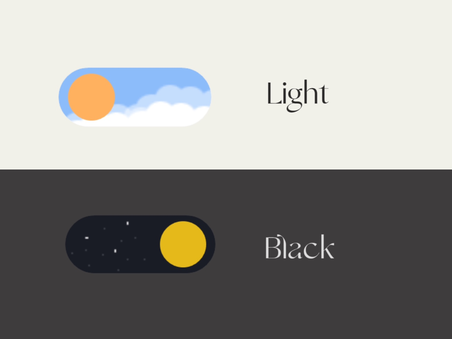
The ThemeSwitch control is a customizable WPF ToggleButton-based control with three types of animations and is available as a NuGet Package, accompanied by a GitHub repository for the source code and instructions, designed to add engaging visual elements to WPF applications.

Introduction
Toggle Switch Button
The ThemeSwitch control is a CustomControl built on top of the WPF ToggleButton. This control is accessible for download as a NuGet Package, with the option to run a demo project from a GitHub repository that includes the original source code and instructions.
The ThemeSwitch is distributed as a multi-targeting framework free library through NuGet Package, ensuring compatibility across all WPF versions.
It features three animation types:
ValueItem (DoubleAnimation)ThickItem (ThicknessAnimation)ColorItem (ColorAnimation)
Yutube:Use WPF to create a day and night Toggle Switch Button |GitHub Source Code | NuGet - YouTube
Background
Initially inspired by a YouTube video showcasing a day-to-night switch button designed in Figma, I took it upon myself to replicate the concept in WPF, my area of expertise. The final outcome was remarkable, and I am excited to share it with others. This journey also offered me the opportunity to impart my coding skills and tips to those who have an affinity for or are currently learning WPF development.
1. Project Composition Analysis

Our analysis through software tools reveals that this button is a custom variant derived from the WPF ToggleButton. It comprises elements representing day (sun/clouds) and night (moon/starry sky). Additionally, we have incorporated custom animations to enhance the day-to-night transition effect.
2. Drawing Special Shapes in WPF
There are numerous methods for drawing special shapes, such as using pre-edited SVG images or drawing with the Path tool in Blend. However, in this project, we demonstrate how to directly draw our desired shapes within the WPF project without any external design software.
- Daytime (Sun/Clouds) and Nighttime (Moon/Starry Sky)
- For the daytime mode, the sun can be simply represented using the ellipse. The clouds, although seemingly complex, are quite straightforward to create. To see the drawing effects in real-time, we operate in the
Mainwindow.
We draw an appropriately sized circle and replicate it about eight times. These circles can be positioned using the mouse or arrow keys to achieve a cloud-like appearance. Visual Studio generates corresponding margin values based on the positions of these shapes, which we then incorporate into App.xaml. We create a cloud effect by adding varying degrees of transparency.

<Grid Width="60" Height="30">
    <Ellipse Width="17" Height="17" Fill="#FFFFFF" Margin="26,1,16,12"/>
    <Ellipse Width="17" Height="17" Fill="#FFFFFF" Margin="38,1,5,12"/>
    <Ellipse Width="17" Height="17" Fill="#FFFFFF" Margin="10,12,33,1"/>
    <Ellipse Width="17" Height="17" Fill="#FFFFFF" Margin="23,12,20,1"/>
    <Ellipse Width="17" Height="17" Fill="#FFFFFF" Margin="32,13,11,0"/>
    <Ellipse Width="17" Height="17" Fill="#FFFFFF" Margin="43,8,0,5"/>
    <Ellipse Width="17" Height="17" Fill="#FFFFFF" Margin="16,3,27,10"/>
    <Ellipse Width="17" Height="17" Fill="#FFFFFF" Margin="5,2,38,11"/>
    <Ellipse Width="17" Height="17" Fill="#FFFFFF" Margin="0,8,43,5"/>
</Grid>
- Night Theme
- The starry sky in the night theme is created using the same method. We define the basic elements of the starry sky as rectangles, with the brightness effect achieved by adjusting the opacity. We set the basic opacity to
55, and for brighter stars, we simply remove the opacity.
<Rectangle Width="1" Height="1" Fill="#55FFFFFF" Margin="60,35,19,14"/>
<Rectangle Width="1" Height="1" Fill="#FFFFFF" Margin="36,6,43,43"/>
3. Adding Animations to the Project
To vividly present the button's toggling effect, we add animations to each element. These animations are facilitated by the jamesnet.WPF Nuget Package, which simplifies animation integration in WPF.
-
Element Movement Animation - ThickItem
The movement of elements is achieved using the ThickItem animation from jamesnet.WPF (akin to ThicknessAnimation in WPF). We select "Margin" for the "Property", add more natural animation effects using Cubieaseinout, set the duration to 0.5 seconds, and use margin values to determine movement endpoints.
<james:ThickItem TargetName="cloud1" Property="Margin" Mode="CubicEaseInOut" Duration="0:0:0.5" To="-70 20 0 0"/>
-
Color Transition Animation - ColorItem
The transition of colors from the sun to the moon or from day to night elements is achieved using the ColorItem animation from jamesnet.WPF (similar to ColorAnimation in WPF). The general property settings are akin to ThickItem, but with a slight variation in Property syntax:
Ellipse - (Fill).Color;
Border - (Background).Color
The 'To' part is altered to the desired color.
<james:ColorItem TargetName="ellipse" Property="(Fill).Color"
  Mode="CubicEaseInOut" Duration="0:0:0.5" To="#E5B91A"/>
<james:ColorItem TargetName="border" Property="(Background).Color"
  Mode="CubicEaseInOut" Duration="0:0:0.5" To="#191C25"/>
-
Appearance/Disappearance Animation - ValueItem
For the galaxy element in the night mode, which doesn't need to appear initially, we use the ValueItem animation from jamesnet.WPF (equivalent to DoubleAnimation in WPF). We set the Property to Opacity and To to 0, indicating an initially invisible state.
-
<james:ValueItem TargetName="galaxy" Property="Opacity"
 Mode="CubicEaseInOut" Duration="0:0:0.5" To="0"/>
4. Clip Property
Following the code outlined above, we achieve the effect of alternating element movement. However, we noticed that the clouds extend beyond the toggle button's range and remain visible. To address this, we set a confined area for the project, restricting all elements to display only within our defined region.
This is achieved using the Clip property.
We define a clipping shape using Geometry, specifically RectangleGeometry, with the project's size set to 120x50. We also add a corner radius value of 25, ensuring that all elements are displayed only within the designated Clip area.
<Setter Property="Clip">
 <Setter.Value>
    <RectangleGeometry Rect="0,0,120,50">
      <RectangleGeometry.RadiusX>25</RectangleGeometry.RadiusX>
      <RectangleGeometry.RadiusY>25</RectangleGeometry.RadiusY>
   </RectangleGeometry>
 </Setter.Value>
</Setter>
Points of Interest
The development process brought forth unique challenges, such as the feasibility of fulfilling UI design requirements in WPF programming without a designer's input, solely utilizing Visual Studio with straightforward operations. Furthermore, I explored enhancing visual experiences by implementing more naturally flowing animations.
History
- 8th November, 2023: Initial version
