Introduction
The <code><code>GridView is a convenient control for displaying tabular data with ASP.NET web forms. When used in web applications which target the desktop browser it works very well, however, the user experience is not always optimal when using these same applications on smaller screen devices such as tablets and phones. Tables of data are usually quite wide and they don't scale down very well for small screens. The page layout can get messed up and the user often has to zoom in and out and scroll around the screen to use the application.
Responsive web design provides techniques for building web pages which can be viewed on any screen size, this article describes one of the techniques for displaying tabular data and shows how it can be applied to a GridView.
Background
Mobile devices are being used more frequently to access web applications and users expect to have a good experience while using them, unfortunately, existing projects don't always have the time or resources to develop a dedicated mobile client app or a dedicated mobile web application. The best we can do in this scenario is to spend some time refactoring and to apply some responsive web design techniques, with careful planning, these changes can greatly improve the user experience with minimal effort.
Responsive Design Patterns
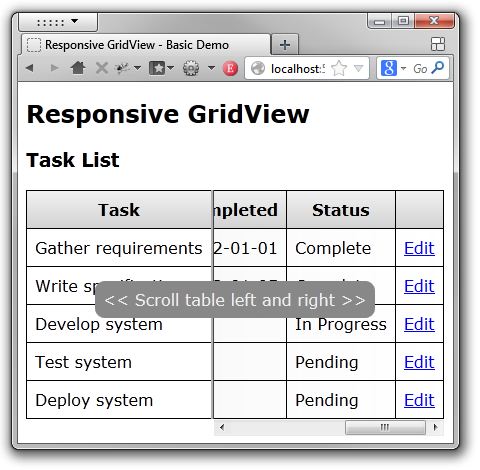
Several patterns have emerged to help solve the problem of wide data tables on small screens, one of these patterns keeps the first few columns in place and allows the others to flow underneath. Priority columns and action buttons on the left and right are visible when the table loads and the user can scroll horizontally to view the other columns as required. This pattern works well on the desktop and on touch enabled mobile devices.
The Responsive Table jQuery Plugin can be used to apply this pattern to a GridView, the appearence of the GridView is not altered dramatically when the repsonsive behaviour is triggered therefore any user who already uses the web application on the desktop will feel familiar with it on a small screen device.

Setting up the Page
When applying responsive design techniques, we want to control how the page will be displayed on a small screen device. Adding a viewport meta tag to the page header will prevent the page from being scaled to a mobile browsers default viewport size. This will also prevent the user from pinch zooming so ensure that you set a reasonable font size so that zooming is not required.
<meta name="viewport"
    content="initial-scale=1.0, maximum-scale=1.0, user-scalable=no, width=device-width">
Setting up the GridView
We also want to control how the GridView behaves when it exceeds the width of its container therefore we need to prevent it from changing in the normal flow of the page. If the table data contains white spaces then these cells will wrap when the table width is reduced, to prevent this from happening there are two options:
1. Set the RowStyle-Wrap property on the GridView to false:
<asp:GridView runat="server" RowStyle-Wrap="false">
2. Or add some CSS:
table th, table td { white-space: nowrap; }Setting up the Responsive Table jQuery Plugin
Add jQuery to your page and then add the jquery.responsivetable.min.js plugin script:
<script src="scripts/jquery.responsivetable.min.js"></script>
Call the responsive table plugin from within a jQuery document ready function, there are also some options which can be set:
$(document).ready(function() {
$('.myTable1').responsiveTable();
$('.myTable2').responsiveTable({
staticColumns: 2,
scrollRight: true,
scrollHintEnabled: true,
scrollHintDuration: 2000
});
}); You do not have to set any predefined breakpoints, the code automatically detects when the GridView is about to overflow its container.
Responsive Table jQuery Plugin Options
- staticColumns: The number of columns to remain static when the plugin is triggered, default is 1
- scrollRight: Scroll the overflow table to the right, default is true
- scrollHintEnabled: Display a hint to the user that the table content can be scrolled left and right, default is true
- scrollHintDuration: The duration in milliseconds which the hint is displayed, default is 2000
Using the Responsive Table plugin with an ASP.NET UpdatePanel
If the GridView is inside an UpdatePanel then the plugin must be called at the end of an async call as the GridView's HTML will have been replaced in the DOM. You can achieve this by registering a callback with the ASP.NET AJAX PageRequestManager:
$(window).on('load', function () {
Sys.WebForms.PageRequestManager.getInstance().add_endRequest(endUpdatePanelRequest);
});
function endUpdatePanelRequest() {
} References:
Conclusion
If you need a GridView to display nicely on a small screen device then this technique may be useful.
History
- v1.0 - 17th Feb 2013
- v1.1 - 19th Feb 2013 - Updated description and source
- v1.2 - 28th Apr 2014 - Updated plugin to latest version
