Introduction
This short paper introduces its readers to the steps taken to
create a user control that displays a circular indeterminate
progress control.
Table of Contents
The symbol [^] returns to the Table
of Contents.
Background
In preparing a tool to help me organize Visual Studio solutions
(.sln), projects (.csproj, .vbproj, etc.), and source files on my
computer and innumerable USB drives, I found I needed a simple
circular indeterminate progress indicator. I had written a
progress indicator with an annulus and a rotating indicator,
but the tool that I was building required something simpler.
We have all seen that ring of colored circles, rotating around a
central point, indicating that an unseen, and usually long
running, process is executing in the background. It is simple and
met my needs. This article is a discussion of my implementation of
the control.
Control Components [^]

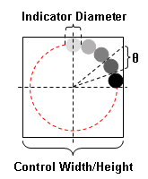
The ring of colored circles (hereafter called "indicator circles")
can be viewed as a group of circles that travel along an imaginary
circle that is centered within the control's boundaries.
In the diagram, the control's boundary is drawn in black and the
imaginary circle upon which the indicator circles travel is drawn
in dashed red.
Three values are needed before the control may be drawn:
- The width of the control. Note that the control's width and
height are equal.
- The diameter of the indicator circles.
- The angle subtended by an indicator circle from the center
of the control.
What may not be readily apparent is that the control, with the
exception of its appearance properties (e.g., color, number of
indicator circles, rotation rate, etc.), is completely defined
by the
Control Width/Height and
the Indicator Diameter.
Later sections will discuss how these two properties are used.
The Two Radii [^]

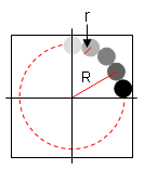
The value R is the distance
from the center of the control to the center of an indicator
circle. The value r is the
radius of an indicator circle. These values are the same for all
indicator circles.
The observant reader might notice that, given
R and
r, we can use simple
trigonometry to solve for the remaining value.
Linear Components [^]

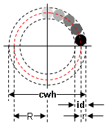
Two linear components are used to define the control.
r =
id / 2.0
R =
cwh / 2.0 -
r
r is the radius of the
indicator circles (simply the
Indicator Diameter (shown
as id in the diagram)
divided by two). Once we have
r, we can compute
R as the difference after
subtracting r from the
Control Width/Height (shown
as cwh in the diagram)
divided by two.
This holds because the outer edges of the indicator circles may
not extent beyond the
Control Width/Height.
Note too that it is easier to compute
r before computing
R.
Angular Components [^]

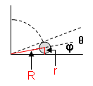
One angular component positions the initial indicator circle
within the control; a second angular component is used to position
the remaining indicator circles.
theta (shown as θ in
the diagram) is the angle subtended by an indicator circle from
the center of the control.
phi (shown as φ in the
diagram) is one-half theta
and is the angle from the center of an indicator circle to the
bottom of the indicator circle. It is easier to compute
phi before computing
theta.
phi =
arctan (
r /
R )
theta =
2.0 * phi
phi positions the
first indicator circle;
theta positions
the remaining indicator circles.
Implementation [^]
Properties [^]
A number of properties make the control more useful for programming
in the wild. The control's properties are enumerated in the
following table.
| Property | Description | Property Type | Default | Min/Max |
| Animate | Start/stops indicator animation | Boolean | true | |
| BackgroundColor | Control background color | SystemColors | Control | |
| CirclesCount | Number of indicator circles | Integer | 5 | 5/10 |
| ControlWidthHeight | Width and height of control | Pixels | 30 | 20/400 |
| IndicatorColor | Color of first rotating indicator | Color | Black | |
| IndicatorDiameter | Diameter of the indicator circles | Pixels | 8 | 4/100 |
| IndicatorType | Specifies if control is animated or pulsed | Enumeration | ANIMATED | |
| RefreshRate | Interval between indicator movements | Milliseconds | 100 | 50/300 |
Methods [^]
There is only one method,
Pulse
that may be invoked in the control. This method is used to cause the
indicator circles to move one position clockwise. It is activated
when the IndicatorType property is set to PULSED. Once that property
is so set, the rotation of the indicator circles stops until either
the Pulse method is invoked or the IndicatorType property is set to
ANIMATED.
Revise Control Geometry [^]
Modifying certain of the control's properties require that the
control be redrawn.
When the control's CirclesCount, ControlWidthHeight, or
IndicatorDiameter properties change, the control must be redrawn.
Prior to redrawing the control, the four values that influence the
control's appearance must be recalculated. This recalculation is
performed in the
update_indicator_geometry
method.
void update_indicator_geometry ( )
{
r = ( float ) IndicatorDiameter / 2.0F;
R = ( ( float ) ControlWidthHeight / 2.0F ) - r;
phi = -( float ) Math.Atan2 ( ( double ) r,
( double ) R );
theta = 2.0F * phi;
indicator_angular_advance = -theta;
}
After invoking
update_indicator_geometry,
the control can be redrawn.
Redraw Control [^]
As with all Windows Forms, we override the OnPaint event in order to
take control of the redrawing process.
protected override void OnPaint ( PaintEventArgs e )
{
base.OnPaint ( e );
if ( control_graphic == null )
{
create_control_graphic ( );
}
control_graphic.RenderGraphicsBuffer ( e.Graphics );
create_indicator_graphic ( );
indicator_graphic.RenderGraphicsBuffer ( e.Graphics );
indicator_angle += indicator_angular_advance;
if ( indicator_angle > ( float ) ( 2.0 * Math.PI ) )
{
indicator_angle -= ( float ) ( 2.0 * Math.PI );
}
}
As seen from this source code, the control is made up of two graphic
objects: a control graphic and an indicator graphic. The control
graphic is simply the control background; the indicator graphic is
the indicator circles.
void create_control_graphic ( )
{
Rectangle bounding_rectangle;
if ( control_graphic != null )
{
control_graphic =
control_graphic.DeleteGraphicsBuffer ( );
}
control_graphic = new GraphicsBuffer ( );
if ( control_graphic.CreateGraphicsBuffer (
this.CreateGraphics ( ),
ControlWidthHeight,
ControlWidthHeight ) )
{
control_graphic.g.SmoothingMode =
SmoothingMode.HighQuality;
bounding_rectangle = this.ClientRectangle;
bounding_rectangle.Inflate ( 1, 1 );
control_graphic.g.FillRectangle (
new SolidBrush ( BackgroundColor ),
bounding_rectangle );
bounding_rectangle.Inflate ( -1, -1 );
}
}
The indicator graphic is somewhat more complex. It draws the number
of indicator circles specified by CirclesCount. It colors the first
indicator circle with the color specified by IndicatorColor and
thereafter it "lightens" each following indicator circle.
void create_indicator_graphic ( )
{
if ( control_graphic == null )
{
create_control_graphic ( );
}
if ( indicator_graphic != null )
{
indicator_graphic =
indicator_graphic.DeleteGraphicsBuffer ( );
}
indicator_graphic = new GraphicsBuffer ( );
update_indicator_geometry ( );
if ( indicator_graphic.CreateGraphicsBuffer (
this.CreateGraphics ( ),
ControlWidthHeight,
ControlWidthHeight ) )
{
Color color = IndicatorColor;
Graphics graphics = indicator_graphic.g;
Rectangle indicator_bounding_rectangle;
Size size = new Size ( ( int ) ( 2.0F * r ),
( int ) ( 2.0F * r ) );
indicator_graphic.g.SmoothingMode =
SmoothingMode.HighQuality;
indicator_bounding_rectangle = this.ClientRectangle;
indicator_graphic.g.FillRectangle (
new SolidBrush ( Color.Transparent ),
indicator_bounding_rectangle );
for ( int i = 0; ( i < CirclesCount ); i++ )
{
float angle;
Rectangle bounding_rectangle;
Brush brush = new SolidBrush ( color );
Point top_left = new Point ( );
int x;
int y;
angle = ( phi + ( float ) i * theta ) +
indicator_angle;
polar_to_cartesian ( R,
angle,
out x,
out y );
top_left.X = ( int ) ( ( float ) x - r ) +
this.Width / 2;
top_left.Y = ( int ) ( ( float ) y - r ) +
this.Height / 2;
bounding_rectangle = new Rectangle ( top_left,
size );
graphics.FillEllipse ( brush,
bounding_rectangle );
brush.Dispose ( );
color = lighter_color ( color, 0.25F );
}
}
}
The two helper functions
polar_to_cartesian and
lighter_color are:
public void polar_to_cartesian ( float radius,
float theta,
out int x,
out int y )
{
double r = ( double ) radius;
double t = ( double ) theta;
x = ( int ) ( r * Math.Cos ( t ) );
y = ( int ) ( r * Math.Sin ( t ) );
}
Color lighter_color ( Color color,
float factor )
{
Color new_color = Color.Black;
try
{
float red = ( 255 - color.R ) * factor + color.R;
float green = ( 255 - color.G ) * factor + color.G;
float blue = ( 255 - color.B ) * factor + color.B;
new_color = Color.FromArgb ( color.A,
( int ) red,
( int ) green,
( int ) blue );
}
catch ( Exception ex )
{
new_color = Color.Black;
}
return ( new_color );
}
Animate or Pulse [^]
The tool that I am building performs a search for all .sln
files that are beneath a topmost directory. The tool has no way of
knowing how long the search will take. So I plan to set the
control's IndicatorType property to PULSED and, upon finding an .sln
file, invoke the control's Pulse method.
Conclusion [^]
This brief article has shown how a simple control can be
implemented.
References [^]
History [^]
| 04/10/2013
| | Original Article
|
