Introduction
SharePoint is rapidly emerging as an enterprise wide collaboration platform. Since the inception of SharePoint 2003, Microsoft made a lot of improvements in WSS and related tools and technologies. Earlier we have seen significant improvements in SharePoint 2007 compared to 2003 version. Microsoft heavily invested in SharePoint 2010 and now 2010 beta is available for download.
SharePoint 2010 beta is shipped up with a lot of cool UI enhancements Like AJAX, ribbon interface, Silverlight webpart, etc. I am explaining few of them hereunder.
Ribbon Toolbar
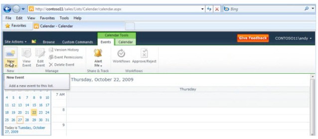
Now ribbon toolbar is available like Microsoft office products. Ribbon interface makes it very easy to work in SharePoint sites, document library, lists, calendar and other items.

More Options in Site Action Menu
Site Action menu is placed on top left and contains more items than MOSS 2007 like Workflows, New Document library, Create Site, Edit in SharePoint Designer, Sync with SharePoint Workspace, etc. Apart from that, site actions are better organized in site settings page as compared to the earlier version of SharePoint.


Hierarchical Breadcrumb
Hierarchical breadcrumb shows links in tree view fashion that make navigation much easier. Apart from hierarchical display of site navigation, one level up button is also available to navigate one level up in the hierarchy.
AJAX Enabled
Finally SharePoint embraced beauty of AJAX. Now most of activities in SharePoint are AJAX enabled. Inserting, editing or deleting items in List or Document library (and other items) actions are available in place and require no full page refresh.
File Drag and Drop
This is a very nice feature in SharePoint 2010, where the user can upload multiple documents by just dragging from their PC and dropping into the document library. The entire process is AJAX enabled and displays currently uploading document(s) progress. Now the entire exercise is much easier than SharePoint 2007.

Separate Tabs for Library and Items
This is part of ribbon enhancement. The idea behind it is to better organize library wide options and item wise options. Whenever user navigates to a list, library, tasks or calendar, the ribbon toolbar hovers with library tools tab. Library tools tab contain two tabs; namely Library and Documents. Library tab displays document library related settings icons while documents tab display item(s) related actions like new item, edit, delete document. Similarly Calendar displays Calendar tools (Calendar and events).

Developer Dashboard
Developer Dashboard is a developer productivity tool to diagnose and monitor Page. This can be enabled for any Page and after this a new icon appears on the top left side of the page. Developer dashboard displays various database calls, webpart execution time, authenticates users, critical errors and various SPRequest object calls.

Popup Dialog to Retain the Working Window
In SharePoint 2007, whenever we do any activity like create a new task or list item we redirect to new window and user comes back to the main list after completing the task. To overcome so many page traversals, SharePoint 2010 pops up a dialog instead of redirecting to new page. So working page is retained and there is a better user experience.
References
History
- 10th February, 2010: Initial post
