Introduction
Panel in WPF is actually a logic preset that determines the way children of the panel will be arranged visually.
So we, as developers, knowing this logic, can choose the appropriate panel that will display its content in the way we expect.
Panels can also relay their display logic upon additional parameters, such as the order of the elements, or, special Attached-Properties they provide.
Switching between Panels
On some occasions, UI is 'called' to change its display (view) from one to another, while displayed elements should remain the same.
This procedure should re-arrange the UI-Elements in a different way while making the user convinced that he is seeing the same elements, only arranged in a different way.
The Power of Animation
In the early days of WPF, it was common to see many animated controls that were 'jumping'/'spinning'/changing colors and so on.
In my opinion, this is a mis-use of Animation as a concept. I consider animation as a 'UI to User' information channel, on which UI passes additional, important information to the user!, rather than just making the UI visually impressive or fun.
If we'll take the issue at hand - switching same set of elements from one layout to another, animation becomes critical for the user's understanding of the UI.
If we'll make this switch instant - the old layout will disappear and the new one will show, the user might misunderstand the action for a new set of controls being presented to him, while if we'll animate the transition, it would be perfectly clear for the user that he is seeing the same elements, only placed in different locations.
Another benefit of 'Animated-Transition' is to do with 'Human-Natural-Conception': we as humans live in the real world (most of us, at least) on which transitions occur mostly in a gradual way. For instance - when I pick my pen and move it to a different location, I can see its movement to its new location, the pen doesn't disappear from its current place and pop-up in a new place. This would make us a bit uncomfortable, and it will take us a while to figure out what just happened.
While in the 'UI world', this 'popping-up' scenario is very common. So making these transitions behave more close to most of the transitions in the physical world will keep our user more comfortable and in sync with what is actually happening in the UI.
Background
What we want #1
As a concept - Take a set of elements and display them in different layout logics
WPF implementation - ItemsControl Items can be arrange in different layouts based on the ItemsControl's ItemsPanel property
What we want #2
As a concept - Transition between layout should be animated
WPF implementation - In order to animate elements transition from one location (prev' layout) to another (new layout), we should intercept the change in the ItemsPanel property, take a 'snap-shot' of each item at its prev' state, apply the new layout*, take another 'snap-shot' of the element, then - animate 'snapshot to snapshot' in an efficient way**.
* We will apply the new layout in an invisible way, so we will be able to take the 'after' snapshot, apply the 'before-to after' animation, and only then! Display the new layout.
** Efficient animation will be achieved by animating a specially-created, lightweight ItemsControl's Adorner for each of the ItemsControl's elements, This Adorner will have an image of the 'Before-State' and a Background of the 'After-State', then, we'll Animate the Adorner's RenderTransform properties.
Using the Code
As described above, we will do the following:
Instead of directly changing the ItemsPanel property of the ItemsControl, we'll add a new AttachedProperty named 'ChangeMonitoredItemsPanelTemplate' - this will allow us to intercept and respond to the layout change.
<ItemsControl app:ItemsControlAttached.ChangeMonitoredItemsPanelTemplate=
    "{Binding ElementName=cmbxItemsPanel,Path=SelectedValue}" Grid.Row="1" >
...
In the AttachedProperty change callback will do the following:
- Move over all Items of the
ItemsControl: Register for its Loaded event (that will be fired when new Panel will be applied and will give us the 'After' snapshot), create a matching Adorner, hold the Adorner (AnimAdorner) in the Item's Tag property. - Apply the new Panel to the
ItemsControl's ItemsPanel property.
private static void ChangeMonitoredItemsPanelTemplateChanged(object sender, DependencyPropertyChangedEventArgs e)
{
    ItemsControl ic = sender as ItemsControl;
    if (e.OldValue != null)
    {
        int itemscount = ic.Items.Count;
        for (int i = 0; i < itemscount; i++)
        {
            var fe = ic.ItemContainerGenerator.ContainerFromIndex(i) as FrameworkElement;
            fe.Loaded += fe_Loaded;

            var animador = new AnimAdorner(ic, fe, (Duration)ic.GetValue
            (ItemsControlAttached.ChangePanelAnimationDurationProperty),
            (EasingFunctionBase)ic.GetValue(ItemsControlAttached.ChangePanelAnimationEasingFunctionProperty));
            AdornerLayer.GetAdornerLayer(ic).Add(animador);
            fe.Tag = animador;
        }
    }
    (sender as ItemsControl).ItemsPanel = (ItemsPanelTemplate)e.NewValue;
}
In the AnimAdorner constructor:
- We will create an
Image of the Item's 'Before' state - We will create necessary Animation objects for Transition the element from its 'Before' Position/Size/Look to its 'After' Position/Size/Look
    public AnimAdorner(UIElement adornedElement, UIElement ChildElement,
Duration MoveDuration, EasingFunctionBase Easing) :
        base(adornedElement)
    {

        var ic = adornedElement as FrameworkElement;
        var fe = ChildElement as FrameworkElement;

        var point = fe.TransformToVisual(ic).Transform(new Point(0, 0));
        sizeSrc = new Size(fe.ActualWidth, fe.ActualHeight);

        var bitmap = RenderToBitmap(ChildElement);

        var tg = new TransformGroup();
        var st = new ScaleTransform(1, 1);
        tg.Children.Add(st);
        var tt = new TranslateTransform(point.X, point.Y);
        tg.Children.Add(tt);
        var imgSrc = new Image();

        imgSrc.Visibility = System.Windows.Visibility.Visible;
        imgSrc.Source = bitmap;
        imgSrc.Stretch = Stretch.None;

        gridChild = new Grid();
        gridChild.Visibility = System.Windows.Visibility.Visible;
        gridChild.Children.Add(imgSrc);
        gridChild.RenderTransform = tg;
        this.AddVisualChild(gridChild);

        Storyboard sb = new Storyboard();

        DoubleAnimation daX = new DoubleAnimation();
        daX.Duration = MoveDuration;
        daX.EasingFunction = Easing;
        Storyboard.SetTarget(daX, gridChild);
        Storyboard.SetTargetProperty(daX, new PropertyPath
        ("(UIElement.RenderTransform).(TransformGroup.Children)[1].(TranslateTransform.X)"));
        sb.Children.Add(daX);

        DoubleAnimation daY = new DoubleAnimation();
        daY.Duration = MoveDuration;
        daY.EasingFunction = Easing;
        Storyboard.SetTarget(daY, gridChild);
        Storyboard.SetTargetProperty(daY, new PropertyPath
        ("(UIElement.RenderTransform).(TransformGroup.Children)[1].(TranslateTransform.Y)"));
        sb.Children.Add(daY);

        DoubleAnimation daSX = new DoubleAnimation();
        daSX.Duration = MoveDuration;
        daSX.EasingFunction = Easing;
        Storyboard.SetTarget(daSX, gridChild);
        Storyboard.SetTargetProperty(daSX, new PropertyPath
        ("(UIElement.RenderTransform).(TransformGroup.Children)[0].(ScaleTransform.ScaleX)"));
        sb.Children.Add(daSX);

        DoubleAnimation daSY = new DoubleAnimation();
        daSY.Duration = MoveDuration;
        daSY.EasingFunction = Easing;
        Storyboard.SetTarget(daSY, gridChild);
        Storyboard.SetTargetProperty(daSY, new PropertyPath
        ("(UIElement.RenderTransform).(TransformGroup.Children)[0].(ScaleTransform.ScaleY)"));
        sb.Children.Add(daSY);

        DoubleAnimation daO = new DoubleAnimation();
        daO.To = 0;
        Storyboard.SetTarget(daO, imgSrc);
        Storyboard.SetTargetProperty(daO, new PropertyPath("Opacity"));
        sb.Children.Add(daO);

        sb2PointSize = sb;
    }
Back in the AttachedProperty class ItemsControl's Item Loaded Event (occurs after new Panel applied):
- Set the new ('After') snapshot as the background of the
Adorner. - Hide the Item.
- Adjust the
Adorner's Animations to Animate Position (TranslateTransform), Size(ScaleTransform), Look (Opacity of Overlaid Image to 0, thus revealing the Background with New Look) - Start the transition Animation
- Unregister
Loaded Event
--- Upon Transition animation complete - show the actual Item and remove the matching Adorner used for the transition-animation.
static void fe_Loaded(object sender, RoutedEventArgs e)
{
    var fe = sender as FrameworkElement;
    var matchingadorner = fe.Tag as AnimAdorner;
    var bitmap =AnimAdorner.RenderToBitmap(fe);
    matchingadorner.SetDstImage(bitmap);

    fe.Visibility = Visibility.Hidden;
    var point = fe.TransformToVisual(fe.Parent as Visual).Transform(new Point(0, 0));
    var size = new Size(fe.ActualWidth, fe.ActualHeight);

    var sb = matchingadorner.sb2PointSize as Storyboard;

    DoubleAnimation daX = sb.Children[0] as DoubleAnimation;
    daX.To = point.X;
    DoubleAnimation daY = sb.Children[1] as DoubleAnimation;
    daY.To = point.Y;

    DoubleAnimation daSX = sb.Children[2] as DoubleAnimation;
    daSX.To = size.Width / matchingadorner.sizeSrc.Width;
    DoubleAnimation daSY = sb.Children[3] as DoubleAnimation;
    daSY.To = size.Height / matchingadorner.sizeSrc.Height;

    DoubleAnimation daOS = sb.Children[4] as DoubleAnimation;
    var SizeRatio = (matchingadorner.sizeSrc.Width *
    matchingadorner.sizeSrc.Height) / (size.Width * size.Height);
    var DurationRatio = Math.Min(Math.Max(SizeRatio, 0.1), 0.9);
    daOS.Duration = new Duration(TimeSpan.FromSeconds
    (daSY.Duration.TimeSpan.TotalSeconds * DurationRatio));

    sb.Completed += (s1, e1) =>
    {
        fe.Visibility = Visibility.Visible;
        var ic = fe.Parent as ItemsControl;
        AdornerLayer.GetAdornerLayer(ic).Remove(matchingadorner);
    };
    sb.Begin();

    fe.Loaded -= fe_Loaded;
}
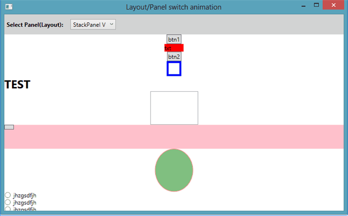
In The MainWindows:
- Items are children of the
ItemsControl, each item is displayed on each Layout according to: applied panel internal-logic, order in the Items list & per-Panel Attached Properties
        <ItemsControl app:ItemsControlAttached.ChangeMonitoredItemsPanelTemplate=
    "{Binding ElementName=cmbxItemsPanel,Path=SelectedValue}" Grid.Row="1" >
...
            <ItemsControl.Items>
                <Button Content="btn1" Width="30.1" Grid.Row="0"
                Grid.Column="0" DockPanel.Dock="Bottom"
                Canvas.Left="80" Canvas.Top="90"/>
                <TextBlock x:Name="txt" Text="txt"
                Width="40" Background="Red" Grid.Row="1"
                Grid.Column="1" DockPanel.Dock="Right"/>
                <Button Content="btn2" Width="30"
                Grid.Row="2" Grid.Column="2" DockPanel.Dock="Left"/>
                <Border  Width="30.5" BorderThickness="4"
                BorderBrush="Blue" Grid.Row="2" Grid.Column="2"
                Height="31.4" DockPanel.Dock="Right"
                Canvas.Left="100" Canvas.Top="40"/>
                <TextBlock Text="TEST" FontSize="24"
                FontWeight="Bold" Grid.Row="1" Grid.Column="2"
                DockPanel.Dock="Bottom" HorizontalAlignment="Left"
                VerticalAlignment="Top" Background="Transparent"
                Canvas.Left="300" Canvas.Top="120"/>

                <TextBox Width="100" Height="70"
                Canvas.Left="400" Canvas.Top="150" DockPanel.Dock="Bottom"/>

                <Grid MinWidth="50" Height="50"
                Background="Pink" Canvas.Left="100" Canvas.Top="50">
                    <Button Width="20" Height="10"
                    HorizontalAlignment="Left" VerticalAlignment="Top" />
                </Grid>

                <Ellipse Width="80" Height="90"
                Stroke="Red" Fill="Green" Opacity="0.5"
                Grid.Row="0" Grid.Column="2" DockPanel.Dock="Left"/>

                <StackPanel Grid.Row="0" Grid.Column="0"
                DockPanel.Dock="Right" HorizontalAlignment="Left"
                VerticalAlignment="Top">
                    <RadioButton Content="jhzgsdfjh"/>
                    <RadioButton Content="jhzgsdfjh"/>
                    <RadioButton Content="jhzgsdfjh"/>
                    <RadioButton Content="jhzgsdfjh"/>
                </StackPanel>
            </ItemsControl.Items>
        </ItemsControl>
Additional Features
- I've added two
AttachedProperties: ChangePanelAnimationDuration & ChangePanelAnimationEasingFunction, for better control of the transition-animation behavior. - For this sample sake: Panels (templates) are
ComboBox's Items, and Names are extracted using reflection in a special ValueConverter.
Points of Interest
Limitation & Compromises
In some cases (Elements), this Transition-Mechanism produces undesired 'interpretation' for the transition of the element from one Layout to another.
This can be solved, in some cases, by explicitly setting Width/Height or Alignment properties.
It must be acknowledged that on Layout-to Layout transition, not only the ItemsControl's Items change their Position/Size/Look, but also the content of each of the items Re-Arrange itself!
I've used a, what is for me, considered to be a reasonable compromise, and fade-in new look over the old one.
In theory, the same mechanism applied on top level items can be applied on each item's internal content (that might consist of items as well) recursively, yet, with performance penalty!
This member has not yet provided a Biography. Assume it's interesting and varied, and probably something to do with programming.


 General
  News
News  Suggestion
  Question
  Bug
Bug  Answer
  Joke
Joke  Praise
  Rant
Rant  Admin
Admin 


 Submit an article or tip


