Introduction
This tutorial will show how to add a Common control to a very basic dialog, using a dialog based application. It will cover the following points:
This tutorial assumes that you are comfortable with creating a dialog based application using the VC++ 6 Class Wizard. If you require information on this topic, consult the article: A Beginners Guide to Dialog Base Applications - Part 1.
Placing a Control on a Dialog
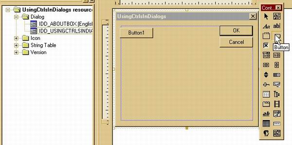
When your dialog-based application is generated, go to the Resources in the Workspace window. Select the dialog IDD_USINGCTRLSINDIALOGS_DIALOG in the Dialog section. For this example, use the Button control, select it from the Control palette. The cross shaped cursor indicates where the centre of the Button will be placed.
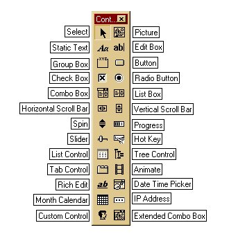
There are a number of common controls you use shown below with their tool tips. These controls are discussed in more detail in other tutorials on this site.
Sizing the Control on the Dialog
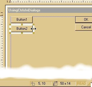
As the cursor moves over the 'widened border', it will change to a double headed arrow indicating the directions in which you can resize the control. You will see the position and the dimensions of the control on the status bar at the bottom right. I must point out that these are in dialog units and not pixels. Care must be taken therefore if an image is to be placed on the control.
Dialog Unit (DLU)
A unit of horizontal or vertical distance within a dialog box. A horizontal DLU is the average width of the current dialog box font divided by 4. A vertical DLU is the average height of the current dialog-box font divided by 8.
As can be seen from the above definition, DLUs depend on the font and assume that font's aspect ratio is 2:1 (height:width). This is why some dialogs will look good on the system on which they were designed but not so good on others. It is extremely important with multilingual applications, because not only can the length of the text vary in another language but also the style of the font.
Aligning Controls
The layout of a dialog is important if it is to be user friendly, so don't take this demo as a good example. The controls should be in a logical sequence and neatly layout. To assist with the latter, the resource editor can place a grid on the dialog for you and the controls will snap to the grid when it is turned on. The size of the grid can be adjusted by going to Layout >> Grid Setting. Also, there is a toolbar of alignment tools that are easy to use.
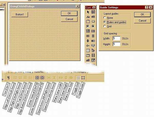
These tools allow selected controls to be left or right aligned, cantered same sized, etc.
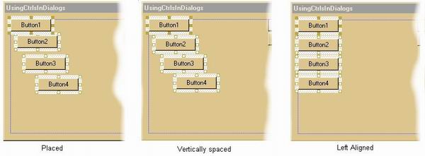
Above, the buttons have been placed with approximate vertical spacing, then press Space Down (Alt+UpArrow) which will keep the top and bottom buttons in place and evenly space the other in-between. Press Align Left (Ctrl+LeftArrow) and the button will be left aligned with Button 1 because it is highlighted. Had Button 2 been highlighted, Button 1 would have been moved to the right in line with Button 2.
Changing Control Styles and Properties
To change the style and properties of a control, select it, then select the Properties menu under View, or right click on the control and select Properties.
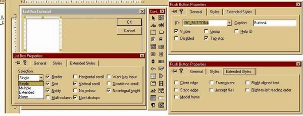
The Properties dialog has three tabs: General, Styles and Extended Styles. For most controls, the General and Extended Styles tabs are the same and provide for entering the control's ID and text, default enable/visible states, and if it is to be part of the tab order. Extended Style include border types and reading order for Hebrew and Arabic applications.
The Styles tab has the styles that are specific to the control type as shown for the list box above. The effect of these styles are discussed in other articles on this site in more detail.
Setting the Tab Order
The tab order is the order in which you move focus through a series of controls using the TAB key. By default, the tab order is the order in which the controls are placed on the dialog. Once the placement is complete, it is worth checking that the tab order follows a logical flow in which the controls are best accessed.
To do this, press CTRL+D, Layout menu Tab Order. The dialog will then be displayed (as below) with the numbers indicating the present tab order. Click each control in the order in which the controls are to be tabbed. If a control is already in the right sequence, still click it so that it maintains its position in the order. When the order is complete, press ENTER or click where there is no control.
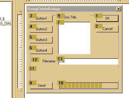
If only a few controls are to be re-ordered, hold down the CTRL key and click on the control prior to the one that is to be changed, then release the CTRL key and proceed as before. If the control is double clicked, it will become the first in the tab order.
Linking Variables to a Control
To link a variable to a control such as pointer that will give access to control's class methods:
- Select View >> Class Wizard
- Select the Member Variables tab
- Select the control's ID
- Click on Add Variable button. To pop up the Add Member Variable dialog,
- Enter the variable name, select the category (there can be one variable for each category if needed), and variable type
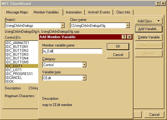
Class Wizard will have made the following entry in the dialog's header file:
enum { IDD = IDD_USINGCTRLSINDIALOGS_DIALOG };
CEdit m_Edit;
CString m_strEdit;
the next in the dialog's constructor:
m_strEdit = _T("");
and the following entries in the DoDataExchange() method.
CDialog::DoDataExchange(pDX);
DDX_Control(pDX, IDC_EDIT1, m_Edit);
DDX_Text(pDX, IDC_EDIT1, m_strEdit);
The number of variables allowed does vary depending on the control.
Linking Notification Handlers
To link a notification handler to a control:
- Select View >> Class Wizard.
- Select the Message Maps tab.
- Select the class name of the dialog,
CUsingCtrlsInDialogsDlg, to display the relevant object IDs for the class. - Select the object ID, in this case
IDC_BUTTON1. This will display the allowable Messages. - Select the Message to be handled and click on the Add Function button.
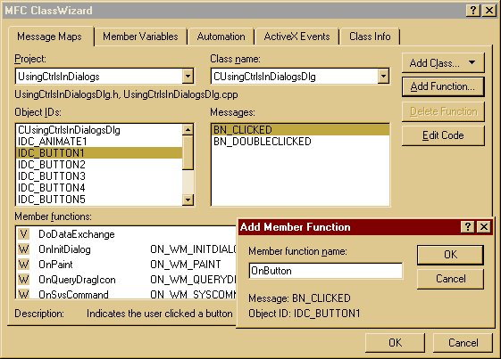
Class Wizard will have made the following entry in the dialog's header file:
.
.
.
afx_msg void OnButton();
and in the CPP file's Message Map:
ON_BN_CLICKED(IDC_BUTTON1, OnButton)
and added the following function to the bottom of the file:
void CUsingCtrlsInDialogsDlg::OnButton()
{
}
You will notice that Class Wizard will name the function OnButton1(). This was changed because the intention was to use the same handler for all four buttons. So the Message Map entry is moved outside the Class Wizard reserved section in both the header and code file.
The prototype is also modified to take the button ID as an input.
afx_msg void OnButton(UINT nID);
DECLARE_MESSAGE_MAP()
The Message Map entry is modified to handle a range of button controls. For this to work, it is vital the IDs are in consecutive order.
ON_CONTROL_RANGE(BN_CLICKED, IDC_BUTTON1, IDC_BUTTON4, OnButton)
END_MESSAGE_MAP()
Add contents of function to display the button number in the Static control.
void CUsingCtrlsInDialogsDlg::OnButton(UINT nID)
{
    m_strReport.Format("%d", nID-IDC_BUTTON1+1);
    UpdateData(FALSE);
}
Conclusion
I have shown on the basics here in a rather badly laid out dialog. It should give a starting point, however. More complete and advanced information can be found in other articles on this site.
Happy programming!
History
- 24th March, 2001: Initial version
License
This article has no explicit license attached to it, but may contain usage terms in the article text or the download files themselves. If in doubt, please contact the author via the discussion board below.
A list of licenses authors might use can be found here.
