Introduction
First lets talk about the knockoutgrid that we see in knockout examples. It is a simple grid which accepts columns, data to showcase your data in tabled manner. It is perfect for requirements where there are no interactions of grid with outside DOM. But there will be few requirements like for example, the grid shows list of students , the requirement is i need to view marks of individual student on click on some column of each student something as shown below:
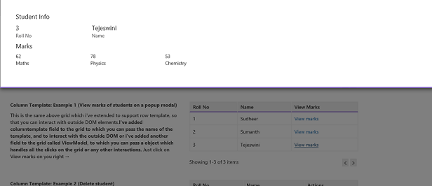
So by using custom template you can bind grid column template click event to interact with outside DOM elements.
Background
To understand grid functionality , i recommend you to practice the knockoutgrid from knockout examples.
Knockout grid provides you with following configuration options.
this.gridViewModel = new ko.simpleGrid.viewModel({
            data: this.items,
            columns: [
                { headerText: "Item Name", rowText: "name" },
                { headerText: "Sales Count", rowText: "sales" },
                { headerText: "Price", rowText: function (item) { return "$" + item.price.toFixed(2) } }
            ],
            pageSize: 4
});
1) data - The collection of entity.
2) columns - The header text for you table and rowText is the property name in you collection.
3) pageSize - Specifies how many rows should each page contain.
Using the code
Coming to my code. I've modified knockout grid and added few more fields to accept column template , select all template and view model property to add all your bussiness logic of grid in it so that you can interact with outside DOM bindings to meet your bussiness requirements.
I've used the advantage of knockout template binding to fulfill the grid requirements. You can learn more about template binding here.
Here are the fields I've added to fulfill the grid requirements.
1) columnTemplate - Its accepts an string ie, id of the script where you will have your markup for a row.
2) ViewModel - Where you store all your bussiness logic to interact with grid columns like click event as i've shown above to open a pop up modal to view specific student marks like such.
3) hasMultiSelect - Which is a boolean field if specified. you must add an <td> with checkbox in your column template markup so that you can bind to your own ViewModel property to it. You must also specify select all template which is explain below.
4) headerMultiselectTemplate - Which is a string field accepts script id of template for header multiselect <th> to bind it to your own ViewModel property so that you can customize or perform preprocess or post process works on select or deselect of rows.
5) addEnabled - Which is a boolean field which is used when you have a scenario like you want a add template at the starting to add new entry in the grid. You need to specify add template to use this feature.
6) addTemplate - Which is a string field accepts script id of template to specify customized template for add row, you can have any html like drop downs, text inputs and bind properties to your own View Model properties.
The grid will fallback to knockout simple grid style of simple text binding if you won't any of the above fields and it will display simple grid with my customized paging as shown below:
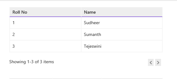
Code to use simple grid:
this.simpleStudentGrid = new ko.simpleGrid.viewModel({
            data: this.studentModel.students,
            pageSize: 10,
            columns: [{ headerText: "Roll No", rowText: "srNo" }, { headerText: "Name", rowText: "name" }],
        });
and bind property to your DOM.
Example 1: (Using column template to view marks of a student)
To use column property you need to have columnTemplate, ViewModel to have bussiness logic to handle click event to view marks that will pop up a bootstrap modal window.
Grid binding:
this.gridWithColumnTemplate = new ko.simpleGrid.viewModel({
            data: this.studentModel.students,
            pageSize: 10,
            columnTemplate: "gridWithColumnTemplate",
            columns: [{ headerText: "Roll No", rowText: "" }, { headerText: "Name", rowText: "" }, { headerText: "View Marks", rowText: "" }],
            ViewModel: studentModel
        });
ViewModel : (One of the property of view model studentModel as specified in above configuration)
self.ViewMarks = function (data, e) {
            e.stopPropagation();
            self.name(data.name);
            self.srNo(data.srNo);
            self.marks(data.marks);
            showTopModal("studentModal");
};
Template :
<script id="gridWithColumnTemplate" type="text/html">
    <td data-bind="text: srNo"></td>
    <td data-bind="text: name"></td>
    <td><a href="#" data-bind="click: $parent.ViewModel.ViewMarks">View marks</a></td>
</script>
output:
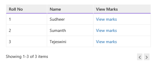
When you click on View marks above a bootstrap pop up modal opens with marks of specific student.

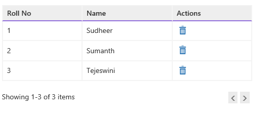
You can have any html input elements in your template , like have a remove glyphicon which will remove specific user on click on it , have remove business logic in your view model.
Example 2: (Using column template to remove users )
Grid binding won't change from above except the columnTemplate changes.
View Model : ( Remove user property )
self.RemoveStudent = function (data, e) {
            e.stopPropagation();
            alert("All grids are bind to same data source, Are you sure you want to delete data.");
            self.students.remove(data);
        };
Template:
<script id="gridRemoveStudent" type="text/html">
    <td data-bind="text: srNo"></td>
    <td data-bind="text: name"></td>
    <td><a href="#" data-bind="click: $parent.ViewModel.RemoveStudent"><i class="glyphicon windows-icon-trash"></i></a></td>
</script>
Output:
Example 3: (Using addTemplate to have your custom style add template like drop downs , input boxes)
Requirements such as add new entry when click a button which is not inside grid , but outside the grid DOM.To enable such addTemplate you need to use two fields addEnabled , addTemplate
Grid binding:
this.gridWithAddTemplate = new ko.simpleGrid.viewModel({
            data: this.studentModel.students,
            columns: [{ headerText: "Roll No", rowText: "" }, { headerText: "Name", rowText: "" }, { headerText: "View Marks", rowText: "" }, { headerText: "Actions", rowText: "" }],
            pageSize: 10,
            columnTemplate: "gridAddStudentStudent",
            addEnabled: studentModel.addEnabled,
            addTemplate: "addStudentTemplate",
            ViewModel: studentModel
        });
View Model:
self.addEnable=ko.observable(false);
self.EnableAdd = function () {
            self.addEnabled(true);
        };
self.cancelEdit = function () {
            self.addEnabled(false);
        };
self.AddStudent = function () {
            self.student.marks = { maths: 90, physics: 82, chemistry: 80 };
            self.student.srNo = self.srCounter();
            self.students.push(self.student);
            self.student = new student();
            self.addEnabled(false);
            self.srCounter(self.srCounter() + 1);
        };
Template: ( 2 Template one for add row and one for complete grid(which will be same as above))
<script id="gridAddStudentStudent" type="text/html">
    <td data-bind="text: srNo"></td>
    <td data-bind="text: name"></td>
    <td style="width:166px;"><a href="#" data-bind="click: $parent.ViewModel.ViewMarks">View marks</a></td>
    <td style="width:150px;"></td>
</script>

<script id="addStudentTemplate" type="text/html">
    <!-- ko with: ViewModel.student -->
    <td><input type="text" class="form-control input-sm" data-bind="value: $parent.ViewModel.srCounter" disabled="disabled"/></td>
    <td><input type="text" class="form-control input-sm" data-bind="value: name"/></td>
    <td>View marks</td>
    <td style="width:150px;text-align: center;">
        <a href="#" data-bind="click: $parent.ViewModel.AddStudent" style="margin-right:10px;" title="Save"><i class="glyphicon windows-icon-save"></i></a> <span style="border-left:2px solid #F4F4F4;"></span> <a href="#" data-bind="click: $parent.ViewModel.cancelEdit" style="margin-left:10px;" title="Cancel"><i class="glyphicon windows-icon-cancel"></i></a>
    </td>
    <!-- /ko -->
</script>
Output:
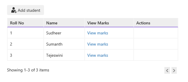
when you click on add student, it will add a new entry on top of grid as below:
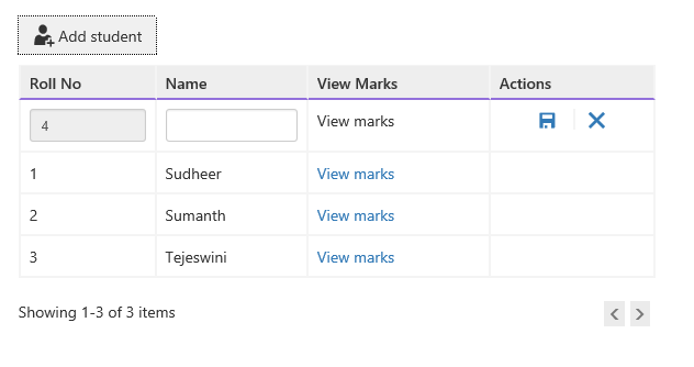
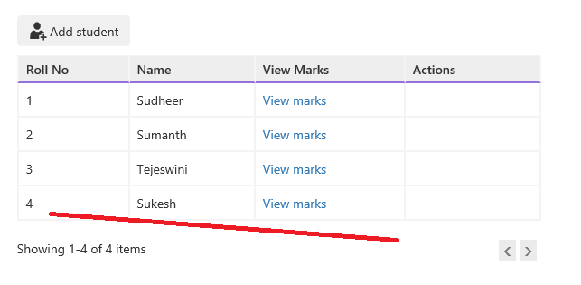
And when you type in text and click save it will add it to the grid as follows:
Example 4: (Using hasMultiSelect feature and bind to your view model properties and process pre and post operations before selecting and after selecting rows)
Grid binding:
To your multi select template you need to have two fields specified in the grid hasMultiSelect , headerMultiselectTemplate and in your grid template add first row as checkbox to bind each column to your checked property.
this.gridWithSelectAll = new ko.simpleGrid.viewModel({
            data: this.studentModel.students,
            columns: [{ headerText: "Roll No", rowText: "" }, { headerText: "Name", rowText: "" }, { headerText: "View Marks", rowText: "" }],
            pageSize: 10,
            columnTemplate: "gridWithSelectAll",
            hasMultiSelect: true,
            headerMultiselectTemplate: "mainGridMultiSelectTemplate",
            ViewModel: studentModel
        });
View Model:
self.selectedStudents = ko.observableArray();
self.selectedAllStudents = ko.pureComputed({
            read: function () {
                return self.selectedStudents().length === self.students().length;
            },
            write: function (value) {
                self.selectedStudents(value ? self.students().slice(0) : []);
            }
        });
Template:
To use multiselect template specify header select all template so that you can bind it to your own property to you further. And in main grid template add a <td><input type="checkbox"/></td> row as first row and bind to your own view model property to process further.
<script id="gridWithSelectAll" type="text/html">
<script id="gridWithSelectAll" type="text/html">
    <th style="text-align: center; width: 50px;"><input type="checkbox" data-bind="attr:{id:srNo+'_'+name},checkedValue: $data, checked: $parent.ViewModel.selectedStudents" /><label data-bind="attr:{for:srNo+'_'+name}"></label></th>
    <td data-bind="text: srNo"></td>
    <td data-bind="text: name"></td>
    <td><a href="#" data-bind="click: $parent.ViewModel.ViewMarks">View marks</a></td>
</script>

<script id="mainGridMultiSelectTemplate" type="text/html">
    <th style="text-align: center; width: 50px;"><input type="checkbox" id="srSelectAll" data-bind="checked: ViewModel.selectedAllStudents" /><label for="srSelectAll"></label></th>
</script>
Output:
When you select rows, as i binded it to show selected student names it will show as follow:
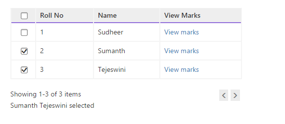
When you click on select all rows, it will show as follow:
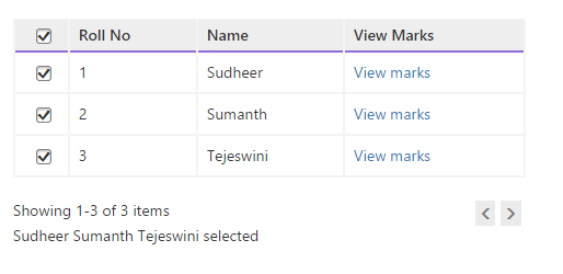
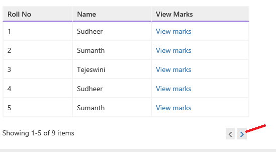
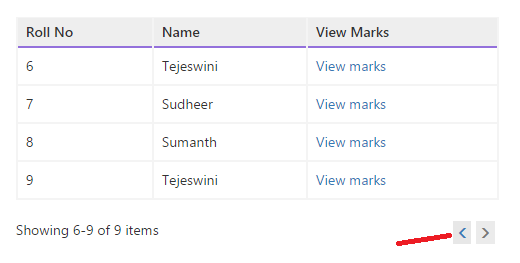
You can see the paging functionality by adding more records and play back and forth with the pager. The site is styled with bootstrap. In code you will find knockoutgrid.css which has grid styling and site.css has site layout styles , custom checkbox styles to have same checkbox feel across browsers.
Paging sample screens:
Thanks for reading in advance :-P
