Introduction
This article describe how to build from scratch a WPF Window that has the look and feel of Windows 8 style. The solution is based on the MVVM (Model-View- ViewModel) architecture.
Background
This article may be useful for intermediate developers and designers who have some basics in C#, WPF, and Entity Framework.
Using the Code
Through this article, we will explain how to develop a WPF application that display a list of clients from SQL SERVER database. We will explain this through three steps:
- Introduction to Windows Presentation Foundation
- Using Entity Framework 6 for database access
- Explaining MVVM architecture
You can download all the source code and adapt it to your UI project, then start directly writing your custom business code without wasting time in design and user interfaces.
I. Windows Presentation Foundation (WPF)
Windows Presentation Foundation is a graphical subsystem for rendering user interfaces in Windows-based applications. WPF, previously known as "Avalon", was initially released as part of .NET Framework 3.0. Rather than relying on the older GDI subsystem, WPF uses DirectX and provide a consistent programming model for building applications and separates the UI from business logic.
Before WPF, Microsoft developers used Windows Forms (Winforms) which is based on the GDI + and some Windows kernel libraries, which means that we do not have full control on Winforms, we can make our own controls but without modifying the base template of any existing control.
In WPF, things becomes easier and developers have full control on UI components for many reasons:
- WPF is extensible and it uses an XML style programming language called XAML.
- We can ‘radically’ change the look and feel of user controls based on their templates without writing any line of code, all is based on resources and themes and written in XML style language.
Let’s write some XAML code with Visual studio 2013 and .NET 4.5.1. Please follow the steps below:
- Open Visual Studio.
- Choose Visual C# and create a WPF Application.
- Call the application ‘Code Project’.
- Visual Studio will generate a default WPF Window called MainWindow.xaml which looks like this:
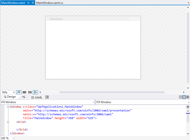
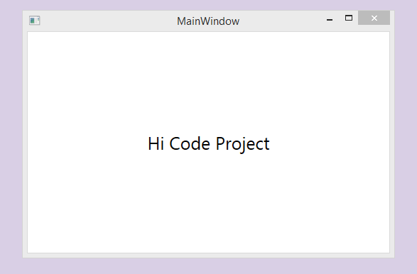
The previous picture presents the default template of a WPF Window generated by Visual Studio, let’s take a closer look to the template behind this Window:
="1.0"="utf-16"
<ControlTemplate TargetType="Window"
xmlns="http://schemas.microsoft.com/winfx/2006/xaml/presentation">
<Border BorderThickness="{TemplateBinding Border.BorderThickness}"
BorderBrush="{TemplateBinding Border.BorderBrush}"
Background="{TemplateBinding Panel.Background}">
<AdornerDecorator>
<ContentPresenter Content="{TemplateBinding ContentControl.Content}"
ContentTemplate="{TemplateBinding ContentControl.ContentTemplate}"
ContentStringFormat="{TemplateBinding ContentControl.ContentStringFormat}" />
</AdornerDecorator>
</Border>
</ControlTemplate>
The default template contains 4 major classes:
ControlTemplate: Defines the template of the WPF WindowBorder: Draws a border, background, or both around another elementAdornerDecorator: Adorners are a special type of FrameworkElement, used to provide visual cues to a user. Among other uses, Adorners can be used to add functional handles to elements or provide state information about a controlContentPresenter: Displays the content of a ContentControl
'Templates' is the main point of this article, we want to add some features to our original WPF Window through the use of XAML Templates, examples:
- Remove Border
- Add resize Grip (in the bottom right of the Window)
- Add new functionalities in the top right border (Example: refrech, About, etc.)
- The Window must be responsive to different devices (Phones, tablets, PC, etc.)
Let's get back to Visual Studio:
- Right click on the solution and Add a new folder called ‘Themes’.
- Add a new resource dictionary in this folder and call it “Generic.xaml’
- Paste this code into Generic.xaml (Please read comments inside).
<Setter Property="shell:WindowChrome.WindowChrome">
<Setter.Value>
<shell:WindowChrome CornerRadius="0" GlassFrameThickness="1" />
</Setter.Value>
</Setter>
<Setter Property="Template">
<Setter.Value>
<ControlTemplate TargetType="{x:Type local:WindowBase}">
<Border BorderBrush="{DynamicResource WindowBorder}" BorderThickness="1">
<Border.Background>
<SolidColorBrush Color="{DynamicResource WindowBackgroundColor}" />
</Border.Background>
<Grid x:Name="LayoutRoot">
<Grid.RowDefinitions>
<RowDefinition Height="30" />
<RowDefinition Height="*" />
<RowDefinition Height="15" />
</Grid.RowDefinitions>
<TextBlock Text="{Binding Header,
RelativeSource={RelativeSource AncestorType=
{x:Type local:WindowBase}}}"
Grid.Row="0"
Foreground="{DynamicResource ButtonTextDisabled}"
HorizontalAlignment="Center"
VerticalAlignment="Top"
Margin="5"/>
<StackPanel Grid.Row="0"
Orientation="Horizontal"
HorizontalAlignment="Right"
VerticalAlignment="Top"
Margin="5"
shell:WindowChrome.IsHitTestVisibleInChrome="True">
<Button FontSize="12"
FontWeight="Bold"
Command="{Binding PreferencesWindowCommand,
RelativeSource={RelativeSource
AncestorType={x:Type local:WindowBase}}}"
Style="{StaticResource SystemButton}">
<Path Width="14" Height="14"
Data="F1 M 38,23.5C 38.8643,23.5 39.7109,
23.5756 40.5337,23.7206L 42.6275,18.5381L 48.1901,
20.787L 46.0964,25.9692C 47.6473,27.0149 48.9851,
28.3527 50.0308,29.9036L 55.213,27.8099L 57.4619,
33.3725L 52.2794,35.4664C 52.4244,36.2891 52.5,
37.1357 52.5,38C 52.5,38.8643 52.4244,39.7109 52.2794,
40.5337L 57.4619,42.6275L 55.213,48.1901L 50.0308,
46.0964C 49.0795,47.5073 47.8865,48.7418 46.5112,
49.7405L 48.7844,54.8462L 43.3041,57.2891L 41.0307,
52.1828C 40.0533,52.3906 39.0394,52.5 38,52.5C 37.1357,
52.5 36.2891,52.4244 35.4664,52.2794L 33.3725,
57.462L 27.8099,55.213L 29.9036,50.0309C 28.3527,
48.9851 27.0149,47.6473 25.9691,46.0964L 20.787,
48.1901L 18.538,42.6275L 23.7206,40.5336C 23.5756,
39.7109 23.5,38.8643 23.5,38C 23.5,37.1357 23.5756,
36.2891 23.7206,35.4664L 18.538,33.3725L 20.787,
27.8099L 25.9691,29.9036C 26.9205,28.4927 28.1135,
27.2582 29.4889,26.2594L 27.2157,21.1537L 32.6959,
18.7109L 34.9694,23.8172C 35.9468,23.6094 36.9606,
23.5 38,23.5 Z M 38,28C 32.4771,28 28,32.4772 28,
38C 28,43.5229 32.4771,48 38,48C 43.5228,48 48,
43.5229 48,38C 48,32.4772 43.5228,28 38,28 Z"
Stretch="Fill"
Fill="{Binding Foreground,
RelativeSource={RelativeSource
Mode=FindAncestor, AncestorType=Button}}"
Stroke="{Binding Foreground,
RelativeSource={RelativeSource
Mode=FindAncestor, AncestorType=Button}}"
StrokeThickness="0.1" />
</Button>
<Button Content="?" Command="{Binding AboutWindowCommand,
RelativeSource={RelativeSource AncestorType={x:Type local:WindowBase}}}"
FontSize="13" FontWeight="Bold" Style="{StaticResource SystemButton}"/>
<Button Command="{Binding MinimizeWindowCommand,
RelativeSource={RelativeSource
AncestorType={x:Type local:WindowBase}}}"
ToolTip="{Binding MinimizeWindowToolTip,
RelativeSource={RelativeSource
AncestorType={x:Type local:WindowBase}}}"
Style="{StaticResource SystemButton}">
<Button.Content>
<Grid Width="13"
Height="12"
RenderTransform="1,0,0,1,0,1">
<Path Data="M0,6 L8,6 Z"
Width="8"
Height="7"
VerticalAlignment="Center"
HorizontalAlignment="Center"
Stroke="{Binding Foreground,
RelativeSource={RelativeSource
Mode=FindAncestor, AncestorType=Button}}"
StrokeThickness="2" />
</Grid>
</Button.Content>
</Button>
<Button x:Name="Restore"
Command="{Binding RestoreWindowCommand,
RelativeSource={RelativeSource
AncestorType={x:Type local:WindowBase}}}"
ToolTip="{Binding RestoreWindowToolTip,
RelativeSource={RelativeSource
AncestorType={x:Type local:WindowBase}}}"
Style="{StaticResource
SystemButton}" Visibility="Collapsed" >
<Button.Content>
<Grid Width="13"
Height="12"
UseLayoutRounding="True"
RenderTransform="1,0,0,1,.5,.5">
<Path Data="M2,0 L8,0 L8,
6 M0,3 L6,3 M0,2 L6,2 L6,8 L0,8 Z"
Width="8"
Height="8"
VerticalAlignment="Center"
HorizontalAlignment="Center"
Stroke="{Binding Foreground,
RelativeSource={RelativeSource
Mode=FindAncestor, AncestorType=Button}}"
StrokeThickness="1" />
</Grid>
</Button.Content>
</Button>
<Button x:Name="Maximize"
Command="{Binding MaximizeWindowCommand,
RelativeSource={RelativeSource
AncestorType={x:Type local:WindowBase}}}"
ToolTip="{Binding MaximizeWindowToolTip,
RelativeSource={RelativeSource
AncestorType={x:Type local:WindowBase}}}"
Style="{StaticResource SystemButton}" >
<Button.Content>
<Grid Width="13"
Height="12">
<Path Data="M0,1 L9,1 L9,8 L0,8 Z"
Width="9"
Height="8"
VerticalAlignment="Center"
HorizontalAlignment="Center"
Stroke="{Binding Foreground,
RelativeSource={RelativeSource
Mode=FindAncestor, AncestorType=Button}}"
StrokeThickness="2" />
</Grid>
</Button.Content>
</Button>
<Button Command="{Binding CloseWindowCommand,
RelativeSource={RelativeSource
AncestorType={x:Type local:WindowBase}}}"
ToolTip="{Binding CloseWindowToolTip,
RelativeSource={RelativeSource
AncestorType={x:Type local:WindowBase}}}"
Style="{StaticResource SystemButton}" >
<Button.Content>
<Grid Width="13"
Height="12"
RenderTransform="1,0,0,1,0,1">
<Path Data="M0,0 L8,7 M8,0 L0,7 Z"
Width="8" Height="7"
VerticalAlignment="Center"
HorizontalAlignment="Center"
Stroke="{Binding Foreground,
RelativeSource={RelativeSource
Mode=FindAncestor, AncestorType=Button}}"
StrokeThickness="1.5" />
</Grid>
</Button.Content>
</Button>
</StackPanel>
<ContentPresenter Grid.Row="1" Margin="40" />
<Border Grid.RowSpan="3"
Background="{DynamicResource Accent}"
RenderTransform="1,0,0,1,0,32"
MinWidth="14" MinHeight="53"
HorizontalAlignment="Left"
VerticalAlignment="Top">
<TextBlock Text="{TemplateBinding Title}"
Foreground="White"
Margin="0,8"
VerticalAlignment="Center">
<TextBlock.LayoutTransform>
<RotateTransform Angle="-90" />
</TextBlock.LayoutTransform>
</TextBlock>
</Border>
<Grid Grid.Row="2">
<Path x:Name="ResizeGrip"
Visibility="Collapsed"
Width="12"
Height="12"
Margin="1"
HorizontalAlignment="Right"
Stroke="{DynamicResource WindowText}"
StrokeThickness="1"
Stretch="None"
Data="F1 M1,10 L3,10 M5,10 L7,10 M9,10 L11,10 M2,
9 L2,11 M6,9 L6,11 M10,9 L10,11 M5,6 L7,6 M9,6 L11,
6 M6,5 L6,7 M10,5 L10,7 M9,2 L11,2 M10,1 L10,3" />
</Grid>
</Grid>
</Border>
</ControlTemplate>
</Setter.Value>
</Setter>
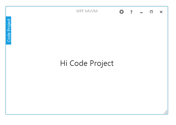
The result is as follows:
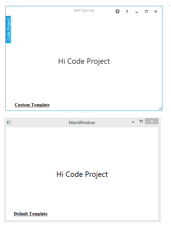
Let's make a comparison:
- The first Window presents the custom template with extra functionalities (About, Preferences, etc.), it is a chrome Window and it is without border, resizable with resize Grip on the bottom right.
- The second one is our default template generated by Visual Studio (without customization) and it contains the base functionalities (Minimize, Maximize, Close).
There are two last remarks about the Button class , in the last code snippet, when adding new buttons, I used:
Command property: It is a dependency property and it presents an input command which will be detailed in depth in the next paragraph (explaining MVVM architecture).SystemButton: It is a style attached to Button and it is taken from an extra library called FirstFloor.ModernUI, you can add it to your solution via Nuget package manager.
<Button Content="?" Command="{Binding AboutWindowCommand,
RelativeSource={RelativeSource AncestorType={x:Type local:WindowBase}}}"
FontSize="13" FontWeight="Bold" Style="{StaticResource SystemButton}"/>
After understanding custom template and XAML, let’s write some C# code to explain MVVM pattern.
II. Explaining MVVM Architecture
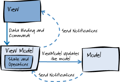
The Model-View-View Model (MVVM) pattern helps you to cleanly separate the business logic of your application from its user interface (UI). Maintaining a clean separation between application logic and UI helps to address numerous development and design issues and can make your application much easier to test, maintain, and evolve.
It can also greatly improve code re-use opportunities and allows developers and UI designers to more easily collaborate when developing their respective parts of the application. MVVM is based on top of these three components:
- Model: It refers either to a domain model, which represents the real state content (an object-oriented approach), or to the data access layer that represents that content (a data-centric approach).
- View model: The view model is an abstraction of the view that exposes
public properties and commands. - View: As in the MVC and MVP patterns, the view is the user interface (UI).
-
Implementing the Model with Entity Framework 6
Entity Framework (EF) is an open source] object-relational mapping (ORM) framework for ADO.NET, part of .NET Framework. You can download the source from http://entityframework.codeplex.com/. The following diagram illustrates the Entity Framework architecture for accessing data:
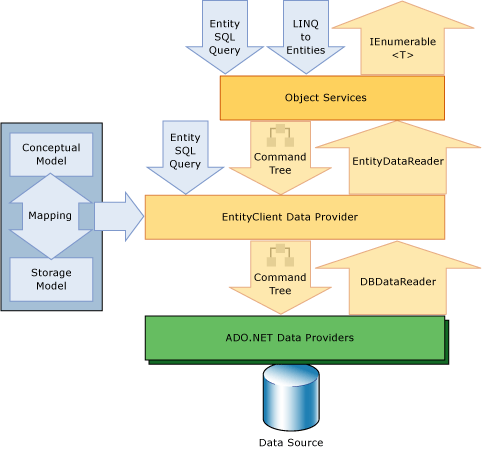
The object services is a component that enables the developer to query the database (insert, select, update, remove) using CLR object that are instances of entity types. The object services support Linq (language integrated query).
Besides, ADO.NET is always used to query the database with the ADO.NET Data provider who receive the queries from the entity Client Data provider and returns a collection of object to the caller. The Entity Framework supports two scenarios (Database First and Code First).
In this current solution, we will use the Database first approach. Please follow these steps:
- Create a folder in the solution called ‘Models’
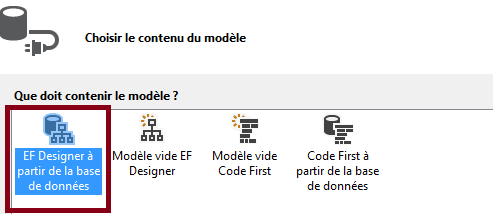
- Right click on solution explorer => Add => new element =>Data => ADO.NET Entity Data Model
- Visual Studio assistant will suggest many options (Database first, code first, etc.), in our case we will choose Database First
- The assistant will connect to Our Database and extract data (tables, stored procedures, etc.)
Click OK and the assistant will generate entities needed to access the database.

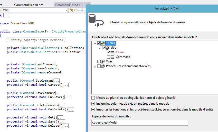
Entity framework make all the necessary mapping (Table to Class), now we can start querying the database using only objects. Our database is called ‘Demo, so EF 6.0 will generate a class called “DemoEntities” which is derived from System.Data.Entity.DbContext.
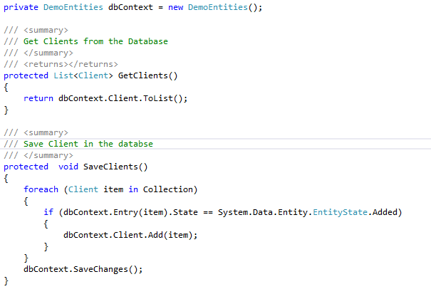
With Entity Framework, everything is presented by an object, it creates a level of abstraction and makes the application independant from the database. If we want to work with Oracle or MySQL database for example, the programming model will stay the same and all that we have to do is to install the Entity Framework provider for the target database.
Our Model is complete, let’s implements the second component “The view Model” which will query the Model.
2. Implementing the View Model
The ViewModel interacts with the Model and acts as an intermediary between it and the View. We will create a base class called 'CommandBase.cs' for all View-Model classes, this base class contains the base properties and Commands, then we will write a second class called "ClientViewModel.cs', the ClientViewModel.cs is responsible for querying Clients data and displaying them into the Client View.
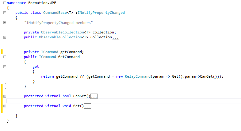
CommandBase.cs is a base class for all View-Model classes:
- It is a generic class that can work with any object in the database (Client, Command, Foo, etc.).
- It implements '
INotifyPropertyChanged' so it will be able to notify the View. - It contains property of type '
ICommand' which presents a command sent from the View to the View-Model (for example: Get Command which will execute the Get method), the Get method will be overridden in the derived class (see ClientViewModel.cs). - Boolean properties like '
CanGet' are very useful when we want to activate/deactivate some controls in a clean manner. - Some properties and methods are marked with the
Virtual Keyword so we can redefine them in each derived class.
After defining the base class for all View-Model classes, let's write an example of a view-Model class (ClientViewModel.cs).
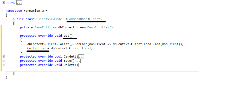
The ClientViewModel class implements the CommandBase class and passes the entity 'Client'. We can also notice how the derived class overrides some properties and methods like (Get, CanGet) so they work against the Client Entity. voila :).
3. Implementing the View
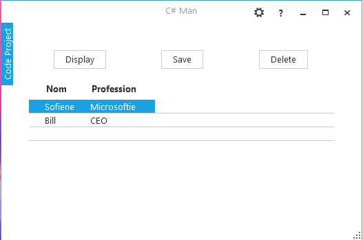
The View contain a button and a data grid, the button must be attached to a command through binding (Command="{Binding GetCommand}"), when user clicks on the Button, the GetCommand will be executed in the View Model, this command will retrieve data from the Client table and copy them back into our Collection of Client.
When our 'Collection' is filled with data, the Data Grid will display these data to the end user because its Item source is related to 'Collection'.
<Window.Resources>
<local:ClientViewModel x:Key="clientViewModel"/>
</Window.Resources>
<Grid DataContext="{StaticResource ResourceKey=clientViewModel}">
<Grid.RowDefinitions>
<RowDefinition Height="Auto" />
<RowDefinition Height="9*" />
</Grid.RowDefinitions>
<Grid Grid.Row="0">
<Grid.ColumnDefinitions>
<ColumnDefinition/>
<ColumnDefinition/>
<ColumnDefinition/>
</Grid.ColumnDefinitions>
<Button x:Name="BtnDisplayClient" Grid.Column="0"
Content="Display"
HorizontalAlignment="Center" Margin="2"
Command="{Binding GetCommand}"/>
</Grid>
<DataGrid x:Name="clientDataGrid" Grid.Row="1"
Margin="0,10,0,0"
ItemsSource="{Binding Collection}"
AutoGenerateColumns="False">
<DataGrid.Columns>
<DataGridTextColumn Header="Nom"
Binding="{Binding Path=Nom}"/>
<DataGridTextColumn Header="Profession"
Binding="{Binding Path=Profession}"/>
</DataGrid.Columns>
</DataGrid>
</Grid>
Final result, every components in this WPF Window is customizable through XAML Template.
Summary
I wanted to write an article about WPF MVVM, XAML Templates and Entity Framework together in one solution. Whether you are the Windows Forms guy or the WPF guy, I hope that you appreciated my effort. Thank you for viewing my blog post, try to download the source code and do not hesitate to leave your questions, comments and thanks if you want to.
