Introduction
The great thing about WPF is that it gives you the freedom to completely customize the appearance of every single control. Unfortunately, out of the box, the default WPF control styles are fairly plain. This means that many WPF applications end up looking no different from how they would had you built them in Windows Forms.
But wouldn’t it be nice if you could just reference a library and instantly get your WPF application updated to have a much more modern (or "metro") look and feel? Well the great news is that this can be done quickly and easily with one of my favourite open source libraries, MahApps.Metro.
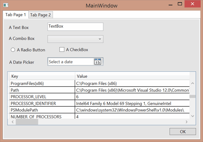
In this tip, I'll show you how easy it is to get started. We'll convert a very simple WPF application which just has a few examples of the standard controls such as tab control, textbox, combo box, radio button, checkbox, date picker, a button and a datagrid.

Step 1 - Reference MahApps.Metro
This is as simple as adding the MahApps.Metro NuGet package to your project. I do this by simply typing Install-Package MahApps.Metro in the package manager console.
Step 2 - Turn your Windows into Metro Windows
Now go to your application's main window xaml file, (usually MainWindow.xaml), change the top-level node from Window to controls:MetroWindow. You'll need to also add in the controls namespace with xmlns:controls=http://metro.mahapps.com/winfx/xaml/controls.
<controls:MetroWindow
    x:Class="MahAppsExample.MainWindow"
    xmlns="http://schemas.microsoft.com/winfx/2006/xaml/presentation"
    xmlns:x="http://schemas.microsoft.com/winfx/2006/xaml"
    xmlns:controls="http://metro.mahapps.com/winfx/xaml/controls"
    Title="MainWindow" Height="350" Width="525">
...
</controls:MetroWindow>
We'll also need to make the corresponding change in the code behind (MainWindow.xaml.cs), to specify we now inherit from MetroWindow rather than Window.
using MahApps.Metro.Controls;

public partial class MainWindow : MetroWindow
Step 3 - Add in the MahApps.Metro Resource Dictionaries
Finally, we need to add in some XAML resources to our app.xaml file. Just cut and paste the following code:
<Application.Resources>
    <ResourceDictionary>
        <ResourceDictionary.MergedDictionaries>
            <ResourceDictionary Source="pack://application:,,,
             /MahApps.Metro;component/Styles/Controls.xaml" />
            <ResourceDictionary Source="pack://application:,,,
             /MahApps.Metro;component/Styles/Fonts.xaml" />
            <ResourceDictionary Source="pack://application:,,,
             /MahApps.Metro;component/Styles/Colors.xaml" />
            <ResourceDictionary Source="pack://application:,,,
             /MahApps.Metro;component/Styles/Accents/crimson.xaml" />
            <ResourceDictionary Source="pack://application:,,,
             /MahApps.Metro;component/Styles/Accents/baselight.xaml" />
        </ResourceDictionary.MergedDictionaries>
    </ResourceDictionary>
</Application.Resources>
The first three XAML files will always be used, while the last two chose the accent colour and whether we are using a dark or light theme. I've chosen a light theme with a crimson accent colour to get started.
Here's what it looks like when we run now:

Hopefully, you’ll agree that this looks much nicer already, but there’s a lot more that MahApps.Metro can do for us.
Step 4 - Give your MetroWindow a Border
When using the light theme, I find it helps to make sure you have a border. You can set a solid border with the BorderBrush property, but there is also a very nice glowing border option, set with the GlowBrush property. We can set this to use the current accent colour (in our case crimson), by using the AccentColorBrush dynamic resource.
So on my MetroWindow control in MainWindow.xaml, I simply add:
GlowBrush="{DynamicResource AccentColorBrush}"
And now when we run, you can see this nice subtle glow border around the window.

Step 5 - Customize the Colour Scheme
We saw that we got the white background and crimson window outline by including crimson.xaml and baselight.xaml in our app.xaml file. But we have access to a whole host of colours. At the time of writing, the choices are blue, brown, cobalt, crimson, cyan, emerald, green, indigo, lime, magenta, mauve, olive, orange, pink, purple, red, sienna, steel, taupe, teal, violet, and yellow. And if that's not enough, you can easily create your own.
You can also choose whether the accent is over a light or dark background. Let's switch our app to use emerald on a dark background by updating our app.xaml.
<ResourceDictionary Source="pack://application:,,,/MahApps.Metro;component/Styles/Accents/emerald.xaml" />
<ResourceDictionary Source="pack://application:,,,/MahApps.Metro;component/Styles/Accents/basedark.xaml" />
Now when we run, we see this:

So it really is very easy to get the colour scheme you want for your application.
What Next?
Well, there are even more ways in which you can customize your MetroWindow, and you can also enhance your application by making use of a whole host of additional cool controls that come with MahApps.Metro such as toggle buttons, or different styles for buttons such as circular icon buttons. You can also replace your message boxes with dialog overlays and your settings dialogs with flyouts, to give your application a very modern look and feel.
If you're interested in watching a step by step tutorial that takes you through the whole process of converting a WPF application to use MahApps.Metro, and shows how to make use of some of these additional features, you may wish to check out my Creating Modern WPF Apps with MahApps.Metro course at Pluralsight.
So if you’ve not tried out MahApps.Metro yet, why not give it a try? It only takes five minutes to do what I’ve shown in this tip, and it can instantly give your application a visual facelift.
History
- 16th May, 2015 - First version
