Introduction
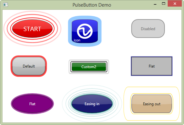
This article demostrates how to make a button that emits pulses in .NET 4.5 WPF (C#).
Also available as NuGet package.

Background
I made a similar control in .NET 2.0 in 2009 using WinForms and for some time, I wanted to make the same in WPF.
After cracking the initial challenge of structuring the control, everything went smoothly and I managed to add some additional features.
The Button Layout
The basic button layout, shown below:


The control is built using a gradient ellipsis as basis with a semitransparent stroke as border.
The reflex is created as a second ellipsis on top of the button where its fill area is indicated with the large bounding box around the semitransparent white area.
The text is just a content presenter on top.
The pulses are animated ellipsis placed under the button.
Here is the markup (XAML) to produce the control:
<Grid x:Name="PART_body" Background="{TemplateBinding Background}">
<Grid x:Name="PART_pulse_container" />
<Ellipse x:Name="PART_button" Stroke="#60000000" StrokeThickness="2"
Fill="{TemplateBinding ButtonBrush}"/>
<Ellipse x:Name="PART_focus_visual" IsHitTestVisible="False"
Stroke="{TemplateBinding ButtonHighlightBrush}"
StrokeThickness="2"
StrokeDashArray="1 2"
Fill="Transparent" Margin="2"
Visibility="{TemplateBinding IsFocused,
Converter={StaticResource BoolToVisibilityConverter}}" />
<Ellipse x:Name="PART_reflex" IsHitTestVisible="False"
Visibility="{TemplateBinding IsReflective,
Converter={StaticResource BoolToVisibilityConverter}}">
<Ellipse.Fill>
<RadialGradientBrush RadiusX="2.6" RadiusY="2.05" Center="0.5,-1.5"
GradientOrigin="0.5,-1.5">
<RadialGradientBrush.GradientStops>
<GradientStop Color="White" Offset="0"/>
<GradientStop Color="#60FFFFFF" Offset="0.4"/>
<GradientStop Color="#30FFFFFF" Offset="0.995"/>
<GradientStop Color="#00FFFFFF" Offset="1"/>
</RadialGradientBrush.GradientStops>
</RadialGradientBrush>
</Ellipse.Fill>
</Ellipse>
<ContentPresenter IsHitTestVisible="False"
HorizontalAlignment="{TemplateBinding HorizontalContentAlignment}"
VerticalAlignment="{TemplateBinding VerticalContentAlignment}" />
</Grid>
The Button States
The button states are shown below (except pulsing and highlight with focus):

The states are mainly set using ControlTemplate triggers. The markup (XAML) for handling the triggers is shown below:
<ControlTemplate.Triggers>
<Trigger Property="IsMouseOver" Value="True" SourceName="PART_button">
<Setter Property="Fill" TargetName="PART_button"
Value="{Binding Path=ButtonHighlightBrush,
RelativeSource={RelativeSource AncestorType={x:Type local:PulseButton}}}" />
<Setter Property="Stroke" TargetName="PART_focus_visual" Value="Black" />
</Trigger>
<Trigger Property="IsPressed" Value="True">
<Setter Property="Fill" TargetName="PART_button"
Value="{Binding Path=ButtonPressedBrush,
RelativeSource={RelativeSource AncestorType={x:Type local:PulseButton}}}" />
</Trigger>
<Trigger Property="IsEnabled" Value="False">
<Setter Property="Fill" TargetName="PART_button"
Value="{Binding Path=ButtonDisabledBrush,
RelativeSource={RelativeSource AncestorType={x:Type local:PulseButton}}}" />
<Setter Property="Foreground" Value="DimGray" />
<Setter Property="IsPulsing" Value="False" />
<Setter Property="Visibility" TargetName="PART_reflex" Value="Hidden" />
</Trigger>
</ControlTemplate.Triggers>
The Code
The button consists of a single button class with a corresponding Style. The properties and methods for the PulseButton class are shown below:

The corresponding Style is shown below:
<Style TargetType="{x:Type local:PulseButton}">
<Setter Property="Background" Value="Transparent"/>
<Setter Property="Foreground" Value="Black"/>
<Setter Property="ClipToBounds" Value="False"/>
<Setter Property="HorizontalContentAlignment" Value="Center" />
<Setter Property="VerticalContentAlignment" Value="Center" />
<Setter Property="IsReflective" Value="True"></Setter>
<Setter Property="Template" Value="{StaticResource RectangleTemplate}" />
<Setter Property="FocusVisualStyle" Value="{x:Null}" />
<Style.Triggers>
<Trigger Property="IsEllipsis" Value="True">
<Setter Property="Template" Value="{StaticResource EllipseTemplate}" />
</Trigger>
</Style.Triggers>
</Style>
The style has a trigger that will reference different templates depending on the property IsEllipsis.
Setting the IsEllipsis to true will let the control render an ellipsis instead of a rectangle.
The style is referenced in the static constructor of the PulseButton control:
static PulseButton()
 {
   DefaultStyleKeyProperty.OverrideMetadata(typeof(PulseButton),
               new FrameworkPropertyMetadata(typeof(PulseButton)));
 }
It is possible to reference the style directly in the constructor but the code above lets you change the style using the BasedOn property.
Setting Up the Pulses
The pulses are shape(s) with animations of the scale and the opacity.
For each of the properties that affect the pulses, the method PulsesChanged is called.
The method will recalculate the pulses and set up the animation, see the method below:
private static void PulsesChanged(DependencyObject d, DependencyPropertyChangedEventArgs e)
{
var pb = (PulseButton)d;
if (pb == null || pb.partPulseContainer == null || !pb.IsPulsing) return;
pb.partPulseContainer.Children.Clear();
var items = pb.Pulses;
for (var i = 0; i < items; i++)
{
var shape = pb.IsEllipsis ?
(Shape)new Ellipse
{
StrokeThickness = pb.PulseWidth,
Stroke = pb.PulseColor,
RenderTransformOrigin = new Point(0.5, 0.5)
} :
new Rectangle
{
RadiusX = pb.RadiusX,
RadiusY = pb.RadiusY,
StrokeThickness = pb.PulseWidth,
Stroke = pb.PulseColor,
RenderTransformOrigin = new Point(0.5, 0.5)
};
pb.partPulseContainer.Children.Add(shape);
}
pb.SetStoryBoard(pb);
}
The animations of each individual pulse is done in the method SetStoryBoard:
private void SetStoryBoard(PulseButton pb)
{
double delay = 0;
double correctedFactorX = pb.PulseScale, correctedFactorY = pb.PulseScale;
if (pb.IsMeasureValid)
{
if (pb.ActualHeight < pb.ActualWidth)
correctedFactorY = (pb.PulseScale - 1) * ((pb.ActualWidth - pb.ActualHeight) /
(1 + pb.ActualHeight)) + pb.PulseScale;
else
correctedFactorX = (pb.PulseScale - 1) * ((pb.ActualHeight - pb.ActualWidth) /
(1 + pb.ActualWidth)) + pb.PulseScale;
}
foreach (Shape shape in pb.partPulseContainer.Children)
{
shape.RenderTransform = new ScaleTransform();
var animation = new DoubleAnimation(1, correctedFactorX, pb.PulseSpeed)
{
RepeatBehavior = RepeatBehavior.Forever,
AutoReverse = false,
BeginTime = TimeSpan.FromMilliseconds(delay),
EasingFunction = pb.PulseEasing
};
var animation2 = new DoubleAnimation(1, correctedFactorY, pb.PulseSpeed)
{
RepeatBehavior = RepeatBehavior.Forever,
AutoReverse = false,
BeginTime = TimeSpan.FromMilliseconds(delay),
EasingFunction = pb.PulseEasing
};
var animation3 = new DoubleAnimation(1, 0, pb.PulseSpeed)
{
RepeatBehavior = RepeatBehavior.Forever,
AutoReverse = false,
BeginTime = TimeSpan.FromMilliseconds(delay)
};
delay += pb.PulseSpeed.TimeSpan.TotalMilliseconds / pb.Pulses;
var storyboard = new Storyboard();
storyboard.Children.Add(animation);
storyboard.Children.Add(animation2);
storyboard.Children.Add(animation3);
Storyboard.SetTarget(animation, shape);
Storyboard.SetTarget(animation2, shape);
Storyboard.SetTarget(animation3, shape);
if (pb.IsEllipsis)
{
Storyboard.SetTargetProperty(animation,
new PropertyPath("(Ellipse.RenderTransform).(ScaleTransform.ScaleX)"));
Storyboard.SetTargetProperty(animation2,
new PropertyPath("(Ellipse.RenderTransform).(ScaleTransform.ScaleY)"));
Storyboard.SetTargetProperty(animation3,
new PropertyPath("(Ellipse.Opacity)"));
}
else
{
Storyboard.SetTargetProperty(animation,
new PropertyPath("(Rectangle.RenderTransform).(ScaleTransform.ScaleX)"));
Storyboard.SetTargetProperty(animation2,
new PropertyPath("(Rectangle.RenderTransform).(ScaleTransform.ScaleY)"));
Storyboard.SetTargetProperty(animation3,
new PropertyPath("(Rectangle.Opacity)"));
}
storyboard.Begin();
}
The correctedFactor is needed to let the pulses spread out from the control evenly.
Usage
Here are some samples on how to use the control.
<controls:PulseButton Margin="30"
IsEllipsis="True"
FontSize="20"
Pulses="3"
PulseScale="1.5"
PulseSpeed="0:0:3"
PulseWidth="2"
Content="START"
ButtonBrush="{StaticResource RedButtonBrush}"
ButtonHighlightBrush="{StaticResource ButtonHighlightBrush}"
ButtonPressedBrush="{StaticResource RedButtonPressedBrush}"
Foreground="White"/>
<controls:PulseButton IsEllipsis="False" Margin="30,30,53,30"
RadiusX="20"
RadiusY="20"
Content="Default" />
Remember to add a reference to the control in the App.xaml like this:
<Application x:Class="PulseControlTest.App"
             xmlns="http://schemas.microsoft.com/winfx/2006/xaml/presentation"
             xmlns:x="http://schemas.microsoft.com/winfx/2006/xaml"
             StartupUri="MainWindow.xaml">
    <Application.Resources>
        <ResourceDictionary>
            <ResourceDictionary.MergedDictionaries>
                <ResourceDictionary Source="/PulseButton;component/Themes/Generic.xaml" />
            </ResourceDictionary.MergedDictionaries>
        </ResourceDictionary>
    </Application.Resources>
</Application>
Additional Feature
It is possible to add an EasingFunction to the control. For possible easing functions, see here.
The example below shows how to add a QuadraticEase to the PulseEasing property:
<controls:PulseButton IsEllipsis="True" Margin="30"
PulseScale="1.7"
PulseWidth="1"
PulseSpeed="0:0:5"
PulseColor="Teal"
Pulses="10"
Content="Easing in"
IsReflective="True"
ButtonBrush="MidnightBlue"
ButtonHighlightBrush="Blue"
ButtonPressedBrush="Green"
Foreground="White"
PulseEasing="{StaticResource EasingIn}"
Where EasingIn is placed in resources of the window or application:
<QuadraticEase x:Key="EasingIn" EasingMode="EaseIn" />
The example looks like this, where the pulses accelerate towards the edges.

History
- 1.0.3 Bug fix
- 1.0.2 The style is changed,
IsHitTestVisible set to false on Grid - 1.0.1 The property
IsHitTestVisible set to false on pulses (Nuget also updated) - 1.0.0 The initial version
