Article Rewritten 21 Feb 2008
On 21 Feb. 2008, this article was rewritten. The main reason for this was because my original approach was to try and keep everything as simple as possible. As I was writing part two of this series, I realized that while simple was good, there were better "long term" methods to style and skin management. I will cover several different techniques that can be used including the one I've chosen to implement.
I had a choice to make. Leave this article as is and just change the future articles, or spend the time and come back and rewrite this article with the better, "long term" methods I'll be describing here. I chose to rewrite this article so that the series would have continuity and flow between articles.
Introduction
This is the first in a series of articles on writing WPF Business Applications in VB.NET using Visual Studio 2008. This series will conclude with a complete business application that utilizes all the features presented here and from some of my other CodeProject articles. I will also include an ASP.NET web site that consumes the data using the same business layer we will build.
For the purpose of this series, a business application is defined as a form based data entry, data processing, and reporting application.
This series targets business application developers who know the basics of WPF or have experience with WPF. The primary focus of the series is on writing business applications, rather than addressing the questions, "what is a style, how do I apply a style, or how does the UniformGrid control work". I will try and provide references to other articles and resources when we are exploring an area that could be a bit deeper than a beginner level so that developers can get additional background on the topic.
There are many fine WPF authors here on CodeProject with great insight and code. If you are new to WPF, can I suggest that you bookmark this article and take the time to read the foundational tutorials that CodeProject MVPs Josh Smith and Sacha Barber have authored? In addition to their tutorials, each have many WPF articles here on CodeProject and their blogs with sample code. At the bottom of this article, I have also listed the WPF books that I have purchased and use.
I should also mention that the SDK team has put a lot of work into providing a lot of good, simple examples in the WPF SDK that are easy to learn from. When you install Visual Studio 2008, these are also installed. Take advantage of the free code.
Each of the components that are presented in this series will be packaged so that you can use them by simply referencing them in your applications. Each of the articles will build on previous articles.
When necessary, the articles will have one or more Silverlight Streaming videos to enhance the learning experience.
Series Background
I'm starting this series because I believe that WPF will soon become the mainstream platform for new business applications. Many developers transitioning from other form based platforms have a lot to learn before they can program or design WPF applications effectively. I've been reading questions like these on various forums, "how do I structure my application; how do I change the skin at run-time; how do I validate my user's input; where do I validate my user's input; how does WPF implement MDI; how do I setup application navigation in a business application; ..." These are very good questions and deserve an answer. If you have additional questions, please post them as comments to this article and I'll try and answer them in future articles with examples.
Another reason for this series is I want to publish my ideas and techniques and have them critiqued, and then readers and I can grow from the input as WPF developers. This is the heart beat of CodeProject; to share and learn from one another.
You will notice throughout this series, that I try to do everything as simply as possible. Small software vendors that deliver business applications typically do not have the resources of larger shops. Smaller shops need to be able to get their bullet proof, feature rich applications to market in a timely manner. So they must put their limited resources into developing maintainable solid application features as opposed to designing the perfect application framework.
Here is the good news. The knowledge and experience that you bring from WinForms, ASP.NET, or other forms based platforms is valid, and you can draw extensively from it. Personally, I'm an ASP.NET guy who has added WPF to my skillset.
I hope this series will allow developers to "connect the dots", so to speak, and write great business applications.
WPF Business Application Series
I have a few other ideas, but for now, the road map is:
Solution Structure
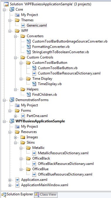
Structuring a business application solution is very straightforward. The method I'm showing here is how I actually structure my "real world" applications.
The top Core assembly is where all non-business related middle tier objects reside. For example, custom controls, validation, logging, messaging, data access, helper functions, etc. All projects in the solution reference Core.dll. Each of the root folders in Core represents a Namespace. The CustomToolBarButton's full type name is Core.WPF.CustomToolBarButton. At your option, you could add further Namespace nesting as required. For example, you could place the CustomToolBarButton in the Core.WPF.Controls Namespace. I chose the simple route, since each of my Namespaces won't have that many classes anyway.
Here is a tip on how to save yourself a lot of grief when you create your own Core (or similar) project. Ensure that you use the "WPF Custom Control Library" project template as opposed to the "Class Library" template when you add your Core project to your assembly. This adds all the required references, and makes available additional "New Item..." templates in Visual Studio 2008, like the, "WPF CustomControl" template.
The Core assembly is typically only modified by senior developers. This assembly does not change very often. This DLL is normally referenced by developers and is not part of their visible source code. For this series, the Core assembly will be part of our source code so that we can learn about it. Doing this also shortens build times for developers.
Notice the CustomToolBarResourceDictionary.xaml file. By default, when you create a new WPF CustomControl, the control template is placed in the \Themes\Generic.xaml file. I like to keep my custom control XAML in a separate file in the same directory as the code. In order to do this, you must add a MergedDictionary entry in Generic.xaml that points to one or more custom control .xaml files. Have a look at the Generic.xaml file to see how easy this is to do. The Generic.xaml markup is also listed near the bottom of this article.
The DemonstrationForms project will contain the simple demo forms. Later on, other projects that contain business forms and code will be added.
PartOne.xaml contains a UserControl that is loaded in the ApplicationMainWindow.xaml TabControl.
The project WPFBusinessApplicationSample is our executable. This project will not contain any business application code, controls, or forms. Its purpose is to be a traffic cop if you will. It handles the application level Menu, ToolBar, StatusBar, and windowing MDI functions. It also has all the skins for this application, and handles changing of the skins. We will be adding several other business application projects to the solution as this series progresses.
Once we get deeper into the series, you will see that each business form is actually a WPF UserControl that is loaded from another assembly. For example, if I had an application that had three vertical areas, Customers and Orders, Inventory, and Accounting, I would have three satellite projects, one for each of these areas. When the application user selects the Customer Maintenance function from the menu, that UserControl would be dynamically loaded into the MDI system and displayed to the user.
The Resources folder is located in the root of the application. This will contain your resource dictionary, image, video, and sound files.
I've placed each skin in its own folder because as time goes on, you may need to add more resource dictionaries for each skin; additionally, you may want to have different images for each skin. To implement different images for each skin, just assign each image a resource name and use that resource in your code when you want to reference that image. This is a decision you will want to make up front so that you don't have to go back and rework your application.
I always name my main window ApplicationMainWindow. The reason I do this is because there is a WPF property, Application.Current.MainWindow, that points to the window object that is considered your MainWindow. To avoid confusion, I name it ApplicationMainWindow. The name just makes sense to me. Note: you can change which window is your MainWindow at run-time if you desire.
Business Application Skinning
This is one section of the article that after the initial writing I came back and rewrote completely. I did this after getting some suggestions, corresponding with an application skin vendor and speaking with Josh Smith.
I realized in my effort to keep everything simple, I was missing the larger WPF picture of Styling and ControlTemplates. So rather than shying away from creating a good number of styles, we will be embracing the use of this great WPF feature. WPF developers need to learn to structure their applications so that its rendering can be altered by applying a style or a new control template without affecting the operation of the application. These styles or control templates can be designed by the developer, designer, or purchased from third party vendors.
The concept of styling the UI, as opposed to setting properties on UI controls, can take some getting used to if you have not done this before. This is actually part of the WPF learning curve. WPF allows styling without the UI markup even knowing that it's being styled. WPF styles can be explicitly assigned or globally applied by control type. Learning to take advantage of this platform feature will make the developer's life simpler and easier in the long run.
There are several techniques for skinning your application. Let's have a look at them.
Hey, My Application Only Has/Needs One Color Scheme
If you are delivering an application that will only have one color scheme, you may be tempted to set the colors directly on the controls, just like WinForms or ASP.NET without CSS. Think long and hard before heading down this bumpy road. Your application will become very difficult to maintain over time, and if a change is required, you may be required to touch all the forms, in other words, touching the markup.
If your application falls into this category, you will benefit greatly by following the below or similar suggestions. Application maintenance is much easier, and one day you may want to have a designer give your UI a few finishing touches. With the styling of the application cleanly separated from the actual UI, this task can very easily be accomplished without getting into your UI markup at all.
Applying Resources to Control Properties
This is the technique I was using in the first article. It is by far the simplest method of skinning, but harder to maintain over the long haul. When using this technique, you are assigning resources to one or more properties on the controls. For example, you may assign the BorderBrush, Background, and Foreground properties of the TabControl to a DynamicResource. These DynamicResources would be present in each skin ResourceDictionary. When the skin is changed, these properties would point to the new resources.
On the surface, this sounds good, but by having to set multiple properties on each control, this makes application development harder, since these same properties would have to be set on similar controls on other forms. Then, what happens if the boss wants the BorderThickness property changed on all the TabControls. Now you have to go back to each TabControl and either set up a new DynamicResource or manually change the BorderThickness property. If the TabControl was styled, you would only have to edit the one style to accomplish the change. That could easily be the difference between a 30 second change and a 2 or more hour editing session.
Assigning Styles to a Control
Styles can be explicitly assigned to a control by assigning a resource key as in the below example. The style is assigned using this code: Style="{DynamicResource TabControlStyle_Application}">. The reason for assigning the style like this as opposed to globally applying it is that we don't want every TabControl in our application using this style, just this one TabControl.
Run the demo program. Notice the nice custom look for the TabItem Header and the mouse over and mouse click styling that takes place. The below code is very clean and, in fact, void of any special color or mouse event markup. This is the power of using styles and custom control templates. The TabControl and TabItem rendering specifications are external to these controls and the XAML markup where the control is located. This is a very good thing. These controls can now be customized to render differently without touching or changing the markup. You can get a custom look from a designer or even a third party vendor's theme packs.
<TabControl
        x:Name="tcOpenPages" SelectedIndex="0" TabStripPlacement="Bottom"
        Style="{DynamicResource TabControlStyle_Application}" >

    <TabItem Style="{DynamicResource TabItemStyle_Application}" Header="Part 1">
        <demo:PartOne />
    </TabItem>
</TabControl>
Possible bug: In the above code, you can see that I have assigned the TabStripPlacement property to Bottom in the markup, instead of the Style. It took me about an hour to figure out that I had to do this workaround. If this property was not assigned here, when you switched skins, the TabStripPlacement triggers on the child TabItems were not firing when the skin was changed. The result was the TabItem Headers did not look correct after switching skins. By assigning the TabStripPlacement property here, the child TabItem triggers fired correctly.
Styles can also be applied globally to a control type. This below style in a skin resource dictionary does not have a Key property assigned. This style will be globally applied to every TextBox in the application, unless the TextBox has been assigned another style, as in the above example.
This global TextBox style is coded to display data validation errors in the ToolTip, and have assigned a Validation.ErrorTemplate too. You can see how much markup was just saved on each Window, UserControl, etc. Also, this makes it very easy to change the entire application by editing this one style.
<Style TargetType="{x:Type TextBox}">
    <Setter Property="Validation.ErrorTemplate"
             Value="{DynamicResource validationTemplate}" />
    <Style.Triggers>
        <Trigger Property="Validation.HasError" Value="true">
            <Setter Property="ToolTip"
               Value="{Binding Path=(Validation.Errors)[0].ErrorContent,
               RelativeSource={x:Static RelativeSource.Self}}" />
        </Trigger>
    </Style.Triggers>
</Style>
Purchase Third Party Styles and Control Templates
Another option you have is to purchase a third party vendor theme pack or control template package. In fact, Josh Smith has a blog entry, Buying Themes for WPF Applications, that brings this option to light. Two vendors that have started in this market are Reuxables and Infragistics. While neither vendor has a full blown solution, with every WPF control styled in the theme pack, Josh and I believe a comprehensive solution will be available in the future. The Reuxables theme pack covers a good number of controls. You don't have to touch your markup at all. Just load the resource dictionary and watch your application take on a new look. They have a free download that you can use in your projects to test with.
Ultimately, we will probably see a hybrid of third party styles and application developer styles being used in an application.
Skinning this Application
All skins files must have the same resource keys. Styles do not require keys, but if assigned, each skin much have a style with that key. This is required so that when you dynamically swap out the skin, the application can locate the required styles. If you don't include the same named styles in each skin resource dictionary, you will get run-time exceptions and unexpected results. This is where good up-front planning comes in and why I highly recommend writing a mock up or test application. The time spent on this will return huge payoffs in the long run on your real application.
The method for loading skins used in this application is not the only way this can be accomplished. Skin resource dictionaries can be loaded from loose XAML files or from other satellite assemblies. Take your application requirements into consideration and find the simplest method to meet your specification requirements and use that method. If your application requires that customers be able to design their own skins without your knowledge or intervention, then allow for the loading of loose XAML files. If you want to be able to distribute a new skin without recompiling your application or redistributing the entire application, then use the dynamic loading of a satellite assembly method and just distribute a new satellite assembly to your customers.
When your application references a style in a skin resource dictionary, you must always reference the style as a DynamicResource as opposed to a StaticResource. A DynamicResource is required since the skin resource dictionary can be replaced at any time by the user. Notice the difference between the StaticResource and DynamicResource below.
StaticResource - Provides a value for a XAML property by substituting the value of an already defined resource.DynamicResource - Provides a value for a XAML property by deferring that value to be a runtime reference to a resource. A dynamic resource reference forces a new lookup each time such a resource is accessed.
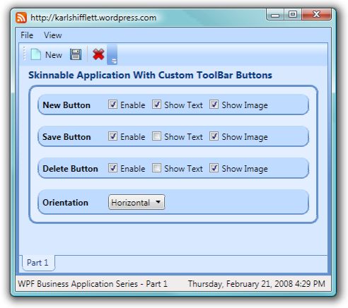
FYI: Karl already knows that his "design" skills are not his strongest skills, so go easy on me.
This simple application allows you to change the settings on each CustomToolBarButton, watch the button change, and gives you the ability to select a different style at run-time. The CustomToolBarButton changing is accomplished with property element binding to the CheckBox and ComboBox controls. Later on in the series, we will use code to alter the CustomToolBarButtons at run-time based on application state and user security permissions.
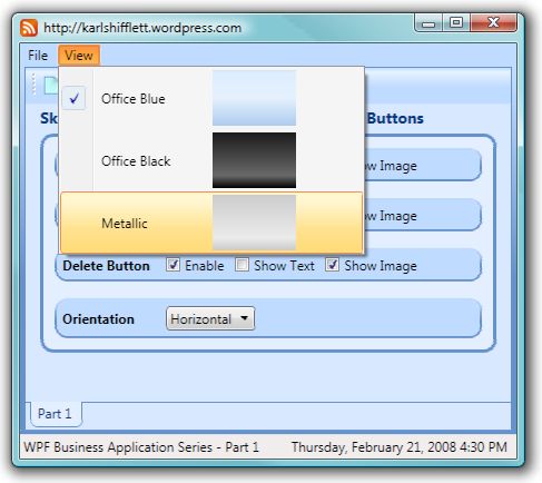
To change the skin, use the View menu and select the skin you want to use. I have included three skins: modified versions of Office 2007 Blue, Black, and Metallic. The CustomToolBarButtons, Menu, and TabItem Headers render like Office 2007 when moused over or clicked.
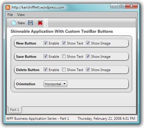
I like using Microsoft Blend 2, December Preview to adjust my colors and styles because it allows you to visually edit styles and see those changes real-time on your business form. Making the second and third skins only took about 20 minutes each.
Thanks to WPF, this type of UI restyling is just a few simple lines of code. Let me say something about skinning. You can do much more than simple color changes. You can change an entire control template, the rendering of the control, etc. Since we are writing a business application, we are sticking with color changes and a few simple control template changes, but you are only limited by your imagination, time, and skills.
Select Skin Code
I learned a good bit from Josh Smith's Creating a Skinned User Interface in WPF article on skinning UIs.
This application goes a step further with respect to managing the swapping out of the resource dictionaries. The code ensures that if you have multiple resource dictionaries loaded, only the skin dictionary will be swapped, the other resource dictionaries will not be touched. The code below demonstrates a technique for swapping skin dictionaries that works pretty good and is very simple.
This simple code handles the menu click events.
Class ApplicationMainWindow

#Region " Methods "

    Private Sub OnViewMenuItemClick(ByVal sender As Object, _
      ByVal e As RoutedEventArgs)

        Dim objClicked As MenuItem = CType( _
          e.OriginalSource, MenuItem)

        For Each mi As MenuItem In CType(sender,  _
          MenuItem).Items
            mi.IsChecked = mi Is objClicked
        Next

        CType(Application.Current, Application).ApplySkin( _
          New Uri(TryCast(objClicked.CommandParameter, String), _
          UriKind.Relative))
    End Sub

    Private Sub OnMenuItemExitClick(ByVal sender As System.Object, _
      ByVal e As System.Windows.RoutedEventArgs)

        Me.Close()

    End Sub

#End Region

End Class
When the user selects a skin from the View menu, the OnViewMenuItemClick event handler fires. Here, we need to get a reference to the clicked MenuItem and then set its IsChecked property to True.
In this implementation, the image location is stored in the CommandParameter property. This will be passed to the Application.ApplySkin method as a URI. Placing the ApplySkin method in the Application class allows other application windows to access this same code. Our application will only have one Window, so I could have placed this code in the Window, but it just makes good sense to place application scope code in the Application class.
Apply Skin Code
Imports System.Collections.ObjectModel
Class Application
Private _objLoadedSkinResourceDictionary As ResourceDictionary
Public ReadOnly Property MergedDictionaries() As Collection(Of ResourceDictionary)
Get
Return MyBase.Resources.MergedDictionaries
End Get
End Property
Private Sub Application_Startup(ByVal sender As Object, ByVal e As _
System.Windows.StartupEventArgs) Handles Me.Startup
For Each obj As ResourceDictionary In Me.MergedDictionaries
If obj.Source IsNot Nothing AndAlso obj.Source.OriginalString.Contains( _
"\Skins\") Then
_objLoadedSkinResourceDictionary = obj
Exit Sub
End If
Next
End Sub
Public Sub ApplySkin(ByVal objSkinDictionaryUri As Uri)
If String.IsNullOrEmpty(objSkinDictionaryUri.OriginalString) Then
Throw New NullReferenceException( _
"The skin dictionary URI OriginalString was null or empty.")
End If
Dim objNewSkinDictionary As ResourceDictionary = TryCast( _
Application.LoadComponent(objSkinDictionaryUri), ResourceDictionary)
If objNewSkinDictionary Is Nothing Then
Throw New NullReferenceException(String.Format( _
"The {0} ResourceDictionary could not be loaded.", _
objSkinDictionaryUri.OriginalString))
End If
Me.MergedDictionaries.Remove(_objLoadedSkinResourceDictionary)
_objLoadedSkinResourceDictionary = objNewSkinDictionary
Me.MergedDictionaries.Add(objNewSkinDictionary)
End Sub
End Class
First, this code supports having one resource dictionary define a skin. If you need to have multiple resource dictionaries define your styles, then this code must be modified to support the selecting, adding, removing, and tracking of multiple dictionaries per skin. The easiest way to do this would be to use the generic List(Of ResourceDictionary) collection to track your loaded resource dictionaries. This is an example of my "keep it simple" philosophy. Even my large business applications only need one resource dictionary per skin. So I write code to support this, and do not write code to support something that I don't need.
The purpose of the ApplySkin method is to replace the current skin with the newly selected skin, but not affect any other resource dictionaries that are currently loaded. For this to happen, we must have a way to locate and remove the currently loaded skin resource dictionary.
I chose to use the simplest method I could come up with to accomplish this task. When the application starts up, find the resource dictionary that was assigned in the Application.xaml file as the default skin. This is accomplished by looking through the MergedDictionary collection and finding the resource dictionary that has the string, "\Skins\" in its OriginalString property. Once located, assign this dictionary to a class level variable for future use.
When the Application.ApplySkin method is called, load up the new skin resource dictionary, remove the old one, reassign the class level variable with our new skin dictionary, and add the new skin dictionary to the MergedDictionary collection.
Some would ask why I didn't utilize the look for the string "\Skins\" technique in the ApplySkin method. Good question. The reason is, when a resource dictionary is loaded into the MergeDictionaries collection in code, the Source property is Nothing. If you step through the code and inspect the new skin dictionary properties after it gets loaded, you'll see that the Source property is Nothing. I do not know why this is. (Bug?) So this test is a onetime test that can be used only on resource dictionaries that were loaded from XAML code. I didn't want to hard code the original or default skin in this code. This technique is not dependent on anything except the "\Skins\" folder name.
As you can see, this code is very simple, and can be used as is or is easily modified to support your application requirements.
CustomToolBarButton Control
CustomToolBarButton Control Options
Use the CheckBox and ComboBox controls to alter how each Button is rendered. Below are some screenshots with various features enabled or disabled.
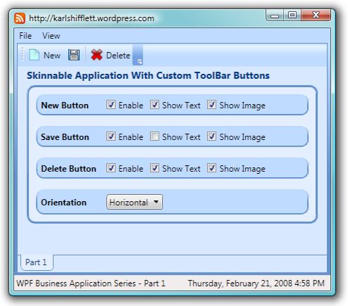
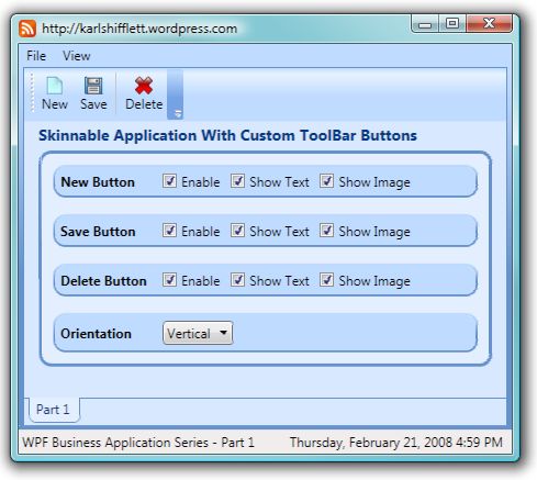
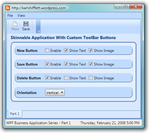
Notice how the New Button looks when disabled.
There are other simple methods to implement a ToolBar Button with an Image. You can use XAML markup by placing an Image in the Button control's Content. When making a decision to use XAML markup or author a custom control, you need to take your application specifications into consideration. Here are our ToolBar Button requirements:
ToolBar Button Requirements
- Ability to construct a toolbar button in code, taking into consideration the user's permissions
- Modify the appearance of the toolbar button at run-time
- Provide images for normal and disabled appearance
- Ability to display an icon, text, or icon and text
- Ability to display the text to the right or below the icon
- Place a left margin on the text if the text is displayed to the right of the icon
- Raise a
ClickEvent when the toolbar button is clicked
In business applications, intrinsic security is a must. Security, like exception handling and logging, is not something that you want to add in later. These are foundational considerations for business applications.
Let me give you a security requirement example. You want to allow all system users to view the customer records, but only the order department and supervisors to edit customer records. This is very easily accomplished by altering which toolbar buttons are visible based on the user's permissions. Later in the series, we will be loading the ToolBar items in code based on the user's permissions.
Custom Controls 101
There are many resources here on CodeProject, WPF books, and Internet articles on authoring WPF CustomControls so I won't be covering the theory or step by step directions on authoring custom controls. One of the best chapters on CustomControls I've read is in Chapter 24 of Matthew MacDonald's book, Pro WPF Windows Presentation Foundation. He takes you though creating a UserControl and then converting it to a CustomControl, and he writes it so well you can't help but learn the topic. This is an outstanding WPF book. I also have several custom control articles on my blog and here on CodeProject.
Evaluate your requirements carefully. If a style will do, use a style instead of authoring a control.
When authoring your control, attempt to design a control that derives its behavior and appearance from its own dependency properties. If you do this, consumers of your control won't have to write their own custom control template to get the results they need. Instead, they can provide values to properties you have exposed. Consumers can set properties directly in the control XAML markup, in styles or code.
Let's touch on the naming of controls inside your custom control templates. There is no need to name each control inside your custom control unless you will be accessing them in a trigger or in the control's code. If the control is only accessed in a trigger, then you can use your standard control naming convention. If, however, the control is accessed in the control's code, you should follow the established naming convention of "PART_ControlName." When you name your control template controls in this fashion, it is very easy for consumers of your control who edit your default control template to see which controls are referenced in the control's code.
Use property triggers instead of code when possible. If you do this, it will make customizing your control by consumers much easier.
To the degree that it is possible, your CustomControl should be, "lookless". Lookless means that there is a high degree of separation between the UI of the control and its code. Sometimes, 100% separation is not possible, but many times, I see controls that have introduced dependencies in their code that didn't have to be there. For example, you can customize the standard WPF Button ControlTemplate any way you want, and the Button's code won't throw an exception at run-time.
Our simple CustomToolBarButton control does not have any methods that reference any controls, so you will not see the "PART_ControlName" naming convention used. In future series articles, you will see this being used.
CustomToolBarButton Control ControlTemplate
<ResourceDictionary
xmlns="http://schemas.microsoft.com/winfx/2006/xaml/presentation"
xmlns:x="http://schemas.microsoft.com/winfx/2006/xaml"
xmlns:Core_WPF="clr-namespace:Core.WPF">
<Style TargetType="{x:Type Core_WPF:CustomToolBarButton}">
<Style.Resources>
<BooleanToVisibilityConverter x:Key="booleanToVisibilityConverter" />
<Core_WPF:CustomToolBarButtonImageSourceConverter
x:Key="customToolBarButtonImageSourceConverter" />
-->
<SolidColorBrush x:Key="DisabledForegroundBrush"
Color="#888" />
<SolidColorBrush x:Key="DisabledBackgroundBrush"
Color="#EEE" />
<SolidColorBrush x:Key="DisabledBorderBrush"
Color="#AAA" />
-->
<LinearGradientBrush x:Key="DefaultedBorderBrush"
EndPoint="0,1"
StartPoint="0,0">
<GradientStop Color="#777"
Offset="0.0" />
<GradientStop Color="#000"
Offset="1.0" />
</LinearGradientBrush>
</Style.Resources>
<Setter Property="BorderThickness"
Value=".7" />
<Setter Property="Padding"
Value="5" />
<Setter Property="IsTabStop"
Value="False" />
<Setter Property="Template">
<Setter.Value>
<ControlTemplate TargetType="{x:Type Core_WPF:CustomToolBarButton}">
<Border x:Name="Border"
Background="{TemplateBinding Background}"
BorderBrush="{TemplateBinding BorderBrush}"
BorderThickness="{TemplateBinding BorderThickness}"
Padding="{TemplateBinding Padding}">
<StackPanel Orientation="{Binding Path=ButtonLayout,
RelativeSource={RelativeSource TemplatedParent}}">
<Image Stretch="None"
VerticalAlignment="Center"
Visibility="{Binding Path=ShowButtonImage,
RelativeSource={RelativeSource TemplatedParent},
Converter={StaticResource booleanToVisibilityConverter}}">
<Image.Source>
<MultiBinding Converter="{StaticResource
customToolBarButtonImageSourceConverter}">
<Binding Path="IsEnabled"
RelativeSource="{RelativeSource TemplatedParent}" />
<Binding Path="EnabledButtonImage"
RelativeSource="{RelativeSource TemplatedParent}" />
<Binding Path="DisabledButtonImage"
RelativeSource="{RelativeSource TemplatedParent}" />
</MultiBinding>
</Image.Source>
</Image>
<TextBlock x:Name="tbButtonText"
Text="{Binding Path=ButtonText,
RelativeSource={RelativeSource TemplatedParent}}"
Visibility="{Binding Path=ShowButtonText,
RelativeSource={RelativeSource TemplatedParent},
Converter={StaticResource
booleanToVisibilityConverter}}" />
</StackPanel>
</Border>
<ControlTemplate.Triggers>
<Trigger Property="IsKeyboardFocused"
Value="true">
<Setter Property="BorderBrush"
Value="{StaticResource DefaultedBorderBrush}"
TargetName="Border" />
</Trigger>
<Trigger Property="IsMouseOver"
Value="true">
<Setter Property="Foreground"
Value="{Binding Path=MouseOverForeground,
RelativeSource={RelativeSource TemplatedParent}}" />
<Setter Property="BorderBrush"
Value="{Binding Path=MouseOverBorder,
RelativeSource={RelativeSource TemplatedParent}}"
TargetName="Border" />
<Setter Property="BorderThickness"
Value="0.7"
TargetName="Border" />
<Setter Property="Background"
TargetName="Border"
Value="{Binding Path=MouseOverBackground,
RelativeSource={RelativeSource TemplatedParent}}" />
</Trigger>
<Trigger Property="IsPressed"
Value="true">
<Setter Property="Background"
Value="{Binding Path=ButtonPressedBackground,
RelativeSource={RelativeSource TemplatedParent}}"
TargetName="Border" />
<Setter Property="BorderBrush"
Value="{Binding Path=ButtonPressedBorder,
RelativeSource={RelativeSource TemplatedParent}}"
TargetName="Border" />
<Setter Property="BorderThickness"
Value="0.7"
TargetName="Border" />
</Trigger>
<Trigger Property="IsEnabled"
Value="false">
<Setter Property="Foreground"
Value="{StaticResource DisabledForegroundBrush}" />
</Trigger>
<MultiTrigger>
<MultiTrigger.Conditions>
<Condition Property="ShowButtonImage"
Value="True" />
<Condition Property="ShowButtonText"
Value="True" />
<Condition Property="ButtonLayout"
Value="Horizontal" />
</MultiTrigger.Conditions>
<MultiTrigger.Setters>
<Setter Property="Margin"
TargetName="tbButtonText"
Value="5,0,0,0" />
</MultiTrigger.Setters>
</MultiTrigger>
</ControlTemplate.Triggers>
</ControlTemplate>
</Setter.Value>
</Setter>
</Style>
</ResourceDictionary>
You will first notice that two converters have been added to the Style.Resources section. The BooleanToVisibilityConverter comes with WPF, and provides for Boolean value conversion to either Visibility.Visible or Visibility.Collapsed.
The CustomToolBarImageSourceConverter is a MultValueConverter that takes a Boolean and two String values and returns a BitmapImage that can be used as the Source for an Image control. In this implementation, the two strings that are passed in are paths to two images. If your application needed to have different images for each skin, you could pass in a resource name instead of a path and return the image from that. A very simple modification to this converter and the converter source information, and you are up and running. I'll show you the converter code below.
We need our CustomToolBarButton to work like a Button. For example, when the user mouses over the CustomToolBarButton, I want it to have the same look as an Office 2007 toolbar item. So I have chosen to start with a standard WPF Button control and work from there. By choosing a Button control, we get the built-in Button.ClickEvent that fulfills one of our specification requirements.
The Content of the Button control is very simple. A StackPanel with an Image and TextBlock control. Notice the StackPanel.Orientation property and how it binds to the control's ButtonLayout dependency property.
The Image control has its Visibility property bound to the control's ShowButtonImage property.
Are you seeing a pattern develop here? You define dependency properties in the control's code and then bind to them in the ControlTemplate to get the behavior you need. WPF CustomControls are really not that difficult to author, you just need to do a little planning. I'm so glad us VB.NET developers can author our own controls when we need to. Thanks Microsoft!
I better explain why I chose to have two images for each Button instead of one. I did an extensive search on how to render an image so that it looked disabled. There were solutions that adjusted the Opacity property, but the button image just didn't look disabled, there was still some visible color. I found solutions that took the normal image and re-rendered it as grayscale on the fly. The problem with this solution is that the transparent areas of the image would lose their alpha channel information and not look like a disabled button. Since our business application toolbar only needs 5-10 icons, it was much easier and the results were much better if I just supplied two images.
The Image.Source XAML looks a little complex, so let's break it down. The rendered CustomToolBarButton image depends on three properties: IsEnabled, EnabledButtonImage, and DisabledButtonImage. When you have multiple input values that determine the result, you'll need to use the WPF MultiValueConverter. A MultiValueConverter is designed to take a parameter and an array of values to determine what it returns. In the above example, I didn't pass a parameter; instead, I just passed in three values. The values that I'm passing in are all bound to dependency properties of the control. Remember, when you use dependency properties and bind to them, you get a change notification built in for free. In other words, when the Button.IsEnabled property changes, you don't need to do anything, the Image.Source will be updated automatically for you. I'll show you the MultiValueConverter code below.
The TextBlock control also has its Text and Visibility properties bound. Notice that we have assigned the TextBlock.Name property. This was done so that the below trigger can access this TextBlock.
The last section of the XAML is ControlTemplate.Triggers. The CustomToolBarButton specification calls for a left margin on the TextBlock when the Image and TextBlock are both displayed and the control ButtonLayout is Orientation.Horizontal. When you have multiple conditions that must be met before the action is taken, you need to use a MultiTrigger. MultiTriggers are like the VB.NET If statement blocks with multiple conditions. If all conditions are met, the MultiTrigger.Setters are fired.
If you were to write the above MultiTrigger in code, it would look like this (this assumes you have access to the tbButtonText TextBlock):
If Me.ShowButtonImage AndAlso Me.ShowButtonText AndAlso _
      Me.ButtonLayout = Orientation.Horizontal Then
   tbButtonText.Margin = New Thickness(5, 0, 0, 0)
End If
The other triggers are used to set the colors for the Button when it is pressed, the mouse is over it, etc. Notice how I'm using properties to set the rendering of the Button within these triggers.
MultiValueConverter
Namespace WPF

  Public Class CustomToolBarButtonImageSourceConverter
    Implements IMultiValueConverter

    Public Function Convert(ByVal values() As Object, _
      ByVal targetType As System.Type, ByVal parameter _
      As Object, ByVal culture As  _
      System.Globalization.CultureInfo) As Object _
      Implements _
      System.Windows.Data.IMultiValueConverter.Convert

      Dim strImage As String = String.Empty

      If CType(values(0), Boolean) Then
        strImage = values(1).ToString

      Else
        strImage = values(2).ToString
      End If

      If Not String.IsNullOrEmpty(strImage) Then

        Dim objURI As New Uri(strImage, _
          UriKind.Relative)
        Return New BitmapImage(objURI)

      Else
        Return Nothing
      End If

    End Function

    Public Function ConvertBack(ByVal value As Object, _
      ByVal targetTypes() As System.Type, ByVal _
      parameter As Object, ByVal culture As  _
      System.Globalization.CultureInfo) As Object() _
      Implements _
      System.Windows.Data.IMultiValueConverter.ConvertBack

      Throw New System.NotImplementedException()

    End Function

  End Class
End Namespace
WPF MultiValueConverters implement the IMultiValueConverter interface. WPF ValueConverters implement the IValueConverter interface.
In the above code, we simply cast the three elements in the values array, making a decision on which image to use, and return either a BitmapImage or Nothing.
CustomToolBarButton Code
Imports System.ComponentModel
Namespace WPF
Public Class CustomToolBarButton
Inherits System.Windows.Controls.Button
#Region " Shared Declarations "
Public Shared ButtonLayoutProperty As DependencyProperty = _
DependencyProperty.Register("ButtonLayout", GetType(Orientation), _
GetType(CustomToolBarButton), New PropertyMetadata( _
Orientation.Horizontal))
Public Shared ButtonPressedBackgroundProperty As DependencyProperty = _
DependencyProperty.Register("ButtonPressedBackground", GetType(Brush), _
GetType(CustomToolBarButton))
Public Shared ButtonPressedBorderProperty As DependencyProperty = _
DependencyProperty.Register("ButtonPressedBorder", GetType(Brush), _
GetType(CustomToolBarButton))
Public Shared ButtonTextProperty As DependencyProperty = _
DependencyProperty.Register("ButtonText", GetType(String), GetType( _
CustomToolBarButton))
Public Shared DisabledButtonImageProperty As DependencyProperty = _
DependencyProperty.Register("DisabledButtonImage", GetType(String), _
GetType(CustomToolBarButton))
Public Shared EnabledButtonImageProperty As DependencyProperty = _
DependencyProperty.Register("EnabledButtonImage", GetType(String), _
GetType(CustomToolBarButton))
Public Shared MouseOverBackgroundProperty As DependencyProperty = _
DependencyProperty.Register("MouseOverBackground", GetType(Brush), _
GetType(CustomToolBarButton))
Public Shared MouseOverBorderProperty As DependencyProperty = _
DependencyProperty.Register("MouseOverBorder", GetType(Brush), GetType( _
CustomToolBarButton), New PropertyMetadata(New SolidColorBrush( _
Colors.Black)))
Public Shared MouseOverForegroundProperty As DependencyProperty = _
DependencyProperty.Register("MouseOverForeground", GetType(Brush), _
GetType(CustomToolBarButton))
Public Shared ShowButtonImageProperty As DependencyProperty = _
DependencyProperty.Register("ShowButtonImage", GetType(Boolean), _
GetType(CustomToolBarButton), New PropertyMetadata(True))
Public Shared ShowButtonTextProperty As DependencyProperty = _
DependencyProperty.Register("ShowButtonText", GetType(Boolean), _
GetType(CustomToolBarButton), New PropertyMetadata(False))
#End Region
#Region " Properties "
<Category("Custom"), Description( _
"This sets the position of the text in relation to the button image.")> _
Public Property ButtonLayout() As Orientation
Get
Return CType(GetValue(ButtonLayoutProperty), Orientation)
End Get
Set(ByVal value As Orientation)
SetValue(ButtonLayoutProperty, value)
End Set
End Property
<Category("Custom"), Description("Button pressed background brush.")> _
Public Property ButtonPressedBackground() As Brush
Get
Return CType(GetValue(ButtonPressedBackgroundProperty), Brush)
End Get
Set(ByVal value As Brush)
SetValue(ButtonPressedBackgroundProperty, value)
End Set
End Property
<Category("Custom"), Description("Button pressed border brush.")> _
Public Property ButtonPressedBorder() As Brush
Get
Return CType(GetValue(ButtonPressedBorderProperty), Brush)
End Get
Set(ByVal value As Brush)
SetValue(ButtonPressedBorderProperty, value)
End Set
End Property
<Category("Custom"), Description("Text for the button.")> _
Public Property ButtonText() As String
Get
Return CType(GetValue(ButtonTextProperty), String)
End Get
Set(ByVal value As String)
SetValue(ButtonTextProperty, value)
End Set
End Property
<System.ComponentModel.Browsable(False)> _
Public Shadows Property Content() As Object
Get
Return MyBase.Content
End Get
Set(ByVal value As Object)
MyBase.Content = value
End Set
End Property
<Category("Custom"), Description( _
"Image to display when the button is disabled.")> _
Public Property DisabledButtonImage() As String
Get
Return CType(GetValue(DisabledButtonImageProperty), String)
End Get
Set(ByVal value As String)
SetValue(DisabledButtonImageProperty, value)
End Set
End Property
<Category("Custom"), Description( _
"Image to display when the button is enabled.")> _
Public Property EnabledButtonImage() As String
Get
Return CType(GetValue(EnabledButtonImageProperty), String)
End Get
Set(ByVal value As String)
SetValue(EnabledButtonImageProperty, value)
End Set
End Property
<Category("Custom"), Description("Mouse over background brush.")> _
Public Property MouseOverBackground() As Brush
Get
Return CType(GetValue(MouseOverBackgroundProperty), Brush)
End Get
Set(ByVal value As Brush)
SetValue(MouseOverBackgroundProperty, value)
End Set
End Property
<Category("Custom"), Description("Mouse over border brush.")> _
Public Property MouseOverBorder() As Brush
Get
Return CType(GetValue(MouseOverBorderProperty), Brush)
End Get
Set(ByVal value As Brush)
SetValue(MouseOverBorderProperty, value)
End Set
End Property
<Category("Custom"), Description("Mouse over foreground text brush.")> _
Public Property MouseOverForeground() As Brush
Get
Return CType(GetValue(MouseOverForegroundProperty), Brush)
End Get
Set(ByVal value As Brush)
SetValue(MouseOverForegroundProperty, value)
End Set
End Property
<Category("Custom"), Description("Display the image on the button.")> _
Public Property ShowButtonImage() As Boolean
Get
Return CType(GetValue(ShowButtonImageProperty), Boolean)
End Get
Set(ByVal value As Boolean)
SetValue(ShowButtonImageProperty, value)
End Set
End Property
<Category("Custom"), Description("Display the text on the button.")> _
Public Property ShowButtonText() As Boolean
Get
Return CType(GetValue(ShowButtonTextProperty), Boolean)
End Get
Set(ByVal value As Boolean)
SetValue(ShowButtonTextProperty, value)
End Set
End Property
#End Region
#Region " Constructor "
Shared Sub New()
DefaultStyleKeyProperty.OverrideMetadata(GetType(CustomToolBarButton), _
New FrameworkPropertyMetadata(GetType(CustomToolBarButton)))
End Sub
#End Region
End Class
End Namespace
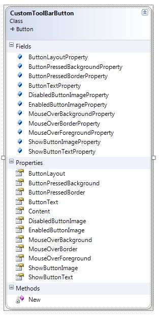
The code for our CustomToolBarButton is not very sexy, but it provides a lot of built-in functionality. As we have already seen, dependency properties have some very cool built-in features that we have taken advantage of, like binding change notification.
You will notice the attributes that I've applied to each Property. If you supply a Description property, this value will show up in the GUI designers, providing the developer information about your property. The Category property assigns which category the property will be listed in. If you omit this, the property will be listed in the Misc category. I make it a practice to assign my properties to the Custom category so that I can easily find the properties I have assigned when using Blend.
I need to mention a little something about Namespaces. The Core assembly has a default Namespace of Core. We want our control to be in the Core.WPF namespace. To accomplish this, we wrap this class in the Namespace WPF block. This will place the classes inside this block, in the Core.WPF Namespace.
I have elected to derive this control from Button. This gives us some default characteristics and properties. The rest of the code is just dependency property declarations with corresponding property getters and setters. If writing your own dependency properties is new to you, please read the VB.NET help topic, "DependencyProperty Class". This topic is covered well in the help documentation.
The Shared constructor is added by Visual Studio when you add a new CustomControl to your project. This code tells WPF how to find your default control template. If you look back at the XAML for this CustomControl, you'll find both the Style and ControlTemplate elements have their TargetType set to CustomToolBarButton, the same as is defined here. By default, WPF will look in \Themes\Generic.xaml for the ControlTemplate. Notice how I have modified the below Generic.xaml file so that our CustomControl XAML can be in its own XAML file.
Generic.xaml
<ResourceDictionary
xmlns="http://schemas.microsoft.com/winfx/2006/xaml/presentation"
xmlns:x="http://schemas.microsoft.com/winfx/2006/xaml">
-->
<ResourceDictionary.MergedDictionaries>
-->
<ResourceDictionary
Source="/Core;component/WPF/Custom Controls/CustomToolBarButton/
CustomToolBarResourceDictionary.xaml" />
</ResourceDictionary.MergedDictionaries>
</ResourceDictionary>
StatusBar TimeDisplay Control
If you look again at the application StatusBar, you'll see the date and time displayed on the right side. Below is the XAML markup for the application StatusBar.
<StatusBar DockPanel.Dock="Bottom">
    <StatusBar.Resources>
        <Core_WPF:TimeDisplay x:Key="timeDisplay"/>
        <Core_WPF:FormattingConverter x:Key="formattingConverter" />
    </StatusBar.Resources>
    <StatusBarItem Margin="5,0,5,0" Content="{Binding Source={StaticResource timeDisplay},
        Path=Now, Converter={StaticResource formattingConverter},
        ConverterParameter={}{0:f}}" DockPanel.Dock="Right"/>
    <StatusBarItem Content="WPF Business Application Series - Part 1" />
</StatusBar>
I've added two resources to the StatusBar since these resources will not be used anywhere else in the window. If the ConverterParameter format String is new to you, check out my formatting blog entry. At your option, you could make the display of the date time and the format a user configurable option.
The TimeDisplay control is a class with a Timer that implements INotifiyPropertyChanged and exposes the current date time in the public Now property. The control updates the Now property every minute. The constructor sets the Timer Interval property so that the first time the Timer Elapsed event fires, it will be on the next minute. From there, the Elapsed event fires every 60 seconds. This is a case where WPF data binding makes this feature super easy to accomplish.
Namespace WPF
Public Class TimeDisplay
Implements System.ComponentModel.INotifyPropertyChanged
Implements IDisposable
#Region " Declarations "
Private _bolDisposedValue As Boolean = False
Private _datNow As DateTime = DateTime.Now
Private WithEvents _objTimer As New System.Timers.Timer
#End Region
#Region " Properties "
Public ReadOnly Property Now() As DateTime
Get
Return _datNow
End Get
End Property
#End Region
#Region " Events "
Public Event PropertyChanged(ByVal sender As Object, ByVal e As _
System.ComponentModel.PropertyChangedEventArgs) Implements _
System.ComponentModel.INotifyPropertyChanged.PropertyChanged
#End Region
#Region " Constructors "
Public Sub New()
_objTimer.Interval = (60 - Now.Second) * 1000
_objTimer.Start()
End Sub
#End Region
#Region " Methods "
Private Sub _objTimer_Elapsed(ByVal sender As Object, ByVal e As _
System.Timers.ElapsedEventArgs) Handles _objTimer.Elapsed
If _objTimer.Interval <> 60000 Then
_objTimer.Interval = 60000
End If
_datNow = DateTime.Now
RaiseEvent PropertyChanged(Me, New _
System.ComponentModel.PropertyChangedEventArgs("Now"))
End Sub
#End Region
#Region " IDisposable Support "
Public Sub Dispose() Implements IDisposable.Dispose
Dispose(True)
GC.SuppressFinalize(Me)
End Sub
Protected Overridable Sub Dispose(ByVal disposing As Boolean)
If Not _bolDisposedValue Then
If disposing Then
_objTimer.Dispose()
End If
End If
_bolDisposedValue = True
End Sub
#End Region
End Class
End Namespace
Book's I've Read and Use
Close
I hope that you got something from this first article in the WPF Business Application Series, and that you have seen some of WPF's potential for writing great business applications.
In addition to this Business Application Series, I also have a WPF Sample Series on my blog. I post several WPF Sample Applications a month. I won't be posting every sample here on CodeProject, but you can still read them and download the code from my blog.
Have a great day!
History
- 9 Feb. 2008: Initial release.
- 21 Feb. 2008: Rewrote article.
- 4 Apr. 2008: Updated the list of articles in this series.
