Introduction
This is Part 2 in a series of articles on writing WPF Business Applications in VB.NET using Visual Studio 2008. This series tries to take a complex form or application and deliver articles on small pieces so that each piece can be understood.
If you have not yet read Part 1, please take a few minutes and read it. This series builds on previous articles, and does not repeat information.
Note: On 21 Feb. 2008, I rewrote Part 1 of the series, making large changes to the skinning and button control. If you previously read this article before 21 Feb. 2008, please go back and review it.
New to WPF?
There are many fine WPF authors here on CodeProject with great insight and code. If you are new to WPF, can I suggest that you bookmark this article and take the time to read the foundational tutorials that CodeProject MVPs Josh Smith and Sacha Barber have authored? In addition to their tutorials, each have many WPF articles here on CodeProject and their blogs with sample code:
I should also mention that the SDK Team has put a lot of work into providing a lot of good, simple examples in the WPF SDK that are easy to learn from. When you install Visual Studio 2008, this is also installed. Take advantage of this free code. There is also a new Framework 3.5 SDK that was recently released. There is an issue with the install package, and when you install this new 3.5 SDK, XAML intellisense will quit working. Please read my blog post for the Registry entry fix.
Article Highlights
- Covers the
FormNotification control in detail.
- Covers binding to objects that implement
IDataErorrInfo.
- Shows how the Form Notification popup is rendered in the Adorner Layer.
- Explains how to extend the data binding system to utilize logical operations in trigger conditions.
- Explains how to get around the toolbar button and textbox
IDataErrorInfo data binding gotcha.
- Problem is, the
TextBox source is not updated when a toolbar button is clicked. A solution is provided.
- Shows how to persist validation error cues in the Adorner Layer when switching between
TabItems.
- Explains how to use the
Dispatcher object to permit the System.Timers.Timer thread to update the UI.
- Shows a creative use of skin
ControlTempates to provide rounded corners on TextBoxes in one of the skins.
FormNotification Control
Being a long time ASP.NET developer, I like to give the web page visitor a visual cue when there are errors on the page or the requested operation was successful. ASP.NET has a ValidationSummary control for displaying errors on a page. I like its simple programming interface and effective display of entry errors to the web page visitor. When operations are successful, I display a message indicating success. Moving to WPF, I wanted this same functionality, so I wrote a control that encapsulated the error listing and successful record operations notification.
The control is located in close proximity to the ToolBar buttons, making it very easy to train users to click the Save button and look for a visual cue, success or failure.
In the below series of images, the * is rendered by the data binding validation system in the Adorner Layer. I have replaced the default Validation.ErrorTemplate that renders a red box around controls with a template that renders a red asterisk when a validation error is reported for that control. A validation error could be an empty field, invalid entry, or any other business rule that is applied to the corresponding property on the business entity object.
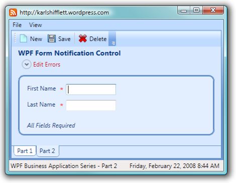
The above image shows a simple form with two fields that must be filled in. The Validation.ErrorTemplate indicates a validation rule is currently broken. By changing the Validation.ErrorTemplate to the very familiar red asterisk, users can easily identify fields that need to be filled in or have other validation errors. As part of the error template, the TextBox ToolTip has been set to the validation error message.
The FormNotification control is designed to be data bound to the IDataErrorInfo.Error property of the business entity object that is being edited. This provides an instant no code solution for listing all entity object validation errors. This assumes that the Error property was coded. Many examples of using WPF 3.5 to bind to a business object that implements the IDataErrorInfo interface do not return information in the Error property. When writing the implementation code for the IDataErrorInfo interface in your applications, ensure that you code the Error property. In a future article in this series, I will show a complete, "real world" example of data binding to a business object that implements this interface in its base class. This same article will also cover how to set up validation rules that are declarative; meaning, without code, just attributes applied to properties.
The FormNotification control does not have to be data bound; its properties can be set in the form's code as well.
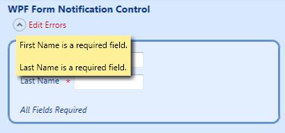
In the above image, the user clicked the Expander control's button which displays the error message text. The First and Last Name fields have not yet been filled in. I stated before that the red asterisks are rendered in the Adorner Layer. The Adorner Layer is above the layer that the controls are rendered on. When I first wrote this FormNotification control, the red asterisks would be displayed on top of the error message text. So I had to move the rendering of the error message text to the Adorner Layer so that it would be on top of the red asterisks in the Adorner Layer.

In the above image, the user has clicked the Expander control's button and the error message text is displayed. Notice that the red asterisk is no longer present near the First Name textbox. The Last Name textbox does have a validation error, so the red asterisk is present.
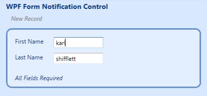
The above image shows the Watermark feature of the FormNotification control. If there are no errors and the user has not yet pressed the Save button, there would be nothing for the control to display. So I added a Watermark feature to provide a default text message. This way, the space below the form title would not be empty. You can use this any way you see fit. You could, for example, display the Watermark message, "New Record Is Ready To Be Saved".
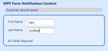
In the above image, the user has just pressed the Save button. The form was valid and the record was written, so the user gets a visual cue indicating success. In this simple application, the NotificationMessage property is set in the Save button's click event. In future articles, I'll show you a technique to data bind this property to the business layer.
The FormNotificaion control provides several methods for implementing it. Your application requirements, business and data layers will determine how you will set its properties; binding, in code, or a combination of both.
FormNotification Control Requirements
- Display error message text in an expandable region.
- Display successful data layer operation message.
- Display watermark message if the above two messages are empty.
- Auto collapse the expanded error message region after the user moves the mouse away from the expanded region.
- Provide property to configure the auto collapse timeout.
- Ensure that the expanded region overlays all controls and their Adorners.
- Ensure that properties of the control can be set by data binding, in code or XAML markup.
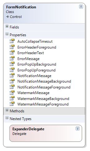
In keeping with good WPF custom control design, I have provided a number of dependency properties to control the behavior of the FormNotification control. The properties are self explanatory.
I didn't supply a Background property for the ErrorHeader because I wanted it to take on the Background of the control. The ErrorHeaderText Foreground is already red by default, and since the ErrorHeaderText will be displayed until the form is valid, I didn't want to add another visual distraction for the user. If you need this, you can easily add it.
FormNotification ControlTemplate
At first glance, the below XAML ControlTemplate for the FormNotification control looks complex. Broken down, it is just a Grid with a Canvas and two TextBlocks. The Grid is a really cool and flexible WPF layout control. If you don't specify multiple rows, the child controls are just stacked on top of each other. The FormNotification control takes advantage of this layout rendering, and uses triggers to alter the Visibility property of the child controls so that only one is visible at any time.
You will notice how the ControlTemplate binds to the control's dependency properties to populate TextBlocks, set colors and visibility.
<ResourceDictionary
  xmlns="http://schemas.microsoft.com/winfx/2006/xaml/presentation"
  xmlns:x="http://schemas.microsoft.com/winfx/2006/xaml"
  xmlns:Core_WPF="clr-namespace:Core.WPF">
  <Style
    TargetType="{x:Type Core_WPF:FormNotification}">
    <Style.Resources>
      <Core_WPF:StringLengthToBooleanConverter
        x:Key="stringLengthToBooleanConverter" />
    </Style.Resources>
    <Setter
      Property="Template">
      <Setter.Value>
        <ControlTemplate
          TargetType="{x:Type Core_WPF:FormNotification}">
          <Grid
            Width="Auto"
            Height="Auto"
            Background="{Binding Path=Background,
            RelativeSource={RelativeSource TemplatedParent}}">
            <Canvas
              x:Name="canvasEntryErrors"
              HorizontalAlignment="Stretch"
              Visibility="Collapsed">
              <Expander
                x:Name="PART_Expander"
                Foreground="{Binding Path=ErrorHeaderForeground,
                  RelativeSource={RelativeSource TemplatedParent}}"
                Header="{Binding Path=ErrorHeaderText,
                  RelativeSource={RelativeSource TemplatedParent}}"
                HorizontalAlignment="Stretch"
                VerticalAlignment="Stretch">
                <Grid
                  Background="{x:Null}" />
              </Expander>
            </Canvas>
            <TextBlock
              Text="{Binding Path=NotificationMessage,
                   RelativeSource={RelativeSource TemplatedParent}}"
              Foreground="{Binding Path=NotificationMessageForeground,
                   RelativeSource={RelativeSource TemplatedParent}}"
              Background="{Binding Path=NotificationMessageBackground,
                   RelativeSource={RelativeSource TemplatedParent}}"
              Margin="5,5,5,5"
              TextWrapping="Wrap"
              x:Name="txtNofificationMessage"
              VerticalAlignment="Center"
              Visibility="Collapsed"
              HorizontalAlignment="Stretch" />

                        <TextBlock
              Text="{Binding Path=WatermarkMessage,
                       RelativeSource={RelativeSource TemplatedParent}}"
              Foreground="{Binding Path=WatermarkMessageForeground,
                            RelativeSource={RelativeSource TemplatedParent}}"
              Background="{Binding Path=WatermarkMessageBackground,
                            RelativeSource={RelativeSource TemplatedParent}}"
              Margin="5,5,5,5"
              TextWrapping="Wrap"
              x:Name="txtWatermarkMessage"
              Visibility="Visible"
              HorizontalAlignment="Stretch"
              FontStyle="Italic" />

                     </Grid>
          <ControlTemplate.Triggers>
            <MultiTrigger>
              <MultiTrigger.Conditions>
                <Condition
                  Property="NotificationMessage"
                  Value="" />
                <Condition
                  Property="ErrorMessage"
                  Value="" />
              </MultiTrigger.Conditions>
              <MultiTrigger.Setters>
                <Setter
                  Property="Visibility"
                  Value="Visible"
                  TargetName="txtWatermarkMessage" />
                <Setter
                  Property="Visibility"
                  Value="Collapsed"
                  TargetName="txtNofificationMessage" />
                <Setter
                  Property="Visibility"
                  Value="Collapsed"
                  TargetName="canvasEntryErrors" />
              </MultiTrigger.Setters>
            </MultiTrigger>
            <MultiDataTrigger>
              <MultiDataTrigger.Conditions>
                <Condition
                  Binding="{Binding Path=ErrorMessage,
                    RelativeSource={RelativeSource Self},
                    Converter={StaticResource stringLengthToBooleanConverter}}"
                  Value="False" />
                <Condition
                  Binding="{Binding Path=NotificationMessage,
                    RelativeSource={RelativeSource Self},
                    Converter={StaticResource stringLengthToBooleanConverter}}"
                  Value="True" />
              </MultiDataTrigger.Conditions>
              <MultiDataTrigger.Setters>
                <Setter
                  Property="Visibility"
                  Value="Collapsed"
                  TargetName="txtWatermarkMessage" />
                <Setter
                  Property="Visibility"
                  Value="Visible"
                  TargetName="txtNofificationMessage" />
                <Setter
                  Property="Visibility"
                  Value="Collapsed"
                  TargetName="canvasEntryErrors" />
              </MultiDataTrigger.Setters>
            </MultiDataTrigger>
            <MultiDataTrigger>
              <MultiDataTrigger.Conditions>
                <Condition
                  Binding="{Binding RelativeSource={RelativeSource Self},
                    Converter={StaticResource stringLengthToBooleanConverter},
                     Path=ErrorMessage}"
                  Value="True" />
              </MultiDataTrigger.Conditions>
              <MultiDataTrigger.Setters>
                <Setter
                  Property="Visibility"
                  Value="Collapsed"
                  TargetName="txtWatermarkMessage" />
                <Setter
                  Property="Visibility"
                  Value="Collapsed"
                  TargetName="txtNofificationMessage" />
                <Setter
                  Property="Visibility"
                  Value="Visible"
                  TargetName="canvasEntryErrors" />
              </MultiDataTrigger.Setters>
            </MultiDataTrigger>
          </ControlTemplate.Triggers>
        </ControlTemplate>
      </Setter.Value>
    </Setter>
  </Style>
</ResourceDictionary>
Triggers
The above ControlTemplate uses three triggers to determine which text message (error, notification, or watermark) gets displayed.
MultiTrigger
This first trigger tests if the NotificationMessage and ErrorMessage properties are empty, and if so, triggers the display of the WatermarkMessage text. MulitTriggers are just like VB.NET If statements with the And operator between conditions.
MultiDataTrigger
Triggers by themselves do not allow developers to test to see if the property value is greater than or less than a certain value. However, by using a ValueConverter, developers can pass in values to the ValueConverter and return a Boolean that can be tested by the trigger.
Have a look at the above second and third triggers. By using a MultiDataTrigger, we can utilize a WPF binding expression that includes a ValueConverter and test the output of the ValueConverter. In the first MultiDataTrigger, we need to test for the condition where the ErrorMessage is empty and the NotificationMessage has a value so that we can display the notification message text.
The StringLengthToBooleanConverter is very simple. It tests if the input String is null or empty, and returns False; otherwise, it returns True. You will want to get comfortable with writing your own ValuteConverters. These simple classes allow you to not only convert data but also to extend the WPF binding system to perform logical operations on data. You can also do other things with converters, as we will see in future articles.
Imports System.ComponentModel
Namespace WPF
<TemplatePart(Name:="PART_Expander", Type:=GetType(Expander))> _
Public Class FormNotification
Inherits System.Windows.Controls.Control
#Region " Declarations "
Private WithEvents _objErrorsExpander As Expander
Private WithEvents _objErrorsExpanderAdornerLayer As AdornerLayer
Private WithEvents _objExpandedTimer As System.Timers.Timer
Private WithEvents _objTextBlockAdorner As TextBlockAdorner
Private Delegate Sub ExpanderDelegate()
#End Region
#Region " Shared Properties "
Public Shared AutoCollapseTimeoutProperty As DependencyProperty = _
DependencyProperty.Register("AutoCollapseTimeout", GetType(Double), _
GetType(FormNotification), New PropertyMetadata(2.0), New _
ValidateValueCallback(AddressOf IsAutoCollapseTimeoutValid))
Public Shared ErrorHeaderForegroundProperty As DependencyProperty = _
DependencyProperty.Register("ErrorHeaderForeground", GetType(Brush), _
GetType(FormNotification), New PropertyMetadata(New SolidColorBrush( _
Color.FromArgb(255, 208, 0, 0))))
Public Shared ErrorHeaderTextProperty As DependencyProperty = _
DependencyProperty.Register("ErrorHeaderText", GetType(String), _
GetType(FormNotification), New PropertyMetadata("Edit Errors"))
Public Shared ErrorMessageProperty As DependencyProperty = _
DependencyProperty.Register("ErrorMessage", GetType(String), GetType( _
FormNotification), New PropertyMetadata(String.Empty, New _
PropertyChangedCallback(AddressOf OnErrorMessageChanged)))
Public Shared ErrorPopUpBackgroundProperty As DependencyProperty = _
DependencyProperty.Register("ErrorPopUpBackground", GetType(Brush), _
GetType(FormNotification), New PropertyMetadata(New SolidColorBrush( _
Color.FromArgb(255, 253, 240, 151))))
Public Shared ErrorPopUpForegroundProperty As DependencyProperty = _
DependencyProperty.Register("ErrorPopUpForeground", GetType(Brush), _
GetType(FormNotification), New PropertyMetadata(New SolidColorBrush( _
Colors.Black)))
Public Shared NotificationMessageBackgroundProperty As DependencyProperty _
= DependencyProperty.Register("NotificationMessageBackground", GetType( _
Brush), GetType(FormNotification), New PropertyMetadata(New _
SolidColorBrush(Colors.LightGray)))
Public Shared NotificationMessageForegroundProperty As DependencyProperty _
= DependencyProperty.Register("NotificationMessageForeground", GetType( _
Brush), GetType(FormNotification), New PropertyMetadata(New _
SolidColorBrush(Colors.Blue)))
Public Shared NotificationMessageProperty As DependencyProperty = _
DependencyProperty.Register("NotificationMessage", GetType(String), _
GetType(FormNotification), New PropertyMetadata(String.Empty, New _
PropertyChangedCallback(AddressOf OnNotificationMessageChanged)))
Public Shared WatermarkMessageBackgroundProperty As DependencyProperty = _
DependencyProperty.Register("WatermarkMessageBackground", GetType( _
Brush), GetType(FormNotification))
Public Shared WatermarkMessageForegroundProperty As DependencyProperty = _
DependencyProperty.Register("WatermarkMessageForeground", GetType( _
Brush), GetType(FormNotification), New PropertyMetadata(New _
SolidColorBrush(Colors.Gray)))
Public Shared WatermarkMessageProperty As DependencyProperty = _
DependencyProperty.Register("WatermarkMessage", GetType(String), _
GetType(FormNotification), New PropertyMetadata(String.Empty))
#End Region
#Region " Properties "
<Category("Custom"), _
Description("Number of seconds the error pop remain...")> _
Public Property AutoCollapseTimeout() As Double
Get
Return CType(GetValue(AutoCollapseTimeoutProperty), Double)
End Get
Set(ByVal value As Double)
SetValue(AutoCollapseTimeoutProperty, value)
If _objExpandedTimer IsNot Nothing Then
_objExpandedTimer.Interval = value
End If
End Set
End Property
<Category("Custom"), _
Description("Error header text foreground brush.")> _
Public Property ErrorHeaderForeground() As Brush
Get
Return CType(GetValue(ErrorHeaderForegroundProperty), Brush)
End Get
Set(ByVal value As Brush)
SetValue(ErrorHeaderForegroundProperty, value)
End Set
End Property
<Category("Custom"), _
Description("Error header text that is displayed when there ...")> _
Public Property ErrorHeaderText() As String
Get
Return CType(GetValue(ErrorHeaderTextProperty), String)
End Get
Set(ByVal value As String)
SetValue(ErrorHeaderTextProperty, value)
End Set
End Property
<Category("Custom"), _
Description("Error message that is displayed in the expander ...")> _
Public Property ErrorMessage() As String
Get
Return CType(GetValue(ErrorMessageProperty), String)
End Get
Set(ByVal value As String)
SetValue(ErrorMessageProperty, value)
End Set
End Property
<Category("Custom"), _
Description("Error message pop up background brush.")> _
Public Property ErrorPopUpBackground() As Brush
Get
Return CType(GetValue(ErrorPopUpBackgroundProperty), Brush)
End Get
Set(ByVal value As Brush)
SetValue(ErrorPopUpBackgroundProperty, value)
End Set
End Property
<Category("Custom"), _
Description("Error message pop up forground brush.")> _
Public Property ErrorPopUpForeground() As Brush
Get
Return CType(GetValue(ErrorPopUpForegroundProperty), Brush)
End Get
Set(ByVal value As Brush)
SetValue(ErrorPopUpForegroundProperty, value)
End Set
End Property
<Category("Custom"), _
Description("Notification message text. If this property is ...")> _
Public Property NotificationMessage() As String
Get
Return CType(GetValue(NotificationMessageProperty), String)
End Get
Set(ByVal value As String)
SetValue(NotificationMessageProperty, value)
End Set
End Property
<Category("Custom"), _
Description("Notification message pop up background brush.")> _
Public Property NotificationMessageBackground() As Brush
Get
Return CType(GetValue(NotificationMessageBackgroundProperty), Brush)
End Get
Set(ByVal value As Brush)
SetValue(NotificationMessageBackgroundProperty, value)
End Set
End Property
<Category("Custom"), _
Description("Notification message pop up foreground brush.")> _
Public Property NotificationMessageForeground() As Brush
Get
Return CType(GetValue(NotificationMessageForegroundProperty), Brush)
End Get
Set(ByVal value As Brush)
SetValue(NotificationMessageForegroundProperty, value)
End Set
End Property
<Category("Custom"), _
Description("Watermark text message. This is displayed if ...")> _
Public Property WatermarkMessage() As String
Get
Return CType(GetValue(WatermarkMessageProperty), String)
End Get
Set(ByVal value As String)
SetValue(WatermarkMessageProperty, value)
End Set
End Property
<Category("Custom"), _
Description("Watermark message pop up background brush.")> _
Public Property WatermarkMessageBackground() As Brush
Get
Return CType(GetValue(WatermarkMessageBackgroundProperty), Brush)
End Get
Set(ByVal value As Brush)
SetValue(WatermarkMessageBackgroundProperty, value)
End Set
End Property
<Category("Custom"), _
Description("Watermark message pop up foreground brush.")> _
Public Property WatermarkMessageForeground() As Brush
Get
Return CType(GetValue(WatermarkMessageForegroundProperty), Brush)
End Get
Set(ByVal value As Brush)
SetValue(WatermarkMessageForegroundProperty, value)
End Set
End Property
#End Region
#Region " Constructor and Initializer "
Shared Sub New()
DefaultStyleKeyProperty.OverrideMetadata(GetType(FormNotification), _
New FrameworkPropertyMetadata(GetType(FormNotification)))
End Sub
Private Sub FormNotification_Initialized(ByVal sender As Object, _
ByVal e As System.EventArgs) _
Handles Me.Initialized
_objExpandedTimer = New System.Timers.Timer(AutoCollapseTimeout * 1000)
_objExpandedTimer.Enabled = False
_objExpandedTimer.AutoReset = False
End Sub
#End Region
#Region " Methods "
Private Sub _objErrorsExpander_Collapsed(ByVal sender As Object, _
ByVal e As System.Windows.RoutedEventArgs) _
Handles _objErrorsExpander.Collapsed
If _objErrorsExpanderAdornerLayer IsNot Nothing Then
_objErrorsExpanderAdornerLayer.Remove(_objTextBlockAdorner)
_objTextBlockAdorner = Nothing
_objErrorsExpanderAdornerLayer = Nothing
End If
End Sub
Private Sub _objErrorsExpander_Expanded(ByVal sender As Object, _
ByVal e As System.Windows.RoutedEventArgs) _
Handles _objErrorsExpander.Expanded
Dim objExpanderGrid As Grid = FindChilden.FindVisualChild(Of Grid)( _
_objErrorsExpander)
_objErrorsExpanderAdornerLayer = AdornerLayer.GetAdornerLayer( _
objExpanderGrid)
Dim txt As New TextBlock
txt.Text = Me.ErrorMessage
txt.Padding = New Thickness(5)
txt.Foreground = Me.ErrorPopUpForeground
txt.Background = Me.ErrorPopUpBackground
txt.BitmapEffect = New _
System.Windows.Media.Effects.DropShadowBitmapEffect
Dim obj As New TranslateTransform(5, _objErrorsExpander.ActualHeight + 2)
txt.RenderTransform = obj
_objTextBlockAdorner = New TextBlockAdorner(objExpanderGrid, txt)
_objErrorsExpanderAdornerLayer.Add(_objTextBlockAdorner)
End Sub
Private Sub _objErrorsExpander_MouseEnter(ByVal sender As Object, _
ByVal e As System.Windows.Input.MouseEventArgs) _
Handles _objErrorsExpander.MouseEnter
_objExpandedTimer.Stop()
End Sub
Private Sub _objErrorsExpander_MouseLeave(ByVal sender As Object, _
ByVal e As System.Windows.Input.MouseEventArgs) _
Handles _objErrorsExpander.MouseLeave
If _objExpandedTimer.Interval > 0 Then
_objExpandedTimer.Start()
End If
End Sub
Private Sub _objExpandedTimer_Elapsed(ByVal sender As Object, _
ByVal e As System.Timers.ElapsedEventArgs) _
Handles _objExpandedTimer.Elapsed
Dispatcher.Invoke(Windows.Threading.DispatcherPriority.Normal, New _
ExpanderDelegate(AddressOf CloseExpander))
End Sub
Private Sub _objTextBlockAdorner_MouseEnter(ByVal sender As Object, _
ByVal e As System.Windows.Input.MouseEventArgs) _
Handles _objTextBlockAdorner.MouseEnter
_objExpandedTimer.Stop()
End Sub
Private Sub _objTextBlockAdorner_MouseLeave(ByVal sender As Object, _
ByVal e As System.Windows.Input.MouseEventArgs) _
Handles _objTextBlockAdorner.MouseLeave
If _objExpandedTimer.Interval > 0 Then
_objExpandedTimer.Start()
End If
End Sub
Private Sub CloseExpander()
If _objErrorsExpander IsNot Nothing AndAlso _
_objErrorsExpander.IsExpanded Then
_objErrorsExpander.IsExpanded = False
End If
End Sub
Private Shared Sub OnErrorMessageChanged(ByVal d As DependencyObject, _
ByVal e As DependencyPropertyChangedEventArgs)
Dim obj As FormNotification = DirectCast(d, FormNotification)
If Not String.IsNullOrEmpty(e.NewValue.ToString) Then
obj.NotificationMessage = String.Empty
End If
obj.CloseExpander()
End Sub
Private Shared Sub OnNotificationMessageChanged(ByVal d As DependencyObject, _
ByVal e As DependencyPropertyChangedEventArgs)
DirectCast(d, FormNotification).CloseExpander()
End Sub
Public Shared Function IsAutoCollapseTimeoutValid(ByVal value As Object) _
As Boolean
Dim dbl As Double = CType(value, Double)
If dbl < 0 OrElse dbl > 100 Then
Return False
Else
Return True
End If
End Function
Public Overrides Sub OnApplyTemplate()
MyBase.OnApplyTemplate()
_objErrorsExpander = CType(GetTemplateChild("PART_Expander"), Expander)
End Sub
#End Region
End Class
End Namespace
For the most part, the FormNotification control is a good number of dependency properties. There are some parts of the code that need to be reviewed and explained.
Accessing Controls in the ControlTemplate
The <TemplatePart(Name:="PART_Expander", Type:=GetType(Expander))> attribute that decorates the FormNotification class is used by GUI designers like Blend. It also provides a way for developers to document the controls in the ControlTemplate that will be accessed from within the class code of the control. Note the use of the "PART_" naming convention that I covered in the first article of this series.
If a control will be accessed in code, developers typically will declare a class level variable of the same Type as the TemplatePart. The class level variable will be set in the OnApplyTemplate method like this:
_objErrorsExpander = CType(GetTemplateChild("PART_Expander"), Expander)
When designing your custom controls, you must make a decision as to what happens if the TemplatePart is missing from the ControlTemplate. You might ask, "How can this happen?" Remember that consumers of your control can restyle it and do what they want, just like you have done with a Button or another control. For this control, I have decided that the PART_Expander must be present and it must be an Expander control. I do this by not catching any exceptions from the OnApplyTemplate method and letting them bubble up.
Displaying the ErrorMessage in the Adorner Layer
I have a blog post, WPF Sample Series - Expander Control With Popup Content that explains how to make the Expander control open and overlay controls as opposed to shifting them down. When I used that control in this project, I found that the Validation.ErrorTemplate error cues were displaying over top of the Expander popup. So I had to move the error message text into the Adorner Layer, which requires code.
If you look back at the FormNotification ControlTemplate, you will notice that the Expander control has one child, an empty Grid with no children. Since we are going to be rendering in the Grid's Adorner Layer, there is no need to have child controls inside the Grid.
I learned a lot about rendering text in the Adorner Layer from Josh Smith's blog post, Rendering Text in the Adorner Layer, and in fact, I am using his TextBlockAdorner class in this project.
The _objErrorsExpander_Expanded event handler fires when the user presses the Expanders button. It is here that we need to perform a little bit of work.
The Dim objExpanderGrid As Grid = FindChilden.FindVisualChild(Of Grid)(_objErrorsExpander) code uses the Generic helper function FindVisualChild to locate the Grid that is a child of the Expander control in the Visual Tree. This is a good use of Generics to allow any dependency object to be discovered inside any other dependency object. We need a reference to the Grid control so that we can render the error message text in its Adorner Layer.
Next we need a reference to the Grid control's Adorner Layer. We get it with this code: _objErrorsExpanderAdornerLayer = AdornerLayer.GetAdornerLayer(objExpanderGrid). You will notice that this Adorner Layer reference is stored at class level. This is done so that we can remove the Adorner Layer at a later time.
Next, the TextBlock control is created and properties set. By setting the Padding property and adding a DropShadowBitmapEffect, we make the TextBlock look like a popup or ToolTip. You could add a Border and or expose other properties to change the look of the popup TextBlock if you need them.
When the Expander opens, we want the popup to be below and indented slightly right of the Expander content. I moved the TextBlock 5 device independent pixels to the right and down the ActualHeight of the Expander plus 2.
This is accomplished with a TranslateTransform object like so: Dim obj As New TranslateTransform(5, _objErrorsExpander.ActualHeight + 2). This object is then applied to the TextBlock in the form of a RenderTransform with this code: txt.RenderTransform = obj. At this point, we have a completed TextBlock that has been moved relative to where it will be placed, we just need to place it.
This is where we will use the TextBlockAdorder class from Josh's blog post. This class derives from Adorner. We create a new one, passing in a reference to the Grid and TextBlock we have constructed with this code: _objTextBlockAdorner = New TextBlockAdorner(objExpanderGrid, txt).
We can now add the new Adorner to the Adorner Layer with this code: _objErrorsExpanderAdornerLayer.Add(_objTextBlockAdorner), and the error message text appears as a popup.
Removing the ErrorMessage from the Adorner Layer
Anytime the Expander control is collapsed, the Adorner will be removed from the Adorner Layer and all class level variables involved in this process set to Nothing. The _objErrorsExpander_Collapsed event handler fires each time the Expander is collapsed.
The Expander is collapsed when the user clicks on the Expander button when it's expanded. The control also collapses the Expander when either the ErrorMessage or NotificationMessage properties are set. These properties trigger the closing in case the user leaves the popup expanded and goes back to working on the form and the ErrorMessage changes or they save a record.
Both the ErrorMessage and NotificationMessage dependency properties have PropertyChangedCallback assigned in the dependency property registration. This callback gets executed when the dependency property is changed using the class property accessors (CLR wrapper for property setter) or when changed directly by using the SetValue method. I want to thank Josh Smith for backing me up on this change I made to the article; his comments to me are in the article comments below.
The Expander can also be collapsed automatically. When the user's mouse leaves the boundary of the Expander and the popup TextBlock, a Timer starts. The Timer.Interval property is set to the FormNoficication.AutoCollapseTimeout value. When the Timer is started and the Timer.Interval is reached, the Timer.Elapsed event fires and the code below in the _objExpandedTimer_Elapsed event handler executes:
Dispatcher.Invoke(Windows.Threading.DispatcherPriority.Normal, _
           New ExpanderDelegate(AddressOf CloseExpander))
WPF uses the STA threading model. Other threads like the Timer are not allowed to directly set properties on UI controls. WPF provides a very simple pattern for other application threads to access UI controls. The Dispatcher is like a Windows Message Pump, except that it only affects the application that it is running in. In the above code, we have instructed the Dispatcher to invoke a delegate method. Since the Dispatcher runs on the WPF application UI thread and is invoking the delegate CloseExpander method, that method will execute properly. The CloseExpander method collapses the Expander if it is expanded. It is the collapsing of the Expander that triggers the Adorer clean up code.
You should have a look at the Dispatcher in general and the Windows.Threading.DispatcherPriority Enum. For example, you can use the above pattern to run code when the application is idle or is in the background. Yes, you read this correctly. You can start a background thread with one line of code in WPF.
System.ComponentModle.IDataErrorInfo Interface
Error - Gets an error message indicating what is wrong with this object.Item - Gets the error message for the property with the given name.
If you want codeless form validation for your controls, your business entity objects need to implement IDataErrorInfo. The Microsoft SDK Team released this article, Data Validation in 3.5 that explains the basics. It takes about 3 minutes to read and understand. Sacha and Josh have good articles on data binding. View Sacha's Data Binding article here. View Josh's Data Binding article here. I recommend you have a look at both of these articles.
I have supplied a demo class called Customer. This class implements the IDataErrorInfo and INotifyPropertyChange interfaces. Please do not copy or use the code from this class. This simple throw away demo code does not represent a very good way to implement data validation logic in your business entity classes. This class is here to provide a method for wiring up the FormNotification control for this demo only. Also, your business entity classes should derive from a class that actually implements these interfaces. No need to add extra code to all your business entity classes when it can be encapsulated in a common base class.
In a future article, I will show you how to implement declarative validation in your business entity objects that is all contained in a base class that any business entity object can derive from.
The read-only IDataErrorInfor.Item property parameter is the property name to validate. If no errors are present, then an empty or null string is returned. If errors are present, a String with the errors should be returned. I have a bone to pick with many implementations of IDataErrorInfo that I have seen. That the code only returns the first error instead of all the errors on the property. When designing your own implementation of IDataErrorInfo, ensure that you return a String that lists all the errors on the property and not just the first one.
The timing when the WPF 3.5 data binding system reads the Item property through the IDataErrorInfo interface is based on the way the binding of the object has been set up. The options are to validate each time the property changes, when focus is lost on the control or explicitly.
For this series, we will be performing validation when focus is lost. One reason for validating on LostFocus is so that we can format the output of the text using the declarative programming in the business layer I've been speaking about. For example, I have a high octane text formatting function that will alter the text case or format of the input text without any code on the developer's part. Just apply an attribute to the entity object property, and along with validating the text, it will be formatted and text case set.
Let's have a look at the XAML markup for the two TextBox controls:
<TextBox Width="100" Grid.Column="1" HorizontalAlignment="Left"
    Margin="5,5,0,5" x:Name="txtFirstName"
    Text="{Binding Path=FirstName, Mode=TwoWay, UpdateSourceTrigger=LostFocus,
      ValidatesOnDataErrors=True}" ToolTip="Enter customers first name."  />

<TextBox Width="100" Grid.Column="1" HorizontalAlignment="Left"
    Margin="5,5,0,5" x:Name="txtLastName" Grid.Row="1"
    Text="{Binding Path=LastName, Mode=TwoWay, UpdateSourceTrigger=LostFocus,
    ValidatesOnDataErrors=True}" ToolTip="Enter customers last name." />
The binding statement is familiar to all WPF developers. What is new to WPF 3.5 is the ValidatesOnDataErrors property. This property is actually a shortcut for cleaner XAML markup. Here is the explanation from the MSDN help file topic:
Setting this property provides an alternative to using the DataErrorValidationRule element explicitly. The DataErrorValidationRule is a built-in validation rule that checks for errors that are raised by the IDataErrorInfo implementation of the source object. If an error is raised, the binding engine creates a ValidationError with the error and adds it to the Validation.Errors collection of the bound element. The lack of an error clears this validation feedback, unless another rule raises a validation issue.
Bottom line, you just change your current binding statements by adding this new ValidatesOnDataErrors property and you now have data entry validation; providing the business object implements the IDataErrorInfo interface. Since most business objects derive from a class other than Object, in other words, they derive from a base class, adding support for this interface to your current projects should be painless.
Customer Business Object
As I've stated before, the Customer class is coded so that we can demo the FormNotification control. This is not how you should implement business rules in your classes.
When the Item property is read, the property name is compared to the simple rules and a validation result is returned for that property.
When the Error property is read, it returns a string that represents all the validation errors on the object.
Public Class Customer
  Implements INotifyPropertyChanged
  Implements IDataErrorInfo

  ...
  ...

Default Public ReadOnly Property Item(ByVal strPropertyName As String) As String _
                          Implements System.ComponentModel.IDataErrorInfo.Item
    Get

      Return Me.CheckProperties(strPropertyName)
    End Get
  End Property

Public ReadOnly Property [Error]() As String _
                  Implements System.ComponentModel.IDataErrorInfo.Error
    Get
      Return Me.CheckProperties(String.Empty)
    End Get
End Property

Private Function CheckProperties(ByVal strPropertyName As String) As String

    Dim strResult As String = String.Empty

    If String.IsNullOrEmpty(strPropertyName) OrElse _
        String.Compare(strPropertyName, "FirstName", True) = 0 Then

      If String.IsNullOrEmpty(_strFirstName) Then
        strResult = "First Name is a required field."
      End If
    End If

    If String.IsNullOrEmpty(strPropertyName) OrElse _
        String.Compare(strPropertyName, "LastName", True) = 0 Then
      If String.IsNullOrEmpty(_strLastName) Then

        If strResult.Length <> 0 Then
          strResult += vbCrLf & vbCrLf
        End If

        strResult += "Last Name is a required field."
      End If
    End If

    Return strResult

End Function
These are the basics for setting up a WPF form that binds to a business entity object.
PartTwo UserControl Code
As previously stated, the forms in this business application are constructed of UserControls that are the Content of a TabItem control. In this simple demo form, the UserControl is very simple, and does not derive from a base class, nor is part of an MVC or similar architecture. In future articles, the UserControls that make up the forms will all derive from a base class that will implement common code. This is especially true of command bindings and the MDI plumbing.
In this simple demo code, you'll notice that I'm creating a new Customer object. This is not a good practice to have the UI constructing business entity objects. This code is here to provide a shell for the FormNotification control demo.
Partial Public Class PartTwo
#Region " Declarations "
Private _objCustomer As Customer
#End Region
#Region " Constructor & Loaded "
Public Sub New()
InitializeComponent()
End Sub
Private Sub PartTwo_Loaded(ByVal sender As Object, _
ByVal e As System.Windows.RoutedEventArgs) _
Handles Me.Loaded
If Me.DataContext Is Nothing Then
NewRecord()
Me.txtFirstName.Focus()
End If
End Sub
#End Region
#Region " Methods "
Private Sub btnNew_Click(ByVal sender As Object, _
ByVal e As System.Windows.RoutedEventArgs) _
Handles btnNew.Click
NewRecord()
End Sub
Private Sub btnSave_Click(ByVal sender As Object, _
ByVal e As System.Windows.RoutedEventArgs) _
Handles btnSave.Click
UpdateFocusedField()
If _objCustomer.IsValid Then
Me.frmNotification.NotificationMessage = "Customer record saved"
End If
End Sub
Private Sub NewRecord()
Me.frmNotification.NotificationMessage = String.Empty
_objCustomer = New Customer()
Me.DataContext = _objCustomer
End Sub
Private Sub UpdateFocusedField()
Dim fwE As FrameworkElement = _
TryCast(Keyboard.FocusedElement, FrameworkElement)
If fwE IsNot Nothing Then
Dim expression As BindingExpression = Nothing
If TypeOf fwE Is TextBox Then
expression = fwE.GetBindingExpression(TextBox.TextProperty)
End If
If expression IsNot Nothing Then
expression.UpdateSource()
End If
End If
End Sub
#End Region
End Class
IDataErrorInfo Bindings and the ToolBar Gotcha!
What I'm about to explain is a serious gotcha in WPF. This only happens with Buttons hosted in a ToolBar object. If you move the same ToolBar Button out of the ToolBar control, this problem does not raise its ugly head. Trust me, I'm thinking about ditching the ToolBar container just so I don't have to deal with this.
The data binding system validates the TextBox control when the TextBox control loses focus. OK, no problem. That's how we set up the TextBox binding behavior, to update on LostFocus.
If you enter some text in a TextBox and then press one of the ToolBar Buttons, the TextBox that has focus will not validate, nor will it update the business entity object it is bound to. It took me a while to figure out what was going on. Other developers had the same problem, so I confirmed that I wasn't crazy.
This is where the UpdateFocusedField method comes into play. In this demo application, the method is called when the Save button is clicked. This method forces the binding system to update its source, which forces the validation code to execute.
All of this code will be moved to a common base class and all command event handlers will run this code. But you need to know what is going on and that there is a solution for this issue.
NotificationMessage
In the btnNew_Click event handler, if the Customer object IsValid method returns True the FormNotification.NotificationMessage is displayed. In future articles, I'll show you how to bind this property to the business object that handles the interaction logic for the form. MVC calls this the Controller class.
PartTwo UserControl XAML Markup
<UserControl>
    <AdornerDecorator>
        <DockPanel>
        ..
        ...
        ...
        </DockPanel>
    </AdornerDecorator>
</UserControl>
Persisting the Adorner Layer as Different TabItems are Selected
There is an undesirable Adorner Layer behavior that occurs when switching the selected TabItem. I have blogged about this here: WPF Validation Errors Disappear Inside TabControl when Switching TabItems.
If you have a form that has some validation errors and then you switch to another TabItem and then switch back, the validation error cues would no longer be displayed. This is not a bug. The Adorner Layer is just not visible any more after switching TabItems. Remember, the Adorner Layer is where the validation error cues are displayed. To get around this behavior, just wrap the form content in an AdornerDecorator as in the above code and the validation cues will remain visible when you return back to this TabItem.
Skins and a TextBox ControlTemplate
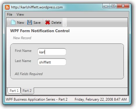
The above image is the Metallic skin. Check out the TextBoxes, they have rounded corners. To accomplish this, I added a new ControlTemplate to the Metallic skin resource dictionary for the TextBox class that adds rounded corners to the TextBox. Open the MetallicResourceDictionary.xaml file and look for the TextBox ControlTemplate. You will notice that I have wrapped the default TextBox control in a Border control.
The PartTwo.xaml file has no special markup. When the skin is changed, all controls begin using the ControlTemplates from the selected skin file.
Take a close look at the border around the form controls. Its BorderThickness is 1. In the Office Blue skin, the same border has a BorderThickness of 3.
These subtle changes between skins are a demonstration of altering Styles and ControlTemplates between skin files to achieve the look your application requires.
Close
I hope that you got something from this article in the WPF Business Application Series and that you have seen some of WPF's potential for writing great business applications.
In addition to this Business Application Series, I also have a WPF Sample Series on my blog. I post several WPF sample applications a month. I won't be posting every sample here on CodeProject, but you can still read them and download the code from my blog.
Have a great day!
History
- 22 Feb. 2008: Initial release.
- 23 Feb. 2008: Added
PropertyChangedCallbacks to the NotificationMessage and ErrorMessage dependency properties. Updated article and code.
- 2 Apr. 2008: Updated the list of articles in this series.
