Introduction
This article describes the creation of a gradient Shape and an inherited Label control. For information on how to create a Control, check out the article "Divider Panel - A tutorial on creating a custom Windows Forms Control from Start to Toolbox" by Furty.
In .NET, there are many classes and interfaces for painting and manipulating graphics and text. The book of Charles Petzold "Programming Microsoft Windows with C#" has a good explanation of many useful methods for development in GDI+.
The Shape Source Code
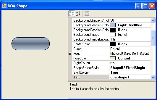
Shape Properties
The Shape has seven added properties:
BackgroundGradientColor1 - First background gradient color BackgroundGradientColor2 - Second background gradient color BackgroundGradientAngle - Background gradient angle SwirlColors - Swirl/twist colors in background gradient Radius - Radius of rounded borders ShapeBorderStyle - Style of the border to be drawn around the control BorderColor - Color of the border to be drawn around the control
Shape Methods
The Shape has four simple methods: OnPaint, DrawShapeBackground, DrawBorder and GetPath.
This is the OnPaint method.
protected override void OnPaint(PaintEventArgs e)
{
SmoothingMode sm = e.Graphics.SmoothingMode;
e.Graphics.SmoothingMode = SmoothingMode.AntiAlias;
DrawShapeBackground(e.Graphics);
if (_borderStyle == ShapeBorderStyles.ShapeBSFixedSingle)
DrawBorder(e.Graphics);
e.Graphics.SmoothingMode = sm;
}
This is the DrawShapeBackground method.
private void DrawShapeBackground(Graphics g)
{
Rectangle rect = this.ClientRectangle;
rect.X++;
rect.Y++;
rect.Width -= 2;
rect.Height -= 2;
GraphicsPath path = GetPath(rect, _radius);
using (LinearGradientBrush br =
new LinearGradientBrush(rect, _color1, _color2, _angle))
{
br.GammaCorrection = true;
if (_swirlColors)
br.SetBlendTriangularShape(.5f, .75f);
br.WrapMode = WrapMode.Tile;
g.FillPath(br, path);
}
Region rgn = new Region(path);
this.Region = rgn;
}
This is the DrawBorder method.
private void DrawBorder(Graphics g)
{
    Rectangle rect = this.ClientRectangle;
    rect.X++;
    rect.Y++;
    rect.Width -= 3;
    rect.Height-= 3;
    using (GraphicsPath bp = GetPath(rect, _radius))
    {
        using (Pen p = new Pen(_borderColor))
        {
            g.DrawPath(p, bp);
        }
    }
}
And this is the GetPath method.
protected GraphicsPath GetPath(Rectangle rc, int r)
{
int x = rc.X, y = rc.Y, w = rc.Width , h = rc.Height ;
r = r << 1;
GraphicsPath path = new GraphicsPath();
if (r > 0)
{
if (r > h) { r = h; };
if (r > w) { r = w; };
path.AddArc(x, y, r, r, 180, 90);
path.AddArc(x + w - r, y, r, r, 270, 90);
path.AddArc(x + w - r, y + h - r, r, r, 0, 90);
path.AddArc(x, y + h - r, r, r, 90, 90);
path.CloseFigure();
}
else
{
path.AddRectangle(rc);
}
return path;
}
The Label Source Code

We use the Shape as the base for the new Label control.
public partial class DOALabel : DOAShape
Label Properties
We add seven new properties:
Text - The text associated with the control Font - The font used to display text in the control Forecolor - The foreground color of this component, which is used to display the text TextAlign - Text alignment (Left, Right or Center), only with Moving None Moving - Text Moving (None, RightToLeft, DownToUp, LeftToRight, UpToDown) MovingActive - Activate text movement DimmedColor - Dims the text color when the mouse is passing over the control
For the Text, Font and ForeColor properties, we override the base properties.
public override string Text
{
    get { return base.Text; }
    set { base.Text = value ; this.Invalidate(); }
}

public override Font Font
{
    get { return base.Font; }
    set { base.Font = value; this.Invalidate(); }
}

public override Color ForeColor
{
    get { return base.ForeColor; }
    set { base.ForeColor = value; this.Invalidate(); }
}
Label Methods
This component uses a timer to update and invalidate the Draw event OnPaint.
private void timer1_Tick(object sender, System.EventArgs e)
{
    this.Update();
    this.Invalidate();
}
OnPaint calls the base class and the DrawText method.
protected override void OnPaint(PaintEventArgs pe)
{
base.OnPaint(pe);
iRect = base.ClientRectangle;
DrawText(pe);
}
This is DrawText method.
protected void DrawText(PaintEventArgs pe)
{
pe.Graphics.TextRenderingHint = TextRenderingHint.AntiAlias;
SizeF sz = pe.Graphics.MeasureString(base.Text, base.Font);
switch (_moving)
{
case MoveType.None:
NoMove();
break;
case MoveType.RightToLeft:
MoveRightToLeft();
break;
case MoveType.DownToUp:
MoveDownToUp();
break;
case MoveType.LeftToRight:
MoveLeftToRight();
break;
case MoveType.UpToDown:
MoveUpToDown();
break;
}
txtRect = new Rectangle(this.pointX, this.pointY,
(int)sz.Width + 1, (int)sz.Height);
Brush brText = new SolidBrush(base.ForeColor);
Brush brTextDimmed = new SolidBrush(_dimmedColor);
if (_isSelected)
pe.Graphics.DrawString(base.Text,
base.Font,
brTextDimmed,
txtRect);
else
pe.Graphics.DrawString(base.Text,
base.Font,
brText,
txtRect);
}
The methods NoMove(), MoveRigntToLeft(), MoveDownToUp(), MoveLeftToRight() and MoveUpToDown()update, for each MoveType, the coordinates of the text rectangle.
protected void NoMove()
{
switch (_textAlign)
{
case TextAlignment.Left:
pointX = (int)this.iRect.X;
break;
case TextAlignment.Center:
pointX = (this.iRect.Width - this.txtRect.Width ) / 2;
break;
case TextAlignment.Right:
pointX = (this.iRect.Width - this.txtRect.Width);
break;
}
pointY = (this.iRect.Height - this.txtRect.Height) / 2;
}
protected void MoveRightToLeft()
{
if (pointX < -this.txtRect.Width)
{
pointX = this.iRect.X + this.iRect.Width;
}
else
{
pointX -= 2;
}
pointY = ( this.iRect.Height - this.txtRect.Height) / 2;
}
protected void MoveDownToUp()
{
pointX = (this.iRect.Width - this.txtRect.Width) / 2;
if (pointY < -this.txtRect.Height)
{
pointY = (int)this.iRect.Y + this.iRect.Height;
}
else
{
pointY -= 2;
}
}
protected void MoveLeftToRight()
{
if (pointX > this.iRect.X + this.iRect.Width)
{
pointX = this.iRect.X - this.txtRect.Width;
}
else
{
pointX += 2;
}
pointY = (this.iRect.Height - this.txtRect.Height) / 2;
}
protected void MoveUpToDown()
{
pointX = (this.iRect.Width - this.txtRect.Width) / 2;
if (pointY > this.iRect.Y + this.iRect.Height)
{
pointY = (int)this.iRect.Y - this.iRect.Height;
}
else
{
pointY += 2;
}
}
If the mouse is passing over the text, it will be dimmed. For that, we use the events OnMouseEnter and OnMouseLeave.
protected override void OnMouseEnter(EventArgs e)
{
    base.OnMouseEnter(e);
    _isSelected = true;
    this.Invalidate();
}

protected override void OnMouseLeave(EventArgs e)
{
    base.OnMouseLeave(e);
    _isSelected = false;
    this.Invalidate();
}
History
- 01/03/2007 First Version
- 15/05/2007 Second Version
- 23/08/2007 Third Version
- Better border management
- The missing last character bug was fixed (alandgraf@gmx.at)
- The code was simplified
This member has not yet provided a Biography. Assume it's interesting and varied, and probably something to do with programming.


 General
  News
News  Suggestion
  Question
  Bug
Bug  Answer
  Joke
Joke  Praise
  Rant
Rant  Admin
Admin 


 Submit an article or tip


