Introduction
In the modern Web Development world, it is very important to provide program solutions that support Responsive Web Design. What is this Responsive Web Design? This is a web site design when your web page should look good on different devices with different solutions. The web site must look good on the desktop computer, laptop, tablet and phone.
One of the techniques to perform the task is to use CSS3 media queries.
Background
The example is an ASP.NET Web Application written in Visual Studio 2013.
Media Queries is a CSS3 module allowing HTML rendering which works in all screen resolution (for example, on smartphone screen and on computer screen). It is a cornerstone technology of Responsive web design.
My aim in this project is to support different screens resolutions for my small site: 1024px, 768px, 480px. For example, 1024px resolution for the desktop computer, 768px for iPad and 480px for the smartphone.
Using the Code
In the solution, I used ASP.NET Web Application with MVC template.
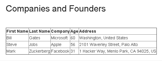
Let us start by creating a simple HTML table in the Index.cshtml, the first page loaded from the site's solution.
<table border="1">
    <tr>
        <th class="un_first">
            First Name
        </th>
        <th>
            Last Name
        </th>
        <th>
            Company
        </th>
        <th class="un_age">
            Age
        </th>
        <th class="un_address">
            Address
        </th>
    </tr>
    <tr>
        <td class="un_first">
            Bill
        </td>
        <td class="un">
            Gates
        </td>
        <td class="un">
            Microsoft
        </td>
        <td class="un_age">
            60
        </td>
        <td class="un_address">
            Washington, United States
        </td>
</tr>
    <tr>
        <td class="un_first">
            Steve
        </td>
        <td>
            Jobs
        </td>
        <td>
            Apple
        </td>
        <td class="un_age">
            56
        </td>
        <td class="un_address">
            2101 Waverley Street, Palo Alto
        </td>
    </tr>
    <tr>
        <td class="un_first">
            Mark
        </td>
        <td>
            Zuckerberg
        </td>
        <td>
            Facebook
        </td>
        <td class="un_age">
            31
        </td>
        <td class="un_address">
            1 Hacker Way, Menlo Park, CA 94025, US
        </td>
    </tr>
</table>
After that, it is needed to create .css file with media queries definitions:
@media (max-width:1024px) {
	.un_address{
		display:none;
	}
}

@media (max-width:768px) {
	.un_age{
		display:none;
	}
}

@media (max-width:500px) {
	.un_first{
		display:none;
	}
}
The explanation of the CSS file is as follows:
- first
@media rule: if the browser window is smaller than 1024px, the .un_address css class will be applied. - second
@media rule: if the browser window is smaller than 768px, the .un_age css class will be applied. - third
@media rule: if the browser window is smaller than 500px, the .un_first css class will be applied.
The display: none definition in the CSS means that the HTML element will be hidden.
I defined the first column in the HTML table with CSS class un_first:
<td class="un_first">
The age HTML table column with CSS class un_age:
<td class="un_age">
The address column with CSS class un_address:
<td class="un_address">
Thus, if the screens resolution will be 1024px or more pixels, the user will see all the columns of the table.

If the screens resolution will be smaller than 1024px, the address column will be hidden.

If the screen's resolution will be smaller than 768px, the age column will be hidden.

If the screen will be smaller than 500px, the First Name column will be hidden.

Points of Interest
.NET, .NET Infrastructure, ASP.NET MVC, WEB, HTML/CSS, JavaScript, jquery, Angular, Database, PL-SQL.
History
- 3rd December, 2015: Initial version
