Introduction
ColorSlider is a slider/trackbar control written in C# (Windows Form).
This is an alternative to the standard Microsoft Visual Studio trackbar control which is not so flexible, lacks basic functionalities and is a little poor in design.
The code is a free interpretation of the original code from Michal Brylka published in the site Code Project.
See https://www.codeproject.com/Articles/17395/Owner-drawn-trackbar-slider
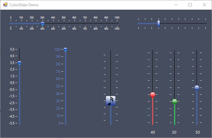
The main enhancements brought by this control are:
- A less surface
- The possibility to parametrize the shape of the thumb or to replace it by an image
- Subdivisions added between main divisions
- The text value of the main divisions
- Many colors parametrization added (ticks, bar, elapsed)
- The orientation can be horizontal and vertical (starting from the bottom)
Using the Code
The control is drawn in the overridden event OnPaint, depending on if it is enabled or not, and if the mouse is over it or not.
- If not enabled, the colors are desaturated
- If the mouse is over, the colors are lighten
- Else, the colors are those chosen in the property box
Depending on these colors, the function DrawColorSlider is called and draws everything.
3 rectangles are mainly used to draw the control:
barRect is used to draw the bar (Elapsed and remaining)thumbRect is used to draw the thumbelapsedRect is the rectangle for the elapsed bar (the left of the thumb if the orientation is horizontal)
The elapsed bar is composed of 3 single lines (inner, top and bottom), having each its own color:
e.Graphics.DrawLine(new Pen(elapsedInnerColorPaint, 1f), x1, y1, x2, y2);
Top and bottom lines are drawn 1 pixel above or under the inner line. A vertical line of 3 pixels is added at the beginning to improve the 3D effect.

The rest of the bar is also composed of 3 single lines (inner, top and bottom), each having its own color.
A vertical line of 3 pixels is added at the end to improve the 3D effect.
The thumb is drawn according to whether it is an image or not:
- Image:
e.Graphics.DrawImage(bmp, thumbRect, srceRect, GraphicsUnit.Pixel); - Drawn by the control, with a linear gradient,
e.Graphics.DrawPath(thumbPen, thumbPath);
The ticks and texts are drawn in two nested loops:
- A first loop from
0 to ScaleDivision for the main graduations and texts - A nested loop from
0 to ScaleSubDivision for the subdivisions
The offset between each tick is a multiple of W/(nbticks -1) where:
W is the width of the bar, minus the width of the thumb, in order that when the thumb is at minimum position or maximum position, the graduation coincides with the middle of the thumbnbticks is the number of graduations including subdivisions: nbticks = 1 + _scaleDivisions * (_scaleSubDivisions + 1);
Properties
| Thumb | |
ThumbSize | The size of the thumb (Width, Height) allowing you to make circles or rectangles |
ThumbCustomShape | Gets or sets the thumb custom shape. Use ThumbRect property to determine bounding rectangle |
ThumbRoundRectSize | Gets or sets the size of the thumb round rectangle edges |
BorderRoundRectSize | Gets or sets the size of the border round rect |
DrawSemitransparentThumb | Gets or sets a value indicating whether to draw semitransparent thumb |
ThumbImage | Gets or sets a specific image used to render the thumb |
| Appearance | |
Orientation | Gets or sets the orientation of the Slider (Horizontal or vertical) |
DrawFocusRectangle | Gets or sets a value indicating whether to draw focus rectangle |
MouseEffects | Gets or sets whether mouse entry and exit actions have impact on how the control looks |
Padding | Gets or Sets the margins inside the control (left & right if horizontal and bottom & top if vertical) to display the ticks with large numbers |
| Values | |
Value | Gets or sets the value of Slider |
Minimum (0) | Gets or sets the minimum value (decimal & negative values) |
Maximum (100) | Gets or sets the maximum value (decimal & negative values) |
SmallChange | Gets or sets trackbar's small change. It affects how to behave when directional keys are pressed |
LargeChange | Gets or sets trackbar's large change. It affects how to behave when PageUp/PageDown keys are pressed. |
MouseWheelBarPartitions | Gets or sets the mouse wheel bar partitions |
| Colors | |
ThumbOuterColor | Gets or sets the thumb outer color |
ThumbInnerColor | Gets or sets the inner color of the thumb |
ThumbPenColor | Gets or sets the color of the thumb pen |
BarInnerColor | Gets or sets the inner color of the bar |
BarPenColorTop | Gets or sets the top color of the bar |
BarPenColorBottom | Gets or sets the bottom color of the bar |
ElapsedPenColorTop | Gets or sets the top color of the elapsed |
ElapsedPenColorBottom | Gets or sets the bottom color of the elapsed |
ElapsedInnerColor | Gets or sets the inner color of the elapsed |
TickColor | Gets or sets the color of the graduations |
| Preformatted colors | |
ColorSchema | 3 predefined color schemas are proposed (red, green, blue). The colors can be changed manually and they overwrite them. |
| Ticks | |
TickStyle | Gets or sets where to display the ticks (None, both top-left, bottom-right) |
ScaleDivisions | Gets or sets the number of intervals between minimum and maximum |
ScaleSubDivisions | Gets or sets the number of subdivisions between main divisions of graduation |
ShowSmallScale | Shows or hides subdivisions of graduations |
ShowDivisionsText | Show or hide text value of main graduations |
TickDivide | float) Gets or sets a value used to divide the graduations (ex: ticks in grams and graduations in kilograms with TickDivide = 1000) |
TickAdd | (float) Gets or sets a value added to the graduations (ex: T(°C) = T(K) - 273.15) |
| Font | |
Font | Gets or sets the text font of the graduations |
ForeColor | Gets or sets the text color of the graduations |
Events
Two events are available:
Typical usage of ValueChanged event:
private void colorSlider1_ValueChanged(object sender, EventArgs e)
 {
     label1.Text = colorSlider1.Value.ToString();
 }
Points of Interest
This project was developed with Visual Studio version 2017.
So, as you see, nothing very difficult in this control.
You just have to draw lines and calculate precisely where they start and where they end...
This simple control shows that with a few efforts we can design a control with beautiful effects. The difficulty in reality is not technical, but it consists of choosing the right assortment of colors.

