Introduction
Background property is a single extension point when it comes to control color scheme. Alternative colors (for mouse hover, selection, disabled state) are often hardcoded in control template. One has to make a Template copy to change them.
Recently, when I was working on WPF styles pack for my personal project (codename RetroUI), I wanted to make them reusable in the way that people who don't like my choice of default colors don't have to copy full control template. Additionally, I didn't want to create derived controls (e.g. CustomButton : Button) with an extended set of properties.
Using the Code
To avoid code duplication, I created reusable attached dependency properties: changing one style setter is simpler than copying a template. The set of attached properties includes pair of Background and Foreground brushes for Alternative, Selected and Disabled control states. The difference in their implementation is only in their class name.
public static class Alt
{
    #region Background
    public static readonly DependencyProperty BackgroundProperty =
              DependencyProperty.RegisterAttached("Background", typeof(Brush),
              typeof(Alt), new PropertyMetadata(null));

    public static Brush GetBackground(DependencyObject obj)
    {
        return (Brush)obj.GetValue(Alt.BackgroundProperty);
    }

    public static void SetBackground(DependencyObject obj, Brush value)
    {
        obj.SetValue(Alt.BackgroundProperty, value);
    }
    #endregion

    #region Foreground
    public static readonly DependencyProperty ForegroundProperty =
              DependencyProperty.RegisterAttached("Foreground", typeof(Brush),
              typeof(Alt), new PropertyMetadata(null));

    public static Brush GetForeground(DependencyObject obj)
    {
        return (Brush)obj.GetValue(Alt.ForegroundProperty);
    }

    public static void SetForeground(DependencyObject obj, Brush value)
    {
        obj.SetValue(Alt.ForegroundProperty, value);
    }
    #endregion
}
Then I created style setters for these properties and used them in a template in a theme resource dictionary:
<SolidColorBrush x:Key="RetroBlue" Color="#00a0a0"/>
<SolidColorBrush x:Key="RetroGreen" Color="#00a000"/>
<SolidColorBrush x:Key="RetroSilver" Color="#c0c0c0"/>
<Style TargetType="{x:Type Button}">
<Setter Property="Background" Value="{StaticResource RetroGreen}"/>
<Setter Property="retroUi:Alt.Background" Value="Black"/>
<Setter Property="retroUi:Disabled.Background" Value="{StaticResource RetroSilver}"/>
<Setter Property="BorderBrush" Value="{x:Null}"/>
<Setter Property="Foreground"
Value="{DynamicResource {x:Static SystemColors.ControlTextBrushKey}}"/>
<Setter Property="HorizontalContentAlignment" Value="Center"/>
<Setter Property="VerticalContentAlignment" Value="Center"/>
<Setter Property="Padding" Value="4,2"/>
<Setter Property="Template">
<Setter.Value>
<ControlTemplate TargetType="{x:Type Button}">
<Grid>
<Grid.ColumnDefinitions>
<ColumnDefinition Width="8" MaxWidth="8"/>
<ColumnDefinition/>
<ColumnDefinition Width="8" MaxWidth="8"/>
</Grid.ColumnDefinitions>
<Grid.RowDefinitions>
<RowDefinition Height="8"/>
<RowDefinition MinHeight="8"/>
<RowDefinition Height="8"/>
</Grid.RowDefinitions>
<Rectangle x:Name="PART_Shadow"
Fill="{Binding Path=(retroUi:Alt.Background),
RelativeSource={RelativeSource TemplatedParent}}"
Grid.Row="1" Grid.RowSpan="2"
Grid.Column="1" Grid.ColumnSpan="2"/>
<Border x:Name="border"
Grid.Row="0" Grid.RowSpan="2"
Grid.Column="0" Grid.ColumnSpan="2"
Background="{TemplateBinding Background}"
SnapsToDevicePixels="true">
<ContentPresenter x:Name="contentPresenter" Focusable="False"
HorizontalAlignment="{TemplateBinding HorizontalContentAlignment}"
VerticalAlignment="{TemplateBinding VerticalContentAlignment}"
Margin="{TemplateBinding Padding}"
RecognizesAccessKey="True"
SnapsToDevicePixels="{TemplateBinding SnapsToDevicePixels}"/>
</Border>
</Grid>
<ControlTemplate.Triggers>
<Trigger Property="IsPressed" Value="true">
<Setter TargetName="border" Property="Grid.Column" Value="1"/>
<Setter TargetName="PART_Shadow" Property="Opacity" Value="0"/>
</Trigger>
<Trigger Property="IsEnabled" Value="false">
<Setter TargetName="border" Property="Background"
Value="{Binding Path=(retroUi:Disabled.Background),
RelativeSource={RelativeSource TemplatedParent}}"/>
</Trigger>
</ControlTemplate.Triggers>
</ControlTemplate>
</Setter.Value>
</Setter>
</Style>
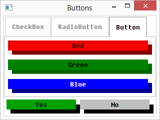
Now I can chose different brushes for Background and Alt.Background, e.g.:
<UniformGrid Columns="1">
	<Button Content="Red" Margin="5"
	Background="Red" retroUi:Alt.Background="DarkRed"/>
	<Button Content="Green" Margin="5"
	Background="Green" retroUi:Alt.Background="DarkGreen"/>
	<Button Content="Blue" Foreground="White" Margin="5"
	Background="Blue" retroUi:Alt.Background="DarkBlue"/>
</UniformGrid>

Credits
Thomas Levesque first described a solution with attached properties in his blog-post and used a term "parametrized styles". I have learnt that trick from him ("parametrized templates" sounds more precise in my opinion). My contribution here is a separate brush per control state (Alt.Background, Selected.Background, Disabled.Background) which can be widely applicable (even if some controls don't need all these brushes) and easily remembered.
