Attention, Microsoft released a Sliding SplitView through the UWP Toolkit thus making this article Obsolete.
UWP and Blend provide some of the simplest and nicest designing tools out there, they make designing accessible and easy so you can focus your time on coding. But when it comes to small little designing tips and tricks, there aren't really that many resources out there.
Background
In this article, I will show you how to implement a sliding Splitview. At the time of writing this, there isn't a built in way to achieve such a thing.
Using the Code
Tested on VS2017 Windows10 SDK 15063, but will probably work on other versions too.
First, you start by creating a SplitView and positioning it in such a way that it fills the entire Page.
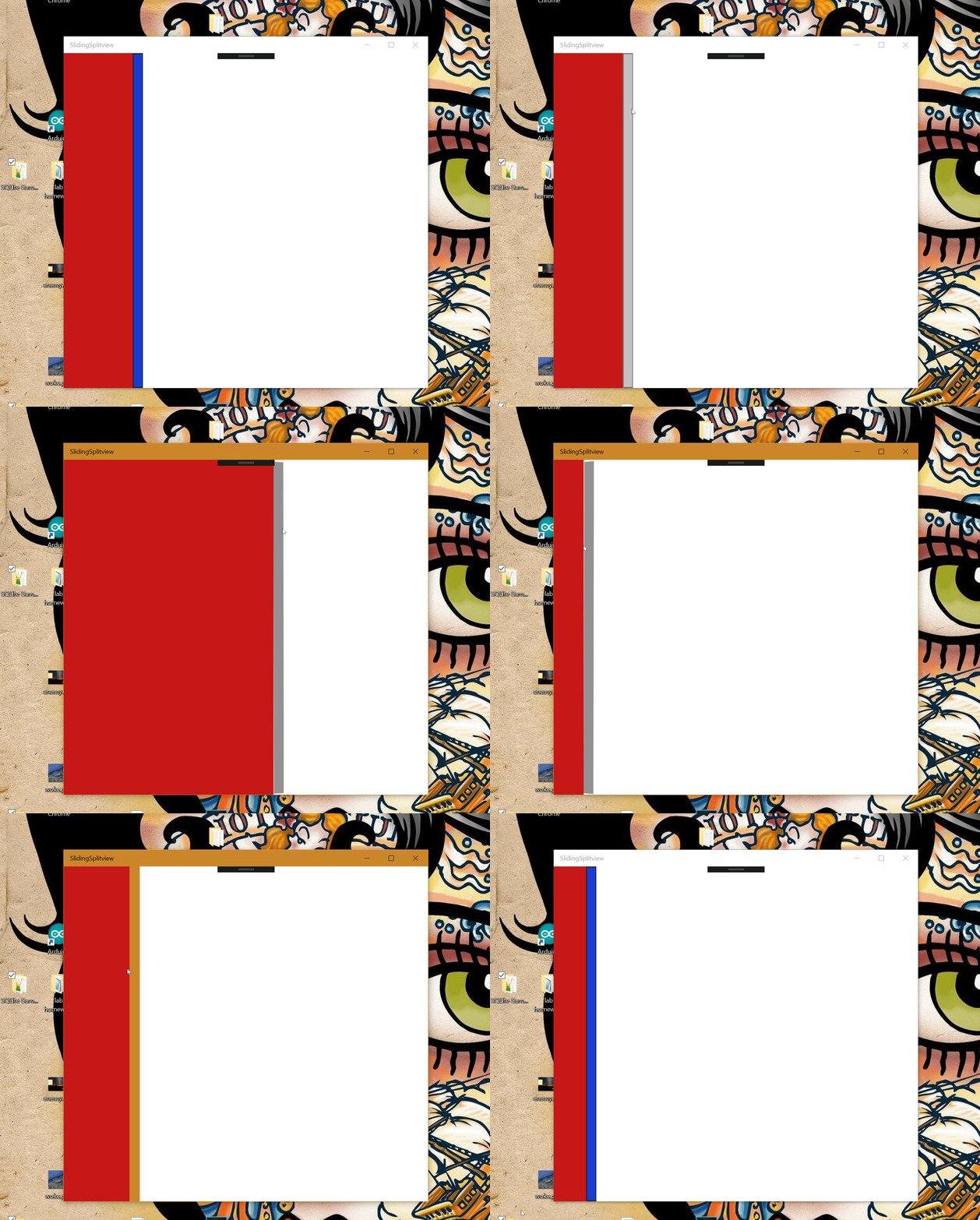
On the pane, you should add a Red grid and a blue Toggle button, while on the content a white grid, coloring is just for clarity reason.
The toggle button works as a sliding enabler, when it's pressed, it will "try" to follow the mouse when it moves to either side of the Splitview, the toggle button doesn't move itself, it's the Pane that constantly changes length thus achieving our goal.
Here is what the main page code should look like after adding some names and event listeners that will be used on the next step.
    x:Class="SlidingSplitview.MainPage"
    xmlns="http://schemas.microsoft.com/winfx/2006/xaml/presentation"
    xmlns:x="http://schemas.microsoft.com/winfx/2006/xaml"
    xmlns:local="using:SlidingSplitview"
    xmlns:d="http://schemas.microsoft.com/expression/blend/2008"
    xmlns:mc="http://schemas.openxmlformats.org/markup-compatibility/2006"
    mc:Ignorable="d">

    <Grid Background="{ThemeResource ApplicationPageBackgroundThemeBrush}">
        <SplitView x:Name="MySplitview" DisplayMode="Inline"  IsPaneOpen="True"
              CompactPaneLength="50" OpenPaneLength="150" Grid.Row="1">
            <SplitView.Pane>
                <Grid Background="#FFF6F2F2">
                    <Grid.ColumnDefinitions>
                        <ColumnDefinition Width="*"/>
                        <ColumnDefinition Width="auto"/>
                    </Grid.ColumnDefinitions>
                    <Grid Background="#FFC61818"
                    PointerMoved="MovingInPane"></Grid>
                    <ToggleButton x:Name="Slider"
                    Grid.Column="1" HorizontalAlignment="Stretch"
                    VerticalAlignment="Stretch"  Width="19"
                    Background="#FF183CD4" BorderBrush="#FF2B2424" />
                </Grid>
            </SplitView.Pane>
            <SplitView.Content>
                <Grid Grid.Column="2"  Height="Auto"
                Width="Auto" Grid.Row="1"
                Margin="1,0,-1,0" PointerMoved="Moving_In_Content">
                    <Grid.Background>
                        <ImageBrush Stretch="Fill"/>
                    </Grid.Background>
                </Grid>
            </SplitView.Content>
        </SplitView>

    </Grid>
</Page>
The next step is to add the code for the two Mousemoved event listeners to the underlying .cs file, each of those guys will trigger a displacement to the splitview pane, until the Sliderbutton catches up and stops them from triggering further, the sliding mechanism depends on the Slider's toggle state.
private void MovingInPane(object sender, PointerRoutedEventArgs e)
{
PointerPoint z = e.GetCurrentPoint(Slider);
double b = z.Position.X;
if ((Boolean)Slider.IsChecked)
{
MySplitview.OpenPaneLength = MySplitview.OpenPaneLength + b;
}
}
private void Moving_In_Content(object sender, PointerRoutedEventArgs e)
{
PointerPoint z = e.GetCurrentPoint(Slider);
double b = z.Position.X;
if ((Boolean)Slider.IsChecked)
{
MySplitview.OpenPaneLength += (b * 2 / 4);
}
}
This is what it looks like:

recorded using Sharex.
The full project solution has been included for download at the top of this tip.
Points of Interest
- This handle type of Sliding is not the most effective when used with a mouse, but I think it has its merits when you consider all the different ways you can interact with such an app, anything from touch and pen to game controllers, can be supported under the
Pointer events. - Movement of cursor above
Textboxes and some other controls is not tracked, thus preventing the sliding from working in case they are positioned in such a way to fill one of the partitions of the SplitView, you can always get around that by making them invisible while dragging.
History
- 22nd August, 2017: Posted
- 9th October, 2017: Obsolescence
