Introduction
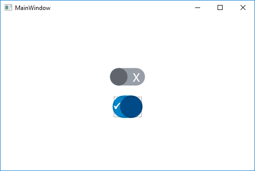
I was working on a project, and there was a switch type on/off Control. I had trouble porting the Control to another project to be used in a Style and was never really happy with it since it was not designed to be easily resized, so I decided to build a new one. There were a number of challenges to overcome since I wanted to be able to animate. Of course, after all the work, I had trouble with the storyboarding (help please).
The Style
The following is the Style I created:
<Style x:Key="SwitchTypeToggleButton"
TargetType="{x:Type ToggleButton}">
<Style.Resources>
<Color x:Key="Color.Additional.LightGrey">#989EA8</Color>
<Color x:Key="Color.Additional.MediumGrey">#61656B</Color>
<Color x:Key="Color.MedtronicBranding.MedtronicBlue">#004B87</Color>
<Color x:Key="Color.MedtronicBranding.CobaltBlue">#0085CA</Color>
<Style x:Key="ToggleButtonContentTextbox"
TargetType="TextBlock">
<Setter Property="HorizontalAlignment" Value="Stretch" />
<Setter Property="VerticalAlignment" Value="Stretch" />
</Style>
<SolidColorBrush x:Key="ToggleButtonFalseBackground"
Color="{StaticResource Color.Additional.LightGrey}" />
<SolidColorBrush x:Key="ToggleButtonTrueBackground"
Color="{StaticResource Color.MedtronicBranding.CobaltBlue}" />
<SolidColorBrush x:Key="ToggleButtonFalseForeground"
Color="{StaticResource Color.Additional.MediumGrey}" />
<SolidColorBrush x:Key="ToggleButtonTrueForeground"
Color="{StaticResource Color.MedtronicBranding.MedtronicBlue}" />
<TextBlock x:Key="OffContent"
Style="{StaticResource ToggleButtonContentTextbox}"
Text="Off" />
<Style x:Key="OnContentControl"
TargetType="ContentControl">
<Setter Property="HorizontalAlignment" Value="Center" />
<Setter Property="HorizontalContentAlignment" Value="Center" />
<Setter Property="Template">
<Setter.Value>
<ControlTemplate>
<TextBlock FontFamily="Wingdings 2"
FontSize="24"
FontWeight="Bold"
Foreground="White"
Style="{StaticResource ToggleButtonContentTextbox}"
Text="P" />
</ControlTemplate>
</Setter.Value>
</Setter>
<Setter Property="VerticalAlignment" Value="Center" />
<Setter Property="VerticalContentAlignment" Value="Center" />
</Style>
<Style x:Key="OffContentControl"
TargetType="ContentControl">
<Setter Property="HorizontalAlignment" Value="Center" />
<Setter Property="HorizontalContentAlignment" Value="Center" />
<Setter Property="Template">
<Setter.Value>
<ControlTemplate>
<TextBlock FontSize="24"
Foreground="White"
Style="{StaticResource ToggleButtonContentTextbox}"
Text="X" />
</ControlTemplate>
</Setter.Value>
</Setter>
<Setter Property="VerticalAlignment" Value="Center" />
<Setter Property="VerticalContentAlignment" Value="Center" />
</Style>
</Style.Resources>
<Setter Property="Template">
<Setter.Value>
<ControlTemplate TargetType="{x:Type ToggleButton}">
<Grid x:Name="MainRow">
<Grid>
<Grid.ColumnDefinitions>
<ColumnDefinition Width="{Binding ElementName=TopRow,
Path=ActualHeight}" />
<ColumnDefinition />
<ColumnDefinition Width="{Binding ElementName=TopRow,
Path=ActualHeight}" />
</Grid.ColumnDefinitions>
<Grid.RowDefinitions>
<RowDefinition x:Name="TopRow" />
<RowDefinition />
</Grid.RowDefinitions>
<Ellipse x:Name="BackgroundEllipse1"
Grid.RowSpan="2"
Grid.Column="0"
Grid.ColumnSpan="3"
Width="{Binding ElementName=MainRow,
Path=ActualHeight}"
Height="{Binding ElementName=MainRow,
Path=ActualHeight}"
HorizontalAlignment="Left"
Fill="{StaticResource ToggleButtonTrueBackground}" />
<Ellipse x:Name="BackgroundEllipse2"
Grid.Row="0"
Grid.RowSpan="2"
Grid.Column="0"
Grid.ColumnSpan="3"
Width="{Binding ElementName=MainRow,
Path=ActualHeight}"
Height="{Binding ElementName=MainRow,
Path=ActualHeight}"
HorizontalAlignment="Right"
Fill="{StaticResource ToggleButtonFalseBackground}" />
<Border x:Name="BackgroundBorder"
Grid.Row="0"
Grid.RowSpan="2"
Grid.Column="1"
Background="{StaticResource ToggleButtonTrueBackground}" />
</Grid>
<Grid HorizontalAlignment="Stretch">
<Grid.ColumnDefinitions>
<ColumnDefinition x:Name="AnimationWidth" />
<ColumnDefinition Width="{Binding ElementName=MainRow,
Path=ActualHeight}" />
</Grid.ColumnDefinitions>
<Border x:Name="AnimationSizeBorder"
Grid.Column="0" />
<ContentControl Grid.Column="0"
Style="{StaticResource OnContentControl}" />
</Grid>
<Grid HorizontalAlignment="Stretch">
<Grid.ColumnDefinitions>
<ColumnDefinition Width="{Binding ElementName=MainRow,
Path=ActualHeight}" />
<ColumnDefinition />
</Grid.ColumnDefinitions>
<ContentControl Grid.Column="1"
Style="{StaticResource OffContentControl}" />
</Grid>
<Grid Background="Transparent">
<StackPanel HorizontalAlignment="Left"
Orientation="Horizontal">
<Border Width="{Binding ElementName=AnimationSizeBorder,
Path=ActualWidth}" />
<Ellipse x:Name="ForegroundEllipse"
Width="{Binding ElementName=MainRow,
Path=ActualHeight}"
Height="{Binding ElementName=MainRow,
Path=ActualHeight}"
HorizontalAlignment="Right"
Fill="{StaticResource ToggleButtonTrueForeground}" />
</StackPanel>
</Grid>
</Grid>
<ControlTemplate.Triggers>
<Trigger Property="IsChecked" Value="False">
<Setter TargetName="BackgroundBorder" Property="Background"
Value="{StaticResource ToggleButtonFalseBackground}" />
<Setter TargetName="ForegroundEllipse" Property="Fill"
Value="{StaticResource ToggleButtonFalseForeground}" />
<Setter TargetName="AnimationSizeBorder" Property="Width" Value="0" />
</Trigger>
</ControlTemplate.Triggers>
</ControlTemplate>
</Setter.Value>
</Setter>
</Style>
It uses a number of Grid controls overlaid. The bottom most creates the rectangle with the rounded ends, and consists of two Ellipse controls and a Border, the Ellipse Height and Width are controlled by the ActualHeight of the control, and the Grid below it consisting of two rows and three columns, the row Height being used to control the width of the left and right columns. This is needed to properly place the Border below. The two Ellipse controls are above the Border control between them so that their Brush does not need to be changed when the background changes as the ToggleButton IsChecked value changes. Only the Brush of the Border between them changes.
The two Grid controls above this grid are used to determine the width of the ContentControl controls to the left and right that display the appropriate text for the IsChecked property's true and false states. One Grid contains the true state text and the other the false state text. Since the size is controlled by a ColumnDefinition GridLength, it was not possible to directly set the ContentControl Width through Binding.
Finally, the top most Grid contains a StackPanel with a Border that is collapsed to move the foreground Ellipse to its left that is the same size as the other Ellipse controls that form the background.
The Trigger for the ControlTemplate changes the Background Brush of the Border on the bottom most Grid, the Fill Brush of the Ellipse on the top most Grid, and the location of size of the Border on the top most Grid so as to move the top most Ellipse the right or left side.
All for the brushes used for the foreground and background and the content (text) for the true and false states are specified within the Resources of the Style so that they can be easily customized.
You will notice that I use a ContentControl for the text that is displayed for the true and false conditions with a Template that contains the text. This is because if I just specified a TextBlock, the first instance of the control would not contain this content if another instance is displayed.
Using the Code
Using this Style is like using any Style:
<ToggleButton Width="70"
              Height="35"
              Margin="10"
              Style="{StaticResource SwitchTypeToggleButton}" />

Notes
I was originally going to animate the control, but had trouble getting the animation to work, and it really seemed like it was unnecessary since the eye was effectively fooled anyway (the original control had a 200 millisecond animation, which is so short).
This right now only works horizontally, and would be best if it would change orientation, but just did not seem like it was worth the effort since I have mostly seen only horizontal switches, and I only needed horizontal for my application.
History
- 03/19/2018: Initial version
