Introduction
There are times when there could be a number of RadioButton/ToggleButton/CheckBox controls, and after the containing Control loses Visibility, it is desirable that they return to a default state. This can be done usually in the associated ViewModel, but it could be easier just to have the controls reset automatically, sort of like when you initially create a View, then any contained control derived from ToggleButton is false unless the ViewModel has set it to true, and the ViewModel will also have the default of false for any property, including those associated with a IsChecked property.
Note:
This behavior is really intended for the case where all contained ToggleButton derived controls have thier IsChecked set to false when the parent container has a Visibility changed to false. It has the ability to change this behavior for some ToggleButton controls to be set to to any of its IsChecked values. If most the ToggleButton derived controls will not be set to false, then a different behavior should be used.
The Behavior
The following is the C# code for the behavior:
public class ResetToggleButtonContentOnVisibilityChangedBehavior
{
public enum State { Disabled, Enabled, EnabledDeep }
public enum DefaultValues { Unset, True, False, Indeterminate}
public static State GetState(DependencyObject obj)
{
return (State)obj.GetValue(StateProperty);
}
public static void SetState(DependencyObject obj, State value)
{
obj.SetValue(StateProperty, value);
}
public static readonly DependencyProperty StateProperty =
DependencyProperty.RegisterAttached("State",
typeof(State), typeof(ResetOnVisibilityChangedBehavior),
new UIPropertyMetadata(OnStatePropertyChanged));
private static void OnStatePropertyChanged(DependencyObject d,
DependencyPropertyChangedEventArgs e)
{
var element = (FrameworkElement)d;
if ((State)e.NewValue != State.Disabled)
element.IsVisibleChanged += ElementOnIsVisibleChanged;
else
element.IsVisibleChanged -= ElementOnIsVisibleChanged;
}
public static DefaultValues GetDefaultValue(DependencyObject obj)
{
return (DefaultValues)obj.GetValue(DefaultValueProperty);
}
public static void SetDefaultValue(DependencyObject obj, DefaultValues value)
{
obj.SetValue(DefaultValueProperty, value);
}
public static readonly DependencyProperty DefaultValueProperty =
DependencyProperty.RegisterAttached("DefaultValue",
typeof(DefaultValues), typeof(ResetOnVisibilityChangedBehavior),
new PropertyMetadata(DefaultValues.Unset));
private static void ElementOnIsVisibleChanged(object sender,
DependencyPropertyChangedEventArgs dependencyPropertyChangedEventArgs)
{
var dependencyObject = (UIElement)sender;
if (!(bool)dependencyPropertyChangedEventArgs.NewValue)
{
var toggleButtons = GetState(dependencyObject) == State.Enabled
? FindImmediateVisualChildren<ToggleButton>(dependencyObject).ToList()
: FindVisualChildren<ToggleButton>(dependencyObject).ToList();
toggleButtons.ForEach(i => i.IsChecked = SetToggleButtonDefault(i));
}
}
private static bool? SetToggleButtonDefault(ToggleButton toggleButton)
{
switch (GetDefaultValue(toggleButton))
{
case DefaultValues.Unset:
case DefaultValues.False:
return false;
case DefaultValues.True:
return true;
default:
return null;
}
}
#region private static
private static IEnumerable<T> FindVisualChildren<T>(DependencyObject root)
where T : DependencyObject
{
if (root != null)
for (int i = 0; i < VisualTreeHelper.GetChildrenCount(root); i++)
{
DependencyObject child = VisualTreeHelper.GetChild(root, i);
if (child is T variable) yield return variable;
foreach (T childOfChild in FindVisualChildren<T>(child))
yield return childOfChild;
}
}
private static IEnumerable<T> FindImmediateVisualChildren<T>(DependencyObject root)
where T : DependencyObject
{
if (root != null)
for (int i = 0; i < VisualTreeHelper.GetChildrenCount(root); i++)
{
DependencyObject child = VisualTreeHelper.GetChild(root, i);
if (child is T variable) yield return variable;
}
}
#endregion
}
There are two DependencyProperty definitions. The State DependencyProperty sets how this behavior functions:
Disabled: does nothing
Enabled: Will work against any Control derived from ToggleButton that is a direct Child of the Control this behavior is attached to.
EnabledDeep: Will work against any Control derived from ToggleButton that is any level of Child under the Control this behavior is attached to.
The DefaultValue DependencyProperty is used to change the IsChecked value of each specific Control derived from ToggleButton is set to when the Visibility changes. This can be True, False, or Indeterminate (used to set IsChecked property to true, false, and null respectively). The default value if this property is not set is false.
The event handler for its DependencyProperty changed event, OnStatePropertyChanged, adds the method ElementOnIsVisibleChanged to the IsVisibleChanged event (or removes it if set to State is set to Disabled). When the e.NewValue part of the ElementOnIsVisibleChanged DependencyPropertyChangedEventArgs argument is not set to true, then the containing Control's VisualChildren are searched for any instances derived from ToggleButton, For each Togglebutton, if the ToggleButton does not have an attached DefaultValue DependencyProperty, then its IsChecked property set to false, otherwise the IsChecked is set to the value according to the DefaultValue DependencyProperty.
I have included the private method FindVisualChildren nad FindImmediateVisualChildren in the behavior for portability, but more than likely would want to put this code in a separate class within the solution for utility code.
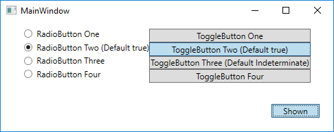
The Sample
To use the sample, you just have to click the ToggleButton on the Window so that RadioButton and ToggleButton controls within a Grid to which this behavior is attached are visible, then can select any of these controls to any value, and when Visibility is again Visible, then the controls will be at their default (or false) values. Hide and show the RadioButton controls using the ToggleButton.

Using the Code
Using this behavior is like any other behavior, the behavior is included in the XAML for the parent or grandparent, or any other ancestor Control containing RadioButton and Togglebutton controls. Its Enable property just has to be set to Enabled:
        <Grid HorizontalAlignment="Center"
              VerticalAlignment="Center"
              local:ResetToggleButtonContentOnVisibilityChangedBehavior.State="Enabled"
              Visibility="{Binding ElementName=ToggleButton,
                                   Path=IsChecked,
                                   Converter={local:IsTrueConverter},
                                   ConverterParameter=Visible:Hidden}">
            <Grid.ColumnDefinitions>
                <ColumnDefinition />
                <ColumnDefinition />
            </Grid.ColumnDefinitions>
            <Grid.RowDefinitions>
                <RowDefinition />
                <RowDefinition />
                <RowDefinition />
                <RowDefinition />
            </Grid.RowDefinitions>
            <RadioButton Content="RadioButton One" />
            <ToggleButton Grid.Row="0"
                          Grid.Column="1"
                          Content="ToggleButton One" />
            <RadioButton Grid.Row="1"
                         Grid.Column="0"
                         local:ResetToggleButtonContentOnVisibilityChangedBehavior.DefaultValue="True"
                         Content="RadioButton Two (Default true)" />
            <ToggleButton Grid.Row="1"
                          Grid.Column="1"
                          local:ResetToggleButtonContentOnVisibilityChangedBehavior.DefaultValue="True"
                          Content="ToggleButton Two (Default true)"
                          IsThreeState="True" />
            <RadioButton Grid.Row="2"
                         Grid.Column="0"
                         Content="RadioButton Three" />
            <ToggleButton Grid.Row="2"
                          Grid.Column="1"
                          local:ResetToggleButtonContentOnVisibilityChangedBehavior
				.DefaultValue="Indeterminate"
                          Content="ToggleButton Three (Default Indeterminate)"
                          IsThreeState="True" />
            <RadioButton Grid.Row="3"
                         Grid.Column="0"
                         Content="RadioButton Four" />
            <ToggleButton Grid.Row="3"
                          Grid.Column="1"
                          Content="ToggleButton Four"
                          IsThreeState="True" />
        </Grid>
History
This is a major update to a previous tip: WPF Behavior to Reset RadioButtons on VisibilityChanged. It also recognizes that the behavior actually works with more that RadioButtons since it works with anything that is derived from ToggleButton.
It adds the following functionality to the previous version
- It can be configured to only search for direct Children, of all Children.
- A different default value can be specified for each ToggleButton derived Control.
Versions:
- 04/27/2018: Initial version

