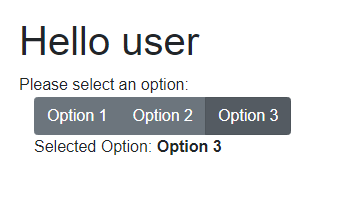
Toggle Button Groups are based on checkboxes shown as buttons in different states. This allows users to choose between different options and see what option is currently selected.


Introduction
Bootstrap is a popular CSS Framework for developing responsive and mobile-first websites. It is included into the Visual Studio Blazor templates and can easily be used in Blazor. But the Toggle Button Groups based on radio buttons normally requires JavaScript. This article shows how to use without JavaScript.
A simple sample for such a group is:

<div class="btn-group btn-group-toggle" data-toggle="buttons">
  <label class="btn btn-secondary active">
    <input type="radio" name="options"
    id="option1" autocomplete="off" checked> Active
  </label>
  <label class="btn btn-secondary">
    <input type="radio" name="options"
    id="option2" autocomplete="off"> Radio
  </label>
  <label class="btn btn-secondary">
    <input type="radio" name="options"
    id="option3" autocomplete="off"> Radio
  </label>
</div>
See this link for more information on the CSS and HTML definition.
Defining a Data Template
As the first step, we define a data Template, holding the shown options, the currently selected options and as specialty a method used in razor syntax to modify the class attribute.
public class ToggleGroupInfo
{
	public String[] Options { get; set; }
	public String SelectedOption { get; set; }

	public String GetActive(String option)
	{
		return option == SelectedOption ? "active" : "";
	}
}
GetActive is a very special method, only if the option is the selected one, it returns "active", what is the CSS class name required by the active element. So this can be used in the razor file to extend "active" CSS class to the class tag on the active button.
This is a basic principle in Blazor in case you need to define a CSS class depending on some runtime variables.
Defining the Razor Component
The second step is to define the botton group:
<div class="btn-group btn-group-toggle" data-toggle="buttons">
    @foreach(var optionName in GroupInfo.Options)
        {
            <label class="btn btn-secondary @GroupInfo.GetActive(optionName)">
                <input type="radio" name="options" autocomplete="off"
                checked="@(GroupInfo.SelectedOption == optionName)"
                @onchange="()=>GroupInfo.SelectedOption = optionName"> @optionName
            </label>
        }
</div>
So we use the HTML syntax from the sample and loop through all options. In the class attribute of the label, we use our defined method 'GetActive' to add "active" only to the active button. For checked, we directly use a compare between optionName and current SelectedOption, that is changed in the onchange event. One last thing is missing the Property in the component holding the information.
@code {
    [Parameter]
    public Data.ToggleGroupInfo GroupInfo { get; set; }
}
Using the Code
Just define a ToggleGroupInfo and set it as the GroupInfo property.
<div class="container">
    <div class="row">
        <div class="col col-6">
            <ToggleButtonGroup.Pages.Components.ToggleGroup
            GroupInfo="@group"></ToggleButtonGroup.Pages.Components.ToggleGroup>
        </div>
        <div class="col col-6">
            </div>
        </div>
    </div>

@code{
    Data.ToggleGroupInfo group = new Data.ToggleGroupInfo()
    {
        Options = new string[] { "Option 1", "Option 2", "Option 3" }
    };
}
Enhance the Code
In case the view needs to be changed with changing the selected option, it is helpful to enhance the ToggleGroupInfo class to implement INotifyPropertyChanged. After this, you may add the usage to the code to reload:
    protected override void OnInitialized()
    {
        group.PropertyChanged += Status_PropertyChanged;
    }

    private void Status_PropertyChanged
    (object sender, System.ComponentModel.PropertyChangedEventArgs e)
    {
        InvokeAsync(StateHasChanged);
    }
So my sample looks like:

Basic Principles
Use a method that returns null or a CSS class name is a basic principle in Blazor in case you need to define a CSS class depending on some runtime variables.
History
- 15th April, 2021: Initial version
