Introduction
In the previous tutorial, we learnt:
- How to write data to an Excel file through Matlab?
- How to insert an Excel formula through Matlab?
- How to insert an image into an Excel sheet through Matlab?
- How to read data from an Excel File through Matlab?
As a follow-up to these articles, we will learn how to insert an Chart into Excel Sheet through Matlab. At the end of this tutorial, you will learn how to open an Microsoft
Excel file, insert a chart, name the chart and the axes.
Steps
Step 1: The first step is to create a COM server which runs the Excel Application.
Excel = actxserver('Excel.Application');
This assumes that the Excel Application is installed in your system. If Excel is not installed, this statement will give an error.
You can put the above statement within a try-catch block:
try
        Excel = actxserver('Excel.Application');
catch
        Excel = [];
end
Step 2: In this step, we will open an Excel file “ResultFile.xls” in the current directory.
ResultFile = [pwd '\ResultFile.xls'];
Workbook = invoke(Excel.Workbooks,'Open', ResultFile);
Step 3: By default, the visibility of the Excel file is set to FALSE. You can make the Excel file visible using the command:
set(Excel,'Visible',1);
Example
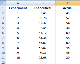
The above steps remain same for all the programs in Matlab dealing Microsoft Excel files. Let us assume, we have recorded some readings
from an experiment. (See the attached screenshot). We have conducted 15 iterations. We have 2 set of readings from the experiment. Theoretical and actual reading.
We will see, how to plot these data as a function of the iteration value.

The attached screenshot shows the chart generated in Microsoft Excel. We will see in this tutorial, how to programmatically create such a chart through Matlab.

Add a new chart
The first step is to add the chart in the "ExperimentSheet". So, we are adding a new chart and we are going to rename the chart as "ExperimentChart".
This can be done using the following code :
Chart = Excel.ActiveSheet.Shapes.AddChart;
%Let us Rename this chart to 'ExperimentChart'
Chart.Name = 'ExperimentChart';
Delete the default entries in the chart :
By default, Excel chart would plot taking data from all the available non-empty columns. So, let us delete all the entries in the chart and start with an empty chart.
So, first we need to select the chart 'ExperimentChart'. Since we have only 3 columns of data, we need to call the
invoke(Series,'Delete') thrice.
%% Delete Default Entries
% Let us delete all the entries in the chart generated by defalut

ExpChart = Excel.ActiveSheet.ChartObjects('ExperimentChart');
ExpChart.Activate;
try
	Series = invoke(Excel.ActiveChart,'SeriesCollection',1);
	invoke(Series,'Delete');
	Series = invoke(Excel.ActiveChart,'SeriesCollection',1);
	invoke(Series,'Delete');
	Series = invoke(Excel.ActiveChart,'SeriesCollection',1);
	invoke(Series,'Delete');
catch e
end
Plot the entries
Now, all we have is a empty chart. The first plot we are drawing is Experiment values in Column B as a function of Iteration value in Column A.
So, first we need to add a new plot to the ActiveChart. The X-values for this plot would be Column A and Y-Values would be Column B in the Excel sheet.
In order to set the legend for this plot, we can take the header name for column B.
...
%We are left with an empty chart now.
%Insert a Chart for Column B
NewSeries = invoke(Excel.ActiveChart.SeriesCollection,'NewSeries');
NewSeries.XValues = ['=' resultsheet '!A' int2str(2) ':A' int2str(16)];
NewSeries.Values  = ['=' resultsheet '!B' int2str(2) ':B' int2str(16)];
NewSeries.Name    = ['=' resultsheet '!B' int2str(1) ];
...
Similarly, we can add another plot in the chart and plot Column C as a function of Column A.
Chart Style
Microsoft Excel support different chart style like bar-graph, piechart, histogram to name a few. So, for your example, we are interested
in having 2-D Line Graph. This can be set using the following Matlab command:
Excel.ActiveChart.ChartType = 'xlXYScatterLinesNoMarkers';
The list of all supported chart style can be found
here.
Set the axes
Now we have the desired plot. The only thing left is to name the axes. The x-axis, and the y-axis can be set with the following code:
% Set the x-axis
Axes = invoke(Excel.ActiveChart,'Axes',1);
set(Axes,'HasTitle',1);
set(Axes.AxisTitle,'Caption','Experiment')

% Set the y-axis
Axes = invoke(Excel.ActiveChart,'Axes',2);
set(Axes,'HasTitle',1);
set(Axes.AxisTitle,'Caption','Results')

%Give the Chart a title
Excel.ActiveChart.HasTitle = 1;
Excel.ActiveChart.ChartTitle.Characters.Text = 'Result vs Experiment';
Chart placement
You can skip this part, if you think that the default placement of the chart in the Excel sheet is not overlapping the data cells. So, we will look for
an empty cell and place the chart starting from that particular cell. The Excel chart placement needs 4 parameter:
- Width
- Height
- Left Placement
- Top Placement
%% Chart Placement
Location  =  [  xlcolumn(2) int2str(20)  ];
GetPlacement = get(Excel.ActiveSheet,'Range', Location);

% Resize the Chart

ExpChart.Width = 400;
ExpChart.Height= 250;
ExpChart.Left  = GetPlacement.Left;
ExpChart.Top   = GetPlacement.Top;
Save Excel
The last step is to save the Excel file and close the Excel application:
invoke(Excel.ActiveWorkbook,'Save');
Excel.Quit;
Excel.delete;
clear Excel;
