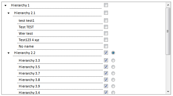
Introduction

In this section am going to show how to create a user
control, which looks similar to treeview control. It overcomes some of the
bottlenecks in treeview control like customizing and positioning of checkbox
and with some added feature to set default as any of the node. It can be helpful,
- When multilevel hierarchical data need to be displayed and
accessed.
- If there different types of notification/access settings
grouped into many categories and user can choose out of it.
- It is built with html controls (div, checkbox, radio
button), asp data controls (repeater) and Jquery.
Usage
Prerequisites:
Place
the following files in the folder structure as mentioned below, if you want to
place it in different folder structure then do the respective changes in the
code.
- Images: Images/tree_arrow.gif
Images/tree_arrow_down.gif
- Scripts: Scripts/ExtendedTreeView.js
- Scripts/Jquery.js
- Styles: Styles/ ExtendedTreeview.css
Properties that are needs to be set for using this extended tree view
control
Mandatory
| Property | Comments | Type |
<ExtendedTreeView1>.DataSourceLevel1 | To preload the values in level 1 | DataTable |
<ExtendedTreeView1>.DataSourceLevel2 | To preload the values in level 2 | DataTable |
<ExtendedTreeView1>.Level0Text | Text at level 0 (upper most
level) | String |
<ExtendedTreeView1>.Level0Value | Value at level 0 (upper most
level) | String |
<ExtendedTreeView1>.Level1Text | Column name from data source "DataSourceLevel1"
that should be displayed in UI | String |
<ExtendedTreeView1>.Level1Value | Column name (unique value) from
data source "DataSourceLevel1" that should be used in background functionality | String |
<ExtendedTreeView1>.Level2Text
| Column name from data source "DataSourceLevel2"
that should be displayed in UI | String |
<ExtendedTreeView1>.Level2Value | Column name (unique value) from
data source "DataSourceLevel2" that should be used in background
functionality | String |
Optional
| Property | Comments | Type |
<ExtendedTreeView1>.DefaultValue
| Value to set as default (This
value will make the radio button to enable) – provide one of the value from Level1Value/Level2Value/
Level0Value | String |
<ExtendedTreeView1>.Expanded | To display the control in
expanded or by collapsed by default | Boolean |
<ExtendedTreeView1>.UserSpecificDataSourceLevel1 | To load the values specific to
user in level 1 | DataTable |
<ExtendedTreeView1>.UserSpecificDataSourceLevel2 | To load the values specific to
user in level 2 | DataTable |
<ExtendedTreeView1>. IsValidationRequired | To Enable/disable validation | Boolean |
Validation Checks:
Checks for at least one checkboxes should be
selected and a radio button should be selected.
By default
it is set to false (No validation).
If the all the items in L2 (e.g., Hierarchy 3.3, Hierarchy
3.4 in Fig 1) is selected then it will return only L1 (e.g., Hierarchy 2.2,
Hierarchy 2.3 in Fig 1) value which shows whole value is selected, if not both
L1 and L2 values are returned.
To change the expand collapse image in the control update
with same name of existing image but if you wished to change the image name
then same name should be updated in the below JS methods too.
ExtendedTreeView.js > ExpandByDefault
ExtendedTreeView.js > ExpandCollapse
Exposed Client Method:
callSaveMethod(): Method used to save and load the selected values
to the hidden variable. Then by calling below server side method you can take
list of values in a comma separated format.
Exposed Server Method:
GetModifiedList():
This method returns the dictionary with keys
- Level1List
- Level2List
- defaultfirstLevel
- defaultSecondLevel
which holds the selected item of level 1 and level2 in a comma (,) separated format and the default
values.
Note*: After saving the details again bind the
saved details to the control to see the saved changes, like rebinding the data
table properties.
History
