Let the Layout Play Out
When creating an Android Layout (in XML) to define the "View" or visual representation of an Activity, there are several types of Layouts
you can choose from, such as:
FrameLayoutGridLayoutLinearLayout (Horizontal) LinearLayout (Vertical)RelativeLayoutTableLayout
By default, new Layouts in Droidio use the
RelativeLayout
. Whether you want to stick with that or use a different Layout will doubtless depend on just what you are building and the
devices on which it will run. There are lots of scenarios, and pleasing everybody quickly becomes complicated. If you are building an app just
for a specific device, though, using
LinearLayout can be a breeze.
I have experimented adding widgets to the default RelativeLayout as well as to GridLayout and TableLayout, but the one that seems to
me to be the easiest to use for this scenario (with a specific device in mind) is the LinearLayout. It's easy because you probably know
whether the device will normally be used in vertical or horizontal orientation. Or your layout can pretty much determine in which orientation
it will be used. If you want to steer the users toward a landscape orientation, you might set the orientation property to horizontal; otherwise
(for portrait orientation), set it to vertical, like so:
<LinearLayout xmlns:android="http://schemas.android.com/apk/res/android"
    android:orientation="vertical"
    . . .
To build your UI, you simply add widgets represented with XML one after another as you want them to appear on the screen. I find the
easiest way in Droidio is to drag and drop the first of a particular type of widget onto the design surface, and then cut-and-paste it to where I
want it to "live." After that, you can copy-and-paste other widgets straight from your XML, changing the properties you need to, such as "id"
and "text" and "checked" (where appropriate, of course).
A nice thing about LinearLayout is that if you want to put multiple widgets in one "row," you can easily do that by simply adding
another LinearLayout (a nested LinearLayout) and setting its orientation to "horizontal." If you go for a landscape orientation,
you might use a horizontally-oriented LinearLayout on just about every "row."
You can do this sort of thing (multiple widgets per row) with GridLayout and TableLayout, too, but it's more complicated, as you have to
keep track of row and column numbers, set columnspan values, etc. A familiarity with XAML will make that pretty easy, too, though.
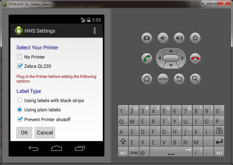
Here's an example of a LinearLayout that has some TextViews, CheckBoxes, Spaces, RadioButtons within a RadioGroup, and then a pair
of Buttons within a nested/embedded horizontally-oriented LinearLayout:
<LinearLayout xmlns:android="http://schemas.android.com/apk/res/android"
    android:layout_width="match_parent"
    android:layout_height="match_parent"
    android:orientation="vertical"
    android:paddingLeft="@dimen/activity_horizontal_margin"
    android:paddingRight="@dimen/activity_horizontal_margin"
    android:paddingTop="@dimen/activity_vertical_margin" >

    <TextView
        android:layout_width="fill_parent"
        android:layout_height="wrap_content"
        android:padding="5dip"
        android:text="@string/select_your_printer"
        android:textAppearance="?android:attr/textAppearanceMedium" />

    <CheckBox
        android:id="@+id/ckbxNoPrinter"
        android:layout_width="fill_parent"
        android:layout_height="wrap_content"
        android:text="@string/no_printer" />

    <CheckBox
        android:id="@+id/ckbxZebraQL220"
        android:layout_width="fill_parent"
        android:layout_height="wrap_content"
        android:checked="true"
        android:text="@string/zebra_ql220" />

    <Space
        android:layout_width="match_parent"
        android:layout_height="5dp" />

    <TextView
        android:layout_width="fill_parent"
        android:layout_height="wrap_content"
        android:padding="5dip"
        android:text="@string/plug_in_the_printer_etc"
        android:textAppearance="?android:attr/textAppearanceSmall"
        android:textColor="#8B0000" />

    <Space
        android:layout_width="match_parent"
        android:layout_height="2dp" />

    <TextView
        android:layout_width="fill_parent"
        android:layout_height="wrap_content"
        android:padding="5dip"
        android:text="@string/label_type"
        android:textAppearance="?android:attr/textAppearanceMedium" />

    <RadioGroup
        android:layout_width="wrap_content"
        android:layout_height="wrap_content">

        <RadioButton
            android:id="@+id/radbtnBar"
            android:layout_width="wrap_content"
            android:layout_height="wrap_content"
            android:text="@string/using_labels_black" />

        <RadioButton
            android:id="@+id/radbtnPlain"
            android:layout_width="wrap_content"
            android:layout_height="wrap_content"
            android:checked="true"
            android:text="@string/using_plain_labels" />
    </RadioGroup>

    <Space
        android:layout_width="match_parent"
        android:layout_height="2dp" />

    <CheckBox
        android:id="@+id/ckbxPreventPrinterShutoff"
        android:layout_width="fill_parent"
        android:layout_height="wrap_content"
        android:checked="true"
        android:text="@string/prevent_printer_shutoff" />

    <Space
        android:layout_width="wrap_content"
        android:layout_height="5dp" />

    <LinearLayout
        android:layout_width="wrap_content"
        android:layout_height="wrap_content"
        android:orientation="horizontal">

        <Button
            android:id="@+id/btnOK"
            android:layout_width="wrap_content"
            android:layout_height="wrap_content"
            android:text="@string/button_ok" />

        <Button
            android:id="@+id/btnCancel"
            android:layout_width="wrap_content"
            android:layout_height="wrap_content"
            android:text="@string/button_cancel" />
    </LinearLayout>

</LinearLayout>
Such a conglomeration or amalgamation turns out to look like so:

If your Widgets Are Collectively Not Midgets
Note: If your Layout is too tall to fit on the screen, you can enclose it with a set of "ScrollView" tags, like so:
<ScrollView xmlns:android="http://schemas.android.com/apk/res/android"
    android:layout_width="fill_parent"
    android:layout_height="fill_parent">

    <LinearLayout xmlns:android="http://schemas.android.com/apk/res/android" . . . >

        <TextView
    . . .
    </LinearLayout>

</ScrollView>
Simple Layout Refactoring (Mini Tip-within-a-Tip)
If you want to refactor a Layout file that uses RelativeLayout to use LinearLayout instead, it should be as simple as the following (but copy-and-paste your existing XML to a text file (or use your fancy pants version control system) and save it so that you can revert to it if necessary):
Replace "RelativeLayout" with "LinearLayout" at the top and bottom.
Add the following to the LinearLayout's properties:
android:orientation="vertical"
Remove the following property settings from each widget:
android:layout_below android:layout_alignParentLeftandroid:layout_alignParentStart
If This Saves You Time
Use the boon wisely; Don't be the bane that causes pain.
