Introduction
Charts in SSRS are used to visualize data. You use Charts when you want to represent large aggregated data in visual formats.
Charts are often used in analytical dashboards, chart control provide various kinds of shapes (Pie Chart, Bar Chart, Column Chart, line Chart, ... etc.). In this tip, I will show you how to use Pie Chart in your report and how to show Percentage data labels instead of numeric (default).
Background
I used AdventureWork2012 in this example, you can download it from:
I'll assume that you created already SSRS project using SSDT, if not, please read the following articles:
Using the Code
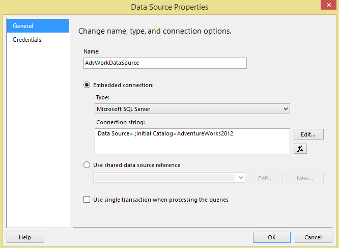
Step 1: Open your SSRS report and create Embedded Connection of type Microsoft SQL Server and set it up to connect to AdventureWork2012 in your local machine.

Step 2: Add Data Set and write query that return BusinessEntityID, JobTitle and Gender from HumanResources.Employee table, as shown below:
SELECT  BusinessEntityID,
          JobTitle,
          Gender

FROM    HumanResources.Employee

Step 3: From Menu bar select View >> Toolbox or click Ctrl+Alt+X to show Toolbox pane.
Step 4: Drag Chart item from Report Items (Toolbox) to report designer, Select Chart Type window will pop up, browse to Shape tab and select Pie chart.

Step 5: Double-click on the chart area, Cart Data window will show up which consists of 3 sections:
- Values: The aggregated numeric amounts that will be grouped by Category Groups, in this example (number of employees).
- Category Groups: The grouping field that will be used in this chart, in this example (
Gender). The Columns group in the matrix is identical to the Category Groups area in the chart. - Series Groups: Is treated as second level group. For example, if we have parent Gender Category Group we can have child group Title. The Rows group in the matrix is identical to the Series Groups area in the chart.
Step 6: Let’s add BusinessEntityId for Values area by clicking on + sign, change the aggregation from SUM to Count.

Step 7: In Category Groups, add Gender field. And leave Series Group empty.

Step 8: Double-click on Chart Title, name it “Number of employees per Gender”.
Step 9: Double-click on the Pie chart >> Right click on it, select Show Data Labels, this option will show the numbers of employees in each piece. Click Preview tab to test the results.

Step 10: Go back to design mode, Right Click on Data Labels >> Series Label Properties.

Step 11: Series Label Properties window will pop up, from General tab select #PERCENT from Label data list. Then click OK and run the report in Preview mode.

Finally, the report should look like the below image in preview mode:

Points of Interest
By default #PERCENT data label comes with 2 decimal precision, if the business requirements asked for 0 decimal places, go to Series Label Properties (Step 11) and use Expression in Label data field with this value:
="#PERCENT{P0}"

History
- 4th January, 2015: Initial version
