Introduction
There are few gradient controls on the net. I didn't find any control that will generate a gradient brush. This is a control which will generate a gradient brush from user selection. I found useful hints from Mark Betz (http://www.markbetz.net/sl/gradient/). It helped me a lot to develop this control. My web address is http://www.yagnaitsolution.ca.
Background
I am developing a reporting tool where a user can make reports from SQL or any data source. In the tools, I need something that will give the user to change the field background. So I was looking for a control which would help me to do this. But unfortunately, I didn't find anything that is perfect for me. So I decided to develop a Gradient brush control which will change the Report field background.
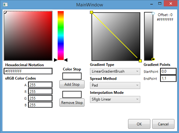
This control has couple of controls. One is color selector. That is, for a particular gradient stop, user can change the color. Color selector has a selector control which user can move and select the color. There is another control which is for gradient purposes. User can change the start point and end point for the Linear brush. For the Radial Brush, user can change center point, Origin point, RadiusX and RadiusY.
User can remove gradient stop or add gradient stop. It has a combobox from which user can select brush type.


Using the Code
This is a user control, so there is no need to do anything. Just add as a user control to the window.
<Style x:Key="{x:Type local:ColorSlider}" TargetType="{x:Type local:ColorSlider}">
<Setter Property="Orientation" Value="Vertical"/>
<Setter Property="Stylus.IsPressAndHoldEnabled" Value="false"/>
<Setter Property="Background" Value="Transparent"/>
<Setter Property="Foreground"
Value="{DynamicResource {x:Static SystemColors.ControlTextBrushKey}}"/>
<Setter Property="Minimum" Value="0"/>
<Setter Property="Maximum" Value="100"/>
<Setter Property="TickFrequency" Value="0.001" />
<Setter Property="IsSnapToTickEnabled" Value="True" />
<Setter Property="IsDirectionReversed" Value="False" />
<Setter Property="Value" Value="1" />
<Setter Property="Template">
<Setter.Value>
<ControlTemplate TargetType="{x:Type local:ColorSlider}">
<Border Background="{TemplateBinding Background}"
BorderBrush="{TemplateBinding BorderBrush}"
BorderThickness="{TemplateBinding BorderThickness}"
Height="{TemplateBinding Height}">
<Grid>
<Grid.ColumnDefinitions>
<ColumnDefinition Width="Auto"/>
<ColumnDefinition Width="Auto"
MinWidth="{TemplateBinding Slider.MinWidth}"/>
<ColumnDefinition Width="Auto"/>
</Grid.ColumnDefinitions>
<Grid.RowDefinitions>
<RowDefinition Height="*"/>
</Grid.RowDefinitions>
<Border x:Name="PART_TrackBackground" Grid.Column="1"
Width="20" Margin="10,16,10,0">
<Rectangle x:Name="PART_SpectrumDisplay"
Stretch="Fill" VerticalAlignment="Stretch" />
</Border>
<Canvas Grid.Column="1" HorizontalAlignment="Center" Width="4">
<Rectangle x:Name="PART_SelectionRange" Canvas.Left="1"
Fill="{DynamicResource {x:Static SystemColors.HighlightBrushKey}}"
Width="2.0" Visibility="Hidden" />
</Canvas>
<Track Grid.Column="1" Name="PART_Track">
<Track.DecreaseRepeatButton>
<RepeatButton Style="{StaticResource SliderRepeatButtonStyle}"
Command="Slider.DecreaseLarge"/>
</Track.DecreaseRepeatButton>
<Track.IncreaseRepeatButton>
<RepeatButton Style="{StaticResource SliderRepeatButtonStyle}"
Command="Slider.IncreaseLarge"/>
</Track.IncreaseRepeatButton>
<Track.Thumb>
<Thumb x:Name="Thumb" Height="16"
Style="{DynamicResource ColorThumbStyle}" />
</Track.Thumb>
</Track>
</Grid>
</Border>
<ControlTemplate.Triggers>
<Trigger Property="IsSelectionRangeEnabled" Value="True">
<Setter TargetName="PART_SelectionRange"
Property="Visibility" Value="Visible"/>
</Trigger>
<Trigger Property="Width" Value="Auto">
<Setter Property="MinWidth" Value="21"/>
</Trigger>
<Trigger Property="Height" Value="Auto">
<Setter Property="MinHeight" Value="104"/>
</Trigger>
</ControlTemplate.Triggers>
</ControlTemplate>
</Setter.Value>
</Setter>
</Style>
