Introduction
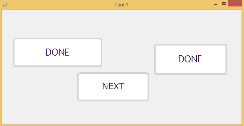
This tip gives an overview to modify existing button control in Winforms to achieve rounded edge Button Control (or rounded corner button control).
Background
Recently, I came across a requirement which asked for rounded edge button (or rounded corner button). I know WinForms is almost outdated and this feature can be achieved very easily in WPF. This tip is written for any programmer who is struggling to get this requirement done.

Final Output
Using the Code
The basic idea of getting this done is to inherit button control to a class ButtonModified and override OnPaint to obtain our requirement.
The first thing is to set the button's FlatStyle as "Flat" from constructor. We can also set the common properties which we use throughout our project like Font, BorderSize, etc. This can also be modified individually from the forms which we refer this.
class ButtonModified : System.Windows.Forms.Button
{
public Color BorderColor = Color.LightGray;
public int BorderSize = 5;
public ButtonModified()
{
FlatStyle = FlatStyle.Flat;
BackColor = Color.White;
FlatAppearance.BorderColor = BorderColor;
FlatAppearance.BorderSize = BorderSize;
Font = new System.Drawing.Font("VAGRounded-Light",
30F, System.Drawing.FontStyle.Regular, System.Drawing.GraphicsUnit.Pixel, ((byte)(0)));
ForeColor = System.Drawing.Color.FromArgb(((int)(((byte)(84)))),
((int)(((byte)(33)))), ((int)(((byte)(107)))));
this.MouseDown += new MouseEventHandler(ButtonLastest_MouseDown);
this.MouseUp += new MouseEventHandler(ButtonLastest_MouseUp);
}
void ButtonLastest_MouseUp(object sender, MouseEventArgs e)
{
ForeColor = System.Drawing.Color.FromArgb(((int)(((byte)(84)))),
((int)(((byte)(33)))), ((int)(((byte)(107)))));
BackColor = Color.White;
}
void ButtonLastest_MouseDown(object sender, MouseEventArgs e)
{
BackColor = System.Drawing.Color.FromArgb(((int)(((byte)(84)))),
((int)(((byte)(33)))), ((int)(((byte)(107)))));
ForeColor = System.Drawing.Color.White;
}
int top ;
int left;
int right ;
int bottom;
protected override void OnPaint(PaintEventArgs pevent)
{
base.OnPaint(pevent);
int CornerRadius = 18;
Pen DrawPen = new Pen(BorderColor);
GraphicsPath gfxPath_mod = new GraphicsPath();
top = 0;
left = 0;
right = Width;
bottom = Height;
gfxPath_mod.AddArc(left, top, CornerRadius, CornerRadius, 180, 90);
gfxPath_mod.AddArc(right - CornerRadius, top, CornerRadius, CornerRadius, 270, 90);
gfxPath_mod.AddArc(right - CornerRadius, bottom - CornerRadius,
CornerRadius, CornerRadius, 0, 90);
gfxPath_mod.AddArc(left, bottom - CornerRadius, CornerRadius, CornerRadius, 90, 90);
gfxPath_mod.CloseAllFigures();
pevent.Graphics.DrawPath(DrawPen, gfxPath_mod);
int inside = 1;
Pen newPen = new Pen(BorderColor, BorderSize);
GraphicsPath gfxPath = new GraphicsPath();
gfxPath.AddArc(left + inside + 1, top + inside, CornerRadius, CornerRadius, 180, 100);
gfxPath.AddArc(right - CornerRadius - inside - 2,
top + inside, CornerRadius, CornerRadius, 270, 90);
gfxPath.AddArc(right - CornerRadius - inside - 2,
bottom - CornerRadius - inside - 1, CornerRadius, CornerRadius, 0, 90);
gfxPath.AddArc(left + inside + 1,
bottom - CornerRadius - inside, CornerRadius, CornerRadius, 95, 95);
pevent.Graphics.DrawPath(newPen, gfxPath);
this.Region = new System.Drawing.Region(gfxPath_mod);
}
}
Now we have two approaches.
Easier Approach
The easier way is to first build your solution and the button will be available in your toolbar which you can use like normal button control.

Approach Two to Modify Existing Buttons Already Aligned and Placed In Project
We all know that normal buttons when placed in winform by dragging and dropping will generate a designer class. We can easily modify our designer class as explained below. To modify the existing buttons in our project:
Partial Class Buttontype
{
Private System.ComponentModel.IContainer Components = Null;
Protected Override Void Dispose(bool Disposing)
{
if (Disposing && (Components != null))
{
components.Dispose();
}
base.Dispose(disposing);
}
#Region Windows Form Designer Generated Code
Private Void Initializecomponent()
{
this.btn_Next = new System.Windows.Forms.Button();
this.SuspendLayout();
this.btn_Next.BackColor = System.Drawing.Color.White;
this.btn_Next.BackgroundImageLayout = System.Windows.Forms.ImageLayout.Stretch;
this.btn_Next.FlatStyle = System.Windows.Forms.FlatStyle.Flat;
this.btn_Next.Font = New System.Drawing.Font("Verdana", 20.25F,
System.Drawing.FontStyle.Regular, System.Drawing.GraphicsUnit.Point, ((Byte)(0)));
this.btn_Next.ForeColor = System.Drawing.Color.FromArgb(((int)(((byte)(84)))),
((Int)(((byte)(33)))), ((Int)(((byte)(107)))));
this.btn_Next.Location = New System.Drawing.Point(244, 204);
this.btn_Next.Name = "Btn_next";
this.btn_Next.Size = New System.Drawing.Size(234, 94);
this.btn_Next.TabIndex = 63;
this.btn_Next.Text = "Next";
this.btn_Next.UseCompatibleTextRendering = True;
this.btn_Next.UseVisualStyleBackColor = False;
this.AutoScaleDimensions = New System.Drawing.SizeF(6F, 13F);
this.AutoScaleMode = System.Windows.Forms.AutoScaleMode.Font;
this.ClientSize = New System.Drawing.Size(778, 374);
this.Controls.Add(this.btn_Next);
this.Name = "Buttontype";
this.Text = "Aint";
this.ResumeLayout(false);
}
#Endregion
Public System.Windows.Forms.Button Btn_next;
}
See the bolded portion of the code:
this.btn_Next = new System.Windows.Forms.Button();
This needs to be replaced as:
this.btn_Next = new ButtonDemo.ButtonModified();
This will update your designer once you rebuild the solution.
The method is depicted here so as to modify any existing project easily without any hassles, i.e., you wouldn't need to align your existing button or modify the font, etc. Use this only if your requirement is just to round off your existing Buttons which were previously aligned and set.
Points of Interest
This is just a method which I came up with. If someone comes up with a better solution, it can be posted here so that it can be a reference to anyone who needs this in the future.
