Introduction
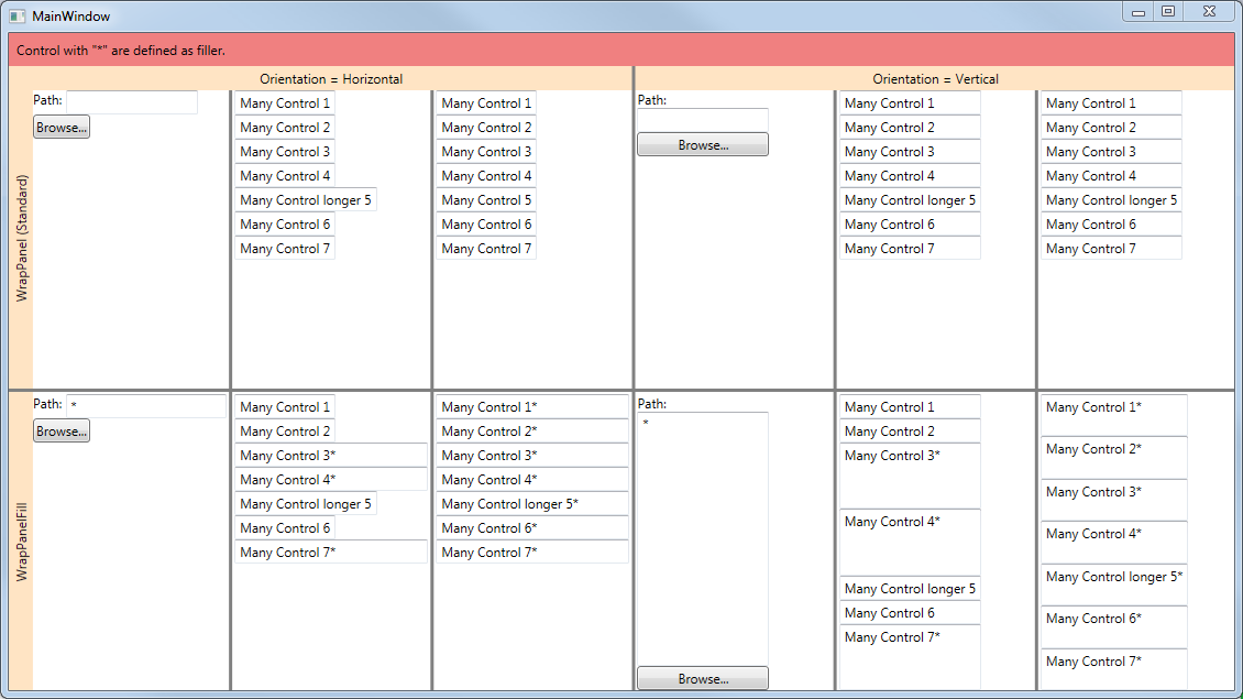
I realized than many people need the same thing as me, a WrapPanel that can fill empty space to the right (Orientation=Horizontal) with one or more of its child controls. I decided to write a re-usable control that does the job in both orientations.
The code contains a little demo where you can easily see if it fits your need.
Note: I really appreciate feedback. If you ever do not like the code, please let me know why. I hope it could help anybody.
Screenshot of the Sample Code

Background
There are a few questions on StackOverflow but no real easy solutions that work when there is more than one line. Also, I wanted to do a Control that I could easily re-use anywhere. I started from the Microsoft code and modified it in order to give the required behavior.
Using the Code
You can either use the DLL or just copy the source code (only one .cs file) in your own library.
Usage is as follows:
<Window x:Class="WpfWrapPanelWithFillTestApp.MainWindow"
        xmlns="http://schemas.microsoft.com/winfx/2006/xaml/presentation"
        xmlns:x="http://schemas.microsoft.com/winfx/2006/xaml"
        xmlns:wrapPanelWithFill="clr-namespace:WrapPanelWithFill;assembly=WrapPanelWithFill"
        Title="MainWindow" Height="400" Width="800">

  <wrapPanelWithFill:WrapPanelFill Grid.Row="2" Grid.Column="6" Orientation="Vertical">
    <TextBlock Text="Path: " TextWrapping="Wrap"></TextBlock>
    <TextBox MinWidth="120" wrapPanelWithFill:WrapPanelFill.UseToFill="True">*</TextBox>
    <Button>Browse...</Button>
  </wrapPanelWithFill:WrapPanelFill>

</Window>
Limitation (way to improve)
- Taking in account
MaxWidth (or MaxHeight when Orientation is vertical) for controls defined as filler. - Fill width is always the same for every child (when more child are defined as "Filler". It would be nice to have the same "proportion" defintion like the one used in "Grid" using "GridLength". For example "Width" of RowDefinition.
- Add the HorizontalContentAlignement and VerticalContentAlignement to make the control more complete. It is usefull when we need to align control on the right or center instead of the Left. I found a nice solution to that an answer from DTig at StackOverflow.
Ideally, its a combinaison of each improvement in one solution that would be nice to have.
History
- 2015-05-12, First version
- 2015-05-13, Made code a little bit cleaner, fixed some mistakes in tip and added a screenshot
- 2015-05-22, Clarify limitions. Improve a little bit the text.
