Today, I am going to share two different categories of selectors, i.e., Nested Selector and Modular Selector. Let’s quickly jump to check 2 different style aspects without waiting for a moment.
Basically, there are 2 different categories of presenting the style:
- Nested Selector (shortcut selector)
- Modular Selector (flexible selector)
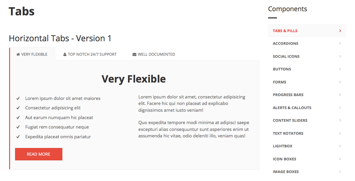
Let’s quickly go through one example to make it clearer. Let's say we have to design the navigation section like below:

To design the navigation pad, the code will look like this:
<html>
<head>
    <title>Example of Nested Selector</title>

    <style type="text/css">
        .sidebar {
            box-sizing: border-box;
            float: right;

            .title {
                margin-bottom: 15px;
                margin-top: 20px;
                position: relative;
            }
        }

        .nav {
            list-style: outside none none;
            margin-bottom: 0;
            padding-left: 0;

            > li {
                display: block;
                position: relative;

                > a {
                    display: block;
                    padding: 10px 15px;
                    position: relative;
                }

                &.active {
                    > a {
                        background-color: #fafafa;
                        border: 1px solid #f3f3f3;
                        color: #e84c3d;

                        &:hover {
                            background-color: #fafafa;
                            border: 1px solid #f3f3f3;
                            color: #e84c3d;
                        }
                    }
                }
            }
        }
    </style>
</head>

<body>
<aside>
    <div class="sidebar">
        <h3 class="title">Components</h3>
        <div class="separator"></div>
        <nav>
            <ul class="nav nav-pills nav-stacked">
                <li class="active">
                    <a href="">Tabs & Pills</a>
                </li>
                <li><a href="">Accordions</a></li>
                .........
                <li><a href="">Image Boxes</a></li>
            </ul>
        </nav>
    </div>
</aside>
</body>
</html>
The above code is a simple example of how nested CSS can be written. But guys, did you find the problem with the above code. Can we use only .sidebar style (title with different CSS) in any other place in future?
No... right!! As the styles are nested, we cannot use the component separately as we want.
So, if we want to reuse each and every style that we have written so far, we have to use a Modular way to design the style.
Let's check the same example in a modular way!!
<html>
<head>
    <title>Example of Modular Selector</title>

    <style type="text/css">
        .sidebar {
            box-sizing: border-box;
            float: right;
        }

        .sidebar .title {
            margin-bottom: 15px;
            margin-top: 20px;
            position: relative;
        }

        .nav {
            list-style: outside none none;
            margin-bottom: 0;
            padding-left: 0;
        }

        .nav > li {
            display: block;
            position: relative;
        }

        .nav > li > a {
            display: block;
            padding: 10px 15px;
            position: relative;
        }

        .nav > li.active > a, .nav > li.active > a:hover {
            background-color: #fafafa;
            border: 1px solid #f3f3f3;
            color: #e84c3d;
        }
    </style>
</head>

<body>
<aside>
    <div class="sidebar">
        <h3 class="title">Components</h3>
        <div class="separator"></div>
        <nav>
            <ul class="nav nav-pills nav-stacked">
                <li class="active">
                    <a href="">Tabs & Pills</a>
                </li>
                <li><a href="">Accordions</a></li>
                .........
                <li><a href="">Image Boxes</a></li>
            </ul>
        </nav>
    </div>
</aside>
</body>
</html>
So, now, can we use only .sidebar class for any other styles? A BIG YES right !!!
Nested selectors are more complex and those are less readable. But, it has its own advantages of targeting DOM elements. Maintainability is easy as we just need to make fewer changes when the class name needs to be changed later. The code will look concise and the selector looks pretty.
But, now-a-days, CSS is getting more modular. It is modulated into different defaults, components, and settings and developer/designer should take 100% advantage of doing so. With modular CSS, coding is much easier like writing simple HTML. Styles will be consistent and easier to reuse the modules. Once the base been created, it would be easier to make modifications in the future. The development time will be less afterwards. It simplifies the code as clashes will not happen with this type of styling.
A lot of theories !!?? Ahh .. I know .. Let’s stop then. Now you decide which one is better and why. Do you really find it useful? If yes, then please like and add some comments, if you want.
Thanks and I will be happy to hear from you.
CodeProject


