Introduction
Recently for a Petition System that I’m working on for Taft College, I thought it would be a good idea to add a modal dialog to show the particular reference petition that a Pass Along is using as the ‘approved’ petition. In other words, you click on “Show Approved Course” and up pops a modal (HTML) dialog that shows the original ‘approved’ petition. I needed to do this in Twig, as part of Symfony3 framework. This blog describes what I did to achieve the modal dialog in Twig.
Twig File
Below is an abbreviated version of the content of the Twig file I used. It starts with an else statement as part of a larger conditional if check, and then also shows the inclusion of the appropriate JavaScript file.
{% if json['Equivalency']['C-ID'] %}
...
{% else %}
<span>Sub Type: Pass Along</span><br/>
<span>Approved Course: {{ json['Equivalency']['PassAlong_Value'] }}</span>
<button onclick="openModal()">Show Approved Course</button>
<div id="myModal" class="modal">
<div class="modal-content">
<div class="close" onclick="closeModal()">?</div>
<iframe height="99%" width="97%"
src="{{ path('showApproved',{'schoolID': pet.getCourse.getSchool.getSchoolId,
'course': pet.getCourse.getCorTitle}) }}"></iframe>
</div>
</div>
{% endif %}
...
{% block javascripts %}
{{ parent() }}
...
<script src="{{ asset('script/modal.js') }}"></script>
{% endblock %}
You’ll notice in the twig file that button tag uses the “onclick” to call “openModal()” JavaScript function. This will bring up the modal dialog, and “closeModal()” closes the modal dialog.
JavaScript File
Here is the JavaScript file used:
document.addEventListener("keydown", escapeModal, false);
function openModal(){
var modal = document.getElementById('myModal');
modal.style.display = "block";
}
function closeModal(){
var modal = document.getElementById('myModal');
modal.style.display = "none";
}
function escapeModal(evt){
var keyCode = evt.keyCode;
if(keyCode == 27){
closeModal();
}
}
The JavaScript is quite simple, just add functions to add and close modal dialogs, and a function to be able to press the ‘Esc’ key to close the modal window.
CSS File
Here is the CSS file:
.modal {
display: none;
position: fixed;
z-index: 1;
padding-top: 100px;
left: 0;
top: 0;
width: 100%;
height: 100%;
overflow: auto;
background-color: rgb(0,0,0);
background-color: rgba(0,0,0,0.4);
}
.modal-content {
background-color: #fefefe;
margin: auto;
padding: 10px;
border: 1px solid #888;
width: 95%;
height: 85%;
}
.close {
color: #aaaaaa;
float: right;
font-size: 28px;
font-weight: bold;
}
.close:hover,
.close:focus {
color: #000;
text-decoration: none;
cursor: pointer;
}
These changes simply add styling changes to make it appear like a modal dialog is appearing. The close class is used to handle clicking the “x” to close the modal window. Hover & focus is used to show the hand when moving over the “x” when attempting to close the modal window. This CSS values can be changed based on your needs.
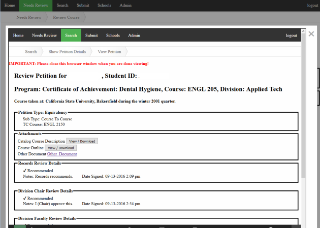
Sample Screenshot
Below is a screenshot of what the modal dialog looks like:

