

Introduction
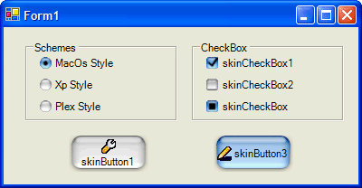
I have finished my project dotnetskin which skins forms and controls automatically for .NET WinForms applications. I am demonstrating some code and images from that project in this article. The SkinControls library includes four components, providing skinned buttons, check boxes and radio buttons with three built-in styles. It is an excellent example of creating custom drawn controls.
Using the code
In order to use the library in your project, add it to your VS toolbox:
- Right-click on the "General" tab in the Toolbox.
- Choose "Add/Remove Items..."
- On the ".NET Framework Components" tab, press the "Browse..." button and find DotNetSkin.SkinControl.dll.
That will add four component icons to the General tab. Drag the "SkinImage" icon to your form.
SkinImage
The SkinImage component provides skin images for all controls. It loads a skin image from a resource. All images are stored in a static object, so you need to add only one SkinImage component to your project.
The skin image can be in any image format that the .NET framework supports. I used PNG files including an alpha channel that determines the transparency.

This is the button image in Mac style.
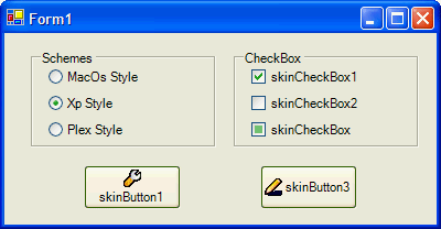
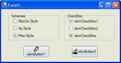
The SkinImage has a Scheme property to set the skin scheme. There are three schemes available in the library's resources: Macos style, XP style, Plex Style.
This is the SkinImage code:
public class SkinImage:Component
{
    public static ImageObject button;
    public static ImageObject checkbox;
    public static ImageObject radiobutton;

    private Schemes scheme = Schemes.MacOs;

    public SkinImage()
    {
    }

    static SkinImage()
    {
        Macskin();
    }

    protected static void Macskin()
    {
        button = new
          ImageObject("DotNetSkin.SkinControls.mac_button.png",
          5,Rectangle.FromLTRB(14,11,14,11));
        checkbox = new
          ImageObject("DotNetSkin.SkinControls.mac_checkbox.png",
          12,new Rectangle(0,0,0,0));
        radiobutton = new
          ImageObject("DotNetSkin.SkinControls.mac_radiobutton.png",
          8,new Rectangle(0,0,0,0));
    }

    protected static void Xp1skin()
    {
        button = new
          ImageObject("DotNetSkin.SkinControls.xp1_button.png",
          5,Rectangle.FromLTRB(8,9,8,9));
        checkbox = new
          ImageObject("DotNetSkin.SkinControls.xp1_checkbox.png",
          12,new Rectangle(0,0,0,0));
        radiobutton = new
          ImageObject("DotNetSkin.SkinControls.xp1_radiobutton.png",
          8,new Rectangle(0,0,0,0));
    }

    protected static void Plexskin()
    {
        button = new
          ImageObject("DotNetSkin.SkinControls.Plex_button.png",
          5,Rectangle.FromLTRB(8,9,8,9));
        checkbox = new
          ImageObject("DotNetSkin.SkinControls.Plex_checkbox.png",
          12,new Rectangle(0,0,0,0));
        radiobutton = new
          ImageObject("DotNetSkin.SkinControls.Plex_radiobutton.png",
          8,new Rectangle(0,0,0,0));
    }

    protected override void Dispose( bool disposing )
    {
        if (disposing)
        {
        }
        base.Dispose( disposing );
    }

    public Schemes Scheme
    {
        get { return scheme;}
        set
        {
            scheme = value;
            try
            {    switch (scheme)
                {
                    case Schemes.MacOs:
                        Macskin();
                        break;
                    case Schemes.Xp:
                        Xp1skin();
                        break;
                    case Schemes.Plex:
                        Plexskin();
                        break;
                }
            }
            catch (Exception)
            {
                return;
            }
        }
    }
}
SkinButton
The button skin image has five button images tiled. These images are used in the Normal, MouseOver, MouseDown, Disabled, and the Focused states of buttons. In order to support non-rectangle images, the SkinButton supports a transparent background. The key is to call base.InvokePaintBackground to draw the parent background.
|

|

|
| Non-transparent background | Transparent background |
protected override void OnPaint(System.Windows.Forms.PaintEventArgs e)
{
Rectangle rc = this.ClientRectangle;
Graphics g = e.Graphics;
base.InvokePaintBackground(this,
new PaintEventArgs(e.Graphics, base.ClientRectangle));
SkinDraw.DrawRect2(g,SkinImage.button,rc,i);
}
SkinCheckbox and SkinRadioButton
The checkbox control has twelve images tiled and the radio button has eight images. These images are used in the Normal, MouseOver, MouseDown, the Disabled states.


History
- 2/10/2005 - First released.
- 3/15/2006 - Fixed bug when button is pressed down, supports shoutcut '&' in
button.text.
