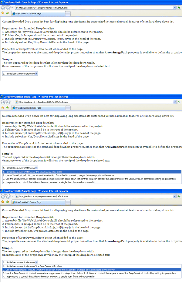
What is DropDownListEx?
Most of the time when the items in the drop down list are lengthy, developers find it difficult to control their appearance. If the drop down width is not set, the size of the drop down list gets lengthy and if the size of the drop down list is set, the items get cropped during display. DropDownListEx is the solution for such a problem. You can control the width of the dropdown with the items displaying without getting cropped.
A sample code is attached along with the DropDownListEx source for you to understand how to use and set the properties of the control.
Background
Including myself, many of my colleagues were facing the dropdownlist problem. Therefore, I thought of developing the custom control to get rid of this problem. And it's not like I am the first person to do this. There are custom controls available, but you have to pay for them. After I developed it, I thought why not share with the other developers across the world who also face the same problem. So here I am presenting my efforts to you. Your suggestions are always welcome.
Using DropDownListEx
This custom control includes:
- DropDownListEx.cs: A custom control source code file
- DropDownListEx.js: JavaScript to handle the client side task
- DropDownListEx.css: A stylesheet to control the appearance of the dropdown and its item
- DownArrow.gif: An image file to display the dropdown button
Rendering DropDownList
DropdownListEx is inherited from DropDownList & IPostBackHandler classes, so we get all the properties, events & methods of standard dropdownlist & IPostBackHandler interface to handle the postback event.
By overriding the rendering functionality of the standard dropdownlist, we create our own rendering functionality. Instead of displaying the standard dropdown, we use the textbox and the bullet tree (ul li) to render the dropdown & its items.
We use HTMLTextWriter to render these controls as shown in the below code:
private void RenderTextBoxSpan(HtmlTextWriter writer)
{
writer.WriteBeginTag("div");
writer.Write(">");
writer.WriteFullBeginTag("table cellpadding='1' cellspacing='0' border='0'");
writer.WriteFullBeginTag("tr");
writer.WriteFullBeginTag("td");
writer.WriteBeginTag("span");
if (!string.IsNullOrEmpty(CssClass))
{
writer.WriteAttribute("class", "textBoxWrapper " + CssClass);
}
else
{
writer.WriteAttribute("class", "textBoxWrapper");
}
writer.Write(">");
.
.
.
.
writer.WriteBeginTag("div");
writer.WriteAttribute("ID", this.ClientID + "_listBox");
writer.WriteAttribute("class", "listBox");
writer.WriteAttribute("tabindex", "0");
writer.Write(">");
writer.WriteLine();
writer.WriteFullBeginTag("ul");
}
By rendering, the following HTML structure is designed:
<div>
        <table>
    <tr>
    <td>
     <table>
          <tr>
       <td>TextBox<td><td>ImageButton</td>
      </tr>
     </table>
     <div>
          <ul>
            <li>First Item of the dropdown</li>
            <li>Second Item of the dropdown</li>
      </ul>
     </div>
    </td>
  </tr>
 </table>
</div>
Some spans are also added in the structure to change the appearance of the controls so that it looks like a dropdown.
The TextBox displays the selected item, Image Button is used to drilldown the items. With use of stylesheets, the appearance of bullets (ui, li) are made similar to the standard dropdown items.
Using DropDownListEx.js
Now since the dropdown is rendered, it's time for the browser to get into action. Using the powerful yet easy features of JQuery, the functionalities of the dropdown at client side are controlled. The functionalities include drilling down the items on image button click, changing the appearance of item on mouse hover, hiding the items when mouse leaves or item is selected, etc.
History
- 16th December, 2010: Initial version
