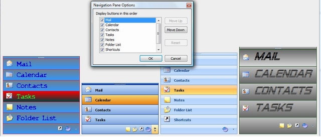
In this article, you will learn how to create a rich OutlookBar in XP or Vista style

Introduction
I've always enjoyed using a control that behaves like the OutlookBar in Outlook. After testing and creating this, I knew that if I wanted other people to work intuitively with my programs, the OutlookBar control must look and work like the one in Outlook.
Needed Properties
The control must be functional and accessible during runtime, as well as in design mode. You can resize the control in design time, so you can choose which buttons will be displayed as large buttons. The buttons can be added and changed using a collection editor. During runtime, the DropDown icon opens a context menu where you can choose which buttons will be visible. You also can open a "Navigation Pane Options" form where you can reorder the buttons.
At runtime, mouse movements must cause the buttons to repaint if needed. There are different color schemes for hovering buttons. I need large buttons and small buttons, displayed in the correct order even after resizing the control. I also want to be able to set a button in a "not allowed" state. Depending on the user of your program, you can disable certain buttons. The difference between Allowed and Enabled is that with the Allowed property set to False, you cannot see the button.
Basic Structure
There are three classes in this control:
Class OutlookBarButton
This represents the instances of the separate buttons. No painting occurs in this class. The basic members of this class are:
Text: This is the text drawn on the button if it's in a large state. If the button is at the bottom of the control, a tooltip will be displayed with the text of the button.Visible: When False, the button will not be visible in the control. You can change this value at runtime with ContextMenu using the DropDown icon.Allowed: When False, this button will not be visible in the control. You cannot access this button at runtime, so you can prevent certain users from clicking a certain button.Image: The image that will be displayed. It works best with a 24x24 icon or larger.Rectangle: This is only accessible in the assembly. When the OutlookBar class calculates where to draw the buttons, it will give each button the rectangle that OutlookBar used to draw it. Thanks to this property, it's easy to find out which button is clicked or which button must be repainted using different colors.
Class OutlookBarButtonCollection
Representing the collection of buttons on the control, this inherits from CollectionBase. In the code, you just use the normal procedures to add or remove buttons to the control:
Dim newButton as New Altea.OutlookBarButton
With newButton
    .Text="my button"
    .Visible=False
    .Image=My.Resources.myImage
End With
me.OutlookBar1.Buttons.Add(newButton)
Or using the overloaded constructor:
Me.OutlookBar1.Buttons.Add(New Altea.OutlookBarButton("my button",
    My.Resources.myImage))
Class OutlookBar
Inheriting from System.Windows.Forms.Control, this is the main class. You have a property called Renderer with two options: Office2003 and Office2007. In a future version, there will be a third option called Custom. You can select a button from the code:
Me.OutlookBar1.Buttons("Journal").Selected = True
This class has the most events. Events such as MouseMove, MouseDown, MouseLeave, etc. will be handled in this class. The painting also happens in this class. OutlookBar will decide which ButtonState the buttons have depending on which user action has happened:
Friend Enum ButtonState
    Passive
    Hovering
    Selected
End Enum
The ButtonState will raise the Paint methods to use the correct colors and cursor. In the painting code, there will often be references to several rectangles. Here's an overview with this image:

Conclusion
Try it, run it and tell me about it!
History
- 10th February, 2007: Original version posted
- 14th July, 2007: Reduced flickering, added custom rendering for colors and button height
- 2nd August, 2007: Download updated
