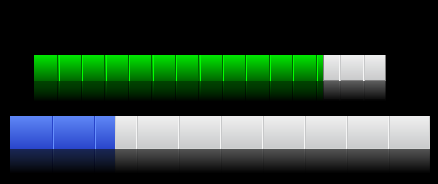
Introduction
This is my first article here on CodeProject, so please let me know about any bad English, or bad implementation in the code and bugs.
I have always liked the Apple design for both OS's and devices. So, naturally, I try to mimic some of the cool controls that OSX and iTunes provide in their GUI. The control I will present here is the "How much space is left" bar in iTunes under the iPod view.
I have also extended the control to support a ProgressBar style with increasing and decreasing values, all customizable.
Points of interest
All features that the control uses is fully customizable, inluding base colors, borders, mirror opacity etc.
The control
The control comes as a DLL, so all you need to do is add a reference to the DLL in your .NET project and you will have full access to the control, or you could include the DLL project and make your own extra customizations.
The control also has full support for Mono. As long as you use the System.Windows.Forms bindings with Mono, it works great.
Public Properties
public float StepSize
public int StepInterval
public int BarDividersCount
public float BarMirrorOpacity
public float BarFillProcent
public float BarBorderWidth
public Color BarBackgroundLight
public Color BarBackgroundDark
public Color BarLight
public Color BarDark
public Color BarBorderColor
public BarType BarType
All properties listed here are the only values you need to modify the look-n-feel of the control completely. Some of them need a little explanation.
The StepSize and StepInterval properties controls whether or not the control should act as a progressbar control. You activate this by setting the StepSize to a value that's not 0 (zero). If the value is less then 0, the progress will tick backwards, and if the value is greater than 0, it will move as a usual progress control and the StepInterval goes to a value > 0.
The BarDividersCount controls how many vertical lines the control will draw.
The BarType property is an enum that controls the control state or type. For example, if you set the BarType property to ProgressBar, it will act as a progressbar. If you set the BarType to Animation, the control will "Rubber Band" to the new percent value, and last, you can set the BarType to Static, and it will be a static control without motion or animations.
The Animation effect idéa was submitted by Ben_64, thanks for the great idéa :)
Basic knowledge to implement the "drop effect"
To accomplish the drop effect, we need to create a replica of the image we originally draw and then flip it 180 degrees. Also, we need to make the image semi-transparent and then add a fade from transparent to the target background color.
The following code demonstrates this:
Bitmap theImage = new Bitmap( width, height );
Graphics g = Graphics.FromImage( theImage );
g.SmoothingMode = SmoothingMode.AntiAlias;
g.Clear( bgColor );
Bitmap bmp = GenerateBarImage( width, height - ( height / 3 ), procent );
Bitmap mirror = FadeToBg( bmp, bgColor, -90.0F );
GraphicsState state = g.Save();
g.ScaleTransform( 1, -1.0F, MatrixOrder.Prepend );
ColorMatrix clr = new ColorMatrix();
ImageAttributes attributes = new ImageAttributes();
clr.Matrix33 = ( mirrorOpacity / 100 );
attributes.SetColorMatrix( clr );
Rectangle source = new Rectangle( 0, -( height ), mirror.Width, mirror.Height );
g.DrawImage( mirror, source, 0, 0, mirror.Width,
mirror.Height, GraphicsUnit.Pixel, attributes );
g.Restore( state );
g.DrawImage( bmp, 0, -5 );
Finally
I really hope that someone will put this control to use in some project. And maybe, I have made it a simpler to flip graphical objects and to modify the transparency of an image. Because of my poor English, I really hope that the code will speak for itself. ;)
