Introduction
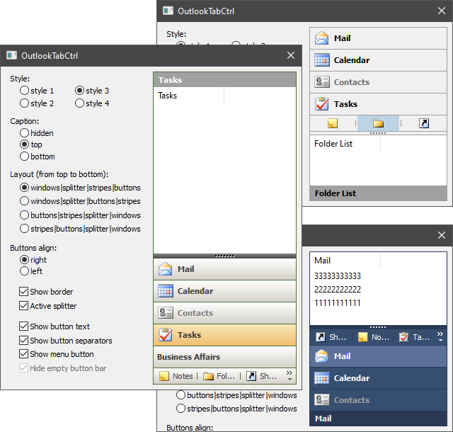
This control is another kind of tab. Tabs are displayed as horizontal stripes and can be collapsed into buttons located in a separate area. Each tab is assigned its own window, which is shown when you click on the tab. An additional button can be displayed in the button area. You can use it to show menu, for example.
The control is derived from CWnd and is a common control based on MFC. It is possible to put it on any window: main frame, dialog, etc.
Using the Code
To create the control and add elements to it, you can do the next steps:
#include "OutlookTabCtrl.h"
OutlookTabCtrlEx<OutlookTabCtrlCustom1> m_TabCtrl;
CListCtrl m_List1, m_List2;
...
if( !m_TabCtrl.Create(this, WS_CHILD | WS_VISIBLE,CRect(10,10,100,200), ID_OutlookTabCtrl) )
return -1;
m_TabCtrl.CreateStripeImage(NULL,IDB_STRIPE_NORMAL,IDB_STRIPE_DISABLE,true,24);
m_TabCtrl.CreateButtonImage(NULL,IDB_BUTTON_NORMAL,IDB_BUTTON_DISABLE,true,16);
if( !m_List1.Create(WS_CLIPCHILDREN | LVS_REPORT, CRect(0,0,0,0), &m_TabCtrl,ID_List1) ||
!m_List2.Create(WS_CLIPCHILDREN | LVS_REPORT, CRect(0,0,0,0), &m_TabCtrl,ID_List2) )
return -1; m_List1.InsertColumn(0,"Mail",LVCFMT_LEFT,100);
m_List2.InsertColumn(0,"Calendar",LVCFMT_LEFT,100);
if( !m_TabCtrl.AddItem(&m_List1,"Mail",0,0) ||
!m_TabCtrl.AddItem(&m_List2,"Calendar",1,1) )
return -1;
if( !m_TabCtrl.LoadState(AfxGetApp(),"OutlookTabCtrl","State") )
m_TabCtrl.PushVisibleItem();
m_TabCtrl.Update();
The OutlookTabCtrl class does not draw itself. To do this, inherit from the OutlookTabCtrl::Draw class and implement its functions. A pointer to OutlookTabCtrl::Draw must be passed to the control by calling the SetDrawManager function. The classes OutlookTabCtrlCustom1...OutlookTabCtrlCustom4 are ready-made implementations of the OutlookTabCtrl::Draw class. Each of them renders OutlookTabCtrl in its own style. The OutlookTabCtrlEx class helps you combine OutlookTabCtrl with the render class. For example, like this: OutlookTabCtrlEx<OutlookTabCtrlCustom2> ctrl; .
The OutlookTabCtrl::IRecalc interface sets the sizes of the areas in the control. The OutlookTabCtrl class has its own OutlookTabCtrl::IRecalc implementation. But you can also make your own implementation of the OutlookTabCtrl::IRecalc interface and pass a pointer to it in the control using the SetRecalcManager function.
There are also three additional classes: Ability, Notify, and ToolTip. The Ability class allows the user to select any tab. Notify informs about the occurrence of some event. ToolTip manages the creation of tooltips for tabs in button state. A pointer to the implementation of each of the classes must also be passed to OutlookTabCtrl.
Windows for all new added items should have the unique identifiers. Items can be in the state of a stripe or button. By default, an item is added as a stripe. The user should call the Update function to show the results that are set by functions DeleteItem, SetItemWindow, SelectItem, etc. You can hide an item (ShowItem) or block it (DisableItem). It is also possible to get the index of an item among all visible items (GetVisibleIndexByHandle) or in general among all items in the control (GetIndexByHandle). A control can save and load the position of its elements and their visibility from the registry or another source (LoadState/SaveState). This is only part of the possibilities. To learn more, take a look at the public interface of the OutlookTabCtrl class.
Good luck!
History
- 4th October, 2007 - Original version posted
- 11th October, 2007 - Fixed problem with addition
Dialog as child control; added functions SetLayout and SetButtonsAlign for determination places of the control's areas - 17th December, 2008 - Just corrected some small errors
- 16th March, 2021 - Improved sources and text of the article
