 | Quick & Easy HTML5 & CSS3
Rob Crowther
In this article from Quick & Easy HTML5 & CSS3, the author discusses four new features for the background image: sizing; multiple backgrounds on a single element; positioning relative to the border, padding, or content; and clipping according to the border, padding or content. Compliments of manning.com is a 40% discount to the Code Project community. Use promotional code code40project at manning.com and save 40% off the MEAP, eBook and pBook. All pBook purchases include free eformats (PDF, ePub, and Kindle) when available.
You may also
be interested in…
|
CSS3 offers four new features for the background image: sizing;
multiple backgrounds on a single element; positioning relative to the border,
padding, or content; and clipping according to the border, padding, or
content. In this article, you will learn about each of these new features.
| Browser Quick Check |
| Type | Standard | Prefixed |
| IE | 9 | - |
| Firefox | 4.0 | 3.6 |
| Chrome | 7 | 5 |
| Safari | 5 | 3 |
| Opera | 10.5 | 10.1 |
Background Size
Background images are intended to be used purely for decoration,
whereas images placed in the HTML are supposed to mean something. However,
images placed in the markup have certain practical advantages that can
discourage web authors from doing the right thing.
 | One of these
advantages of images in markup is that it's easy to make an inline image
scale according to the size of its container; simply set the width of the
image to be 100%. But, in CSS2, there is no way to make the image be anything
other than its innate size. The following example shows the issue. |
|
In this example,
an image has been set as a decorative background to a header:
h1 {
    background-image:
      url('head-banner.png');
    background-repeat: no-repeat;
    padding-top: 1.85em;
}
|  |
|
The top padding
has been set to allow room for the background image, and the image itself is
sized to match the width of the heading.
| |
|
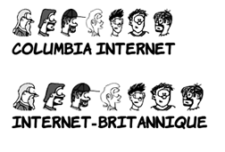
If the heading was to change at
all though, the background image might look a little incongruous. If we
translate “Columbia Internet” into French, suddenly we have an image with
some text sticking out underneath, and the visual relationship is lost.
The new background-size
property allows the image to be stretched in proportion to the element’s
dimensions:
h1 {
    background-image:
      url('head-banner.png');
    background-repeat: no-repeat;
    background-size: 100% 1.85em;
    padding-top: 1.85em;
    display: inline-block;
}
| 
 |
|
The h1 is set to be an inline-block so that its width will
shrink-wrap its contents, and then the background image is set to be a fixed
height and full width. You can see that the image becomes distorted as the
width of the element forces it to stretch. This approach is only suitable to
allow for small changes in the expected element width.
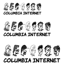
If the text should stay the same
but appear in different font sizes, it is possible to avoid the aspect ratio
issue. If you know how wide the text will be, simply specify the width and
height in proportion to the aspect ratio:
h1 {
    background-image:
      url('head-banner.png');
    background-repeat: no-repeat;
    padding-top: 2.18em;
    display: inline-block;
    background-size: 11.1em 2.18em;
}
section:nth-of-type(1) h1 {
    font-size: 200%;
}
section:nth-of-type(2) h1 {
    font-size: 250%;
}
section:nth-of-type(3) h1 {
    font-size: 300%;
}
| 
|
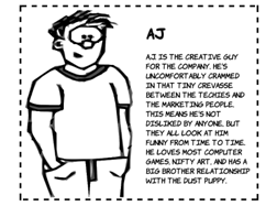
The ability to size backgrounds aligns well with vector
graphics. Because they are vectors, SVG graphics are smooth and sharp no matter
how much you stretch them, whereas bitmap graphics become blocky and blurry.
Below are two examples—one using a bitmap PNG format, the other SVG.

| 
|
div {
    background-image: url('aj.png');
    background-repeat: no-repeat;
    background-size: 50% 100%;
    padding-left: 50%;
    display: inline-block;
}
|
div {
    background-image: url('aj.svg');
    background-repeat: no-repeat;
    background-size: 50% 100%;
    padding-left: 50%;
    display: inline-block;
}
|
Although SVG works well with background sizing, it is a bad fit
for photographic type images. You may want to set a single picture behind your content,
similar to the effect achieved by setting a desktop background on your
computer. In this case, the detail of the image is less important, so
distortion is less of an issue.
|
This example shows the main content with a semi-transparent
background overlaid on top of a background image set to fill the entire box.
Here is the markup:
<section>
  <div>
    <p>In almost every...</p>
  </div>
</section>
The CSS for this is shown in the listing below. Unlike the
previous examples, this uses the shorthand syntax. The size appears with the
position separated by a slash: top / 100%.
| 
|
section {
    margin: 1em;
    padding: 5%;
    outline: 4px dashed black;
    background: url('10years.jpg') top / 100% no-repeat;
    display: inline-block;
    min-height: 342px;
    min-width: 300px;
}
div {
    background-color: rgba(255,255,255,0.66);
}
Note that, although several browsers have implemented background-size
only, Opera has implemented the shorthand syntax. For other browsers, you will
have to stick with a separate background-size
declaration.
Scaling is not
the only new background feature added in CSS3; you also are allowed to attach
multiple backgrounds to a single element. In the last example above, we added
an element to the markup whose only role was to add a background to the text.
In the next section, you'll see how CSS3 allows you to do without additional
markup for styling.
Multiple Backgrounds
In CSS2, you are only allowed one background image per element,
but there are many situations where you might want more than one image:
- A header might have a
background image spanning the width of the page as well as a company logo.
- A decorative
pullquote box could have opening and closing quotes on either side.
- Beveled buttons or
tabs have images for the left and right sides.
- Creating a rough-edged
paper scroll effect needs a repeating image down
both sides.
Web authors often use CSS tricks to size a
child element to match its container so that their background images can
overlap (this is known as the sliding doors
technique), but often they will be forced to introduce an extra element just to
support the styling or even add a purely decorative image inline in the markup.
 | All of these
approaches end up adding a purely presentational markup to the page or
depending on elements being combined in a particular way. While this is
usually not a big issue in these isolated instances, they indicate a lack of
power in the presentation language, CSS. This lack of power is addressed in
CSS3, as you'll see in the examples below.
|
| Browser Quick Check |
| | Standard | Prefixed |
| IE | 9 | - |
| Firefox | 3.6 | - |
| Chrome | 7 | - |
| Safari | 3 | - |
| Opera | 10.5 | - |
|
Let's revisit the
last example from the previous section, except this time without the
additional div element for wrapping the content:
<section>
  <div>
    <p>In almost every...</p>
  </div>
</section>
Despite losing the extra element, the page still looks the
same. That’s because two backgrounds are applied to the section
element:
|  |
section {
    margin: 1em;
    padding: 5%;
    outline: 4px dashed black;
    background: url('trans-66.png') 50% 50% no-repeat,
                url('10years.jpg') no-repeat;
    background-size: 90% 90%,
                     100%;
    display: inline-block;
}
|
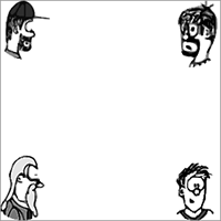
Adding multiple background images is simply a matter of listing
them, along with any relevant attributes, separated by commas in the
background property:
background: top right
  url('pitr-head.png') no-repeat,
 bottom right
  url('aj-head.png') no-repeat,
 top left
  url('mike-head.png') no-repeat,
 bottom left
  url('sid-head.png') no-repeat;
|  |
|
All of the other background properties also allow a comma-separated
list, so you could also write the above as:
background-image:
 url('pitr-head.png'), url('pitr-head.png'),
 url('mike-head.png'), url('sid-head.png');
background-position:
 top right, bottom right,
 top left, bottom left;
background-repeat:
 no-repeat, no-repeat,
 no-repeat, no-repeat;
| |
|
The background image you list first will be the closest to the
viewer. If you put them all in the same place, you can see the first image
covers the rest:
background: center
  url('pitr-head.png') no-repeat,
 center
  url('aj-head.png') no-repeat,
 center
  url('mike-head.png') no-repeat,
 center
  url('sid-head.png') no-repeat;
|

|
|
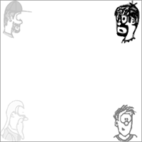
You can use this to your advantage to create some interesting
effects. Here, we use a semi-transparent PNG image in between each of the
other background images to create a progressive fading:
background: top right
  url('pitr-head.png') no-repeat,
 url('half-white.png'),
 bottom right
  url('aj-head.png') no-repeat,
 url('half-white.png'),
 top left
  url('mike-head.png') no-repeat,
 url('half-white.png'),
 bottom left
  url('sid-head.png') no-repeat;
|
|
Background Origin and Clipping
CSS2 has no control over which part of an element the background
applies to. Since CSS2 doesn't allow background sizing, most authors will have
not come up against this limitation, but CSS3 introduces two new properties to
give web authors fine-grained control: background-origin
and background-clip.
The next section will require an understanding of the CSS box
model to get the most out of it.
|
The default for background-origin
is padding-box. This means the background applies to the area containing the
padding but not to the area containing the border:
section {
    margin: 1em;
    padding: 1em;
    border: 1em dashed black;
    background-origin: padding-box;
}
This sample image is scaled to fill its container and set not to
repeat.
|  |
|
Setting the origin to border-box means that the background will now extend
out under the border:
section {
    margin: 1em;
    padding: 1em;
    border: 1em dashed black;
    background-origin: border-box;
}
|  |
|
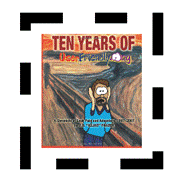
Finally, content-box limits the
background just to the content area, inside the padding:
section {
    margin: 1em;
    padding: 1em;
    border: 1em dashed black;
    background-origin: content-box;
}
|  |
|
The default value for background-clip is border-box:
section {
    margin: 1em;
    padding: 1em;
    border: 1em dashed black;
    background-clip: border-box;
}
Remember that our example is scaled and set not to repeat.
| 
|
|
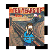
When applied to backgrounds that
don't repeat, this is indistinguishable from padding-box
because of the default value of background-origin:
section {
    margin: 1em;
    padding: 1em;
    border: 1em dashed black;
    background-clip: padding-box;
}
|  |
|
However, if the background is allowed to repeat, the
difference becomes apparent. The setting of padding-box
will still clip the image inside the border, but for border-box
we can see the repeating image under the border:
section {
    background-clip: border-box;
    background-repeat: repeat;
}
|  |
|
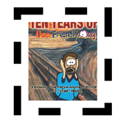
Finally, content-box will clip the
background to the content area:
section {
    margin: 1em;
    padding: 1em;
    border: 1em dashed black;
    background-clip: content-box;
}
Note that, even though the background is clipped, the image is
still sized to the padding-box.
|  |
Scaling backgrounds uniformly may not always produce the effect
you want. Although the sliding doors technique provides a workaround for that,
there is a more straightforward CSS3 approach to achieve the same effect:
border-image.
Summary
The features CSS3 for borders and backgrounds allow you to:
- Add visual depth with
drop shadows on text and boxes.
- Create striking effects
with border images.
- Make things smooth
with rounded corners.
- Make your life easier
with multiple backgrounds.
- Snazz up your designs
with gradients.
Most of these features give web authors a way to accomplish
effects that are commonly used but, with CSS2, have to be created in graphics
packages as images or require JavaScript hacks and additional HTML markup. We
showed you some new possibilities for managing backgrounds with CSS3, including
sizing, multiple backgrounds, positioning, and clipping.
Here are
some other Manning titles you might be interested in:
