Update: I modified the code so it would work with the onresize() event
Would you believe that was the best title I could come up with? Honestly, if you can think of a better one, shoot me a line - I want to hear from you.
Okay, I'm a big fan of Fluid Design. I love to design websites/webapps that flow into the space available, from giant screened desktops to mobile phones, and always look like they were designed with exactly that screen size in mind.
One thing that CSS-P brought to web design that didn't exist back when we were using invisible nested tables to do webpage layout is the ability to have rows with a dynamic number of "columns". So, for instance, if you are showing rows of thumbnails, you can have more thumbnails on a row if the browser window is wide, and fewer if the window is narrower.
The method for doing this is to cause items to "Float Left". Usually, this means putting your content (say a thumbnail and label) into a DIV; and giving the DIV the CSS property of:
div.column
{
   float:left;
}
If the above were added to a page's stylesheet, the DIVs with the class "column" assigned to them would stack to the right of the item before it on the page, and if there are more than one item, each will stack to the right of the previous DIV until there is no more room on that line, and then the next will appear below that row, starting a new one.
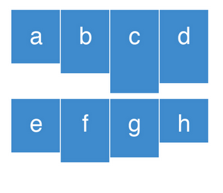
If the DIVs do not share the same height, each row will have their tops all lined up, but will have bottoms extend downwards as much as they need to accommodate the content they contain. And the next row, which also has all the tops lined up, will appear just below the bottom of the DIV, from the previous row, that was "tallest". Like this:

(So above the second row begins below the "tallest" item in the first row, which is c)
This isn't bad, but many designers would rather have some uniformity to the DIV sizes and have, say, the container backgrounds and borders fill in the spaces below a, b, and d. We can do that, of course, by giving each container a specified height, instead of letting the content drive the height, but then we would have to make all the containers as tall as they are likely ever to get which isn't prefect either.
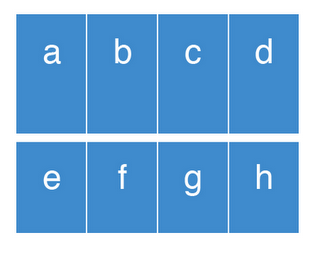
Ideally, I think, it would be best to have all of the DIVs in a row be all be the same height, but only be as tall as is actually needed to accommodate the tallest DIV in the row. Like this:

(In the above example, the DIVs in the first row are as tall as the tallest DIV in the row, which is c, and all the DIVs in the second row are as tall as f, which is the tallest DIV in that row.)
Well, with a bit of jQuery, you can have your DIVs all adjust their heights so they are uniform across the entire row. You will have to add jQuery to your page (see How jQuery Works) and add the following JavaScript to your page:
var currentTallest = 0;
var currentRowStart = 0;
var rowDivs = new Array();
function setConformingHeight(el, newHeight) {
el.data("originalHeight", (el.data("originalHeight") ==
undefined) ? (el.height()) : (el.data("originalHeight")));
el.height(newHeight);
}
function getOriginalHeight(el) {
return (el.data("originalHeight") == undefined) ?
(el.height()) : (el.data("originalHeight"));
}
function columnConform() {
$('div.column').each(function(index) {
if(currentRowStart != $(this).position().top) {
for(currentDiv = 0 ; currentDiv < rowDivs.length ; currentDiv++)
setConformingHeight(rowDivs[currentDiv], currentTallest);
rowDivs.length = 0;
currentRowStart = $(this).position().top;
currentTallest = getOriginalHeight($(this));
rowDivs.push($(this));
} else {
rowDivs.push($(this));
currentTallest = (currentTallest < getOriginalHeight($(this))) ?
(getOriginalHeight($(this))) : (currentTallest);
}
for(currentDiv = 0 ; currentDiv < rowDivs.length ; currentDiv++)
setConformingHeight(rowDivs[currentDiv], currentTallest);
});
}
$(window).resize(function() {
columnConform();
});
$(document).ready(function() {
columnConform();
});
(The above code assumes you have assigned the CSS class called "column" to each of the DIVs that are "Floating Left".)
If you can read JavaScript/jQuery, you will find the code comments will sufficiently explain how it works; but in a nutshell: The script goes through each DIV, determining which are on the same row by comparing the X value of the top of each container. It keeps track of which is the tallest, and then sets the height for each DIV in the row based on that value.
