Introduction
This article demonstrates how to make a button with a dynamic element (pulses) using .NET 2.0 and GDI+. The control utilizes the .NET Framework's Button class.
The Button States
Here are the different button states:

The MouseOver is just shown with a white (transparent) border and the focus is shown with a solid orange. The pressed state is the same as the default but without the reflex.
The Graphics
Here are the different elements of the button displayed:

Both Image and Text property can be set. The button supports two kinds of shapes: round and rectangular. The rectangular shape can have rounded corners.
Architecture
The control consists of a single class PulseButton that inherits from the System.Windows.Forms.Button class:

Using the Code
To test the button, just download the demo project and build it using Visual Studio 2008.
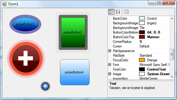
Click the different PulseButtons in order to reference them in the property grid.
Here's a brief description of the properties:
ButtonColorBottom - The color of the centre's bottomButtonColorTop - The color of the centre's topCornerRadious - The radius of the corner when Shape is set to rectangleFocusColor - The color of the border that indicates focusedForeColor - The color of the TextInterval - The timer interval, default 50 [ms] (this property is not browsable)NumberOfPulses - Number of pulses, 1 - 3 give the best resultsPulseColor - The color of the pulsesPulseWidth - The width of the pulses - should be less than half of the control widthShapeType - Round or RectanglePulseSpeed - The speed of the pulses, a value between 0.1 - 2 looks OK
Code
The pulses are updated using a System.Windows.Forms.Timer. The routine that renders the pulses looks like this:
private void PulseTimerTick(object sender, EventArgs e)
{
pulseTimer.Enabled = false;
InflatePulses();
Invalidate();
pulseTimer.Enabled = true;
}
private void InflatePulses()
{
for (var i = 0; i < pulses.Length; i++)
{
pulses[i].Inflate(PulseSpeed, PulseSpeed);
if (pulses[i].Width > Width || pulses[i].Height > Height ||
pulses[i].X < 0 || pulses[i].Y < 0)
pulses[i] = new RectangleF(pulseWidth, pulseWidth,
Width - 2 * pulseWidth, Height - 2 * pulseWidth);
pulseColors[i] = Color.FromArgb((int)(Math.Min(pulses[i].X * 255 /
pulseWidth, 255)), PulseColor);
}
}
The pulses are inflated using the PulseSpeed, when a pulse exceeds the bounds of the control then the size is reset. The pulses color gets more transparent when moving to the edge of the control.
Points of Interest
The regular Button control covers a lot more than what just meets the eye, so we gain a lot by inheriting from it. Another possibility is to inherit from ButtonBase and implement IButtonControl to avoid getting what you don't need, but that would be much more effort.
History
- 10th October, 2009: First version of control 1.0
- June 2015: WPF version found here:

