Page Layout
Making website layout used to be hard... Frames, tables, floats, display: table, vertical-align, negative margins, absolute positioning ... you name it! People & frameworks had to abuse HTML/CSS features just to center a div (let alone do a responsive page setup) ... Fortunately, the dark ages are over, Flexbox is supported for quite a while and about two years ago, major browsers implemented Grid. It took 30 years, but website layout problem is solved (almost, still waiting for Subgrid).
If you haven't heard about CSS Grid, here's a couple of great resources:
Quick Experiments
The above sites (and myriad of others) are doing a great job of describing grid features, so I'm not going to do that here. Instead, I will share the page I made while learning grid: https://morzel85.github.io/css-grid-playground (ups, I've just noticed that https://www.cssgridplayground.com exists, the more playgrounds the better?)
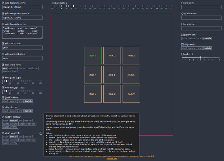
My site is not a grid generator but rather a place were you can quickly test effects of various CSS Grid properties. Play with properties and immediately see the result (you may also want to open browser devtools to see how styles are actually applied to container and items)... If you are lost don't worry, just reload the page to get to initial state.
Here's how the site looks:

On the left-hand side, you can control properties of grid container (div with grid-container class). In the middle, you can set the amount of grid items (divs with grid-item class) and see the resulting grid. If you click an item, an additional panel opens where you can control specific grid item properties. If you are not sure what a property does, hover over it to see a brief description and example values.
I've tested the page in Chrome 75, Firefox 68 and Edge 44.
Supported Properties
CSS Grid is quite complex, but if think that my tool does a decent job of demonstrating its most important features. These are the supported properties:
grid-template-rows
Defines the amount and sizes of explicit grid rows.
grid-template-columns
Defines the amount and sizes of explicit grid columns.
grid-auto-Rows
Defines sizes of implicit grid rows. Implicit rows are created when amount of items exceed the amount of explicit rows (rows defined by template) or when an item placement goes outside the range of explicit rows.
grid-template-areas
Defines named grid areas which can be associated with particular grid items by using placement properties: grid-row-start, grid-row-end, grid-column-start, grid-column-end (or their shorthands: grid-row, grid-column and grid-area). Areas for each row are specified between quotes, white-space might be added to increase readability.
grid-auto-columns
Defines sizes of implicit grid columns. Implicit columns are created when amount of items exceeds the amount of explicit columns (columns defined by template) or when an item placement goes outside the range of explicit columns.
grid-auto-flow
Defines placement algorithm for items which are not specifically positioned (for example, by using grid-column or grid-area).
row-gap
Defines space (gutter) size between grid rows. Older implementations used grid-row-gap name. gap shorthand property can be used to specify row and column gutters at the same time.
column-gap
Defines space (gutter) size between grid columns. Older implementations used grid-column-gap name. gap shorthand property can be used to specify row and column gutters at the same time.
justify-items
Defines placement of items in grid cells along inline (main) axis (horizontally, except for vertical writing mode). Value set on a container can be overridden by justify-self on an item. place-items shorthand property can be used to specify both align and justify at the same time.
align-items
Defines placement of items in grid cells along block (cross) axis (vertically, except for vertical writing mode). Value set on a container can be overridden by aling-self on an item. place-items shorthand property can be used to specify both align and justify at the same time.
justify-content
Defines placement of grid cells along inline (main) axis (horizontally, except for vertical writing mode). The setting will not have any effect if there is no space left on inline axis (for example, when some column is defined as 1fr)! place-content shorthand property can be used to specify both align and justify at the same time.
align-content
Defines placement of grid cells along block (cross) axis (vertically, except for vertical writing mode). The setting will not have any effect if there is no space left on block axis (for example, when some row is defined as 1fr)! place-content shorthand property can be used to specify both align and justify at the same time.
grid-row
A shorthand property that controls item row placement by setting grid-row-start, and grid-row-end values respectively. If placement goes outside of explicitly defined grid rows, implicit rows will be created.
grid-column
A shorthand property that controls item column placement by setting grid-column-start, and grid-column-end values respectively. If placement goes outside of explicitly defined grid columns, implicit columns will be created.
grid-area
A shorthand property that controls item placement by setting grid-row-start, grid-column-start, grid-row-end and grid-column-end values respectively. The setting is especially helpful when grid-template-areas "ascii-art" is used. If placement goes outside of explicitly defined grid, implicit row or columns will be created.
justify-self
Places the item inside grid cell along inline (main) axis (horizontally, except for vertical writing mode). The setting takes precedence over justify-items specified on container.
align-self
Places the item inside grid cell along block (cross) axis (vertically, except for vertical writing mode). The setting takes precedence over align-items specified on container.
order
Allows reordering of automatically placed item. By default, items have order 0. The higher the order, the later the item will appear. If other items have default order, setting to 1 will move the item to the end, and setting to -1 will move the item to the beginning.
History
- 4th August, 2019: Initial version
