Introduction
The concept of pie menus have been around for quite some while, and might in certain contexts have some benefits over the standard linear menus. In particular, when large touch screens like the Microsoft PixelSense/Samsung SUR40 become more available, we might expect an increased demand for alternatives to linear menus.
Unfortunately, the .NET framework does not provide a standard pie menu control for WPF. The closest thing is the ElementMenu control of the Surface 2.0 SDK. This article presents a pie menu control for WPF. Because the menu is intended for use in touch enabled applications, it responds to both mouse and touch events.
Using the Code
The PieMenu is used in a fashion similar to the WPF Menu control; a PieMenu may contain any number of PieMenuItems, which again may contain PieMenuItems to arbitrary depth. The labels of the menu items are given by the Header property and their behavior is specified by the Click event or the Command property.
<p:PieMenu x:Name="Menu1">
    <p:PieMenuItem Header="Item 1">
        <p:PieMenuItem Header="Item 1.1" Click="PieMenuItem_Click"/>
        <p:PieMenuItem Header="Item 1.2" Command="NotACommand"/>
        <p:PieMenuItem Header="Item 1.3" />
    </p:PieMenuItem>
    <p:PieMenuItem Header="Item 2">
        <p:PieMenuItem Header="Item 2.1" />
        <p:PieMenuItem Header="Item 2.2" />
    </p:PieMenuItem>
    <p:PieMenuItem Header="Item 3">
        <p:PieMenuItem Header="Item 3.1" />
        <p:PieMenuItem Header="Item 3.2" />
        <p:PieMenuItem Header="Item 3.3" />
        <p:PieMenuItem Header="Item 3.4" />
    </p:PieMenuItem>
</p:PieMenu>
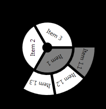
This menu, with only default settings, will look like this (when Item 1.1 is pressed):

Properties common for all UI controls, such as Background, Foreground, FontSize, etc. work as expected, and properties specified in the menu items override properties specified in the menu items. In addition, the PieMenu has several custom properties:
SelectedBackground specifies the color of selected menu items (default gray)Radius specifies the radius of the first level of the menu (default 50.0)InnerRadius specifies the radius of the hole in the middle of the menu (default 10.0)Gap specifies the distance between the levels of the menu (default 5.0)SectorGap specifies the distance between menu items at the same level (default 5.0)MenuSector specifies the sector of the circle that the menu will use (default 360.0)Rotation specifies the angle at which the first menu item is placed (default 0.0)RotateText specifies whether the labels of the menu items are rotated to follow the circle (default True)
The PieMenuItem has one custom property: SubMenuSector specifying the sector of the circle that its sub items will occupy (default 120.0).
Thus, we may define a pie menu as follows:
<p:PieMenu x:Name="Menu2"
           Background="Blue"
           SelectedBackground="LightBlue"
           Foreground="White"
           BorderBrush="Red"
           SectorGap="10"
           Gap="10"
           Radius="100"
           InnerRadius="0"
           RotateText="False"
           Rotation="90"
           MenuSector="180">
    <p:PieMenuItem Header="Item 1"
                   BorderThickness="1"
                   SubMenuSector="90">
        <p:PieMenuItem Header="Item 1.1" />
        <p:PieMenuItem Header="Item 1.2" />
        <p:PieMenuItem Header="Item 1.3" />
    </p:PieMenuItem>
    <p:PieMenuItem Header="Item 2"
                   BorderThickness="2"
                   BorderBrush="Green"
                   SubMenuSector="60">
        <p:PieMenuItem Header="Item 2.1" />
        <p:PieMenuItem Header="Item 2.2" />
    </p:PieMenuItem>
    <p:PieMenuItem Header="Item 3"
                   FontFamily="Times New Roman"
                   FontStyle="Italic"
                   FontSize="14"
                   Background="Green"
                   Foreground="Black" >
        <p:PieMenuItem Header="Item 3.1" />
        <p:PieMenuItem Header="Item 3.2" />
        <p:PieMenuItem Header="Item 3.3" />
        <p:PieMenuItem Header="Item 3.4" />
    </p:PieMenuItem>
</p:PieMenu>
This gives the following (not very pretty) menu (when Item 2.1 is pressed):

Points of Interest
The PieMenu class extends ItemsControl while the PieMenuItem class extends HeaderedItemsControl. These general controls give us a lot for free with respect to the management of the menu items.
In the implementation of the menu, the PieMenu class is responsible for the rendering of the full menu as well as maintaining the state of the menu. The alternative approach would be to have each instance of PieMenuItem render itself and maintaining its own state. The benefit of the chosen, centralized, approach is that it makes it easy to calculate the outline and relative placement of the menu items compared to having each menu item figuring out its own outline and placement. The drawback with this approach is that it requires a certain amount of book keeping for remembering which menu items are selected and visible and figuring out which menu item is clicked. In this last respect, a decentralized approach where each menu item keeps track of its own state and handles input events would probably be simpler, even though some messaging between the menu items would be required for maintaining the correct global state of the menu.
Acknowledgements
This code is developed in context of the BRIDGE and DARIUS projects.
History
- 05 January 2013: Original version
