Develop a Windows 8 app in 30 days
Modern browsers like Internet Explorer 10 support the width and height properties of the W3C Working Draft CSS Device Adaptation. This gives Web developers a simple tool to control automatic content scaling across various window dimensions. In particular, it enables sites to easily adapt to Windows 8 browsing on touch-enabled tablet devices in the snapped view and in portrait orientation.
Auto-Scaling and When It Is Used
Most websites have prioritized optimization for a 1024 pixel wide window. This ensures a good user experience for a wide variety of displays when the browser is maximized. However, sites may not work well on new form factors like tablets and portrait screen orientation if they haven't optimized for other window sizes as well. In particular, pages often clip or distort layout when viewed in a narrow width.


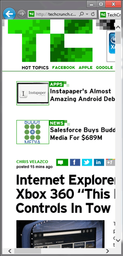
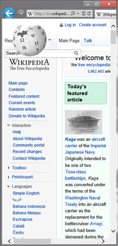
TechCrunch and Wikipedia displayed in very narrow windows
This narrow layout is particularly important in Windows 8, where the snapped view of the browser is in this exact state. This situation also occurs for portrait mode on slate devices due to the smaller form factor.
The snapped view and portrait mode are auto-scaled by default to ensure at least 1024 pixels of layout width. Mobile devices take a similar approach when displaying non-mobile-optimized sites on a narrow form factor. Since most sites are built to work well at 1024 pixels, this ensures that they are laid out well and do not clip content by default.


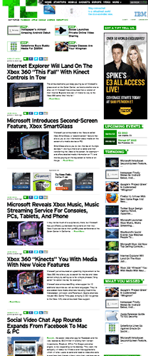
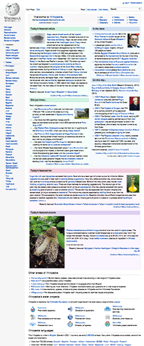
TechCrunch and Wikipedia displayed in Windows 8 Metro style browser in snapped view
Although this approach ensures a good default experience, users will need to zoom in to view and interact with the site.
Working Well In a Narrow Window
The best narrow layouts are those that have been custom-made by the Web developer. In addition to fitting the site into a narrower region, this also may require changes to image sizes, reordering of content, alternative tools for site navigation, or other fundamental changes to content.
If your site has already made these modifications for narrow windows, then Device Adaptation can be used to override the default scale.
For some great examples of adaptive layouts, check out Media Queries. Metal Toad Media also has a great article discussing layout width support based on prevalent devices and screen sizes in the market.
Using @-ms-viewport
Simple support for the snapped view. If your site is already capable of a 320 pixel width layout, you can easily choose to show that version in the snapped view. Combining Device Adaptation with CSS media queries allows the auto-scaling feature to be overridden selectively. This CSS overrides the default auto-scaling, and instead enforces a consistent 320 pixel layout width for all windows 320 pixels wide or narrower:
@media screen and (max-width: 320px) {
    @-ms-viewport { width: 320px; }
}
When the window is less than 320 pixels wide the content will be scaled down to fit. For example, a 300 pixel wide window will show the content at 93.75% scale. For larger widths, IE10’s normal scaling applies (for example, when the Metro style browser is in portrait mode).
Device adaptation degrades gracefully in browsers which do not yet support it. These browsers can still benefit from narrow layout support—they just won’t auto-scale to fit content to the window.
Portrait support. If your site supports a 768 pixel wide layout as well, then portrait mode support can be easily added with a second viewport rule:
@media screen and (max-width: 320px) {
    @-ms-viewport { width: 320px; }
}

@media screen and (min-width: 768px) and (max-width: 959px) {
    @-ms-viewport { width: 768px; }
}
I recommend testing your site in layout widths of 768 pixels (portrait on most slates) and 320 pixels (snapped Metro style browser) in addition to 1024 pixels and wider (landscape). You can see an example of the viewport rule in action in the Make it Snappy! demo on the IE Test Drive site.
