Introduction
Did you know that you can use the DevExpress ASP.NET Popup control to show just about any type of tooltip?
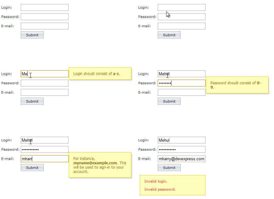
Check out this example which shows a helpful tooltip when the end-user enter an input field:

The tooltip then disappears out of the way when the end-user exits the field.
To try this sample live now, click here: Popup Control - Client-Side Functionality
To see the code, click on the 'Code' tab of the demo at the top right. Below I'll show you a modified and simpler version of this sample.
Versatile Popup Control
Why use the DevExpress ASP.NET Popup Control? Because it's versatile, customizable and provides great client-side events and functionality.
You can even use it with the DevExpress ASP.NET GridView: ASPxGridView Cell Template Popups
Display A Simple Tooltip
Let's see how easy it is to add a simple tooltip when we mouse-over a hyperlink:

Follow these 3 easy steps:
1. Declare your HTML element that you'd like to attach the popup control to. We'll use the hyperlink element with ID of "idUser1" to attach the Popup Control to:
<p>
    Mouse over <a id="idUser1" href="#">this link</a> to see the slick tool tip using the DevExpress ASP.NET Popup control!
</p>
2. Declare your ASPxPopupControl and set the PopupElementID to the HTML element that it will attach to (idUser1 in our case):
<dx:ASPxPopupControl ID="ASPxPopupControl1" runat="server"
    PopupAction="MouseOver" PopupElementID="idUser1"
    ShowHeader="False" Width="100px" PopupHorizontalAlign="LeftSides"
    PopupVerticalAlign="Above" PopupVerticalOffset="-10"
    PopupHorizontalOffset="-10" CloseAction="MouseOut">
    <ContentStyle CssClass="pcContent"></ContentStyle>
    <ContentCollection>
        <dx:PopupControlContentControl ID="PopupControlContentControl1" runat="server" SupportsDisabledAttribute="True">
            <div>
                DevExpress FTW!
            </div>
            <div class="pcCalloutBack">
                <div class="pcCallout"></div>
            </div>
        </dx:PopupControlContentControl>
    </ContentCollection>
</dx:ASPxPopupControl>
You can also add just about any content you want within the ContentCollection area of the ASPxPopupControl. Here, we've just added a couple DIV elements to display a simple message and assigned CSS classes for styling. We've also defined the PopupAction to be MouseOver. Set the CloseAction to MouseOut to hide the tooltip after the mouse over.
3. Style and customize your popup control. Here are a couple of the styles used for the DIV element used within the popup:
<head runat="server">
    <title>ASP.NET Tooltips using DevExpress ASP.NET Popup Control</title>
    <style type="text/css">
        .pcContent {
            background-color: Yellow;
        }
        .pcCalloutBack {
            position: absolute;
            border-style: solid;
            width: 0px;
            margin-top: 10px;
            margin-left: 0px;
            border-width: 15px 15px 0px 5px;
            border-color: transparent;
            border-top-color: #8B8B8B;
        }
        .pcCallout {
            position: absolute;
            border-style: solid;
            width: 0px;
            margin-top: -17px;
            margin-left: -5px;
            border-width: 15px 15px 0px 5px;
            border-color: transparent;
            border-top-color: Yellow;
        }
    </style>
</head>
Now run this sample and mouse over the hyperlink to see the slick tooltip.
Download a sample version of the above as a simple ASP.NET website:

Helpful CodeCentral Samples
Here are 3 other helpful CodeCentral samples that show you how to return values and pass parameters with the ASPxPopupControl:
Summary
Use the DevExpress ASP.NET Popup Control to display a slick and customized tooltip for your websites. Then drop me a line below with your thoughts, thanks.
Save time and money...
Save time and money with high quality pre-built components for ASP.NET, Windows Forms, WPF, Silverlight and VCL as well as IDE Productivity Tools and Business Application Frameworks, all backed by world-class service and support. Our technologies help you build your best, see complex software with greater clarity, increase your productivity and create stunning applications for Windows and Web in the shortest possible time.
Try a fully-functional version of DXperience for free now: http://www.devexpress.com/Downloads/NET/
