In Part 1, we learned a bit about the history of HTML5 and CSS3. We also looked at the syntax rules for HTML5, along with some required and basic elements. In this article we will expand our knowledge a bit and look at:
- Attributes
- Images and Different Kinds of Hyperlinks
- Lists and Tables
- Emphasis Elements (Bold, Underline, Italics, etc.)
- Edit Elements
- Using Comments
- Tips for Structuring Code and Making it Readable
- Browser Support
The Author's Rant
One thing I must emphasize (and I probably will do so in every chapter) is the importance I place upon HTML validation. Code does not have to be validated to work, but it sure does work wonders with your boss when he decides to run his own validation on the sly. Yeah, I've had that happen to me, but I wasn't very smart back then. Plus, it was in the nasty world of XHTML, which is far less forgiving than HTML5.
Element and Template Miscellanea
These articles use a specific convention when describing HTML elements. First, I indicate a void or empty element by wrapping the element name in '<' and ' />'. The slash before the closing bracket indicates this type of element. Second, I describe the non-empty elements with both their opening and closing tags:
<emptyelement />
<normalelement></normalelement>
Additionally, all code samples assume they are placed in the body element of this code:
<!DOCTYPE html>
<html>
    <head>
        <meta http-equiv="Content-Type" content="text/html;charset=UTF-8">
        <title>Beginner's HTML5 Practice Page</title>
    </head>
    <body></body>
</html>
HTML elements often can be specified or modified in some manner through the elements' attributes.
Attributes are declared in the opening tag of an element in the form: name="value". The attribute name and value is case-insensitive in HTML5. Some of the global attributes common to all elements (along with an example) are the following:
id
| id="top_element"
The id attribute assigns a unique name to a single element. No two elements can have the same id value, or scripts that reference elements by id will fail.
|
title
| title="Chapter 2"
The title attribute holds the text that pops out like a tooltip when the mouse hovers over the element.
|
class
| class="ornamented"
The class attribute designates the class (or classes) assigned to the element.
|
style
| style="width: 100px;"
The style attribute in an inline method of defining CSS attributes for an element.
|
For the remainder of this 12-part series, element definitions will only show attributes unique to that element, and then just the attributes most commonly used.
There are two types of images: raster and vector. Raster images map color and transparency values to individual pixels. Vector images contain instructions for drawing an image. Each type has their strengths and weaknesses, as you will see below.
Raster
When you take a picture with your smart phone, you create a raster image. Raster images have defined dimensions and color attributes. BMP, JPG, GIF, and PNG files are all examples of raster format images. When you examine file properties of raster images--depending upon what tool you use--you will find picture dimensions and sometimes color depth.
Dimensions tell you how wide and tall a picture is in pixels. The color depth tells you how many colors are possible in the image.
BMP files are raster images originally created for the Windows and OS/2 operating systems. These files can have a bit depth of 32 bits. Images in this format with a color depth of 16 bits or higher are always uncompressed and therefore large. Because of this, BMP files are a rare find on a web page.
JPEG files can display 16 million colors because they have 24 bits of color depth. When we put on our thinking caps, we quickly see that 24 bits breaks down into three channels of 8 bits each. This is RGB color, with the red, green, and blue channels holding a value from 0 to 255. JPEG files have a scalable compression capacity, giving them the ability to compress very small at the cost of image clarity.
The GIF file format was created in 1987. It supports 8 bits of color depth, meaning 256 colors chosen from a palette. The GIF format, however, has two strengths: small size and animation capabilities.
PNG files can contain a bit depth as high as 48 bits (16 per channel), but usually anything greater than 8 per channel is wasted. The PNG format compresses fairly well and still maintains a very sharp image.
Re-sizing a raster image requires algorithms to either fill in pixles when the picture grows or merge them together when the picture shrinks. Repetitive re-sizing corrupts raster pictures quickly, so web designers often drop raster images onto a web site with varying dimensions.
Vector
Vector image files do not suffer from corruption when they are re-sized. They are basically text files as you can see from this sample taken from the W3C SVG Document Structure page:
="1.0"="no"
<!DOCTYPE svg PUBLIC "-//W3C//DTD SVG 1.1//EN" "http://www.w3.org/Graphics/SVG/1.1/DTD/svg11.dtd">
<svg width="5cm" height="4cm" version="1.1" xmlns="http://www.w3.org/2000/svg">
<desc>Four separate rectangles
</desc>
<rect x="0.5cm" y="0.5cm" width="2cm" height="1cm"/>
<rect x="0.5cm" y="2cm" width="1cm" height="1.5cm"/>
<rect x="3cm" y="0.5cm" width="1.5cm" height="2cm"/>
<rect x="3.5cm" y="3cm" width="1cm" height="0.5cm"/>
<rect x=".01cm" y=".01cm" width="4.98cm" height="3.98cm" fill="none" stroke="blue" stroke-width=".02cm" />
</svg>
Because vector image files are just instructions, a re-sized vector image does not suffer from pixelation. The Wikipedia article on SVG files shows a good comparison of the differences.
All this sounds like SVG files should replace raster, but vector images cannot map thousands of pixels in their specific locations like a raster file can. Vector images are mainly comprised of lines and fills. A quick Google search brings up many examples of vector images. From those pictures, you should be able to see why vector images cannot replace raster images.
Showing an Image on a Page
HTML5 offers only one element for displaying images:
<img src="" alt="" width="" height="" usemap="" />
The img element can display all of the image types listed above, including the SVG files. By default, the img element will display the picture in its native dimensions. Pictures can be stretched or shrunk, depending upon the values of the elements attributes.
IMG Attributes
| src | This is the location of the image. |
| alt | Text in this attribute will display in the space where the image sits if the image cannot be found. |
| width, height | These attributes constrain the image to a specified width and/or height. Omitting these attributes causes the image to display in its native size. |
| usemap | This is the name of an image map, described below in the Hyperlinks section |
In the following example, the img element displays the picture profile.jpg:
<img src="profile.jpg" />
The above example assumes the image file lies in the same directory as the HTML5 document. For images placed in other locations, the proper addressing scheme must be used.
The area element must appear as a child to a map element. The map and area elements work together to form an image map. Now let's see what an image map might do for us.
Hyperlinks
Before we get into image maps, we need to discuss hyperlinks. A hyperlink is a clickable region on a web page that directs the browser to another place. If the destination is a location in the current document, it is called an internal link. If the destination is another web page, we call this an external link.
The a element indicates the presence of a link.
<a href="" target=""></a>
When the href attribute is missing, the a element becomes an anchor.
<a target=""></a>
The anchor format of the a attribute makes it a place where the hyperlink can go. Let's take a look at a few examples of the a element as a hyperlink and get familiar with it:
<a href="/profile.jpg">Root Link</a>
<a href="../images/profile.jpg">Relative Link</a>
<a href="https://db.tt/rD8Ye5QS" target="_blank">External Link</a>
<a href="#some_place_below">Internal Link</a>
The Root Link example tells us that the image is in the root directory of the web site. In contrast, the Relative Link example goes back one directory, then into the images directory to find the image file. The External Link example points to a location on another server, and it uses the target attribute to create a new tab and open the href location there. The Internal Link example points to a location on the current document.
Note that the href targets an anchor point by using '#', followed by the anchor's identifier.
The a element needs only an identifier to be an anchor. The identifier can be either the global attribute id or the global attribute name. The example below uses the id attribute:
<a id="some_place_below">Destination of Internal Link</a>
Text in the context of hyperlinks is underlined and displays in different colors, depending upon the status of the link.
- Unvisited: blue
- Visited: purple
- Active: red
The partial screenshot below shows you what these look like on a web page. Notice that the active color (red) only shows when the mouse is over the link and it is being clicked.

One more thing to know about the a element is that it can contain almost anything you want: text, images, paragraphs, images and paragraphs. The only caveat is that you cannot have interactive elements in the hyperlink region, such as buttons or other links. Conceivably, an entire page may be a link.
Image Maps
Ok, now we can get on to image maps. First, you need to know what this construct looks like in code. We begin with the image:
<img src="https://db.tt/rD8Ye5QS" width="200" height="200" usemap="#samplemap" alt="sample mapped image" />
Then, we put the map element together with its area element children:
<map name="samplemap">
    <area shape="rect" coords="0,0,200,100" href="#top_slice" alt="The top half" />
    <area shape="rect" coords="0,101,200,200" href="#bottom_slice" alt="The bottom half" />
</map>
Here is what this looks like in a browser:

Note that there is nothing added to the image to tell you that you have a map on it. However, when you pass the cursor over the image, you get the familiar selection icon, signifying the presence of a link. When you click on the link, a faint blue border appears around the area clicked, and the browser sends you to the destination. For the example, the destinations were internal, but they can also be external.
In a nutshell, the map element is merely a container, and the area elements are custom-shaped hyperlinks.
You must give the map a value for the name attribute, and that name must match the value of the usemap attribute in the referenced img element. For our example, we use "samplemap".
The shape attribute for the area elements can be one of several values:
- rect: A rectangle where the coords attribute contains the top-left and bottom-right coordinates of the area. The format for that is top-left-x, top-left-y, bottom-right-x, bottom-right-y. The coordinates are relative to the image and not the web page.
- circle: A circular area where the coords attribute contains the center of the circle and its radius. The format is center-x, center-y, radius. The radius value is in pixels.
- poly: A polygon with (ostensibly) an unlimited number of vertices. The coords attribute contains the vertex information as x1, y1, x2, y2,...xn, yn. If the last vertex is not the same as the first, the browser will connect the first and last vertices anyway.
- default: This is the value, not just a default (shape="default"). This value specifies the entire map area.
It is perfectly valid to have area elements hold coordinate information which overlaps. However, only the first specified area element for the overlapped region holds the destination for the link.
This offers an interesting way to create holes in shapes. If you, for example, want to have a clickable area in a ring shape, you would have the "hole" area listed first, smaller than the second area element, and centered in the same spot. To make the center area a dead space, omit the href and alt attributes. Here is an example:
<map>
    <area shape="circle" coords="50,50,10" />
    <area shape="circle" coords="50,50,100" href="#ring_shaped_link" alt="Ring Shape Destination" />
</map>
FYI, if you were curious while reading through the Hyperlinks section about the external link address, and you went there, you would have noticed that the image was much larger than the size defined for the img element of our map sample.
Content can easily be formatted in columns and rows or just columns via the list and table elements.
Lists
There are two HTML lists, the ordered list and the unordered list:
<ol type="" start="" reversed=""></ol>
<ul></ul>
Both list elements act as containers for the list items, which are represented by the li element:
<li value=""></li>
The value attribute for the li element only makes sense with an ordered list, because the li elements in an ol element have an ordinal value. The content of the attribute needs to be an integer, and it indicates the value of the displayed number.
If I have an ordered list with elements that have no values, I get a list numbered from 1:
<ol>
    <li>Kiwi</li>
    <li>Orange</li>
    <li>Apple</li>
    <li>Melon</li>
</ol>

If I include value attributes, the numbering changes:
<ol>
    <li value="4">Kiwi</li>
    <li value="3">Orange</li>
    <li value="2">Apple</li>
    <li value="1">Melon</li>
</ol>

Note that we just as well could have set the reversed attribute of the ol element to "reversed" to do the same thing....
If I specify a value for only one of the items in the list:
<ol>
    <li>Kiwi</li>
    <li>Orange</li>
    <li value="16">Apple</li>
    <li>Melon</li>
</ol>

You can see that the list numbering basically increments normally for the items that had no value attribute specified.
OL Attributes
| type | Specifies the type of numbering. Values are as follows:
- "1" : Decimal (default)
- "a" : Lower-case latin alphabet
- "A" : Upper-case latin alphabet
- "i" : Lower-case roman numerals
- "I" : Upper-case roman numerals
|
| start | Sets the first value in the series. The same can be done by setting the value attribute of the first li element. |
| reversed | This will count backwards from the top, or upwards from the bottom of the list up. |
The ul element has no attributes outside of the global attributes.
Tables
An HTML table creates a grid where each cell in the grid can hold content. All of the elements that contribute to a table are listed below:
<table></table>
<thead></thead>
<tbody></tbody>
<tfoot></tfoot>
<tr></tr>
<td colspan="" rowspan=""></td>
<th colspan="" rowspan=""></th>
All table elements act as containers. The HTML5 recommendations say the closing tags are not necessarily needed, but I have found that my sanity remains mostly intact when I include them, especially if I have been staring at code for hours.
In a simple sense, the table element contains one thead, one tbody, and one tfoot element; or it contains zero or more tr elements; or it contains a mixture of the four. In the author's experience, the thead, tbody, and tfoot elements can show up in any order and the table will look just fine, but only if you include closing tags for the elements.
The thead, tbody, and tfoot elements can contain zero or more tr elements. The tr elements can contain zero or more td or th elements.
And, if you are thoroughly confused at this point, a picture might make things clearer:
<table>
    <thead>
        <tr>
            <th>Day</th>
            <th>Max</th>
            <th>Min</th>
        </tr>
    </thead>
    <tbody>
        <tr>
            <td>Monday</td>
            <td>4.01</td>
            <td>1.12</td>
        </tr>
        <tr>
            <td>Tuesday</td>
            <td>2.67</td>
            <td>0.57</td>
        </tr>
        <tr>
            <td>Wednesday</td>
            <td>0.33</td>
            <td>0.09</td>
        </tr>
    </tbody>
    <tfoot>
        <th>Total:</th>
        <td>7.01</td>
        <td>1.78</td>
    </tfoot>
</table>
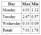
Tables are nice for showing tabular data, but they can also contribute to page formatting. Just about anything can fit inside a td element, including other tables.
The one powerful feature of a table is its re-sizing abilities. The cells' width can be specified in terms of percent, which keeps the cell widths proportionally the same when the table shrinks or grows (usually as a result of re-sizing the browser window in the OS).
The image of the table shown above contains borders, even though borders were not specified in the HTML code. (The author cheats with CSS!) Borders can be drawn at the cell level, which means we can have lines forming something other than a grid.
Cells can also be widened to span multiple columns or stretched vertically to span multiple rows. This is what the colspan and rowspan attributes do for a cell (td element). Here is another version of the example table with a twist:
<table>
    <thead>
        <tr>
            <th>Day</th>
            <th>Max</th>
            <th>Min</th>
            <th>Avg</th>
        </tr>
    </thead>
    <tbody>
        <tr>
            <td>Monday</td>
            <td>4.01</td>
            <td>1.12</td>
            <td>2.57</td>
        </tr>
        <tr>
            <td>Tuesday</td>
            <td rowspan="2" colspan="2"></td>
            <td>0.00</td>
        </tr>
        <tr>
            <td>Wednesday</td>
            <td>0.00</td>
        </tr>
    </tbody>
    <tfoot>
        <th>Total:</th>
        <td>4.01</td>
        <td>1.12</td>
        <td>2.57</td>
    </tfoot>
</table>
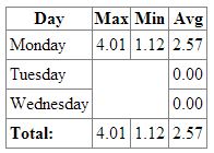
Please note the way the td element with the rowspan and colspan attributes has expanded. The cell begins where the Tuesday row and the Max column intersect, but it consumes the row below and the column to the right.
To keep the table in a rectangle, some of the cells had to be removed. One was removed from the Tuesday row, and two were removed from the Wednesday row.
A very large amount of text can be devoted to tables, because they used to hold a very prominent position in web design. With the advent of HTML5 and CSS3, however, the frequency of table element occurrence has dropped. Rather, the need for tables as formatting agents has diminished.
The W3C recommendations place emphasis elements in a group called Text Semantics. Within that group are 31 elements. The ones you will most likely use are the following:
<em></em>
<strong></strong>
<small></small>
<code></code>
<q></q>
<sub></sub>
<sup></sup>
<i></i>
<b></b>
<u></u>
<span></span>
<hr />
The descriptions of these elements in the W3C recommendations take a more abstract slant than this article will now take. For instance, the recommendation says the em element "represents stress emphasis of its contents", instead of merely saying 'shows in italics'. Here, then are the practical explanations alongside the semantic:
Text Semantics Elements
| Element | Rational Description | Semantic Description1 |
| em | Shows text in italics. | Represents stress emphasis of its contents |
| strong | Shows text in bold. | Represents strong importance, seriousness, or urgency for its contents |
| small | Shows small text. Essentially, it sets the CSS element font-size to "smaller". | Represents side comments such as small print. |
| code | Shows text in mono-spaced font, usually Courier New. | Represents a fragment of computer code. |
| q | Puts quotes around the content. | Represents some phrasing content quoted from another source. |
| sub | Subscript | The sup element represents a superscript and the sub element represents a subscript |
| sup | Superscript | (see above) |
| i | Shows text in italics. | Represents a span of text in an alternate voice or mood, or otherwise offset from the normal prose in a manner indicating a different quality of text, such as a taxonomic designation, a technical term, an idiomatic phrase from another language, transliteration, a thought, or a ship name in Western texts. |
| b | Shows text in bold. | Represents a span of text to which attention is being drawn for utilitarian purposes without conveying any extra importance and with no implication of an alternate voice or mood, such as key words in a document abstract, product names in a review, actionable words in interactive text-driven software, or an article lede. |
| u | Underlines the text. | Represents a span of text with an unarticulated, though explicitly rendered, non-textual annotation, such as labeling the text as being a proper name in Chinese text (a Chinese proper name mark), or labeling the text as being misspelt. |
| span | Indicates an inline section of text, often used to change attributes for emphasis, color, or mood. | The span element doesn't mean anything on its own, but can be useful... |
1 Semantic descriptions shamelessly taken from the W3C Recommendations.
Here is what each of the semantic elements does in the browser:
<p>This is the default font style and size.</p>
<p>
    <b>This is bold.</b><br />
    <i>This is italic.</i><br />
    <u>This is underlined.</u><br />
    <em>This is the em element.</em><br />
    <strong>This is STRONG.</strong><br />
    Regular alongside <small>some small</small> text<br />
    To use a library in C#: <code>using System.Text;</code><br />
    He said: <q>Put out the fire!</q><br />
    Here we have <sup>superscript</sup> and now <sub>subscript</sub>.<br />
    The SPAN element <span>doesn't seem to do much.</span><br />
</p>
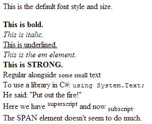
There are two elements which are used to demonstrate edits:
<ins cite="" datetime=""></ins>
<del cite="" datetime=""></del>
Edit Element Attributes
| cite | Contains a URL which should point to a location which explains the change. |
| datetime | The date and time of the change. Please note that this attribute is just a string value and can contain any ascii text. However, if you want valid code, then this attribute should contain text that can be parsed into a date and time. |
In the browser, the ins and del element underlines its contents. The del element decorates the text with a strikethrough. Here is how it looks:
<del>
<p>This is the default font style and size.</p>
</del>

There used to be a strike element, which displayed text in strikethrough, but that element has been eliminated from the W3C HTML5 recommendation. Browsers, however, will still parse the strike element properly if you use it:
<strike><p>This is the default font style and size.</p></strike>

Comments are created by starting with '<!--' and ending with '-->'. In between these two markers, you may have any text, with the exception of additional comment markers.
Also, do not start the commented text with '>' or the sequence '->'. A good rule of thumb is to insert at least one space between the comment markers and the commented text so that there is no confusion about the text you want commented
<!-- This is supposed <!-- to be fully commented --> but it isn't -->
<!-- This is supposed to be commented and it is -->
The comment markers can also span multiple lines:
<!--
<p>This paragraph should never be shown.</p>
<ol>
    <li>Keep this list commented out</li>
    <li>until we find a reason for it.</li>
</ol>
-->
The HTML5 document has no formatting requirements. Thus, the parsing engine is lenient enough to allow everything to be crammed together in a tortuous mess. Humans, however, are the agents who must maintain these documents, and we need structure to easily read, interpret, and debug HTML5 source code. Therefore, formatting source code should be practiced at all times.
The following rules are not meant to be rigorously followed. However, you will find that
Rule 1: Structure everything like a hierarchy.
The root element, html, should be placed on its own line without any spaces on the left. Thereafter, all children of the html element should be indented by one unit of space (usually four spaces or a tab).
Children of those children should be indented on unit of space to the right more than their parent. The children of the children's children should be indented one more unit of space, and so forth.
<!DOCTYPE html>
<html>                               <!-- the root element -->
    <head>                           <!-- first child of the root element -->
        <title>Home Page</title>     <!-- first child of the child of the root element -->
    </head>
    <body>
        Text in the BODY element.    <!-- Content is also indented. -->
    </body>
</html>
Note how the code above has the content or children of certain elements indented. You can instantly see what the contents of the head element are just by noting what is indented between the opening and closing tags.
In a simple example like this, there is little chance for confusion, but things can get nasty with, for example, table structures:
<table><thead><tr><th>Day</th><th>Max</th><th>Min</th></tr></thead><tbody><tr><td>Monday</td><td>4.01</td><td>1.12</td></tr><tr><td>Tuesday</td><td>2.67</td><td>0.57</td></tr><tr><td>Wednesday</td><td>0.33</td><td>0.09</td></tr></tbody><tfoot><th>Total:</th><td>7.01</td><td>1.78</td></tfoot></table>
Wow. Finding the cell in the third column of the third row will require a lengthy scan of the text with a good chance for errors.
Hierarchical formatting makes the above mess much easier to read:
<table>
    <thead>
        <tr>
            <th>Day</th>
            <th>Max</th>
            <th>Min</th>
        </tr>
    </thead>
    <tbody>
        <tr>
            <td>Monday</td>
            <td>4.01</td>
            <td>1.12</td>
        </tr>
        <tr>
            <td>Tuesday</td>
            <td>2.67</td>
            <td>0.57</td>
        </tr>
        <tr>
            <td>Wednesday</td>
            <td>0.33</td>
            <td>0.09</td>       <!-- Here is the 3rd column in the 3rd row of tbody -->
        </tr>
    </tbody>
    <tfoot>
        <th>Total:</th>
        <td>7.01</td>
        <td>1.78</td>
    </tfoot>
</table>
This makes comprehension and maintenance so much easier.
Now, you may have noticed that the context for the th and td elements was not placed on separate lines and indented. This is fine, since--as was stated earlier--the rules really don't need to be followed ALWAYS. Sometimes it makes more sense to keep the tags and content on the same line.
In the case of the table above, the coder probably felt keeping the contents with the th and td tags would actually facilitate in comprehension.
Rule 2: Decide on a case and stick with it.
As evident by the examples in this series, the author prefers to use lower-case for all element and attribute names. This is not necessary, however, as the HTML5 parser does not care about case.
So, if you want upper-case element names, then go knock yourself out. But, if you do, please make sure all your element names are upper-case. Mixing cases leads to confusion, and confusion always leads to bugs and errors.
Rule 3: Strive for logical organization
As elements appear in the document, so shall they appear in the flow when the document is parsed. By default, this is how things roll out into a web page. Each element's content is displayed right after the previous element. And, the following element's content is positioned right after that. This continues until the end of the page.
But this is not how most pages roll out to the client. CSS makes the job of visually formatting your document relatively easy. This means the position of elements in the source code does not necessarily determine how their contents will be displayed.
The one thing the coder can do to make the document readable, is to formulate an organization to the elements. Keep all navigation elements in one place, all header elements in another, and so on.
Rule 4: Check out other coders' work and see what's good and what's bad
Take a look at the source code of web sites you often visit and see how easy it is to read. Some sites will have badly-formatted code and others won't. Make a note of what you think is easy to understand and what is not. Compare this with the code you have written, then find ways to make your code better-looking.
Mimicking someone's format does not violate copyright laws, as long as you don't enter someone else's source code verbatim. Never outright copy someone else's code. Just take away the concept and use it in your own way in your own code.
On most browsers, you can right-click anywhere on the page and get a dropdown menu that has, among other things, a menu option that will let you look at the source code. This is what the Chrome dropdown (in part) shows:
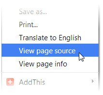
Chrome and Firefox will open a new tab with the source code of the document.
The vendors who create browsers work very hard to get their products in compliance with current recommendation, while supporting prior versions of HTML at the same time. Generally, all browsers support technologies currently in use with HTML4. The issue highlighted in this section is the support they give for the new features in HTML5.
On a scale of most compliant to least compliant, I have found Chrome to be the most compliant, and IE the least. You can test your own browser at Html5test.com. Just for grins, the four browsers I use on a daily basis scored thus (out of 555 possible points):
| Chrome | 505 |
| Opera | 496 |
| Firefox | 432 |
| IE 11 | 365 |
What this means is that the major browsers mostly support HTML5, but don't entirely. And, if you want to have your pages render properly on as many browsers as possible, you must code for the least compliant: in this case, IE.
You can look for yourself, but the support items that aren't supported by the various browsers have nothing to do with the elements discussed in chapters 1 and 2 of this series. For the serious HTML coder, however, many of these unsupported elements will cause a bit of unrest.
For example, IE does not support the Ogg Theora, WebM with VP8 or WebM with VP9 video formats, but Chrome does. Chrome supports all text semantic elements except the time element, but IE only supports the mark and wbr elements.
History
2014-03-30: Initial posting
