The code download supplied with the article contains the ColorPicker.sln solution consisting of three projects:
LaMarvin.Windows.Forms.ColorPicker.vbproj - the project implements the enhanced ColorPicker control and all built-in the adapter / adaptee classes.
ColorPickerDemoVB.vbproj - ColorPicker sample program written in VB.NET. Contains the VB.NET implementation of the LabelDisplayAdapter class.
ColorPickerDemoCS.csproj - ColorPicker sample program written in C#. Contains the C# implementation of the LabelDisplayAdapter class.
Please, don't forget to:
- Extract the files with the 'use folder names' option.
- Rebuild the solution (Build | Rebuild Solution) after you open it for the first time (this step will ensure the
ColorPicker controls will display correctly at design-time).
Introduction
After publishing the
original ColorPicker article, several readers sent me a question about the possibility to make the control to look (and act) like a
ComboBox. It seemed to be quite an interesting and useful feature, so I went out to redesign the control. The rest of the article describes the refactoring process and its results.
The refactoring process
I've decided to employ the
Adapter design pattern to implement a pluggable architecture that will allow dynamically changing the appearance and behavior of the control.
The first thing I did was analyzing the way the embedded CheckBox control is used inside the original ColorPicker control. I've identified the following tasks the embedded CheckBox control fulfilled:
- The
CheckBox covers the entire ColorPicker client area.
- The
CheckBox.BackColor property holds the value exposed by the ColorPicker.Color property.
- The
ColorPicker sets the CheckBox.Text property to either the current color name or to an empty string (with respect to the value of the ColorPicker.TextDisplayed property).
- The
CheckBox.CheckStateChanged event is handled by the ColorPicker control to show or hide the drop-down color editor according to the value of the CheckBox.CheckState property.
- Finally, the
CheckBox.CheckState value is set to 'unchecked' after the user finishes selection in the dropped-down color selector.
After doing the analysis, I've designed an interface that formalizes the above contract:
Public Interface IDropDownDisplayAdapter
  ReadOnly Property Adaptee() As Control
  Property Color() As System.Drawing.Color
  Property Text() As String
  Property HasDropDownAppearance() As Boolean
  Event DropDownAppearanceChanged As EventHandler
End Interface
The interface represents a variation of the
adapter design pattern: The
Adapter is the object implementing the
IDropDownDisplayAdapter interface. The
Adaptee is any
System.Windows.Forms.Control descendant. The
Client is the
ColorPicker control itself. As you can see, I've deliberately chosen to "unhide" the Adaptee from the client, because it simplified the implementation and it also seemed to be more appropriate in this context.
Terminology note: I'll frequently use phrases like "the adapter displays this or that". In reality, however, the adapter doesn't display anything; it's the task of the adaptee - the control used to actually render the display and interact with the user. Nevertheless, from the point of view of the ColorPicker control (the client of the adapter) that communicates with the adapter, the use of the word "adapter" seemed more natural than "adaptee".
The
IDropDownDisplayAdapter.Color property is defined because the
ColorPicker doesn't store the color value itself; it uses this property for storage and retrieval of the current color.
The IDropDownDisplayAdapter.Text property contains the text that the adapter should display. ColorPicker sets the text according to the value of the ColorPicker.TextDisplayed property. If TextDisplayed is True, the Text property is set to the current color name. Otherwise, the Text property is set to an empty string.
The IDropDownDisplayAdapter.HasDropDownAppearance property reflects the current appearance of the adapter. True means that the adapter should look like in dropped-down state. False means it should look "normal". The adapter should raise the IDropDownDisplayAdapter.DropDownAppearanceChanged event when the user interaction changes the drop-down state.
The IDropDownDisplayAdapter.Adaptee property is a reference to the actual wrapped control.
Let's have a look how I've implemented the IDropDownDisplayAdapter interface for the CheckBox control originally used in the ColorPicker:
CheckBoxDisplayAdapter.vb:
Imports System.Drawing
Friend NotInheritable Class CheckBoxDisplayAdapter
Implements IDropDownDisplayAdapter
Public Event DropDownAppearanceChanged As EventHandler _
Implements IDropDownDisplayAdapter.DropDownAppearanceChanged
Public Sub New(ByVal checkBox As CheckBox)
Debug.Assert(Not checkBox Is Nothing)
Me._CheckBox = checkBox
checkBox.Appearance = Appearance.Button
checkBox.TextAlign = ContentAlignment.MiddleCenter
End Sub
Public Property Color() As System.Drawing.Color _
Implements IDropDownDisplayAdapter.Color
Get
Return Me._CheckBox.BackColor
End Get
Set(ByVal Value As System.Drawing.Color)
Me._CheckBox.BackColor = Value
Me._CheckBox.ForeColor = ColorPicker.GetInvertedColor(Value)
End Set
End Property
Public Property HasDropDownAppearance() As Boolean _
Implements IDropDownDisplayAdapter.HasDropDownAppearance
Get
Return Me._CheckBox.Checked
End Get
Set(ByVal Value As Boolean)
Me._CheckBox.Checked = Value
End Set
End Property
Public Property Text() As String Implements IDropDownDisplayAdapter.Text
Get
Return Me._CheckBox.Text
End Get
Set(ByVal Value As String)
Me._CheckBox.Text = Value
End Set
End Property
Public ReadOnly Property Adaptee() As System.Windows.Forms.Control _
Implements IDropDownDisplayAdapter.Adaptee
Get
Return Me._CheckBox
End Get
End Property
Private Sub _CheckBox_CheckStateChanged( _
ByVal sender As Object, _
ByVal e As System.EventArgs) Handles _CheckBox.CheckStateChanged
RaiseEvent DropDownAppearanceChanged(Me, EventArgs.Empty)
End Sub
Private WithEvents _CheckBox As CheckBox
End ClassThe code is just boilerplate delegation. This is not surprising because I've defined the interface according to the
CheckBox' usage pattern in the original
ColorPicker control. Modifying the
ColorPicker to use the
IDropDownDisplayAdapter instead of the embedded
CheckBox was similarly trivial (look for the "_DisplayAdapter" string in the
ColorPicker.vb code supplied with the article).
The more challenging task seemed to be the ComboBoxDisplay control - the control that should look and act like a ComboBox. But instead of displaying plain text, the control should display the current color along with the color name (if desired). The control should also provide a drop-down button reflecting the dropped-down and "normal" appearance states. In addition, I also wanted to enable the user to type a color name directly, just like the PropertyGrid does while editing Color-typed properties.
It turned out that the ComboBoxDisplay implementation is quite simple - a bit of layout and painting code and a bit of mouse and keyboard handling code. (Because I haven't got much experience with GDI+ or low-level input handling, the implementation required a couple of hours of trial and error - see the code comments for details.) The public interface of the ComboBoxDisplay control was designed with the IDropDownDisplayAdapter semantics in mind:
Public Class ComboBoxDisplay
  Inherits Control

  Public Event DropDownAppearanceChanged As EventHandler
  Public Overridable Property Color() As Color
  Public Overridable Property HasDropDownAppearance() As Boolean
...
The
ComboBoxDisplayAdapter class is, naturally, much simpler - it adapts the
ComboBoxDisplay control interface merely by delegation:
ComboBoxDisplayAdapter.vb
Public NotInheritable Class ComboBoxDisplayAdapter
Implements IDropDownDisplayAdapter
Private WithEvents _Display As ComboBoxDisplay
Public Sub New(ByVal display As ComboBoxDisplay)
If display Is Nothing Then
Throw New ArgumentNullException("display")
End If
Me._Display = display
End Sub
Public ReadOnly Property Adaptee() As System.Windows.Forms.Control _
Implements IDropDownDisplayAdapter.Adaptee
Get
Return Me._Display
End Get
End Property
Public Property Color() As System.Drawing.Color _
Implements IDropDownDisplayAdapter.Color
Get
Return Me._Display.Color
End Get
Set(ByVal Value As System.Drawing.Color)
Me._Display.Color = Value
End Set
End Property
Public Event DropDownAppearanceChanged As EventHandler _
Implements IDropDownDisplayAdapter.DropDownAppearanceChanged
Public Property HasDropDownAppearance() As Boolean _
Implements IDropDownDisplayAdapter.HasDropDownAppearance
Get
Return Me._Display.HasDropDownAppearance
End Get
Set(ByVal Value As Boolean)
Me._Display.HasDropDownAppearance = Value
End Set
End Property
Public Property Text() As String Implements IDropDownDisplayAdapter.Text
Get
Return Me._Display.Text
End Get
Set(ByVal Value As String)
Me._Display.Text = Value
End Set
End Property
Private Sub _Display_DropDownAppearanceChanged( _
ByVal sender As Object, _
ByVal e As System.EventArgs) Handles _Display.DropDownAppearanceChanged
RaiseEvent DropDownAppearanceChanged(Me, e)
End Sub
End ClassThe ability for the user to edit the string representing the current color has been implemented in the
EditableComboBoxDisplay class. The class inherits from the
ComboBoxDisplay class and it handles the editing functionality by using an embedded
TextBox control. Please, see the code in the
EditableComboBoxDisplay.vb file for details on how everything has been wired up.
The better ColorPicker
With all these auxiliary classes, the public interface of the revised
ColorPicker control has been enhanced as follows (new elements in
boldface):
Namespace LaMarvin.Windows.Forms

Public Class ColorPicker
  Inherits Control
  Public Event ColorChanged As EventHandler
  Public Property Color() As Color
  Public Property Appearance() As ColorPickerAppearance
  Public Property DisplayAdapter() As IDropDownDisplayAdapter
The
Appearance property enables changing the appearance of the control by switching between the built-in display adapters:
ColorPickerAppearance.Button - this renders the original button-like appearance by using the CheckBoxDisplayAdapter class.
ColorPickerAppearance.ComboBox - this is a new ComboBox-like appearance using the ComboBoxDisplayAdapter class and the ComboBoxDisplay control behind the scenes.
ColorPickerAppearance.EditableComboBox - ComboBox-like appearance with the ability to edit the color string value. Uses the ComboBoxDisplay adapter and the EditableComboBoxDisplay control.
ColorPickerAppearance.Custom - the Custom appearance is returned if the ColorPicker doesn't use one of the built-in display adapters. The Custom appearance cannot be set through the ColorPicker.Appearance property. Instead, the ColorPicker.DisplayAdapter property must be set to a custom implementation of the IDropDownDisplayAdapter interface, in which case the ColorPicker.Appearance property returns the Custom value.
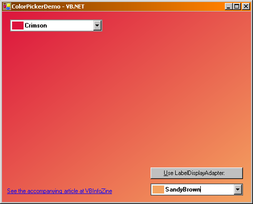
For an illustration of the concept, the demo application contains a simple LabelDisplayAdapter class (in VB.NET and C#) implementing the IDropDownDisplayAdapter interface by adapting the standard Label control. The adapter is associated with the ColorPicker by the following statement:
ColorPicker1.DisplayAdapter = New LabelDisplayAdapter(New Label)
After the assignment, the
ColorPicker.Appearance property returns the
Custom value.
History
-
Thursday, September 16, 2004 - Initial release.


 General
  News
News  Suggestion
  Question
  Bug
Bug  Answer
  Joke
Joke  Praise
  Rant
Rant  Admin
Admin 


 Submit an article or tip


 See my article