Introduction
This article is based on a pre-release version of Microsoft Visual Studio 2005, formerly code-named “Whidbey.” All information contained herein is subject to change.
This article discusses:
Different control container panels such as FlowLayout Panel, TableLayout panel and SplitContainer control.
This article uses the following technologies:
Whidbey is to include a wealth of improvements to make programmers more productive and help them build more robust applications. Panel container controls allows you to arrange or reposition your child controls on your form easily. AutoSize property of the control lets you tell the control that it should resize to properly contain its contents – so Buttons and Labels will expand if the text within them expands, Forms will grow larger if controls within it grow, etc.
There are three types of remote objects are used in .NET Remoting environment.
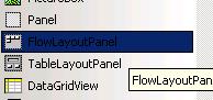
FlowLayoutPanel Class
TableLayoutPanel Class
SplitContainer Control Class
FlowLayoutPanel Class
FlowLayOutPanel control allows you to add child controls, which dynamically repositioned to flow in a particular direction. FLowLayoutPanel class implements FlowPanel class. It arranges all the child controls in the FlowLayoutPanel bound, in a flowing fashion, just like HTML.
The figure 1 shows the FlowLayoutPanel filled with TextBox controls properties. You can see how controls are laid out within your UI, such as anchoring and docking.

Figure 1 FlowLayOutPanel are laid out in your UI
Based on its FlowDirection property, the controls will be repositioned to a particular direction. Flow direction can be controlled, as well as wrapping within the panel. A sample property window is shown in Figure 2.
Figure 2 FlowDirection properties of FlowLayOutPanel
Some of the properties associated with the FlowLayoutPanel class are listed below:
LeftToRight - All the child controls are automatically positioned in left to right direction. A sample form for which FlowLayOutPanelis laid out using the LeftToRight FlowDirection property is shown in Figure 3.
Figure 3 FlowLayOutPanel are laid out using the LeftToRight FlowDirection property
TopDown
All the child controls are automatically positioned in top to down direction. A sample form for which FlowLayOutPanel is laid out using the TopDown FlowDirection property is shown in Figure 4.
Figure 4 FlowLayOutPanel are laid out using the TopDown FlowDirection property
RightToLeft
All the child controls are automatically positioned in right to left direction. A sample form for which FlowLayOutPanel is laid out using the RightToLeft FlowDirection property is shown in Figure 5.
Figure 5 FlowLayOutPanel are laid out using the RightToLeft FlowDirection property
BottomUp
All the child controls are automatically positioned in bottom to up direction. A sample form for which FlowLayOutPanel is laid out using the BottomUp FlowDirection property is shown in Figure 6.
Figure 6 FlowLayOutPanel are laid out using the BottomUp FlowDirection property
Note: When one of the child controls is increased in size, the child controls are moved based on the flow direction.
TableLayoutPanel Class
TableLayOutPanel control allows all the child controls repositioned in a table format or lays out UI that fits well into a grid pattern, which can specify rows and columns sizes being absolutely or proportionally. So, all the child controls' repositioning will be based on the column and row size. In other words, it sets to auto size based on the contents of the column or row. It maintains a structured approach to repositioning child controls. It implicitly positions child controls in a table format, which, assuming default values of 0 for both Columns and Rows, mimics a TableLayoutPanel instance with FlowDirection set to Horizontal and WrapContents set to true.
Uses
- A dialog box resizable during run time, which allows aligning and stretching within the cells.
- It is also useful when generating user forms at run-time.
Some of the properties associated with the TableLayoutPanel class are listed below.
ColumnCount
ColumnCount property allows you to specify the number of columns for child controls. A sample form for TableLayoutPanel are laid out using the one column and two columns is shown in Figure 7.
Figure 7 TableLayoutPanel are laid out using the one column and two columns
RowCount
RowCount property allows you to specify the number of rows for child controls.
Figure 7 TableLayoutPanel are laid out using the one column and two columns
GrowStyle
GrowStyle property allows you to set the row or column add property dynamically while you added child controls on your TableLayoutPanel. This includes three enumeration values such as FixedSize, AddRows and AddColumns. With these attributes, it is possible set the dynamic row or column movement status.
Figure 8 TableLayoutPanel are laid out using the one column and two columns
The FixedSize enumeration doesn't allow you to add a new child control in a new row or column. The AddRows enumeration allows you to add child control in a new row automatically while you added onto the TableLayoutPanel. The AddColumns enumeration allows you to add child control in a new column automatically while you added control onto TableLayoutPanel.
ColumnStyles
ColumnStyles property allows you to set the column style properties such as height, SizeType etc. of a TableLayoutPanel rows. The following figure 9 shows the ColumnStyle Collection Editor window.
Figure 9 ColumnStyle Collection Editor
RowStyles
RowStyles property allows you to set the row style properties such as height, SizeType etc. of a TableLayoutPanel rows.
The SizeType property has different attributes such as AutoSize, Absolute or percent values. The SizeType implements the class System.Windows.Forms.RowStyle in Whidbey.
SplitContainer control
The SplitContainer control allows you to set all the child controls that could share a vertical and horizontal space. The following figure 10 shows how to combine several controls and docking settings commonly used in a single composite control.
Figure 10 How SplitterControl container handles different child controls
The namespace to include this control is System.Windows.Forms.
Some of the properties associated with the SplitContainer control are listed below.
FixedPanel
FixedPanel property allows you to select which panel in the control should not resize as the SplitContainer instance resizes.
SplitterDistance and Orientation
SplitterDistance and Orientation properties allow you to set the control the direction and starting location of the splitter bar.
Panel1MinSize and Panel2MinSize
Panel1MinSize and Panel2MinSize properties are used to specify the minimum size of the SplitterPanel instances in the SplitContainer, effectively controlling how close the splitter bar can be placed to either edge of the control.
Conclusion
In this article, I have described some of the inbound controls using in Whidbey such as FlowLayoutPanel, TableLayoutPanel and SplitterControl etc. In my opinion, the best you make through writing codes in your own way. The example code for this article provides you look on the form view using the above controls.
Binoy is a software developer of Information Technology Division in Memphis,TN.


 General
  News
News  Suggestion
  Question
  Bug
Bug  Answer
  Joke
Joke  Praise
  Rant
Rant  Admin
Admin 


 Submit an article or tip


