Well, You're Gonna Be the Best-Dressed Superhero. Better than Batman, Better than Superman, and...What's That Other child? Spider-Man - Can't Touch Ya!
As the old saying goes, you can't judge an app by its GUI, but it's still the case that most people would rather look at something appealing than something offputting. For that reason, we will now "clean up" the appearance of the page a little. We will get the elements on the form aligned, give them some "breathing room" (they're too scrunched together), and then spruce up the html table so that it is not as wide (doesn't need to be), give it a border for some delineation, add a header row, etc.
Some of this can be done in the HTML. Let's change the "addTimeSpaceForm" and "placesLived" templates to this:
<template name="addTimeSpaceForm">
<form>
    <label class="fixedwidthlbl" for="city">City</label>
    <input type="text" name="city" id="city">


    <label class="fixedwidthlbl" for="state">State</label>
    <input type="text" name="state" id="state">


    <label class="fixedwidthlbl" for="yearin">Year Arrived</label>
    <input type="text" name="yearin" id="yearin">


    <label class="fixedwidthlbl" for="yearout">Year Departed</label>
    <input type="text" name="yearout" id="yearout">


    <input type="submit" name="insertdocument" id="insertdocument" value="Add Place Lived">
</form>
</template>

<template name="placesLived">

  {{#each places}}

  {{/each}}<table border="1" style="width:40"><tbody><tr><td>CITY, STATE</td><td> </td><td>ARRIVED</td><td> </td><td>DEPARTED</td></tr><tr><td> </td><td>{{ts_city}}, {{ts_state}}</td><td> </td><td>{{ts_yearin}}</td><td> </td><td>{{ts_yearout}}</td><td> </td></tr></tbody><tbody><tr><td> </td></tr></tbody></table>
</template>
Note that we reduced the width of the table from 60% to 40%, added a border around the table, added a samsoned header row (sandwiching the text in a "strong" html directive), and concatenated the city and state fields. The "fixedwidthlbl" class reference added to the labels so far does nothing because that CSS class had not been added yet. So, now open the project's .css file (which is currently empty) and add that, as well as something for input elements to give them some elbow room:
.fixedwidthlbl {
width: 96px;
    padding: 2px;
    display: inline-block;
}

input {
    margin: 4px;
    padding: 4px;
}
There Isn't any Scar Tissue Anywhere
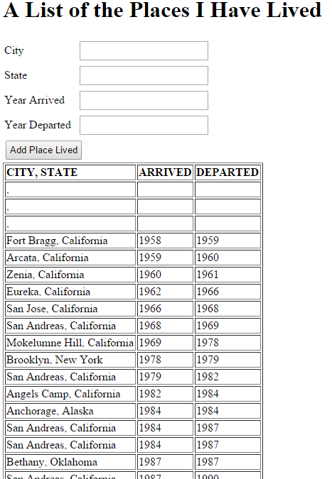
After "saving as" those .html and .css file changes, the page looks like this:

Now, this is surely much more appealing than previously, but if it wins any web design prizes, the judges will be culpable of involuntary manslaughter, for I will die as the result of a sudden and massive myocardial infarction. IOW, my infarction would be brought about by their infraction - that is to say, at least a fraction of the guilt could be laid at their doorstep.
That's enough of that. In the next installment of "As the Meteor Blazes", we will work on filtering the MongoDB result set.
All Articles in the Series "Hitching a Ride on the HuMONGOus Meteor" (or, "As the Meteor Blazes")
PART 1: Installing Meteor, creating a Meteor project, and running the out-of-the-box Meteor Javascript App
PART 2: Making changes to the default HTML
PART 3: Creating a MongoDB Collection
PART 4: Creating the HTML to Receive Input from the User
PART 5: Writing MongoDB data
PART 6: Reading MongoDB Data and Displaying it on the page
PART 7: Gussying up/spiffifying the page with HTML and CSS
PART 8: Filtering and Ordering MongoDB Result Sets
PART 9: Meatier Meteor and MongoDB for Mutating Mavens
