Introduction
When I was trying to find a good example of how to use twitter bootstrap's validation states with jquery's unobtrusive validation, I came across Cristian Moldovan great example of using bootstrap's tooltips to display validation errors. However, for my needs, I wanted to use bootstrap's default form validation states to style how my field errors would look like. So I decided to tweak Cristian's example a little to show how we can use bootstrap's input validation states along with jquery's unobtrusive validation.
Background
I will be just going over my tweaks to Cristian's project. If you want more details on what files to include, please refer to Cristian's example. I am also assuming that you have worked with jquery validation before and are also familiar with Bootstrap.
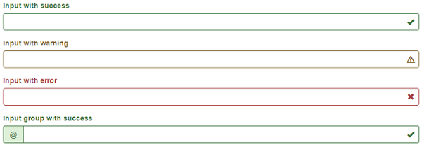
The reason I wanted to change jquery's default validation style was because in the application I was working on, we are using default bootstrap for our UI. jquery's validation was nice but I wanted to be consistent in how our UI looked so I decided to incorporate bootstrap's form validation states into our application. Here is an example of what the field validation would look like with bootstrap:

Using the Code
Similar to Cristian's example, I created a JavaScript library to change the default styling of jquery's validation. Below is that library, jquery.validate.unobtrusive.bootstrap.js:
(function ($) {
    var classes = { groupIdentifier: '.form-group',
    error: 'has-error', success: 'has-success', feedback: 'has-feedback' };
    function updateClasses(inputElement, toAdd, toRemove, addFeedback) {
        var group = inputElement.closest(classes.groupIdentifier);
        if (group.length > 0) {
            group.addClass(toAdd).removeClass(toRemove);
            if (addFeedback) {
                group.addClass(classes.feedback);
            }
        }
    }

    function onError(inputElement, message) {
        var group = inputElement.closest(classes.groupIdentifier);
        var inputGroup = inputElement.closest('.input-group');
        var helpBlock = '<span class="help-block">' + message + '</span>';

        group.find('.form-control-feedback').remove();
        if (group.find('.help-block').length > 0) {
            group.find('.help-block').text(message);
        } else {
            if (inputGroup.length > 0) {
                inputGroup.after(helpBlock);
            } else {
                inputElement.after(helpBlock);
            }
        }

        if (inputElement.context.type === 'text') {
            var errorIcon = '<span class="glyphicon glyphicon-remove
            form-control-feedback" aria-hidden="true"></span>';
            if (inputGroup.length > 0) {
                inputGroup.after(errorIcon);
            } else {
                inputElement.after(errorIcon);
            }
            updateClasses(inputElement, classes.error, classes.success, true);
        } else {
            updateClasses(inputElement, classes.error, classes.success, false);
        }
    }

    function onSuccess(inputElement) {
        var group = inputElement.closest(classes.groupIdentifier);
        var inputGroup = inputElement.closest('.input-group');

        group.find('.form-control-feedback').remove();
        group.find('.help-block').remove();
        if (inputElement.context.type === 'text') {
            var successIcon = '<span class="glyphicon glyphicon-ok
            form-control-feedback" aria-hidden="true"></span>';
            if (inputGroup.length > 0) {
                inputGroup.after(successIcon);
            } else {
                inputElement.after(successIcon);
            }
            updateClasses(inputElement, classes.success, classes.error, true);
        } else {
            updateClasses(inputElement, classes.success, classes.error, false);
        }
    }

    function onValidated(errorMap, errorList) {
        $.each(errorList, function () {
            onError($(this.element), this.message);
        });

        if (this.settings.success) {
            $.each(this.successList, function () {
                onSuccess($(this));
            });
        }
    }

    $(function () {
        $('form').each(function () {
            var validator = $(this).data('validator');
            validator.settings.showErrors = onValidated;
        });
    });
}(jQuery));
The main changes from Cristian's library are in the updateClasses, onError and onSuccess functions.
For the updateClasses function, I added an extra parameter called addFeedback. This determines if I want to add the bootstrap css class has-feedback to the form-group element. The has-feedback class is needed in form-group that contain an input element of type text. This helps in adding the little icon to the right of the input field.
function updateClasses(inputElement, toAdd, toRemove, addFeedback) {
    var group = inputElement.closest(classes.groupIdentifier);
    if (group.length > 0) {
        group.addClass(toAdd).removeClass(toRemove);
        if (addFeedback) {
            group.addClass(classes.feedback);
        }
    }
}
In the onError function, this is where I add a span with a class help-block that contains the error message that is returned to the user indicating what kind of error is on the field. I also check if the input element is inside of an input group. If it is, I want to append the help block after the input group. Otherwise, if it is appended after the input element, inside of the input group, it causes the add-on in the input group to stretch when the help-block message shows.
To get the x mark to show in the input element, I had to make sure that the input element is a text input because this will only work with text inputs. So after I made sure it was a text input, I append a span containing the x icon after the input element. I also do the same input group check as before and also determine if I want to add the has-feedback class.
function onError(inputElement, message) {
var group = inputElement.closest(classes.groupIdentifier);
var inputGroup = inputElement.closest('.input-group');
var helpBlock = '<span class="help-block">' +
message + '</span>';
group.find('.form-control-feedback').remove();
if (group.find('.help-block').length > 0) {
group.find('.help-block').text(message);
} else {
if (inputGroup.length > 0) {
inputGroup.after(helpBlock);
} else {
inputElement.after(helpBlock);
}
}
if (inputElement.context.type === 'text') {
var errorIcon = '<span class="glyphicon
glyphicon-remove form-control-feedback" aria-hidden="true"></span>';
if (inputGroup.length > 0) {
inputGroup.after(errorIcon);
} else {
inputElement.after(errorIcon);
}
updateClasses(inputElement, classes.error, classes.success, true);
} else {
updateClasses(inputElement, classes.error, classes.success, false);
}
}
Similar to the onError function, the onSuccess function also adds an icon to text inputs and checks when to add the has-feedback class to the form-group. The main difference is that we want to remove the help-block message if the field is in the success state.
function onSuccess(inputElement) {
var group = inputElement.closest(classes.groupIdentifier);
var inputGroup = inputElement.closest('.input-group');
group.find('.form-control-feedback').remove();
group.find('.help-block').remove();
if (inputElement.context.type === 'text') {
var successIcon = '<span class="glyphicon
glyphicon-ok form-control-feedback" aria-hidden="true"></span>';
if (inputGroup.length > 0) {
inputGroup.after(successIcon);
} else {
inputElement.after(successIcon);
}
updateClasses(inputElement, classes.success, classes.error, true);
} else {
updateClasses(inputElement, classes.success, classes.error, false);
}
}
Once all of these changes are made and you include the JavaScript library to your application, the end result will look something like this:

Points of Interest
Going into this and before stumbling across Cristian's great example, I thought it was going to be difficult trying to change the default functionality of jquery's unobtrusive validation styles. I was pleasantly surprised at how easy it was to do and I am really happy with the result.
