Introduction

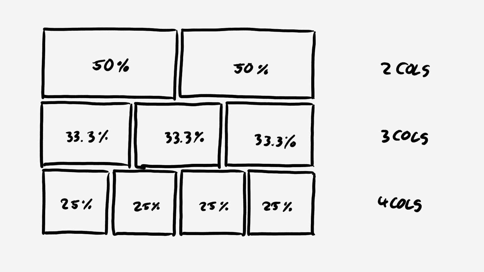
We stumbled across this problem when setting up a base layout for a web page. The requirement was rather simple: Arrange the content in two, three or four equal columns on the page and stretch them over the available width. The total available width on the page is fix, but will be subject to change during the project.
Using the Code
Eventually, the requirement reminds you of the Bootstrap grid concept. Therefore we had a look at the Bootstrap col and container style definitions. Nevertheless, including the complete Bootstrap styling framework was not a favorite way to go.
Setting Up a Container and Several Columns
In our first approach, we defined a container div containing e.g. four columns as div elements.
<!--
<div class="container">
<div class="column-25">
Col 0
</div>
<div class="column-25">
Col 1
</div>
<div class="column-25">
Col 2
</div>
<div class="column-25">
Col 3
</div>
</div>
The container style contains with a fixed but changeable width (e.g. 20cm).
.container {
width: 25cm;
}
The columns style defines a relative width for the columns (e.g. 25%). To give the cells' content some space around, added a padding.
.column-25 {
float: left;
padding: 20px;
position: relative;
width: 25%;
}
The result was not exactly what we were looking for. The last column word wrapped to the next row. Apparently, the columns' width in sum was greater than the available width in the container. Double checking our math (25% * 4 = 100%) proofed, the "error" must be located in the CSS/HTML code.

The HTML Box Model
In HTML, every box element has a content area surrounded by three layers: Padding, border and margin (This link gives a good explanation).
By default, the width attribute of a box element defines the width of the content area. Padding, border and margin add their own areas around. So, the total demanded horizontal space of the box element is not only the content width, but the sum of content width, horizontal padding and margin and border width.
So, our columns have a width of 25% of the available width plus 40px padding (left and right). With four columns, we exceed the container width by eight times the padding value. This causes the horizontal overflow.
Bootstrap Solution
In the Bootstrap style sheet, this problem is tackled by the following definition:
*, *:before, *:after {
-webkit-box-sizing: border-box;
-moz-box-sizing: border-box;
box-sizing: border-box;
}
Changing the box-sizing attribute from content-box to border-box, places content, padding and border within the box width (Read this). Vendor prefixed attributes -webkit-box-sizing and -moz-box-sizing only are added for backward compatibility concerning older browser versions. Marie Mosly wrote an article, which explains this topic.
For further details on available box-sizing modes, see this link.
With the selector *, the style definition gets applied to every HTML tag. This solves our problem for now, but may lead to some restrictions in the future.
Inherited box-sizing
Chris Coyer discusses this topic even further in this article. By defining box-sizing for any element at the root level, we force this attribute value on every element in the HTML DOM and potentially override the style of some components. By defining inherited box-sizing, we allow components to setup a box-sizing environment in the DOM without specifying the attribute for every child element.
html {
box-sizing: border-box;
-webkit-box-sizing: border-box;
-moz-box-sizing: border-box;
}
*, *:before, *:after {
box-sizing: inherit;
-webkit-box-sizing: inherit;
-moz-box-sizing: inherit;
}
Changing the box-sizing model in the example solves this issue. To try it yourself, the example code is attached below.

Example Code
Here is a short code example containing the mentioned style definitions. To "break" the columns, just remove lines 4 to 13.
<html>
    <head>
        <style>
            html {
                -webkit-box-sizing: border-box;
                -moz-box-sizing: border-box;
                box-sizing: border-box;
            }
            *, *, *:before, *:after {
                -webkit-box-sizing: inherit;
                -moz-box-sizing: inherit;
                box-sizing: inherit;
            }
            .container {
                width: 25cm;
                background-color: red;
            }
            .column-25 {
                background-color: blue;
                float: left;
                padding: 20px;
                position: relative;
                width: 25%;
            }
        </style>
    </head>
    <body>
        <div class="container">
            <div class="column-25">
                Col 0
            </div>
            <div class="column-25">
                Col 1
            </div>
            <div class="column-25">
                Col 2
            </div>
            <div class="column-25">
                Col 3
            </div>
        </div>
    </body>
</html>
